Collage Workshop

Yesterday’s collage workshop gave me much more of an appreciation for all of the work that went into Max Ernst’s book. He cut out all of the images he used so well that they almost seamlessly blend together, which it turns out is pretty hard to do. The workshop also made me wonder about Ernst’s creative process. How much of each section or page did he have planned out ahead of time and how much did he allow the images he had on hand to influence him? I went into the workshop with a couple ideas about scenes that I might like to use for my final illustration and then let the images available influence which of those ideas I chose.

Collage is an interesting medium because it seems like the images you have available will always influence the art you produce, at least to some extent. The images you use can inspire you, but it seems like they could also be potentially limiting. It at least forces you to get more creative with your materials if you go in with a specific image in mind that you want to create, for example with the Nancy Goodman Lawrence image that was in our collage powerpoint in class.

Lessons learned from the Collage Workshop

When I was younger, I used to love collecting buttons, sparkly jewels, pretty pieces of paper, newspaper clippings, and receipts to collage together using Elmer’s glue and colored poster board. It was a pastime I had picked up from my older sister, and it provided me an opportunity to dump glitter all over my kitchen counter. What’s interesting looking back on this hobby of mine is that I never incorporated rhyme or reason into the illustrations… I solely crafted together things I liked into an abstract image (with no real underlying message).

What was so different about my experience in the collage workshop today was that for the first time I began to understand that collage can create realistic images… It doesn’t all have to be abstract and structured. Thinking back to Max Ernst’s graphic novel, I realized that one can create his/her own image by means of multiple other images mixed together. Thus, with this new understanding in mind, I used today as a practice run for our final project. I attempted to use various clippings I had selected to create a “realistic” or harmonious image. While the result was not the finest, I think this practice round definitely benefitted my collage skills in the long run. The final project should be very fun…

Today’s Collage Workshop

Going into today’s workshop, I had no vision of what I wanted my final DIY illustration to look like. I ended up using this time to play around with different images through collage, with no end goal besides just having some fun and spurring the creative process of thinking of an idea for my final illustration. I ended up making this:

My first thought after re-examining my collage was that there is tons of white space on the page, which is mostly a product of not “finishing” (although I didn’t really have a plan of what to put in the white space). It was fun to look through the older magazines (I think they were called “ideas”?). Most of the images I cut out are from those magazines–I really liked the older more pop-art style of them, but I also added some random images from various advertisements. I think I had the most fun with the image of the people staring (to the right). The image came from an Easter Church scene, and I though it was pretty funny/creepy how they were all just staring in the same direction. I found some flowers that matched the coloring from the following page, and I decided to cover some of the faces in the crowd with flowers. This wasn’t really for a specific reason/meaning but I just thought it looked cool. I think overall I had a fun experience with collage, although I probably won’t use this in my final project,  because it wasn’t really inspired by a story about play.

Collage Workshop

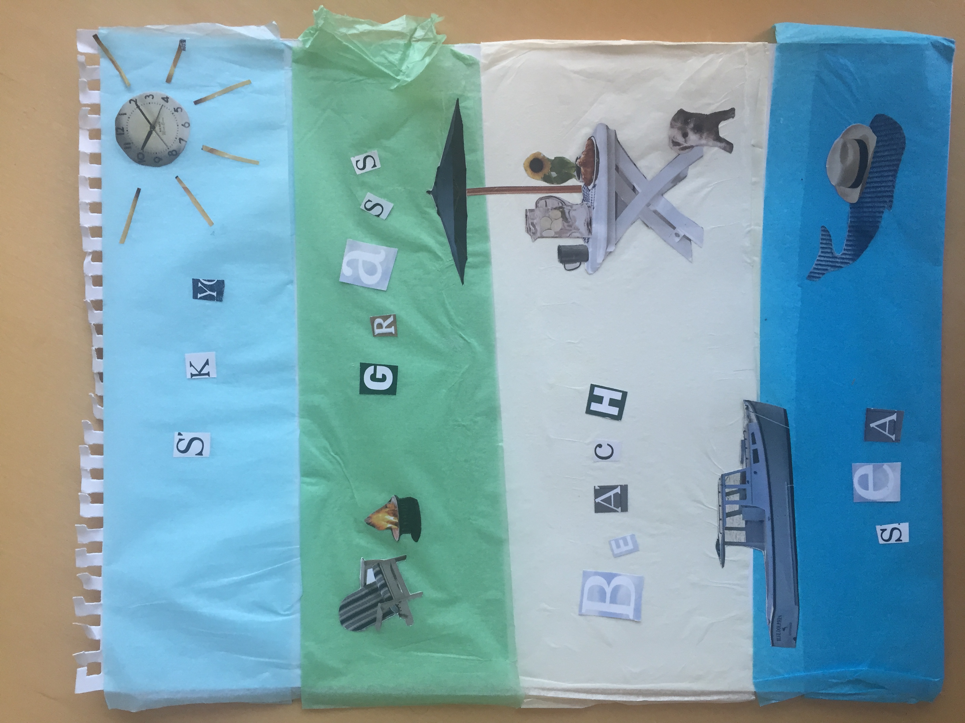
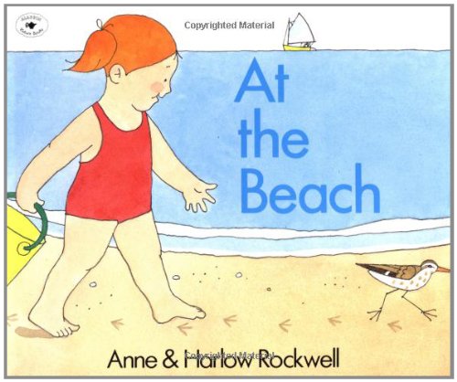
I really enjoyed the collage workshop today and instantly picked out the two L.L.Bean magazines I wanted to use. When I think of play, my mind moves to exploring the beach with my younger sisters, playing in the sand and water, then at night sitting by a fire just off the porch of the house. A book that illustrates just this is Anne & Harlow Rockwell’s At the Beach, which depicts a little girl’s first time at the beach. 

My goal during the workshop was to illustrate a passage from this children’s book. I think that my collage works well in the context of the book because it is both realistic of what a little girl will find at the beach but is also playful. For example, my final DIY illustration accurately depicts the setting of the beach yet adds a playful touch with a hat on the whale and a clock as the sun. The illustration also provides a teachable moment for very young children who are just learning how to read because “sky,” “grass,” “beach,” and “sea” are all spelled out. I look forward to the digital workshop on Wednesday!

Collage Workshop

I really enjoyed working on my collage today during the workshop. I found that, in accordance with our definition of collage, I combined the pictures and fragments I collected to create an entirely new whole with a distinctly separate meaning from their originals. At first, when looking at all of the magazines and materials, I wasn’t sure if I was going to be able to create the image I already had in my head. But I found that something that helped was collecting similar images – things with the same color and theme that could begin to form cohesive patterns. Sometimes, in order to do this, I had to keep my eyes peeled for even the most minimal images such as a small illustration of tree tops or a little boy’s face peeking from behind a curtain. I also found that the degree to which I cut an image had a significant effect on how it would appear in the new illustration. These delineations affected their new place in the dissimilar context of my project. I feel that I have laid down good base work, but I know I need to add more layers of images and meaning to fully convey the passage that I am working with.

Julia Jaqcuette and Play

     The idea of play was discussed numerous times during our class with Julia Jacquette. What I thought was incredibly interesting is the way play has fundamentally changed over the ages. Certainly the digital age has shifted what it means to play – it might not necessarily mean going outside always, for example. However, I felt that Jacquette’s drawings of playgrounds could still be useful in todays world. Even if the use of media and video games is more than the past, playgrounds still become a central place for many kids – and her interpretations of playgrounds allows them to fit not only in her context of Manhattan, but most any park or playground.

     Her explanation of how children are very perceptive to architecture was also intriguing. We don’t often think too much of how different buildings make us feel – but even our own Hamilton campus portrays a wide variety of structures. Milbank, with  its large windows and imposing concrete blocks looks nothing like the classical feel of Root Hall’s white columns out front. I thought Julia’s murals engaged in a juxtaposition between the abstract and the making of social commentary on the power of magazines and media in general. To just look at the murals without any background, one might presume it is simply a ver cool abstract mural. With added context, the murals take on a whole new meaning and allow the viewer to see multiple levels of context in the mural.

When we were walking through Julia Jacquette’s exhibition, the piece that struck me the most was the painting of the couple’s resort, which shows the reflections of two people and a tree in the water of a pool. When I first looked at the piece, it was not quite clear to me that the colors in the water were supposed to be reflections. In fact, I did not realize that people were represented in the painting at all until we took a tour of the gallery on Monday and the painting was explained to the class.

The painting became even more interesting to me when Jacquette started to describe the scene that it was created from. In the original picture, a seemingly perfect man and woman are standing by the side of the pool at a couple’s resort. Jacquette described the scene as looking so perfect that you instantly wanted to go to the resort as well. This speaks to the power that advertisements can have over people. By setting up the “picture perfect” scene, one advertisement can draw people to something that they were not interested in before seeing the advertisement.

Touring the exhibition with Jacquette added to the enjoyment of her artwork. Many of her pieces addressed different social issues, but without her explanations, I may not have picked up on that on my own, especially for the more abstract pieces. Jacquette spoke about trying to make her art interesting enough to get people to look at it, but I think the allure of her work comes from the specific ways in which she represents different social issues.

A Mental Collage

I really enjoyed visiting with Julia Jacquette today. It was a unique experience to get to walk through an art exhibition with the artist–something I’ve never had the chance to do so before. I loved being able to ask her questions and hear how she interpreted her works, made certain decisions, and even to see how we would sometimes see something that wasn’t intentional on her part. One of the things that stuck out most to me was when she was explaining the process she went through curating material for each page of her memoir. Between going to the library, doing google searches, compiling pictures from her family albums–among other things–it was an extremely extensive process. And it really reminded me of a collage of sorts. Not of the physical material brought together as we saw in the examples we’d studied in class; but more so a collage she put together in her mind, repurposing all the material she collected into a new work. To this end, it made me think that we’re always doing some sort of collage in our minds. Be it bringing together sources in a paper, drawing on different influences in a work, today was a reminder of how much the works we produce are amalgamations of what we’ve learned and experienced. Julia Jacquette’s work was like this, only more so, because of all the pieces she’d purposely gone out searching for to illustrate her memory.

It was also really special to hear the personal sentiments behind each work. I’d have to say my favorite page after meeting with her would have to be the first page with her and her mother. It brings to mind a specific brightly patterned shirt I always remember my mother wearing when I was a child. I was actually able to remark upon it when I was back home for the break and we had dug it up from an old box. It brought surprisingly vivid memories and feelings of comfort and nostalgia–akin, somewhat, to what I imagine the emotions behind this page are.


Meeting with Julia

Today’s lecture was amazing.  I really enjoyed having the opportunity to hear about the whole exhibit from Julia herself, and it was something that offered insight into the exhibit as a whole that I had never experienced before.  This was the fourth time that I had walked through the exhibit, and after hearing it described by three people prior to Julia, I thought I knew all there was to know about the exhibit.  I was completely wrong, and the impressions I had of each of her pieces and her inspirations were changed after hearing her speak.

I was truly curious to hear about her feminist approach to art, and after hearing how these were ideals she was raised with, and these ideals still inspire her work today, I was inspired.  I also think that hearing her discuss her illustrated book helped shaped my idea of play and a playground as I start working on my final illustration.  I cannot wait to go through the exhibit a 5th time, and be able to see it yet another light after listening to Julia speak today.

Jacquette Exhibit

Although I did not get to see Julia Jacquette in person, I did visit the installation at the Wellin. I was enthralled by Jacquette’s “American advertisement” exhibit which engages with contemporary art in the form of advertisement. The exhibit exploits the methods through which American advertisement convinces viewers to purchase products, while critiquing that very behavior. Jacquette took pieces of American fashion and beauty magazines and painted them on a large scale. The effect is what often looks like a close up shot of a Coca-Cola advertisement, but instead is an expanded version of a 4”x4” cutout of a picture of a dress. The size of these images in the Wellin make the statement that our coveting for new products is a phenomenon that encompasses the American experience. The colors from the above piece are an inviting shade of caramel and white. Vogue Magazine, one of Jacquette’s influences for this project, intends to immerse viewers. I have long been interested in how artists for companies make art for advertisements. Beauty magazines often eschew uplifting substance with vapid images of blatant consumerism. An entire industry that is just devoted to selling products. There are no column pieces or editorials sharing interesting points of view on societal issues. Instead, there are only pictures that enchant viewers into buying their products. Jacquette seems to recognize this phenomenon of American consumer’s fascination with magazines and general consumerism. In addition to recognizing it, she aims also to show what captivates us about the lust for more, but she also critiques the companies that feed off of America’s consumerist society. In summary, even though Jacquette, once again, adds to the consumerist cycle by displaying these images for more people to see thereby supposedly giving the original company’s products more exposure – it is the company that loses in the end because there name does not appear on any of the pieces. Maybe this is the answer that Jacquette puts forth: we must take back the beauty that “they” try to sell us and recreate it for free.

css.php