Learning to Read Beyond Words

A letter doesn’t communicate by words alone. A letter, just like a book, can be read by smelling it, touching it and fondling it. Thereby, intelligent folk will say, “Go on then, read what the letter tells you!” whereas the dull-witted will say, “Go on then, read what he’s written!”

 – My Name is Red by Orhan Pamuk (p. 37)

For many of us, illiteracy is often associated with a lack of intelligence. From an early age we are preached about the importance of reading and writing, and how reading and writing are tools that help us grow and better understand the world. However, from the very first day of class this “truth” has been questioned. For example, when “reading” The Book of Hours we rely not on words, but on pictures to understand a story. As I flipped through the book’s images, I often found myself struggling to understand the story being told. I felt handicapped without words to help guide me. My inability to understand a story got me thinking about a different kind of illiteracy – I am “ilvisual” if you will. My difficulty with interpretation does not mean that I am unintelligent. Instead, my difficulty to interpret certain pictures in The Book of Hours speaks to my educational background. My education has emphasized words over image. The opposite appears to be true for the original readers of The Book of Hours. Image was valued over text. Though I may be more skilled at reading, the original readers were more skilled at visual translation.

I came across a passage while reading My Name is Red (written above) that I think speaks to the debate of what it means to be intelligent. According to My Name is Red, I am dull-witted. I must learn to look beyond words. Words are easy. What is written is all you get and what you get is accepted as fact. But with a picture, I need to look for details and symbols that reveal the story. Reading pictures requires more effort than reading a text, and with more effort I believe the story becomes more meaningful.


Paganism vs. Christianity in The Secret of Kells

The first way in which paganism is present in the Secret of Kells is through Ashleigh, the fairy Brendan befriends in the forrest. Although a belief in fairies was a part of the pagan religions the Christian church was trying to stamp out in Ireland at this time, Ashleigh is shown in a positive light in the movie and helps Brendan. This positive image of Ashleigh could be a result of the fact that she is almost  a personification of the forrest, which was necessary for monks to create ink so that they could illuminate manuscripts. This use of plants from the forrest, which monks like Challach considered dangerous and wild, to further the spread of Christianity is an example of turning darkness into light, a common refrain in the movie. Even though Ashleigh is friends with Brendan when he is a child, when he comes back to Kells as an adult she will no longer reveal herself in her human form in front of him, which could show that he has succeeded in spreading Christianity in Ireland through the Book of Kells and that paganism, although still present, has been mostly suppressed.

Paganism is also presented in the film through Crom Cruach, who at first seems like the villain of the story. He (possibly symbolizing paganism in Ireland) is responsible for the spread of darkness. However, in the end it turns out that Crom Cruach, or at least a part of him, is necessary for Brendan to complete his illumination of the Book of Kells. This is another example of the theme of turning darkness into light, but it also implies that the spread of light (Christianity) is impossible without the incorporation of at least a little darkness. I took the use of Crom Cruach’s eye to complete the manuscript as a metaphor for how it was necessary for the church to allow certain aspects of local pagan religions to be incorporated into Christianity in order for the religion to spread successfully. Overall, the characters of Ashleigh and Crom Cruach showed how complicated the relationship between local Irish beliefs and the church were at the time of the Book of Kells.

Representations of Nature in the Secret of Kells

While I really enjoyed the storyline of the Secret of Kells, what captivated me most was the intricacies of its animation. One of the recurring patterns that I found most inspiring was the recurring geometric shapes, especially circles.  These two images show somewhat conflicting messages of nature, utilizing circles to do so. The first depicts an aerial view of the forest with the ominous presence of a crow, while the second is less ominous with more light and a sense of simplicity. Circles convey a sense of power; the one strong circle taking up the screen in the first image seems more threatening and ominous than the repeated circles in the second image. These images also give a sense of perspective. In the first image, seeing the forest from an aerial perspective shows its true expanse, while the second image has an outsider perspective that conveys nature as a less threatening force. I think these two screen captures are cohesive but also convey differing representations of nature.

Creativity and The Secret of Kells

I truly enjoyed The Secret of Kells last week.  Not only did I think that it was a creative way of depicting the story of an illuminator, but it was an vividly beautiful movie.  What I found incredibly interesting, which we discussed in class, was the relationship between both Brother Aiden and Uncle Callach with Brendan.  Brendan’s relationship with Aiden seemed to be one which encouraged creativity and promoted openness and freedom.  However, his relationship with his uncle was one of stifling creativity due to his sole focus on achieving a singular goal; building a wall.  These opposite opinions stuck with me after the movie, and were something that I thought was important to discuss.

I think the difference between these two relationships is an incredibly common theme that has been seen in the history of art.  Uncle Callach felt that the wall was the sole goal for the entire community in Kells, and would not begin to discuss the possibility of Brendan trying something different.  This reminded me a lot of how during World War II Hitler believed Modern art to be a disgrace, and held the Degenerate Art Exhibition.  While I do feel like comparing Uncle Callach to Hitler can be a bit harsh, the same idea is evident.  There have constantly been power figures who have stifled the development of art, culture and talent, but there are those like Brother Aiden who encourage this development of talent.  It is these figures in history that are responsible for art.

Nudity in Tres Riches Heures Folio 25v

Folio 25v

In Jonathan Alexander’s article “Labeur and Paresse,” the author examines nudity in folio 25v.  The triptych depicts Adam and Eve’s story.  On the left Eve is picking the forbidden fruit, hands the fruit to Adam, God tells the couple their punishment, and an angel kicks them out of the Garden of Eden.  Alexander states that, “The erotic emphasis on Eve’s nudity” is not a result of the “voyeuristic gaze of the Duke [de Berry]” (447) but of the power exercised through class.  I disagree.  

First, Alexander gives no reason that the image of Eve should not be perceived as eroticized.  He says that because male and female images are presented, it cannot be about sex.  As Professor Serrano said in class there’s often, “Something for everyone.” in pictures such as these.  Why would including the nude Adam make Eve suddenly an unisexual being?  In fact, displaying both of them emphasizes their sexuality.  The story shown in the image represent the consequences of giving into temptation.  Perhaps this was in some way poking fun at the fact that one looks at Eve and sees a form of erotica, when one is not supposed to.  Although many of the other images are about class power, there is no sense of this struggle in folio 25v.  Why should the other images completely alter the meaning of this one?  

Second, if we observe the picture itself, Eve is supposed to represent the ideal female body type for the time.  Her distended belly, the whiteness of her skin, long golden hair,  pert breasts, and thin waist express fertility, youth, and femininity.   I’m curious what my classmates thought of Alexander’s opinion about this folio.  Do you think the image is sexual or erotic?


Are manuscripts biased in perspective?

Thus far, our class conversation surrounding illuminated manuscripts has made it apparent that the primary creators of these works were male. Recently, in my Sexuality & Gender of Ancient Greece and Rome classics course, we’ve discussed the problem of male-centered primary resources. I think this dialogue could be extended to works such as Très Riches Heures or the Book of Kells.

The question becomes, are we making assumptions and associations of a time period based on a male-dominated perspective? Are we truly understanding stories of the time if we are only receiving half the story? These illuminators have the ability to portray whatever it is they would like, as we discussed with their ability to incorporate their patrons into works with either kind or snarky effects. This makes me wonder if their representation of culture are swayed or inaccurate. I’m curious to hear other people’s thoughts on the matter.


The Secret of Kells: Dimensionality of Cinematography

The Secret of Kells movie presented a very interesting cinematography that I had never seen before. The figures seemed both two and three dimensional with the unique combination of simple outlines and shadowing. Seeing these rather flat figures in movement mimicked the experience of seeing the Book of Kells itself. Because of the color and gold leaf and the dimensionality, the pages likely seemed alive in movement despite being printed. In fact, this movement and seeming life contained with the book is something they constantly alluded to in the movie when they would talk of the book giving hope and light through its beauty and importance.

One of my favorite parts in the movie was the last picture that zoomed in on a page of the actual Book of Kells. The way the camera panned and then deconstructed the individual elements of the page mirrored the aspects of the movie. Although we often see and appreciate the design as a whole, sometimes we fail to appreciate the individual elements which, with the emphasis on the magnifying, etc. The whole movie was about the construction of the Book of Kells so the final frame with deconstruction of the page seemed like a very appropriate end.

Ekphrastic Poetry

The beauty found within works of art can often be hard to describe, as it seems at times there is a lack of accurate language available to accurately encapsulate the feelings the art evokes inside of us. It is made difficult also by the fact that one work of art can quite possibly mean one-hundred different things to one-hundred different people. The subjectiveness involved in analyzing and assigning meaning to art has always fascinated me, and is the main reason why I am so found of ekphrastic poetry. While ekphrastic poems are merely poems written about works of art, often times they dig to find deeper meaning relating to the pieces of art that they are commenting on. Such a mode of expression serves as a medium through which writers can relate their emotional and critical responses to a particular work of art. In addition, such poetry can often add to works of art by making known any political and/or societal issues being addressed by the artist of the original work. This intersection of visual and literary art acts trifold as a commentary on the work of art itself, any social or political implications raised by the work and the writers reaction to the piece. Ekphrastic poems serve as examples to show the impact that the arts can have on society, and it is why I believe they should be highly valued.

The color of Virgin Mary and the meanings behind those colors in different illuminated manuscripts.

The colors of Virgin Mary’s clothes always include one most important element– blue. Blue is the symbol of peace, royalty and nature, which is the quality of a great mother of Jesus and the example of females in the traditional biblical culture.

On the  cover of the ‘Books of Hours’ , wearing a pink cape and a blue dress inside, Virgin felt the Christ Child in her womb with the greeting of St Elizabeth.  Another one of the uncountable examples from the book would be plate 29. A young man kneed before Virgin Mary and her child, praying ‘I beseech you, holy lady!’ The blue is the same blue except that, it decorates a fabulous cape with delicate golden edges.

However, other colors were also used in the portrait of Virgin Mary, such as orange, pink and white in different scenarios. So my question would be: what are the symbols of these different colors? What do those colors illuminate or hide? What roles do colors in general play in the depiction of the glorious figures?

Who is served by paratext?

In class this week, we looked at different covers for a work– The Iliad, in this case– and speculated on what the different choices chose to emphasize about the work they were representing to the reader. This got me thinking about the different people such paratext serves.

The first party the paratext can serve is the author. If a cover gives a reader or buyer an accurate reflection of the author’s vision, then I’d say it’s furthering their artistic expression by spreading it, (illuminating it, even) and hopefully appealing to the kinds of people who they hope will experience their work. Today, authors don’t usually have a hand in the paratext of their book, so this end isn’t always served at all.

Publishers are in charge of making as much of a profit as possible, and they choose whatever images and text appear on the cover. Their goal is not to highlight the author’s intent,  but to make the contents marketable. I’m not saying it doesn’t still serve the author by getting their work to as many people as possible, but even if the resulting paratext is what the author would have chosen, it was arrived at by a different intent.

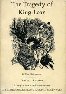
Finally, the paratext serves the reader by coloring their opinion of the work. It helps us choose what we want to read, of course, but it also gives us a sense to view the work through once we’ve begun. I think of the difference between the copies of a book my high school had, for example, vs. the one I might find at a book store. I’ll use King Lear as an example, just because I remember the edition I read in high school as stunningly nondescript:

There it is. Other than the title, it tells us nothing. If anything, I would say it tells us that this is going to be a pretty dry read, in a pretty dry, academic setting. This may as well be the cover of a computer science textbook. The designer of this school edition, I’d assume, knew that they didn’t need to market this to the public: they just needed a cheap cover for a volume that schools would buy in bulk and that students would read whether they liked it or not. So I think that’s the opinion most high school students have of King Lear. It was boring, and they had to read it for class.

In contrast, take this one:

This draws a much more intriguing picture. It tells us that it’s a tragic story, for one thing. The style of the artwork reminds me of medieval art, but I don’t think it is. I think it’s implying that the story takes place in the distant past. I can even extrapolate that there’s an old man who suffers, and causes others to suffer too, based on the figures. At the very least, I could conceivably be intrigued by what’s inside. It’s an interesting enough story to have an interesting cover, and I might approach it differently as a reader if that was my first impression of it.

So I guess paratext serves the company first and the author last, while the reader either is or isn’t depending on the publisher’s approach. What do you guys think?

css.php