More of Eko’s “Don Quixote” Woodcuts

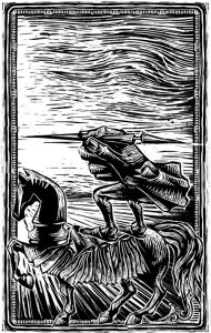
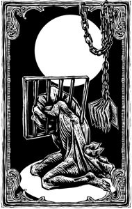
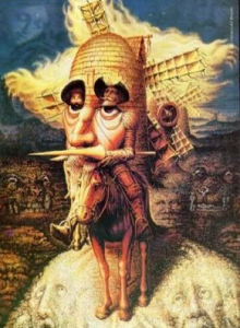
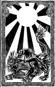
After looking at Eko’s woodcuts in class, I was curious as to how some of his reoccurring thematic images were used in his other depictions of scenes from the book.  As we noticed from the woodcut showing Don Quixote ‘losing his wits’ being too entrenched in his stories, his head and torso were depicted as one large hand. I was interested to see that this portrayal of him reappeared in contexts outside of the context of him reading inside his house. In the second and fourth images below, he is on a horse throwing a spear and locked in jail, but the iconography of the hand suggests that these are figments of his imagination or at least a further sign of his madness. The imagery of books is omnipresent – either placed somewhere in isolation within the scene or imbedded into other objects such as the face of the lion in the first woodcut or the body of the horse in the second.

I included the windmill woodcut that we looked at in class specifically because I hadn’t noticed at the time that it included books as well. The combination of the book and hand imagery (as well as the receding checkered floor which is not included in these woodcuts) suggest that Eko may have chosen to depict this story, in its entirety, as Don Quixote’s descent into madness – or at least, a consistent narrative of his mental state absorbed in the stories he reads.


Judging A Book By Its Cover

Yesterday in class we were asked to look at different book covers of Cervantes’ Don Quixote de la Mancha. On one particular slide, we were presented with two covers side by side – a white cover with a giant Q and a black cover with a small square painting above white print. Nearly everyone in class agreed that the one on the right (the black) looked like a book you’d be asked to purchase for a literature class. The book looked academic to us because of it’s plain, straight-forward, no frills font and the serious, dark-hued painting. I grew bored just looking at the cover.

I’d like to think that I’m the type of person who doesn’t judge a book by its cover. Who cares if I buy the academic looking book or the version featuring a more artistic cover? No matter what the cover looks like, the content is still the same. But I must admit that I am the type of person who judges a book by its cover. In fact, there have been times when I buy a version of a book for more money just because I like the way that cover looks more than I like another cover.

I guess the big question here is why? Why do I care what the cover looks like? The answer: the cover of a book does not only suggest the content of the book, but the cover also reflects my personality and my tastes. Choosing a book based off of its cover is a practice of self-identification.

For example, I would never NEVER purchase, say The Kite Runner, with a cover featuring an image from the film adaption. I don’t want people to think that I am only reading the book because I saw the film. I read books because I like books, not because I like movies.

Or take for example, an experience I had in high school. My mother had given me Daphne Du Maurier’s Rebecca, a respected novel that has been in print since its publication in the 1930s. But to my dismay, the book was dressed in a bright red cover with raised gold lettering written in gaudy cursive. It looked like a cheap romance novel you would pick up at CVS. I remember reading this version of Rebecca in the hallway before going into my US history class.

“What are you reading?” my teacher asked me with raised eyebrows.

“It’s a classic book I swear!” I quickly blurted out trying to correct the false impression my teacher had just gained of me. I didn’t want my teacher to think I was the type of person who would willingly consume trashy literature.

That very afternoon I went to Barnes and Nobles and bought a new Rebecca one with a cover I felt better fit my personality. Yes, a ridiculous course of action. I already had the book. Why by a new one?!

It’s amazing to me that publishers bother to produce the same novel with so man different covers. Why can’t we just be satisfied with one version? But it makes sense. Publishers want to reach as wide an audience as they can. Rebecca has innumerable covers – covers that resemble romance novels, covers that resemble crime novels, covers that resemble teen lit, and covers that resemble Jane Austen novels. By having these options, the publishers are able to find consumers with all different reading habits.

Just a Man on a Horse and some Windmills

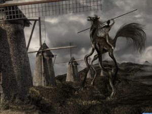
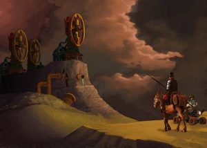
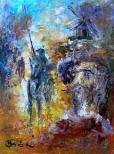
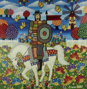
After class, I was interested in looking further into how various artists have illustrated Don Quixote. By doing a few simple Google searches, I found dozens of beautiful pieces of art (and with a lot of thought and indecisiveness, I narrowed it down to 9 images to include in this blog).

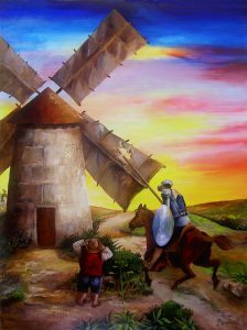
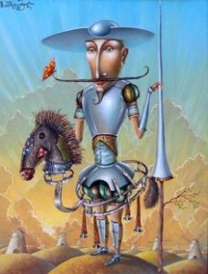
The primary commonality that I found in all of them is that they include a man, a horse, and windmill(s). When these three icons appear together, they make a piece of art identifiable as one that relates to Don Quixote. This illustrates to me the importance of knowing the story when creating an image from it. All these artists knew that those were the aspects that stood out in the story, and would therefore be familiar to the audience. 

I really appreciate the different styles that each one of the images below have. The fact that they all look so different yet pertain to the same story speaks to how classic the story of Don Quixote is. All of the artists created pictures that are an extension of the story, instead of images that told a story of their own. Because of this, they portrayed the same story, but in the different, unique styles of their respective artists.

Below are the 9 images that I selected. My personal favorite is the very last one because the style is quite similar to my country’s, Tanzania’s, cultural art. Which one is your favorite and why?


Doré’s Illustrations of Don Quixote

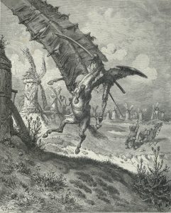
After class, I decided to look at more of Doré’s illustrations of Don Quixote. It turns out that while some of them are fantastic and surrealist, like the two we looked at in class, others are much more realistic. One example is the scene in which Quixote is ‘defeated’ by the windmills.

Unlike Dali’s interpretation of this scene, or the windmills shown on the cover of the Spanish version of the book that we looked at in class, Doré depicts the windmills for exactly what they are and shows Quixote and his horse mid-fall. This artistic choice turns Quixote into a tragic character rather than a comic one. Instead of showing Quixote as a hero bested by a monster like he sees himself, or as one with the windmills like Eko and Dali depict him to show that the monsters are in his mind, this illustration emphasizes the reality of the situation and makes the viewer wince at the real pain that Quixote and his horse will feel as soon as they hit the ground. It shows the power of illustrations to influence a reader’s attitudes toward the words on the page. Whereas the scene can be read as amusing, with this picture it turns into an instance evoking sympathy for the main character of the novel. In showing scenes realistically during Don Quixote’s various moments of defeat, Doré reminds the reader that although the monsters are in his imagination, Quixote is a ‘real’ man who is going through various painful situations, thereby making the reader almost feel bad for laughing at him.

Illustrations with Purpose

Today, the following question was posed in class: “are there any books/poems that should never be illustrated?”

The following were our answers to the question: “The Bible, an encyclopedia, the dictionary.”

Alas, after class I googled illustrated versions of all those things…

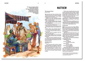
The Bible

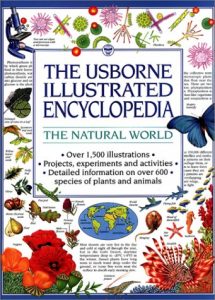
Encyclopedia

Dictionary

Well, turns out not everyone agrees that The Bible, encyclopedias, and dictionaries should not be illustrated. Though we all thought that these books totalities could not be summed in covers, which I still agree with, I did not consider how interior illustrations could be beneficial. Disabled persons, children, and senior citizens all benefit from having these sources of knowledge illustrated. Readers associate the word “bear” with the big, fluffy, black animal on the page, or better understand what Bible verses mean by analyzing the illustrations… these pictures help people learn. Though the illustrations are not like the Dali’s or Dorè’s of the world, they still serve an important role in teaching others crucial knowledge.

Gustav Dore~ More Depictions of Don Quixote

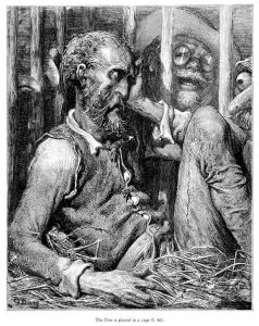
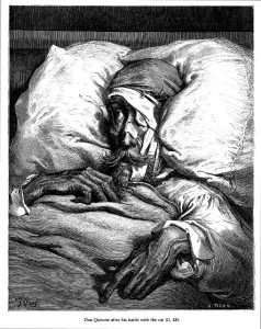
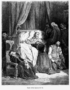
After looking at two Gustave Dore illustrations of Don Quixote in class, I was interested in seeing how else he depicted Don throughout the rest of the book. I was surprised at how many of the images depicted Don as old, tired, and beaten down. The first image is captioned “The Don is placed in a cage.” I find this image very captivating, and it conveys the idea that Don is trapped in his own head filled with stories. The second image is captioned “Don Quixote after his battle with the cat.” Bed ridden Don Quixote is pretty sad, and he has a very vulnerable and beaten down look on his face. The third image actually shows Don Quixote on his death bed, further showing him as a weak individual. I find it interesting that Dore portrays Don Quixote in this way, as a weak almost absent minded character.


Dali and Don

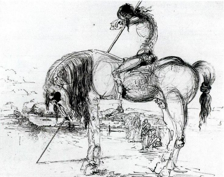
Dali created thirty-eight drawings and watercolors for the 1946 book.  Fittingly Dali’s “paranoiac-critical method” worked well with Quixote’s paranoia and delirium.  Dali said he was inspired to illustrate the book because he found the character of Don Quixote fascinating.  Whether this is because he saw himself or his artistic style in the imaginative and dreamy Quixote we can only speculate.  The sketch above is unique to Dali’s other drawings of Quixote.  Here he appears more of a shell of a man.  He is no longer the heroic knight inflated by creativity, but a defeated old man.  Both Quixote and his horse are half skeleton half flesh and blood.  It’s as if you are viewing them with x-ray vision, seeing the bones and ligaments that keep them together.  It’s also revealing Dali’s style.  His work could, to some, be viewed as incomplete.  There is no color and the outlines are not erased.  Quixote is exposed just as Dali is exposed.

Illustrating Don Quixote

One topic that caught my attention in class today was when we were talking about the decisions that artists have to make when deciding how to illustrate a novel such as Don Quixote. For example, Don Quixote had genuine intent behind his actions, but people often mocked him anyways. How would an illustrator choose to depict a scene where this occurs? Perhaps one might first decide what genre they believed Don Quixote to be and then attempt to convey these issues. The subtly and intricacy of depicting social issues such as this remind me of the illuminations that we have been looking at this semester.

The illuminations we have been looking at so far were intricately designed and there was a focus on using bright colors and gold leaf to enhance the picture. Illustrating a novel such as Don Quixote seems to require a different type of intricacy in order to convey such complex scenes. The illustrator must have a deep understanding of what is happening in the novel during the scene that they are depicting, otherwise the picture won’t accurately reflect the story. Additionally, the artist must be able to accurately convey their understanding of the story so that the audience can pick up on the more subtle aspects of the picture.

Scriptorium Workshop Struggles

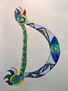
Since I missed the first illuminated manuscript workshop, I was particularly daunted by the project ahead of me when I arrived on Monday. I had to condense the process of producing  an illuminated letter into one class time. It is safe to say that I would not have been accepted as a miniaturist in any sixteenth century scriptorium. I particularly enjoyed working with the gold leaf. Merely by adding small bits of it, the letter transformed completely. These luminescent patches scattered across the letter draw the eye in immediately. Still, the gold leaf was difficult to apply, and never stuck to the page in exactly the way I had intended. I have a deeper respect for the work of miniaturists having now gone through this process, only to produce one letter. This craft requires a level of patience and diligence that is nearly inconceivable to me. Catching a glimpse into the laborious process also made me think about the extent to which miniaturists devoted their whole lives to the craft. The scrupulous nature of the process demands vast spans of time and attention. How long would it have taken just to finish a single page?


(

(I didn’t get to use paints and had to finish outside of class, so I used markers and colored pencil only)

New Revelations

This week I realized the challenge with creating images for texts. I did not realize the level of thinking that went into making pictures for texts. It never dawned on me that in order to make pictures for a widely-read novel like Don Quixote, the illuminator has to ask himself so many questions. For example, in regards to representation there are many ways to represent a character in a text. Each way you express that character visually can change how the patron or the viewer will perceive that character. For example, today we looked at two different versions of Don Quixote. Each depiction showed each artist’s interpretation of Don Quixote’s characteristics and motives. One depicted Don Quixote as a rose-eyed intellectual that is haunted by his thoughts. It placed emphasis on Quixote’s disturbed mental state. However, the other depiction was much simpler. Drawn with pencil it simply featured a general outline of Quixote on his travels. This appeals more to Quixote’s journey rather than his mental affliction.

When considering making my own illustrations for texts, I realized I had to understand the goals of the subject that I am drawing. As someone who enjoys analyzing films, I often make the connection to a film writer’s choice in creating a character on the big screen. “What is the character’s socioeconomic status in society? They must dress as such. What does the character want to become? What do they want to avoid? How can we show that tension visually?” These are all thoughts that a film writer and director make when creating a character for film. In the same way, I have to ask myself the same questions when it comes to writing illustrating images for text.

What are other people’s thought processes on creating images for text?

css.php