No Words, No Problem

Shaun Tan’s graphic narrative contains no words… here’s what I think about it:

  1. As we discussed in class today, by including no words, readers are forced to propel the story forward in their own minds, using their own experiences and memories. This method makes for a much more active and participatory reading experience – something especially essential for a narrative portraying the struggles and triumphs of immigration.
  2. Perhaps this is a stretch, but by including no words, Shaun Tan is forcing readers to do what his protagonist is doing… which is adjusting or assimilating to a new culture and therefore using the visual to communicate. Language is no option for a foreigner, thus Tan is forcing readers to “adjust” to understand the story just as his protagonist does.
  3. Without words, The Arrival can be a different story every time it is read. Depending upon how you view the pictures or the perspective you decide to bring, the book can bring about a different meaning every single time. I love it.

The Return of Peter Rabbit!

When I saw on the syllabus we were going to be reading The Tale of Peter Rabbit, I was beyond excited. I remember getting tucked into bed at night as a 4 year old and begging for my Dad to read me this particular story…

It was certainly one of those experiences (as I have addressed before in blog posts) where I was shocked to re-anaylze a childhood story. Honestly, I didn’t really remember what the story was about – I just remembered that I had loved it. Rereading it today, I was shocked to see how strange, and actually somewhat sad, the story really is. Peter is getting chased by a man who wants to kill him, and when he escapes back home, his mother doesn’t feed him the yummy foods that she does to his siblings… Where is the happy ending? I digress.

Anyways, aside from that initial “plot surprise”, I did enjoy my time paging through the tiny  book once again. I love the small drawings splashed onto the pages. They are simplistic, gentle, and perfectly sized for the book. I’m excited to see where our conversation in class this week takes us.

Lessons learned from the Collage Workshop

When I was younger, I used to love collecting buttons, sparkly jewels, pretty pieces of paper, newspaper clippings, and receipts to collage together using Elmer’s glue and colored poster board. It was a pastime I had picked up from my older sister, and it provided me an opportunity to dump glitter all over my kitchen counter. What’s interesting looking back on this hobby of mine is that I never incorporated rhyme or reason into the illustrations… I solely crafted together things I liked into an abstract image (with no real underlying message).

What was so different about my experience in the collage workshop today was that for the first time I began to understand that collage can create realistic images… It doesn’t all have to be abstract and structured. Thinking back to Max Ernst’s graphic novel, I realized that one can create his/her own image by means of multiple other images mixed together. Thus, with this new understanding in mind, I used today as a practice run for our final project. I attempted to use various clippings I had selected to create a “realistic” or harmonious image. While the result was not the finest, I think this practice round definitely benefitted my collage skills in the long run. The final project should be very fun…

Meeting Julia Jacquette

Today’s visit with Julia Jacquette was an all around amazing experience. I expected nothing less… After our brief tour of the exhibit on Monday morning, I immediately fell in love with her style of painting and play, and I knew that having the opportunity to chat with her would provide interesting context and information.

I particularly enjoyed Julia’s comments on her two large murals. She described the larger frames of work they were taken from — a J.Crew magazine spread and an ad for some sort of beach resort. She explained how each mural is simply a zoomed in “piece” of the larger advertisements. This context makes the abstraction all the more interesting, as someone in our class pointed out, it could critique the already “abstract” world of advertising. Personally, her close attention to the behavior of water and her way of depicting the colors of the water was my favorite part. She drew the water in a way that shows each color broken down to its exact location. The greens and whites of the water are separated out from the blues, making it it a hypnotic mixture of shapes.

Julia’s open mindedness to our interpretations of the two pieces was inspiring to witness. While it is not the larger lesson that I learned from our visit today, I did walk away from the discussion feeling empowered to search for little intricacies and details in all areas of art and life. Sometimes it is the tiniest, most obscure feature that can be the most beautiful.

5 Reasons Why I Love Amphigorey

I have loved Amphigorey.

Here’s why:

1. Reading these short, illustrated stories was the highlight of my weekend. I cruised through the entire book without realizing it had only taken me a whopping 30minutes.

2. The stories are so extremely odd – it’s amazing. Kind of reminds me of A Series of Unfortunate Events, however, a bit more non sequitur in logic.

3. The surreal/gothic/dark humor vibe appeals to me… and honestly, I couldn’t tell you why.

4. The varied styles of illustration, the different fonts, & the wide range of plots… all these things make Edward Gorey seem like the jack-of-all-trades.

5. “The Listing Attic” was my favorite story… The randomness and the rhyme unite into something unforgettable to me.

Have other people enjoyed the book as well?

Blurry Vision

While I’m unsure how relevant and interesting this thought on Une Semaine de Bonté might be, the same thought keeps creeping back into my mind as we’ve looked further into Ernst’s collage-novel this week, so I figured I’d share…

Reading this work has reminded of reading or viewing children’s books or movies… as an adult. As I leaf through the pages, admiring Ernst’s meticulously crafted images, I notice that I feel an odd emotion I experienced when I turned 20. My friend had told me to go back and watch old Disney movies. She noted that as an adult, it’s funny to look back on what were once simply colorful displays of princesses and pick up on some of the hidden inappropriate symbols or themes. For some reason, reading Une Semaine de Bonté has made me feel this weird emotion again. I feel as though I’m looking at this images a few times over, seeing lines and shapes, but it is not until the 4th time that I view all the images together that I am able to discover the violence, brutality, and hyper-sexualization that exist among the pictures. To me, the commentary Ernst is making is not strikingly obvious right off the bat.

Although I’m not sure if other people can relate to this sentiment, I figured I’d share anyways!

Letterpress Studio Experience

Working in the letterpress studio this week has been a very enjoyable experience. I worked in this studio last year for my 19th Century American Literature class, and I was happy to learn I’d be coming back this semester.

I think what has boggled my mind, both times I’ve worked in the studio, is the amount of meticulous work that is required to ensure a successful process. Type setting the sorts takes focus and time. Transferring the type to the press takes precision and time. Inking the press, prepping it with paper, making a few test prints, all take patience and time.

Time. The whole process takes time! When working, I asked Professor Rippeon how one would go about printing something like the Bible… Do you set all the pages of type, have them ready to go, and crank them out in one sitting? Nope. Instead, due to limited amounts of type, if one were printing something so large, they would have to set and press one page at a time, put all the type back, and start the process over and over again.

So, what I’ve gathered from this whole experience? I would’ve never had the patience!

Illustrations with Purpose

Today, the following question was posed in class: “are there any books/poems that should never be illustrated?”

The following were our answers to the question: “The Bible, an encyclopedia, the dictionary.”

Alas, after class I googled illustrated versions of all those things…

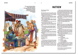
The Bible

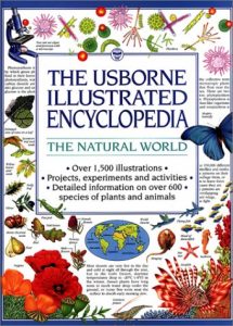
Encyclopedia

Dictionary

Well, turns out not everyone agrees that The Bible, encyclopedias, and dictionaries should not be illustrated. Though we all thought that these books totalities could not be summed in covers, which I still agree with, I did not consider how interior illustrations could be beneficial. Disabled persons, children, and senior citizens all benefit from having these sources of knowledge illustrated. Readers associate the word “bear” with the big, fluffy, black animal on the page, or better understand what Bible verses mean by analyzing the illustrations… these pictures help people learn. Though the illustrations are not like the Dali’s or Dorè’s of the world, they still serve an important role in teaching others crucial knowledge.

Genres in Illustration

Today in class, I found our discussion of genre + Don Quixote of particular interest. We discussed the necessity of artists who attempt to illustrate the story to pick a particular genre, and stick with said genre in their interpretation.

In my own opinion, I find that what makes Don Quixote so successful, is it’s ability to fulfill the needs of many genres/categories. It seems to be almost “uncategorizable”. The book has been around for centuries, enjoyed by children and adults alike. It’s appeal to a wide variety of audiences suggests to me that each reader gets their own preferred genre out of the text (whether it’s romance, farce, satire, etc). Therefore, Don Quixote‘s “adaptability” could be something utilized by artists in their visual interpretations. Instead of sticking to one genre in a depiction, demonstrating the malleability of the text seems appropriate.

Do you guys agree? Is it possible to create successful artwork when appealing to a large variety of genres? Does an artist have to pick just one?

Attempting to Illuminate

Our class experience today was both educational and entertaining. Working with medieval pigments and attempting to create illuminated art was eye opening for a couple of reasons…

– Creating artful images was far more difficult than I perceived. I assumed that the inspiration would flow and my historiated letter would tell a new story… However, I found myself pulling up YouTube videos to show me how to create simple, easy-to-do patterns.

– The creation of paints was a neat thing to experience. As Christian was adding the gum arabic to the pigments, I realized just how long of a process it is to get the perfect consistency of paint. Lots of effort went into creating just a small dose of product.

Today was confirmation that enormous amounts of time and effort had to be put into creating illuminated manuscripts – if you wanted them to be remarkable. It is not something anyone can pick up in a day… the mastery comes with years of practice.

css.php