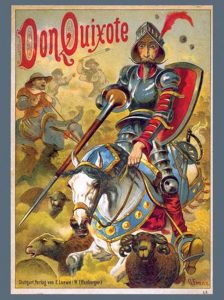
As we learned in class today, Don Quixote is the second most popular book sold in the history of the world. As we were looking at the Dali pieces in the Wellin, which I am still shocked and happy that they are here at Hamilton, Professor Serrano asked us about where the image would fit into the story, and if it could potentially be the cover? This was a question that stood out to me because I was left wondering what is the appropriate book cover for the second most popular book in history. So obviously for this blog post I decided to Google a bunch of covers and discuss them.
First I have picked out the cover for the Salvador Dali illustrated book because I was curious as to what the famous artist came up with. This was a very interesting cover, in my opinion, because the main character is not even the main focus on the image. He is even cut off at the top of the image. For Dali who illustrates Don as a hero throughout the book, it is surprising the the illustration chosen for the cover does not necessarily show off his triumphs. It does show him in a proud moment being greeted by those watching him as he enters, but he is not doing something necessarily heroic.
That led me to the analysis of the next cover. This cover, while less colorful and detailed truly depicts Don Quixote as a heroic protagonist of this book and story. This graphic novel takes the story of Quixote and clearly depicts the action hero and heroism as he his climbing up this structure with his sword. This cover also truly does feel like a graphic novel cover as opposed to a book cover. I am genuinely interested to see what the inside of this book looks like, and Davis chose to illustrate it.
The final cover that I found, and was very intrigued by, was this cover set in modern times. I honestly found this one to be a bit weird, but it is a New York Times bestseller. I think the feeling that I got from this cover was more of a Dan Brown Da Vinci Code type of cover, as opposed to a historically famous book like Don Quixote. It has all of the main parts: the hero himself, a sword and a ton of books. However, I am unsure if Cervantes and Don Quixote were using laptops when the book was written. I guess the editor or publisher felt it was time to add a modern touch to this old classic. It was definitely the most interesting cover I found, but I am not sure if I truly get it. Which cover do you think is the most fitting?
I have also added a few more covers at the bottom so you can truly see how different they have been over the years.


Hi Caroline. I really like your post–it’s so interesting to see a bunch of different interpretations of the same novel. I definitely agree with you, the third cover is super weird. It seems odd to me to put this novel in a modern context, and the sword seems out of place next to the laptop. I think of all the covers I like the 5th (the one on the right). It’s simple and modern without being overly modern like the 3rd, and the silhouette of the windmill is intriguing. This one also reminds me of the 2nd one, which I also think is a good cover for this book.
Hi Caroline,
I really liked how you brought up so many different covers. It was interesting to see the ones we discussed in class–the ones you have here are even more broad in scope. I agree its very revealing about modern times to trace the cover of books that come out over the years. The second one reminds me of something from an old western movie. I also like the fifth one (on the right); I’ve found that I like the ones that don’t depict Don Quixote himself. The book itself leaves so much to the interpretation of reader and it’s all about creating in your own mind your own image of Don Quixote.
Erica