Immigration and New York

When we were looking at the photos throughout class today and in the Wellin, I was reminded of a similar reaction I had when I went to the Tenement museum in New York City.  After growing up in New York, I have been to Ellis Island a handful of times as well as the Tenement museum, and the history of New York cannot be complete without including and understanding the influence immigrants had on the development of society.  The Arrival  highlights the process and the struggles that the individuals faced when immigrating.

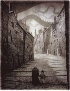
The reason why I initially thought of The Tenement Museum was because of the immediate reaction I had to this illustration from the book.

I believe that this image perfectly highlights the fears that these individuals had when they were walking into the great unknown of a huge city they did not understand.  Immigrants did not have it easy when they came to New York, and it was understandable to be so scared.  Not only were they in a new country, but as the Tenement Museum taught me they were forced into these small living spaces with people from all around the world with languages and cultures they did not understand.  Also on top of all of this, they were in a city that did not accept them or welcome them necessarily.

The way that Shaun Tan portrays this in his illustrations is incredible.  I think it is one of the best books we’ve read this class because I think he highlights the struggles in his images completely.  His balance between portraits and story images were so captivating, and I felt as though I was looking at a photo album at Ellis Island, not an illustrated book of a creative story.  I think that this was what made it such an intriguing story for me, and I would recommend it to someone who is also a history buff like myself.

The Importance of Color

This was definitely the book that I was most excited about to read because of the childhood memories that I associate with The Tale of Peter Rabbit.  One of my family’s weird quirks is that we all call each other rabbits.  This morning as I was getting ready for class and talking to my dad on the phone about the book we were discussing, he jokingly reminded me that it was his story, since his name is Peter and it is the Tale of Peter Rabbit.  This is why I went into reading this book with an already firmly developed opinion.

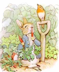
While reminiscing on my childhood, I was reminded of how  important I found the drawings in this book, as well as other children’s books from then.  Beatrix Potter’s use of whimsical and playful color in her illustrations are what make it such an uplifting children’s book.  I had mentioned this in class today, but the way that she romanticizes her idea of nature in these drawings are incredible.

The image above, is my favorite drawing in the book.  The way that she utilizes the contrasting colors of the blue jacket with the red radishes truly make the illustration pop.  This use of colors brings a sense of joy to me, and this is why I associate color with children’s books.  I think it is a very important element of these illustrations and the books in general.

What do you think is the most important element to make an illustration a children’s book illustration?

Whether its Digital or a Hand Illustration I Still am a Horrible Artist.

This week truly opened my eyes to my lack of artistic ability.  I knew before this that I could not draw or paint to any significant level of skill, but now I can officially say that technology and I are not friends as well.  However, my lack of artistic skill aside, I do think that it was an incredibly enjoyable week of workshops.

Starting with the first workshop on Monday morning, I was taken back to elementary school art class where I was practicing my collage techniques, and I really enjoyed having complete freedom to cut and place things wherever I was originally driven to place them.  For Monday’s workshop I chose to cut out all of the things that interested me when I noticed them flipping through the magazines.  As I collected all of these seemingly random pieces, I started to see a story forming that eventually turned into the collage I created.  The randomness was able to become a story, which intrigued me because even though I felt random I guess I was not being random.

Today in the Digital Illustration Workshop, I had the opportunity to once again be disappointed in myself as a future artist.  While I have already harped on this point, I did manage to get a lot more out of it beyond my shortcomings.  I thought it was really interesting to see how much more complicated digital illustration is than it looks.  I also  got to experience how many potential things you can do with the computer in the digital illustrator.  I experimented with a few different techniques when I was creating my pieces.

So while at the end of the day I learned a lot about my inabilities, I still got a lot out of using these programs and techniques that I haven’t been able to try before this week.

Meeting with Julia

Today’s lecture was amazing.  I really enjoyed having the opportunity to hear about the whole exhibit from Julia herself, and it was something that offered insight into the exhibit as a whole that I had never experienced before.  This was the fourth time that I had walked through the exhibit, and after hearing it described by three people prior to Julia, I thought I knew all there was to know about the exhibit.  I was completely wrong, and the impressions I had of each of her pieces and her inspirations were changed after hearing her speak.

I was truly curious to hear about her feminist approach to art, and after hearing how these were ideals she was raised with, and these ideals still inspire her work today, I was inspired.  I also think that hearing her discuss her illustrated book helped shaped my idea of play and a playground as I start working on my final illustration.  I cannot wait to go through the exhibit a 5th time, and be able to see it yet another light after listening to Julia speak today.

The Scary Children’s Book

The other day in class, we were discussing the differences between the story and the illustration  in Edward Gorey’s short stories.  I could not help but recount famous stories that we have heard throughout our childhood that had much darker meanings than we associate the childish images with.  Looking at the images within Gorey’s book, his playful use of color and animation with his cartoonish drawings offer a sense of childish play in his illustrations.  However, further reading of his witty and short writing, open up a whole new world of darkness that we wouldn’t necessarily associate with our version of the modern day children’s books.

As a child I grew up in the magical world of Disney, and it’s princesses and cartoons.  Even though I am now 21, I still am obsessed with this portion of my childhood, and can recount any Disney song (with my 24 year-old sister for backup) at any moment.  However, what is often ignored is the darker origins of these stories that we hold near and dear to our hearts.

Snow White and the Seven Dwarfs is the first Disney princess classic, and the movie was released in 1937.  What is forgotten, is that the origin of this story comes from the 1812 publication of folk tales by the Brothers Grimm.  These were fairy tales that had been told for centuries, and they do not fit the definition of “fairy tale” as we know it today.  The Evil Queen sends a hunter to kill the fair Snow White, and he can’t so he brings back parts of a dead bear in order to “prove” he had killed her.  The Queen then eats these in order to be the fairest of them all.  (This part is definitely not included in the Disney version.  Finally the story ends at wedding where the Queen is forced to wear burning-hot iron shoes until she drops dead.  (Also excluded from the cartoon magical fairy tale by Disney).¹

Snow White is not the only example of this: in Pinocchio Jiminy is killed by Pinocchio and in the Little Mermaid Ariel is killed if she cannot get true love’s kiss.  Disney managed to take these dark and intricate stories and turn them into these fabulously bright and happy cartoons kids have been watching for decades.  So who knows, maybe in a few years well be watching the newest Disney installment of Gorey’s short stories.  It is true that our modern version of the children’s book is very different than the fairytales of the past, and maybe that is what Gorey was inspired by in his stories.

(I had some interesting illustrations of the Brothers Grimm versions of the stories, but I was not allowed to upload them for some reason so if you’re interested just google the stories with Brother’s Grimm!)

  1. Triska, Zoë. “The REAL Stories Behind These Disney Movies Will Ruin Your Childhood.” The Huffington Post. November 12, 2013. Accessed April 05, 2017. http://www.huffingtonpost.com/2013/11/12/the-real-story-behind-eve_n_4239730.html.

The Dada Movement and Surrealism

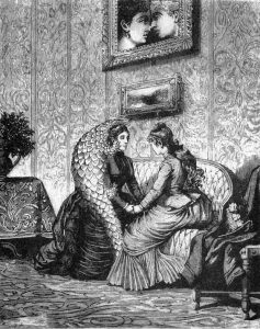
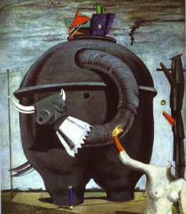
For today’s post I wanted to focus on the Dada Movement and Surrealism because it is something that I have always been intrigued by when studying Modern Art History.  I also wanted to understand the movement and it’s relationship with Max Ernst and Une Semaine de Bonté.

Dada was an art movement that Ernst was very involved in that was developed as a reaction to the changing world following WWI.  They were an “anti-art” movement and this was also a common theme in Surrealism.   I am focusing on this idea of “anti-art” because I think it is clearly evident in Ernst’s collages and art. He takes the typical human form in the Victorian Era and completely adapts it to his own vision.  Whether it is adding wings to a female body or a lions head to a man, he is going against what would normally be seen in depictions of human beings and creates “anti” human beings.

This then peaked my interest further as I considered what his reaction was to the Victorian Era itself?  He is depicting these powerful individuals in compromising situations, as beasts, and he even contrasts situations on opposing pages.  I think that you can look at the book as his reaction to society during that time, and how he responds to what is going on both in and out of the city.  Thinking back to the Dada movement and Surrealism, these artists were in general reacting to WWI, but then applied it to varying situations that they were experiencing in the world.

Printing Press

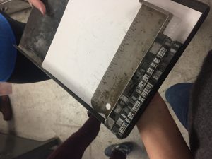
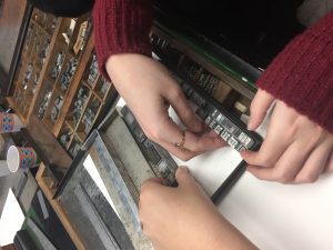
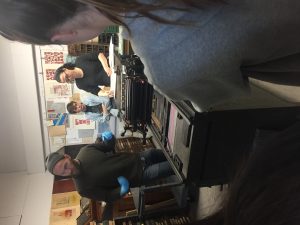
I really enjoyed this week’s exercise, just as I have enjoyed the hands on activities we have done in the past.  One of the most interesting parts of this class so far, have been these opportunities where I have seen resources that, even as a senior, I didn’t know existed on campus.  While I originally found this activity to be fairly challenging because my group managed to put our letters completely backwards more than once,  I think I truly enjoyed our finished product and I look forward to using it in our completed project that is due after break.  I have also attached a few photos from this week’s exercise.  I look forward to reading everyone else’s  responses about this exercise.


Chapman Brothers vs Goya

After learning about this debate in class today, it was something that I found incredibly interesting, and I wanted to do more research on the subject.  There have been opposing opinions on either side of this debate, and I feel as though each of their arguments do make a fair case to either justify or condemn the Chapman Brothers’ adjustments to Goya’s famous pieces.

One of the first articles I read was from The Guardian, where they felt as though these adjustments were disgracing Goyas memory in his death and that they were uncalled for.  However, I do not feel the same way that the Guardian does.  I look at the example of Bansky’s street work across the globe where people feel as though it is vandalism.  Taking the same approach to understanding this artwork, I do not view the Chapman Brother’s work as vandalism.  I think that they are reproducing in image in the way that it has affected them and their culture and ideas, just as Banksy depicts his opinions of society on street and city walls.   I do find the images to be rather creepy, but in that sense they are still beautiful.

What is your opinion?  Is this just another version of vandalism or do you think that it is artistic genius?

Which Cover Works Best?

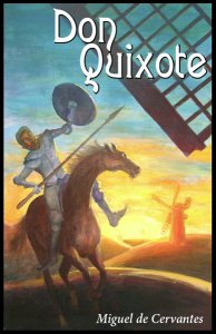
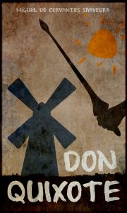
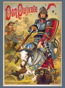
As we learned in class today, Don Quixote is the second most popular book sold in the history of the world.  As we were looking at the Dali pieces in the Wellin, which I am still shocked and happy that they are here at Hamilton, Professor Serrano asked us about where the image would fit into the story, and if it could potentially be the cover?  This was a question that stood out to me because I was left wondering what is the appropriate book cover for the second most popular book in history.  So obviously for this blog post I decided to Google a bunch of covers and discuss them.

First I have picked out the cover for the Salvador Dali illustrated book because I was curious as to what the famous artist came up with.  This was a very interesting cover, in my opinion, because the main character is not even the main focus on the image.  He is even cut off at the top of the image.  For Dali who illustrates Don as a hero throughout the book, it is surprising the the illustration chosen for the cover does not necessarily show off his triumphs.  It does show him in a proud moment being greeted by those watching him as he enters, but he is not doing something necessarily heroic.

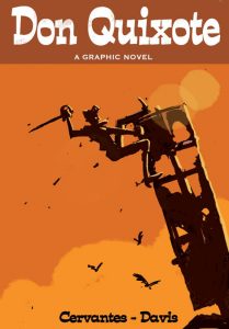
That led me to the analysis of the next cover.  This cover, while less colorful and detailed truly depicts Don Quixote as a heroic protagonist of this book and story.  This graphic novel takes the story of Quixote and clearly depicts the action hero and heroism as he his climbing up this structure with his sword.  This cover also truly does feel like a graphic novel cover as opposed to a book cover.  I am genuinely interested to see what the inside of this book looks like, and Davis chose to illustrate it.

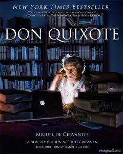
The final cover that I found, and was very intrigued by, was this cover set in modern times.  I honestly found this one to be a bit weird, but it is a New York Times bestseller.  I think the feeling that I got from this cover was more of a Dan Brown Da Vinci Code type of cover, as opposed to a historically famous book like Don Quixote.  It has all of the main parts: the hero himself, a sword and a ton of books.  However, I am unsure if Cervantes and Don Quixote were using laptops when the book was written.  I guess the editor or publisher felt it was time to add a modern touch to this old classic.  It was definitely the most interesting cover I found, but I am not sure if I truly get it.  Which cover do you think is the most fitting?

I have also added a few more covers at the bottom so you can truly see how different they have been over the years.


Illuminating a Historiated Letter

I found today’s exercise to be extremely enjoyable, but it was also a great hands on exercise to review what we have been learning so far in class.  I feel like having the opportunity to actually complete something after we have learned about it helped put into perspective what the illuminators did in the Middle Ages.  When I sat down and decided that I was going to create a C, I also thought about what story I was going to tell through my illumination.  A historiated letter is more than just a decorated letter in a book, but it also offers a picture that describes a scene.  So I decided to based my image off of my name and my story.  I included fragments from my family’s crest in the decoration, as well as a rose for my middle name.  As I was channeling my inner patron/illuminator, I understood how these illuminators would depict what was important to the patrons.  It was a fun exercise that really opened my eyes up to the world of illuminating from making the paints to telling a story through images.

What was your major takeaway from this experience, and what inspired your illumination?

css.php