Illumination and the Printing Press

The collection of books on display at the library today had a range of pieces, from lists of cattle written on papyrus to books printed with a printing press. So far in class we have been focusing on illuminated manuscripts. The manuscripts shown today were beautiful, with historiated letters and some marginalia colored in with pigments from different plants. One of the hymnal books on display featured many pictures with gold and bright colors, although not all of the pictures were filled in. It is possible that the pictures were left blank by mistake, but it was interesting how closely they resembled the pictures that were found in the books that came from the printing press.

One point made in the discussion today was that some nobility had the pictures in their printed books filled in with color after the book was complete. Out of the printed books on display, I was only able to find one picture that was actually colored in. It seems that the art of illumination shifted with the creation of the printing press. Now, instead of enhancing images with gold and brightly colored paints, the quality of the image could be enhanced by adding extra detail to the plate used to make the image. Additionally, the medium used to create the plate played a large role in determining how fine the details in the image could be. As the class progresses, it will be interesting to examine how illumination evolves in the presence of new technologies.

Starry Night: Illustration vs. Illumination

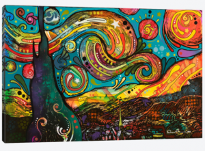
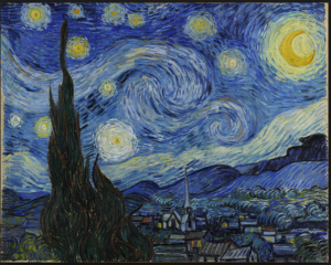
The relationship between an illustration and an illumination is subtle. An artist’s illustration is their interpretation and representation of something. In the following example, the original artist, Vincent van Gogh, illustrated a scene where he was living. When creating the painting, Van Gogh made his own decisions on what parts of the scenery he wanted to emphasize. In an illumination of van Gogh’s painting, Dean Russo chose to emphasize different portions of the illustration to heighten the importance of aspects that he found interesting.

The painting Starry Night, by Vincent van Gogh is a well known piece of artwork that represents van Gogh’s illustration of the view from his bedroom at the Saint- Remy-de- Provence. The painting shows a small town that is surrounded by mountains. Van Gogh emphasizes the night sky, which takes up almost half of the painting. The sky is made up of an intricate mixture of blues and white that illustrate the clouds and sky itself. The stars and moon are surrounded by yellow “clouds” that highlight the light they give off. In contrast, the colors used for the mountains and the buildings are dull and dark, in part because the painting is set during the night. The brighter colors used in the top half of the painting draw the eye to the sky and the details found there.

The illumination of Starry Night, by Dean Russo, emphasizes the sky, but interestingly also places emphasis on the mountains surrounding the town. In contrast to the dark blues that van Gogh used to illustrate the mountains, Russo chose to illuminate the mountains by painting them in vibrant yellows and oranges. Even though Russo used bright colors to illuminate the swirls in the clouds, the eye is drawn more strongly to the mountains. Although Russo used a wider variety of colors throughout the whole painting, the illumination of the mountains and clouds is obvious in contrast to the duller colors found in the rest of the painting.

css.php