Surrealism in The Arrival

One theme that struck me as I was reading The Arrival by Shaun Tan was that throughout the book, there would be a number of illustrations that were believable for depicting everday life, and then there would be a few fantastical images interspersed between them. The distinction between the two types of images caught my eye as I was thinking about Tan’s definition of what it means to photograph through his illustrations. In the opening illustrations, Tan shows images of the family that would be expected to occur in everyday life. These images convey the emotions that the family was feeling and he does it in a way that successfully represents how a photographer would approach capturing these scenes. As the family begins walking through the city, the shadow of a large creature follows along:

This image is interesting because if a photographer was capturing this scene in real life, there would still be shadows in the image, but the shadows would be from other buildings and not a creature. Tan converts this image into the fantastic by transforming the shadows into something scary, the tail of a monster, that he never shows the full form of. This leaves the identity of the monster up to the audience, who have the ability to transform it into something extremely scary. The shadow of the monster parallels the worry felt by the family over the unknown as the father travels to a new country to find work.

Based on Tan’s work, it seems that he believes a good photograph can capture both the obvious and subtle aspects of emotion and desire. His incorporation of the fantastic and dreams that the characters have suggests that it is possible to capture these thoughts in a real photography.

Peter Rabbit: A Bedtime Story

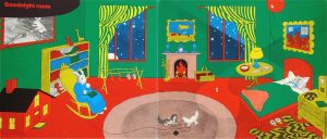
In class today, we talked about the characteristics that make Peter Rabbit a good bedtime story. The language used in the story is rhythmic and was written in a way that children could be lulled to sleep very easily. The use of watercolor makes the images soothing to look at, instead of jarring vibrant colors that would excite children and keep them awake longer. Potter’s use of well-timed pauses also adds to the calming effect felt when reading the story. This discussion made me think of another well-known children’s bedtime story, Goodnight Moon and the differences in illustration between the two.

In contrast to the soothing watercolors found in Peter Rabbit, Goodnight Moon uses more bold reds, greens, and yellows. The color palette in Goodnight Moon is much more vibrant, yet it was chosen to illustrate a book with the intention of putting children to sleep. This story has less text than Peter Rabbit, so it is possible that instead of relying on soothing colors to put children to sleep, Goodnight Moon relies more on mentally preparing children to go to sleep. All of the images in Goodnight Moon focus on night time activities, such as getting ready for bed, and perhaps this is what makes the story so effective.

Do you think that one story is more effective as a bedtime story than the other?

Digital Illustration

I found the digital illustration workshop to be very difficult. I was hoping to create a baseball field, complete with a pitcher on the mound and a batter getting ready to hit. Ideally, I was going to make the view of the field from the batter’s perspective. I was able to make the outline of the field with the foul lines and the wall in the outfield. However, when I tried to make home plate and the batter’s box, the image looked like you were looking down at the baseball field from the sky and not out at the field from the batter’s position. Adding color to the field also proved to be a challenge. I used many different shapes to create the outline of the field and when I went to fill in all of the space that was supposed to be grass, I couldn’t figure out how to do it.

The Illustrator program has many unique features that would have been very useful if I was more skilled in using the program. It was interesting how you had to change your way of thinking in order to be proficient in creating certain objects. To be able to create more complex objects with this program, you needed to be able to break the object down into shapes and lines, instead of thinking of the object as a whole. Using Illustrator helped me start thinking about collage in terms of bringing together different images to create one object, much like we needed to bring together different lines and shapes to create something in Illustrator.

When we were walking through Julia Jacquette’s exhibition, the piece that struck me the most was the painting of the couple’s resort, which shows the reflections of two people and a tree in the water of a pool. When I first looked at the piece, it was not quite clear to me that the colors in the water were supposed to be reflections. In fact, I did not realize that people were represented in the painting at all until we took a tour of the gallery on Monday and the painting was explained to the class.

The painting became even more interesting to me when Jacquette started to describe the scene that it was created from. In the original picture, a seemingly perfect man and woman are standing by the side of the pool at a couple’s resort. Jacquette described the scene as looking so perfect that you instantly wanted to go to the resort as well. This speaks to the power that advertisements can have over people. By setting up the “picture perfect” scene, one advertisement can draw people to something that they were not interested in before seeing the advertisement.

Touring the exhibition with Jacquette added to the enjoyment of her artwork. Many of her pieces addressed different social issues, but without her explanations, I may not have picked up on that on my own, especially for the more abstract pieces. Jacquette spoke about trying to make her art interesting enough to get people to look at it, but I think the allure of her work comes from the specific ways in which she represents different social issues.

Gorey- The Vinegar Works

The cover page for The Vinegar Works says that the stories contained inside are “Three Volumes of Moral Instruction”. When thinking about children’s books, many stories have a moral and aim to teach children a specific life lesson. Usually, these morals are constructive, such as the one found at the end of The Tortoise and the Hare or The Boy Who Cried Wolf. In The Gashlycrumb Tinies, instead of outlining a story and ending with a lesson, Gorey goes through the alphabet and describes how different children died. While one could argue that children need to be aware of dangerous objects in the environment, people generally do not alert children to these dangers by describing how deadly they are. Instead of giving a gentle warning, Gorey uses the worst case scenario of death as a guide for what can happen to unsuspecting children.

The Insect God plays with the idea of child abduction and although it isn’t a story that is necessarily fit to read to children, it does address a topic that is often discussed with children. Children are taught from an early age not to get into the car of a stranger. In the story, young Millicent makes this mistake and ends up being sacrificed by insects. This story follows the more traditional outline used to teach children lessons, but it does so in a very dark manner.

Dragon Wings on Tuesday

When we were looking through the images in  Une Semaine De Bonte in class today, I found it interesting to follow the appearance and disappearance of the dragon wings found on characters in the images for Tuesday. The wings first appeared when a woman was peeking into a shop, suggesting that she was doing something that she wasn’t supposed to. It is interesting that the wings first appear on a woman, as opposed to a man, and if the wings are removed from the woman in an image, a small dragon often appears at her side instead. The wings seem to be placed on the woman for images in which the woman is clearly doing something wrong, such as peeking into the shop (p. 74), standing over a child in such a way that is reminiscent of a vampire (p. 76), or having her husband ask for forgiveness (p. 92).

As the story of the romance unfolds throughout the Tuesday images, it is clear that the man is not blameless. While the wife may have resorted to spying to uncover the fact that her husband was cheating on her, the husband was guilty for having the affair and being the source of the drama in these images. The wings first appear on the man in an image that seems to depict the mistress begging the man to continue the affair (p. 89). The next few images seem to depict the couple breaking up and the wings next appear on the man when the couple makes up (p. 93). The wings on the man in the scene where the couple makes up foreshadows the fact that the man does not remain faithful to his wife and continues to cheat on her.

The element that Tuesday is based on is fire and this is represented by the dragon and what the dragon symbolizes. The dragons found in these images are all small and are often found on or close to the floor. The dragon is often linked with reptiles and snakes, and perhaps by extension sin. Tuesday depicts images of deceit and trickery and it is possible that the dragons, and the appearance of the wings, symbolize the wrongdoings of the husband and wife.

The Letterpress

Spending the last two class periods doing the letterpress workshop helped me appreciate the artistry that goes into using a letterpress. Before the workshop, I had viewed the letterpress as an old tool that had mainly been used to print text in black ink and not as a tool that could be used to design images as well. Actually using the letterpress helped me learn about the planning and design process. An artist must determine where on the page the letters will physically appear and then adjust the spacers and furniture on the machine accordingly. A decision must be made about how deeply the letters should make an impression on the page. For example, when we printed our text with three sheets backing the page rather than two, the letters made deeper indents on the paper. The artist must also determine how dark they want the ink to appear on the page and vary the number of sheets used to back the piece of paper being printed on accordingly. One especially interesting aspect of the design process is the fact that only one color can be used on the press at one time. The artist must determine how they want the colors layered on their paper and then run each sheet of paper through the press color by color.

The process of creating a book with the letterpress must have been an enormous undertaking. Setting each letter into its proper place was difficult and time consuming for one sentence and the idea of having to create an entire page of text seems daunting. Although using the letterpress was fun, I think that it would be more enjoyable to use the press for the creation of cards and posters rather than for books or newspapers. This workshop introduced me to new uses of the letterpress that I was not aware of before and it was a very enjoyable experience overall.


The Chapman Brothers vs. Goya

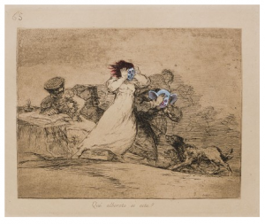
The Chapman brothers decision to revamp Goya’s The Disasters of War was very controversial. The brothers were accused of vandalism and faced harsh criticism from many of their peers in the art community. However, their intention was never to ruin Goya’s work, but to challenge people to think about it in a new light.

The images that Goya etched were dark and disturbing to begin with, but the use of colors added details that enhanced these feelings. The light blue color draws emphasis to the faces, making them pop and highlighting the emotions that they are conveying. The clown-like faces add a sense of eeriness, while also heightening the theme of a nightmare. The brothers addition of color modernized Goya’s work and added a 21st century spin on the etchings. The act alone of drawing on Goya’s artwork causes the audience to debate whether or not the meaning of what Goya was trying to depict was lost or enhanced with the new additions.

Do you think that Goya would approve of what the Chapman brothers did to his work?

Illustrating Don Quixote

One topic that caught my attention in class today was when we were talking about the decisions that artists have to make when deciding how to illustrate a novel such as Don Quixote. For example, Don Quixote had genuine intent behind his actions, but people often mocked him anyways. How would an illustrator choose to depict a scene where this occurs? Perhaps one might first decide what genre they believed Don Quixote to be and then attempt to convey these issues. The subtly and intricacy of depicting social issues such as this remind me of the illuminations that we have been looking at this semester.

The illuminations we have been looking at so far were intricately designed and there was a focus on using bright colors and gold leaf to enhance the picture. Illustrating a novel such as Don Quixote seems to require a different type of intricacy in order to convey such complex scenes. The illustrator must have a deep understanding of what is happening in the novel during the scene that they are depicting, otherwise the picture won’t accurately reflect the story. Additionally, the artist must be able to accurately convey their understanding of the story so that the audience can pick up on the more subtle aspects of the picture.

I Am A Tree

“I don’t want to be a tree, I want to be its meaning.” – I Am A Tree, p. 51

This chapter is written from the perspective of a tree, which was drawn on a sheet of paper that was meant to be included in a manuscript, but never made it into the final product. Immediately before this quote, the narrative voice of the tree states that they are glad they are not drawn in the new style, in which a tree would be drawn in such detail that anyone looking at the picture could select that particular tree out of all the trees in a forest.

This quote leads me to question how it is possible to depict the meaning of a tree. Can the meaning of a tree be conveyed without drawing the tree in great detail? When creating an illumination, an artist strives to uncover the meaning of a scene or object. But as the audience views the illumination, they are left with their interpretation of what they see. The meaning of the tree will first be filtered through the mind of the artist and then through the mind of the audience.

This quote, when taken with the text before it, seems to suggest that the new style of of painting involves the addition of great detail, but the loss of the meaning behind the painting. This thought was counterintuitive to me, because I would normally think that the addition of detail expresses the meaning of an illumination more fully. Perhaps this tree was meant to be a symbol of something greater and by adding detail to the tree, the audience is distracted from that symbolism.

css.php