
In class we discussed how Orhan Pamuk emphasizes the importance of vision and seeing not only to experience illustration, but also to question the world around us. I though it would be interesting to incorporate what we’ve learned about paratext from previous classes into how one sees and reacts to the cover art of this literary work. Below are a few covers:
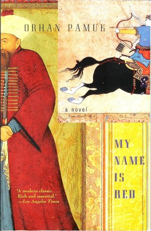
The first one is most similar to the one I own. My initial reaction was that this is an eastern novel, but other than that it was difficult for me to predict what the plot could be. Now I realize that this was intentional because it’s a mystery that leaves room for a lot of interpretation.
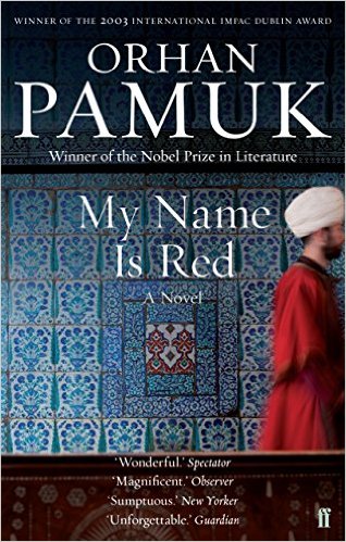
The second cover also informs me that the novel embodies something of eastern culture, but shows this with more religious undertones than the first one. I think by incorporating the intricate arabesque as a major focal point, connotations of religion, specifically Islam, naturally drift into the viewer’s head. Also, it seems as if this cover is more wordy than the other three, but I think that may be due to the structural arrangement. By centering the words, it is evident that western ways of composition have influenced eastern publications.
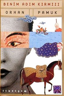
The third cover is similar to the first cover in that by only showing half of the woman’s face and providing a collage of various natural elements, the plot and its’ meaning remain enigmatic. In my opinion, out of the four covers shown, this one is the least westernized.
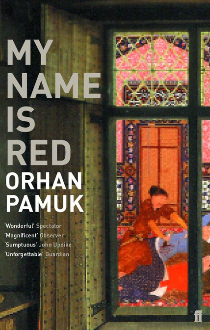
For the final cover, my initial reaction was that it combined modern and aged elements. The font and structure makes it seem like an advertisement I’d see today in the west, but the aged style and color of the image makes me believe the novel eastern. Again, the battle between eastern and western ideas.
I think all of these covers show the main theme of the book that deals with conflict between western and eastern illumination. What cover do you think is the best at representing the visual and textual messages of the novel? What were your initial reactions to viewing these covers?
I personally think the second one is the most fitting. The main reason is the color palette. It uses dark colors which are fitting for the dark mystery that this book is about. The fact that the man’s face is not recognizable also goes along with the reader not knowing who the murderer is, but being pretty sure it is a man. And the arabesque details and the man’s attire speak to the culture and the place that this book is set in and also its characters.
Though I like the idea of the second cover being dark in order to reflect the essence of the murder mystery, I personally think the first one fits the novel best. The entire murder mystery revolves around the manuscript being created for the Sultan who in my opinion, is the person represented on the cover and in some ways, may be the catalyst for the way the story unfolds. Moreover, as the many narrators tell the story of the illuminations they are making, I picture bright colors and designs, which is the general vibe the first cover conveys.
Great analysis! Pretty interesting how in each of the covers, the full body or face is not shown – just parts. I wonder if there is some larger conclusion we could draw as to why each artist decided to make that decision?