Why Wordless?

As a child I remember loving the wordless picture book “The Snowman” by Raymond Briggs and I never really thought about why I enjoyed it so much until Monday’s class. After reading through our assigned wordless novel, “The Arrival,” I found myself enjoying the visual experience of making up my own storyline similarly to my memory of reading “The Snowman.”  As we discussed, the absence of words gives agency to the reader to formulate their own interpretation of what they see, and while I grasped “The Arrival’s” themes of immigration and fear, I also made up my own ideas that related back to my own life. For instance, when I first laid eyes on the cover I had an inkling that the story was going to be about immigration because the man in the photo is holding a trunk in my house that looks identical to the one my great grandpa used when he immigrated from Poland.  Also, I initially interpreted the surrounding cover art, not as a photo album, but rather as a mock-up of a traveler’s trunk. In wordless books, personal perspectives based on one’s own lived experience takes over the narrative depicted in visual representations and leads to a more enticing storyline.

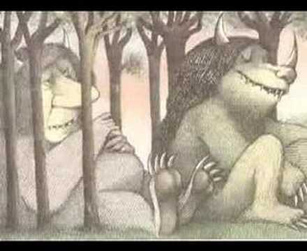
On another note, when reading these wordless novels I was reminded of one of my favorite bedtime stories, “Goodnight Gorilla” by Peggy Rathmann. While this children’s book is not entirely wordless, the only words it really includes are “goodnight” and the name of the animal on the page. A number of the images do not have any words and reflecting on it now I think that is why I enjoyed it so much. I think more children should be exposed to wordless picture books to spark creativity early on in their lives. Do you think children would be as attracted to wordless picture books compared to picture books with words?

Images have the power to override language, such that sometimes words are not enough to describe a particular feeling, emotion, or experience. Visual representations can evoke messages and tell stories just as well as written narratives; however they leave room for various interpretations and might not always be the author’s planned meaning. That is what makes wordless novels fun. Wordless novels are active and require participation from the reader because the author is not telling the reader how to read; but rather providing content to be transformed by one’s own perspective. Wordless novels serve as an invitation for the reader to jump right into the story, observe the symbolic content, and creatively incorporate their identity into the images presented.

Teaching Children About Cultural & Social Structures Through Literature

This week we talked about illustration and themes in The Tale of Peter Rabbit by Beatrix Potter. As a young adult, going back and rereading something I haven’t seen since I was child was an exciting and eye-opening experience. As a child I think I missed a lot of themes when my parents would read to me because I would just be completely fixated on the images, rather than following the content of the storyline, (or I would fall asleep before we reach the moralistic ending). In reexamining Potter’s work, I think the theme of following social norms and being obedient are interesting topic to teach children. It makes sense that parents would want to read books to their children that will help mold them into well-behaved human beings, but I think that Peter Rabbit also does a great job of also introducing the excitement of going against the norms. The most enticing illustrations are those in which Peter is caught in the act of doing something he is not supposed to be doing. For example, the key image of Peter eating the carrots in the garden. While Peter’s disobedience lands him in the scary situation of encountering Mr. McGregor and needing to run away in the hopes of escaping death, he ultimately survived. Even though he did not get to eat the bread, milk, and berries for supper like the other three good rabbits, Peter still ended up safe and sound back at home. I am not arguing against the idea that the theme of Peter Rabbit is about “listening to you mother” and being obedient, but rather noticing that it is possible for everything to work out if you do not follow the rules. After all, Peter did not end up being baked into a pie like his father. It is more likely that children will catch onto the theme of needing to follow the rules or else they will get in trouble (or not enjoy the same benefits as those who are rule-followers); I just find it fascinating that if Potter wanted to send a clear-cut message of “follow the rules or else,” than she probably would have made Peter die or get caught by Mr. McGregor. Incorporating the scary consequences into the protagonists actions would present a more powerful fear of breaking norms.

This narrative that eases children into cultural and social structures of conformity is common in children’s literature. Another coming of age story this reminded me of was that of Hans Christian Anderson’s work, The Ugly Duckling.  The contrasting views between the Ugly Ducking and Peter Rabbit being the odd man out can either be viewed as a beneficial life experience that compliments individuality or a dangerous taboo that should be discouraged. This goes back to the question posed in class: What makes children’s literature? But more specifically, what lessons should be taught in children’s literature? And who gets to decide? I think a mixture of books that encourage nonconformist and conformist behavior would probably be the best way to help introduce children to social elements of this complex life. Seeing which ones they favor would be quite compelling.

Playing with Adobe Illustrator

I had never used a digital platform for illustration before today’s class. Adobe Illustrator has endless of options for creating playful illustrations and allows users to gain a different perspective on what it means to illustrate. Before using this digital platform, I thought it would be more restrictive than freely drawing in the material world, however, I found that I could incorporate even more interesting elements into my work. For example, from the picture I’ve added below, you can tell that I was interested in playing with shape and patterns, which I would not be able to execute as cleanly with actual art supplies. I did not have a plan going into today’s workshop, but after exploring the options Illustrator has to offer, I would be interested in going back to it and creating something like a poster with text. I think it would be fun to compare the work we did with at the printing press workshop and see if one method is more effective or appropriate for certain projects. Did you prefer working with new digital technology or the printing press?

Playing with Julia Jacquette

Last class when we peaked into Julia Jacquette’s exhibition I instantly fell in love with her work. Her theme of play is exciting for viewers because it is something everyone can relate to. As we discussed in class, the word ‘play’ incorporates ideas of being active, subjective,  imaginative, vibrant, and nostalgic. To ‘play’ also means to break the norm and is usually as an expression of escapism in which free choice serves one’s entertainment and contributes to the formation of human culture. What Julia does is play. She has created wildly imaginative pieces of artwork that are so interesting upon first sight, but even more captivating after learning the story behind them. Turning concrete objects into something abstract and exceeding boundaries, but still enabling viewers to see the actual commercialized objects makes Jacquette a visionary that isn’t afraid of a challenge.

There is one piece that I want to buy because to me it resembles the richness of life and presents this warm glowing vibe that makes me feel happy. To me happiness is the essence of play and I believe Jacquette’s execution makes people think of things that make them happy in a sort of childlike manner.  Her work is playful and mesmerizing. The elegance in execution and gold illumination of this piece makes me think that if it were the only artwork on the wall, people would be completely immersed in its beauty. I also think that after discovering it’s from a Dior advertisement there is a  certain allure of taking a closer look at a high end brands. Below is the image:

What is your favorite piece from the exhibit?

What do you think of this piece?

Collaborative Illustration Showcase

I went over to the Kennedy Center after class to look at everyone’s collaborative visual narratives, and was amazed at how beautiful they turned out. Will and I are not the most artistic pair, so looking at all the others really amazed me. I especially liked the Orhan Pamuk ones because Will and I thought Don Quixote would be easier for us to illustrate, so tackling that task was very impressive. It was also nice to see what classmates created for Don Quixote, to compare symbolism and  see what messages people grasped the most.

Sendak & Ernst

When we viewed some of Max Ernst’s collages in class, I immediately thought of the illustrations in Maurice Sendak’s, “Where The Wild Things Are”. While Sendak’s illustrations may be relatively easy to interpret and don’t appear to be collages, the “Wild Thing” characters and style of illustration remind me of the surrealism Ernst played with in his collages. Sendak’s illustrations have a sort of dark feeling like Ernst’s collages. Below I’ve included some works from both artists:

Ernst’s collages can be complex and difficult to decipher, and while they are more sexualized than Sendak’s, I think there is a parallel between their styles. Both create characters that the viewer will be able to objectively recognize, but subjectively interpret. For Sendak we see monsters, but monsters mean different things to different people. Some people find them scary and evil while others see them as an exciting narrative of friendly or cute symbols. I think the monsters aren’t necessarily depicted in a child-friendly manner, they can come off as quite frightening with their teeth, horns, and claws; despite their harmlessness. With Ernst, we see genders. Men and women that have abstract components attached to them like the bird or lizard (I think it’s a lizard) in the pictures above. This allows for a variety of interpretations, which makes collages interesting objects to look at. Sendak and Ernst have a similar storytelling styles that portrays abstract and uncommon content.

Playing with the Printing Press

The printing press workshop workshop was fun for many reasons. I enjoyed looking at the various printed images and words on the walls and feeling almost as if I had traveled back in time. I liked learning about the machine (which looks highly complex, but turns out to be pretty user friendly) and understanding the steps it takes to get a print to turn out clean. From inking the cylinder to clipping in the paper at the right point to checking to see if all the letters are in the right place, I was able to appreciate the thoughtfulness required for a successful printmaking process. Playing with the different fonts, and devising potential images and spacing to go along with my group’s selected quote was creatively stimulating and I would have loved to spend more time thinking of quotes and matching them with available images. Being able to see and use a real printing press is something I never would have thought I’d be able to experience.

The pictures below show our printmaking process and how preparing the print is not as easy as one might think. Will and I kept getting confused as to whether or not our print would read the right way, and it turns out we had initially written our quote the wrong way from right to left, instead of left to right. After fixing that we thought we were good to go, but our first print revealed that we mixed up our ‘b’ and ‘d’ lettering in the word “windmill” and “round”. The mistakes made in the printmaking process add character to the paper and don’t always have to be viewed as mistakes that need to be thrown away. There is value in the learning process, and I am grateful I had the opportunity to learn about old-fashioned printmaking in an era of digital and automatic printing, so that I could appreciate mechanics behind making a print. 

Creating a Don Quixote Cover

When asked to draw a cover of Don Quixote in class today I didn’t really know where to begin. As we have talked about before, illustrating for a book is more challenging than one might initially assume because understanding the most important and intended themes, symbols, characters, genre, setting, and plot are necessary for creating an accurate depiction of the author’s story. Once my partner Will and I started brainstorming, we knew we had to include books, windmills, and Don Quixote, for they are main elements of the story. We also wanted to incorporate other parts of the story that seemed important such as Dulcinea, Don Quixote’s envisioned love, as well as Rocinante, Don Quixote’s horse who accompanies him on his journey. While we may not have the best artistic execution, I think our attempted cover still shows the themes of adventure, delusion, and imagination that we read about in the novel.


Obstacles of Illumination

The scriptorium workshop enabled me to see the difficulties of creating a narration of an illuminated letter. As mentioned in class today, in order for artists to illustrate effectively, they have to learn and understand the context of the story they are trying to exemplify through visual depiction. Since I did not have a story behind my letter “H”, it was difficult for me to add any surrounding detail beyond the lines of the letter. I chose this letter because it is my last name initial. This selection made me feel as though I needed to define myself and incorporate symbols of who I am. Summarizing one’s life or a creating emblems that are personal representations of themselves is no simple task. Similarly, as we talked about with Don Quixote, interpreting stories and illustrating scenes in a way that resonates with intended audiences and accurately depicts the author’s theme is a unique skill. This process of creating an illuminated letter allowed me to appreciate the creativity, patience, and reflection that illuminators and illustrators demonstrate in their art.

Lost in the Pictures

My Name is Red is an interesting work of ekphrasis that enables readers to appreciate art in various forms. One quote that I think resonates with most people is in Chapter 34, when Shekure describes the illustrations left behind by the murderer. She says, “I’d lost myself in the pictures” (p. 208). I believe at one point or another everyone has experienced what it’s like to “get lost” in a work of art. It’s important to recognize that even though the quote only mentions pictures, other works of art that are not just visuals have a way of also captivating admirers. Whether it’s staring at a portrait, listening to a piece of music, reading a poem, or walking through an art gallery, some works of art have a way of consuming an audience. I think this novel made it clear that art is not just about visual images, but can come in a variety of forms, such as reading words on a page.

In Chapter 34, Shekure says,“These illustrations were beautiful enough that you might mistake them for your own forgotten memories; and as with writing, as you looked at them, they spoke” (p. 208). This description makes the comparison between the power of seeing illustration and reading words, both of which emulate meaningful messages. The entire novel successfully communicates artwork, images, and scenes through language alone and speaks to the power of verbal description.

css.php