Don Quixote’s book cover and idea

This is the cover Marie, Jack and I designed for Don Quixote in class today. At first,  we were thinking about drawing the typical scene– Don Quixote holding the shield and the spear on a skinny horse and his servant Sandro on a donkey. But then, it turned out to be really difficult to design a unique one without destroying the theme of the cover, so we decided to show the scene when the priest burned Don Quixote’s knight novels without notifying him.

According to the book, Don Quixote was not supposed to know what happened because people who burned his books told him that, there were never books, but they did only leave some of Don’s collections and hid them in the sealed library. However, we still decided to draw Don Quixote on the left bottom of the cover, waving his hands and legs in bed to show his anger. The fire and the burning books take up most space on the page, because we want it to be Don Quixote’s perspective of witnessing the fire. His fear of losing his books and dream enlarge the size of the fire as if the fire is burning on his heart.

Due to the time limit, we did not have time to write the title on the cover. Our idea was to fill the book title on the bottom right corner. What I like about this cover is that, it is not a typical Don Quixote’s cover. It doesn’t include windmills, or the horse or any of the popular scenes in the story, but it still reveals a certain aspect of Don Quixote’s craziness and the mockery of his knight dream. The burning fire also implies the ending of the story that, his dream to a knight would never come true.


Creating a Don Quixote Cover

When asked to draw a cover of Don Quixote in class today I didn’t really know where to begin. As we have talked about before, illustrating for a book is more challenging than one might initially assume because understanding the most important and intended themes, symbols, characters, genre, setting, and plot are necessary for creating an accurate depiction of the author’s story. Once my partner Will and I started brainstorming, we knew we had to include books, windmills, and Don Quixote, for they are main elements of the story. We also wanted to incorporate other parts of the story that seemed important such as Dulcinea, Don Quixote’s envisioned love, as well as Rocinante, Don Quixote’s horse who accompanies him on his journey. While we may not have the best artistic execution, I think our attempted cover still shows the themes of adventure, delusion, and imagination that we read about in the novel.


The Chapman Brothers vs. Goya

The Chapman brothers decision to revamp Goya’s The Disasters of War was very controversial. The brothers were accused of vandalism and faced harsh criticism from many of their peers in the art community. However, their intention was never to ruin Goya’s work, but to challenge people to think about it in a new light.

The images that Goya etched were dark and disturbing to begin with, but the use of colors added details that enhanced these feelings. The light blue color draws emphasis to the faces, making them pop and highlighting the emotions that they are conveying. The clown-like faces add a sense of eeriness, while also heightening the theme of a nightmare. The brothers addition of color modernized Goya’s work and added a 21st century spin on the etchings. The act alone of drawing on Goya’s artwork causes the audience to debate whether or not the meaning of what Goya was trying to depict was lost or enhanced with the new additions.

Do you think that Goya would approve of what the Chapman brothers did to his work?

Homages

I thought it was really interesting looking at the different ways artists have altered famous prints in order to pay homage to other well-known artists. Though I appreciated the cartoonish, more modern element the Chapman brothers added to the Goya pieces, I still am unsure whether simply going over his original art isn’t vandalism and/or disrespectful. However, as this series of prints have now become  so widely admired, the Chapman brothers may have simply discovered a new way to pay homage.  In some way however, the first homage we looked at (the Dali homage to Goya) resonated more with me because since it is older, Dali had to replicate the print exactly as Goya painted it. There was no way to simply copy the original piece. That exhibits so much effort and time spent on the work of art that it seems to me like Dali’s piece is more of a homage to Goya than what the Chapman brothers did.

Goya as a printmaking inspiration

Francisco de Goya’s Los Caprichos, which I have studied in many different settings over the past few years, become particularly powerful in relation to later prints by other artists whom his work inspired. “The Sleep of Reason Produces Monsters” is a classic print, and a pivotal point in Goya’s turn towards social critique through art. Goya’s criticism is more nuanced than a surface reading suggests. “Reason” is a reference to the grounded, intellectual mindset of the Enlightenment, which was sweeping Spain when he produced this work. Goya warns, it seems, against giving oneself over entirely to rationality. Nightmarish elements of society will still emerge from shadows if men are governed solely by logic. It seems to be an argument for a balance between imagination or creativity and reason. If Spain continues on a path of stale logic and buried corruption, Goya hints that these nightmares might become a reality. The nightmarish quality of this print lies in what is left unsaid, and in the un-pictured images of horror from Spanish society that could not be written off as the product of dreams. In connecting Goya as an inspiration for Dali, and Eko, one understand the sinister undertones of all of these works. Though these artists have certainly taken a page from Goya’s book, none can quite measure up to Goya’s first illustrated nightmare, a suppressed siren for his corrupt society. It is less so the macabre quality of his images, so much as a sense of psychological resonance, of haunting, in Goya’s prints. Still, Dali and Eko effectively borrow the dual sense of parity and detail that defines Goya’s work, as well as a melding of images from the conscious and unconscious worlds that renders each print inexplicable, yet disturbing.

    vs.      

Eko print                                                       Goya

Which is more frightening to you? Why?

More of Eko’s “Don Quixote” Woodcuts

After looking at Eko’s woodcuts in class, I was curious as to how some of his reoccurring thematic images were used in his other depictions of scenes from the book.  As we noticed from the woodcut showing Don Quixote ‘losing his wits’ being too entrenched in his stories, his head and torso were depicted as one large hand. I was interested to see that this portrayal of him reappeared in contexts outside of the context of him reading inside his house. In the second and fourth images below, he is on a horse throwing a spear and locked in jail, but the iconography of the hand suggests that these are figments of his imagination or at least a further sign of his madness. The imagery of books is omnipresent – either placed somewhere in isolation within the scene or imbedded into other objects such as the face of the lion in the first woodcut or the body of the horse in the second.

I included the windmill woodcut that we looked at in class specifically because I hadn’t noticed at the time that it included books as well. The combination of the book and hand imagery (as well as the receding checkered floor which is not included in these woodcuts) suggest that Eko may have chosen to depict this story, in its entirety, as Don Quixote’s descent into madness – or at least, a consistent narrative of his mental state absorbed in the stories he reads.


Judging A Book By Its Cover

Yesterday in class we were asked to look at different book covers of Cervantes’ Don Quixote de la Mancha. On one particular slide, we were presented with two covers side by side – a white cover with a giant Q and a black cover with a small square painting above white print. Nearly everyone in class agreed that the one on the right (the black) looked like a book you’d be asked to purchase for a literature class. The book looked academic to us because of it’s plain, straight-forward, no frills font and the serious, dark-hued painting. I grew bored just looking at the cover.

I’d like to think that I’m the type of person who doesn’t judge a book by its cover. Who cares if I buy the academic looking book or the version featuring a more artistic cover? No matter what the cover looks like, the content is still the same. But I must admit that I am the type of person who judges a book by its cover. In fact, there have been times when I buy a version of a book for more money just because I like the way that cover looks more than I like another cover.

I guess the big question here is why? Why do I care what the cover looks like? The answer: the cover of a book does not only suggest the content of the book, but the cover also reflects my personality and my tastes. Choosing a book based off of its cover is a practice of self-identification.

For example, I would never NEVER purchase, say The Kite Runner, with a cover featuring an image from the film adaption. I don’t want people to think that I am only reading the book because I saw the film. I read books because I like books, not because I like movies.

Or take for example, an experience I had in high school. My mother had given me Daphne Du Maurier’s Rebecca, a respected novel that has been in print since its publication in the 1930s. But to my dismay, the book was dressed in a bright red cover with raised gold lettering written in gaudy cursive. It looked like a cheap romance novel you would pick up at CVS. I remember reading this version of Rebecca in the hallway before going into my US history class.

“What are you reading?” my teacher asked me with raised eyebrows.

“It’s a classic book I swear!” I quickly blurted out trying to correct the false impression my teacher had just gained of me. I didn’t want my teacher to think I was the type of person who would willingly consume trashy literature.

That very afternoon I went to Barnes and Nobles and bought a new Rebecca one with a cover I felt better fit my personality. Yes, a ridiculous course of action. I already had the book. Why by a new one?!

It’s amazing to me that publishers bother to produce the same novel with so man different covers. Why can’t we just be satisfied with one version? But it makes sense. Publishers want to reach as wide an audience as they can. Rebecca has innumerable covers – covers that resemble romance novels, covers that resemble crime novels, covers that resemble teen lit, and covers that resemble Jane Austen novels. By having these options, the publishers are able to find consumers with all different reading habits.

Just a Man on a Horse and some Windmills

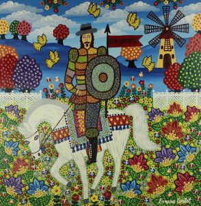
After class, I was interested in looking further into how various artists have illustrated Don Quixote. By doing a few simple Google searches, I found dozens of beautiful pieces of art (and with a lot of thought and indecisiveness, I narrowed it down to 9 images to include in this blog).

The primary commonality that I found in all of them is that they include a man, a horse, and windmill(s). When these three icons appear together, they make a piece of art identifiable as one that relates to Don Quixote. This illustrates to me the importance of knowing the story when creating an image from it. All these artists knew that those were the aspects that stood out in the story, and would therefore be familiar to the audience. 

I really appreciate the different styles that each one of the images below have. The fact that they all look so different yet pertain to the same story speaks to how classic the story of Don Quixote is. All of the artists created pictures that are an extension of the story, instead of images that told a story of their own. Because of this, they portrayed the same story, but in the different, unique styles of their respective artists.

Below are the 9 images that I selected. My personal favorite is the very last one because the style is quite similar to my country’s, Tanzania’s, cultural art. Which one is your favorite and why?


Doré’s Illustrations of Don Quixote

After class, I decided to look at more of Doré’s illustrations of Don Quixote. It turns out that while some of them are fantastic and surrealist, like the two we looked at in class, others are much more realistic. One example is the scene in which Quixote is ‘defeated’ by the windmills.

Unlike Dali’s interpretation of this scene, or the windmills shown on the cover of the Spanish version of the book that we looked at in class, Doré depicts the windmills for exactly what they are and shows Quixote and his horse mid-fall. This artistic choice turns Quixote into a tragic character rather than a comic one. Instead of showing Quixote as a hero bested by a monster like he sees himself, or as one with the windmills like Eko and Dali depict him to show that the monsters are in his mind, this illustration emphasizes the reality of the situation and makes the viewer wince at the real pain that Quixote and his horse will feel as soon as they hit the ground. It shows the power of illustrations to influence a reader’s attitudes toward the words on the page. Whereas the scene can be read as amusing, with this picture it turns into an instance evoking sympathy for the main character of the novel. In showing scenes realistically during Don Quixote’s various moments of defeat, Doré reminds the reader that although the monsters are in his imagination, Quixote is a ‘real’ man who is going through various painful situations, thereby making the reader almost feel bad for laughing at him.

Illustrations with Purpose

Today, the following question was posed in class: “are there any books/poems that should never be illustrated?”

The following were our answers to the question: “The Bible, an encyclopedia, the dictionary.”

Alas, after class I googled illustrated versions of all those things…

The Bible

Encyclopedia

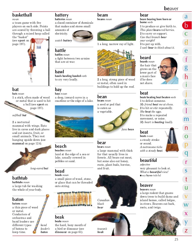
Dictionary

Well, turns out not everyone agrees that The Bible, encyclopedias, and dictionaries should not be illustrated. Though we all thought that these books totalities could not be summed in covers, which I still agree with, I did not consider how interior illustrations could be beneficial. Disabled persons, children, and senior citizens all benefit from having these sources of knowledge illustrated. Readers associate the word “bear” with the big, fluffy, black animal on the page, or better understand what Bible verses mean by analyzing the illustrations… these pictures help people learn. Though the illustrations are not like the Dali’s or Dorè’s of the world, they still serve an important role in teaching others crucial knowledge.

css.php