All that Glitters is Jacquette’s Gold Paintings

It was such a privilege getting to speak to Julia Jacquette today and have her walk us through some of her paintings and the thought processes behind them. The longer I looked at the paintings, the more impressed I was. For some of her paintings, Julia used advertisements as inspiration. I was very impressed by how she managed to pick out these beautiful intricate aspects of advertisements and paint them in a way that is so realistic that I had to do a double take when I learned that they were not photographs.

I was particularly drawn to Julia’s “gold paintings.” I like how she is able to use whites, browns, yellows, greens, and purples to make a painting look gold.

My favorite painting by far is the one of Charlize Theron’s J’adore Dior gold dress detail. I cannot gush enough about how beautiful and accurate this painting is, so I will let the comparison between the painting and photo speak for itself.


I also really like this painting with a similar color palette- the painting of a whiskey glass.

Even though this painting is not gold, it is in the warmer temperature hues, so close enough. The bottom left face reminded me a lot of Mandy Moore. I wonder if she is who Julia painted there? Do the other faces remind you of any celebrities that you know?

Seeing vs. Interacting With Art

I absolutely loved getting to meet Julia Jacquette this morning. Her answers to the class’ questions helped us understand her as a person better, and I think it was interesting to go through a few more generic question before focusing more specifically on a few pieces of her work. As someone in the class brought up, someone with no background knowledge of what Julia’s work represents, especially in regards to the zoomed-in, abstract pieces and her interest in stylizing advertisements, might not fully understand what it symbolizes. Having the opportunity to see paintings is amazing and while art is about interpretation, I found it crazy how much the meaning of a piece can change with explanation of its original message or method of production by the artist. Seeing pieces of art is a completely different world than hearing about them.

Julia Jacquette

Being able to spend time interacting with and listening to Julia this morning was an incredible experience. Hearing about the creative process from her view was fascinating. I particularly enjoyed hearing about the two large murals, each a zoomed in depiction of a larger ad. It was interesting to consider the little idiosyncrasies that exist in advertisements, and for her to draw attention to such minute details, to me, was fascinating. To make such a beautiful piece of art based off of a reflection or a minuscule section of an advertisement is something that at once seems both abstract and representational, and then to hear her motivation behind creating the pieces makes you realize that both are simultaneously correct.

Being able to hear an artist speak about their work and the motivation and struggle involved in creating it was enthralling. Also impressive was the ease with which she was able to field questions and provide in depth answers on the spot. My question, about the possible shift in art in the years to come based on the emergence of digital play and the decline of traditional forms of play, was one that I believed might be too loaded for her to provide a quick and well thought out response so early in the morning, but she provided me with an answer I found to be more than satisfactory.

The experience in it’s entirety was memorizing, and it made me appreciate her work all the more. It made me hope that I will be able to take part in such events again in the future.

Julia Jacquette and her element of water and food

After this morning’s lecture and tour, I learned a lot about the elements Julia Jacquette chose for the book and the exhibition, and the meanings after the elements. Among the many elements such as the food, consumption posters, library resources, feminism and water, I am most interested in water and food, because they act as such common but unique elements in daily life.

As told in the tour, the two huge shadows of the water pools were selected from other small images exhibited as the side. It is really fascinating how water plays not only as life support but as a camera or an document. It records the interaction of people’s life, but since the shadow in the water is too easily disappearing, it hints at the fleeting of lifespan. Also, it shows the audience how variety of a object can be used.

Also, I find two other images– the one painted from the meat leaflet and this other one with different salads and dressings. Food can be really personal and sensitive as for indicating one’s personality. Different from other images exhibited, these two images feel more personalized and intimated. They connect the audience with the artist in a way that, audience feel a sense of belongings in the exhibition and pull art which seems like a remote and undefined terms closer to the audience.

Therefore, the most moving part of the exhibition of Julia jacquette for me is how she makes art is a daily life element and how good she is at using those elements to create an art that’s close enough to real life, but still above the real life.

Julia’s Interesting Perspective

Throughout my time at Hamilton, it has always been a special moment when I have been able to hear an artist or writer provide their own perspective on their work. This morning was no different! When Julia was explaining how she came to create her artwork and where her inspiration came from, it allowed me to see her creations in a new light. There was one part of our lecture with Julia that really stood out to me. She mentioned how some people interpret the meaning and messages of her artwork in ways she never intended for them to be seen. She went on to say that she was delighted at these new interpretations and that she welcomes any new ideas regarding her artwork that she has yet to discover herself. The idea that an artist creates a piece of work but does not know all the power and influence their painting contains is very interesting to me. It also helped me understand the point that every person interprets a piece of art differently and that there is no definitive meaning to a particular artwork.

Julia Jacquette: Admiring Ads, not Critiquing

Walking through Julia Jacquette’s exhibit in the Wellin Museum, it’s almost impossible to miss the artist’s fascination with contemporary advertisement.

One mural in particular, a pop art-esque of reflective pool water, caught my attention.

That’s from the JCrew article. I thought as I looked up,  a little embarrassed that I was able recognized the inspiration so quickly. And the Jcrew catalogue picture wasn’t the only one I recognized. There were bits and piece, close-ups of an ad featuring Matthew McConaughey and another painting pulled from a Dior perfume commercial.

I asked Jacquette what it was about advertisements that captured her attention with an answer already predicted in my mind…. “I’m attempting to critique advertisements, the unrealistic expectations of the glamour, and to deconstruct an image by focusing in on some specific detail.” I thought Jacquette would talk about critique. Her paintings were a way for her to point out how advertisements distort our perception of reality.

But my prediction was wrong. I was surprised when Jacquette responded that she falls prone to the swaying power of advertisements. She wants to travel to the couple’s resort. She wants to be as glamorous as the model in the Dior ad. Jacquette went on to explain that she admires ads and their fanaticism. Her art is not necessarily a critique but an homage.

I really liked the honesty of Jacquette’s answer. Sometime I find myself rolling my eyes at artists who are attempting to make a large critique on the ways of our current society. For me, it was refreshing to see that a talented artists can still appreciate what some may consider “low end” art such as catalogue ads. Jacquette is human just like us! I enjoyed hearing that she too can fall for improbable, such as perfume transforming the wearer into an image of elegance.

Meeting Julia Jacquette

Today’s visit with Julia Jacquette was an all around amazing experience. I expected nothing less… After our brief tour of the exhibit on Monday morning, I immediately fell in love with her style of painting and play, and I knew that having the opportunity to chat with her would provide interesting context and information.

I particularly enjoyed Julia’s comments on her two large murals. She described the larger frames of work they were taken from — a J.Crew magazine spread and an ad for some sort of beach resort. She explained how each mural is simply a zoomed in “piece” of the larger advertisements. This context makes the abstraction all the more interesting, as someone in our class pointed out, it could critique the already “abstract” world of advertising. Personally, her close attention to the behavior of water and her way of depicting the colors of the water was my favorite part. She drew the water in a way that shows each color broken down to its exact location. The greens and whites of the water are separated out from the blues, making it it a hypnotic mixture of shapes.

Julia’s open mindedness to our interpretations of the two pieces was inspiring to witness. While it is not the larger lesson that I learned from our visit today, I did walk away from the discussion feeling empowered to search for little intricacies and details in all areas of art and life. Sometimes it is the tiniest, most obscure feature that can be the most beautiful.

Image-text play and stylistic influences with Julia Jacquette

Like Jess, I fell in love with Julia’s art as soon as we walked into the exhibition! Two aspects struck me immediately: her style echoes that of the hyper-realist Chuck Close, who is famous for his portraits. To me, Jacquette’s work lands somewhere between Edward Hopper’s “Nighthawks” and a Chuck Close portrait. Close was left suddenly paralyzed in the midst of a blossoming career after suffering a sudden spinal artery collapse. He was forced thereafter to work from a wheelchair and to reconsider his technique, painting for a time with a brush strapped to his wrist. In turn, Close’s portraits became less rigidly hyper-realist, as he began to work with gridded paintings based on repeated shapes. Up close the forms were difficult to discern, but from afar, these portraits are not so different from the average hyper-realist work. While Julia is not working with portraits, stylistically I saw a parallel in the way that they both play with expectations//push artistic boundaries, as well as the use of color.

While Close reframed the boundaries of the hyper-realist genre with the painting style he established after his paralyzation, Jacquette conducts a similar genre or style-bending act in introducing text into her garish, almost ad-like images of food. In her various images, the text is presented as either labels or instructions. One could be reading either a text book, a children’s picture book, or the menu at a pastry shop upon first look at her images. Yet the text itself is striking and poetic, and at times deeply at odds with the bright imagery to which it is linked. I particularly loved “Your Every Word a Perfect Jewel and Knife in My Own Heart.” The stark contrast between the bright, romantic, pink and red tones of the desserts depicted and the sharpness-the bleeding-of the words, is quite striking. The dichotomy between image and text prompted my reflection upon the extent of an artist’s control over the way in which their work is viewed. Who sees what first/which side of the mirror? Jacquette forces you to either read a text expounded by an image, or an image elucidated through text. All semester, this course has centered on grappling with how to process this simultaneous bombardment with the visual and the textual-but to me this Julia Jacquette piece is the most overt example of the ways in which the two collide: a connection that is nuanced and undeniably symbiotic.

I am really looking forward to talking with her in class tomorrow!

Playing with Julia Jacquette

Last class when we peaked into Julia Jacquette’s exhibition I instantly fell in love with her work. Her theme of play is exciting for viewers because it is something everyone can relate to. As we discussed in class, the word ‘play’ incorporates ideas of being active, subjective,  imaginative, vibrant, and nostalgic. To ‘play’ also means to break the norm and is usually as an expression of escapism in which free choice serves one’s entertainment and contributes to the formation of human culture. What Julia does is play. She has created wildly imaginative pieces of artwork that are so interesting upon first sight, but even more captivating after learning the story behind them. Turning concrete objects into something abstract and exceeding boundaries, but still enabling viewers to see the actual commercialized objects makes Jacquette a visionary that isn’t afraid of a challenge.

There is one piece that I want to buy because to me it resembles the richness of life and presents this warm glowing vibe that makes me feel happy. To me happiness is the essence of play and I believe Jacquette’s execution makes people think of things that make them happy in a sort of childlike manner.  Her work is playful and mesmerizing. The elegance in execution and gold illumination of this piece makes me think that if it were the only artwork on the wall, people would be completely immersed in its beauty. I also think that after discovering it’s from a Dior advertisement there is a  certain allure of taking a closer look at a high end brands. Below is the image:

What is your favorite piece from the exhibit?

What do you think of this piece?

Gray Play

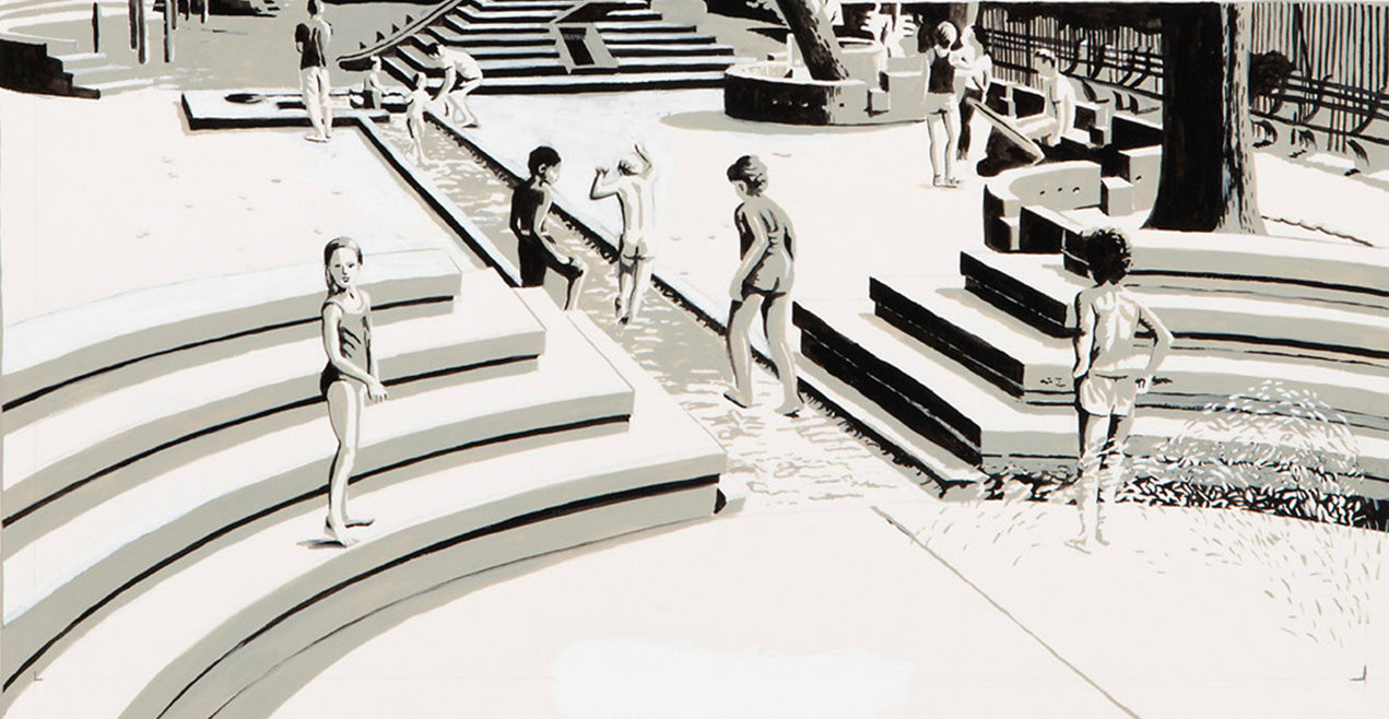
When I think of playing as a little kid, one of the first things that comes to mind is color. Children love to color at restaurants, draw with chalk on the sidewalk, look at colorful books. The lack of color in Julia Jacquette’s Playground of My Mind is a little surprising. The cover of the book has hints of color and the fist page includes a bright blue jacket, but all color then disappears until the last few pages. I wonder why Jacquette decided to use color so sparingly. The lack of color also stands out from her other pieces of artwork on display at the Wellin which use bold colors.

The colorless pages kind of remind me of a coloring book. Perhaps this is what she was going for. Or maybe she wanted the reader/viewer to have to “play” and use his or her imagination to fill in the missing details. Although this book is a memoir, Jacquette allows the reader to add a personal touch by not including every feature. Do people think the book is more effective being mostly black and white?

css.php