The color of Virgin Mary and the meanings behind those colors in different illuminated manuscripts.

The colors of Virgin Mary’s clothes always include one most important element– blue. Blue is the symbol of peace, royalty and nature, which is the quality of a great mother of Jesus and the example of females in the traditional biblical culture.

On the  cover of the ‘Books of Hours’ , wearing a pink cape and a blue dress inside, Virgin felt the Christ Child in her womb with the greeting of St Elizabeth.  Another one of the uncountable examples from the book would be plate 29. A young man kneed before Virgin Mary and her child, praying ‘I beseech you, holy lady!’ The blue is the same blue except that, it decorates a fabulous cape with delicate golden edges.

However, other colors were also used in the portrait of Virgin Mary, such as orange, pink and white in different scenarios. So my question would be: what are the symbols of these different colors? What do those colors illuminate or hide? What roles do colors in general play in the depiction of the glorious figures?

Who is served by paratext?

In class this week, we looked at different covers for a work– The Iliad, in this case– and speculated on what the different choices chose to emphasize about the work they were representing to the reader. This got me thinking about the different people such paratext serves.

The first party the paratext can serve is the author. If a cover gives a reader or buyer an accurate reflection of the author’s vision, then I’d say it’s furthering their artistic expression by spreading it, (illuminating it, even) and hopefully appealing to the kinds of people who they hope will experience their work. Today, authors don’t usually have a hand in the paratext of their book, so this end isn’t always served at all.

Publishers are in charge of making as much of a profit as possible, and they choose whatever images and text appear on the cover. Their goal is not to highlight the author’s intent,  but to make the contents marketable. I’m not saying it doesn’t still serve the author by getting their work to as many people as possible, but even if the resulting paratext is what the author would have chosen, it was arrived at by a different intent.

Finally, the paratext serves the reader by coloring their opinion of the work. It helps us choose what we want to read, of course, but it also gives us a sense to view the work through once we’ve begun. I think of the difference between the copies of a book my high school had, for example, vs. the one I might find at a book store. I’ll use King Lear as an example, just because I remember the edition I read in high school as stunningly nondescript:

There it is. Other than the title, it tells us nothing. If anything, I would say it tells us that this is going to be a pretty dry read, in a pretty dry, academic setting. This may as well be the cover of a computer science textbook. The designer of this school edition, I’d assume, knew that they didn’t need to market this to the public: they just needed a cheap cover for a volume that schools would buy in bulk and that students would read whether they liked it or not. So I think that’s the opinion most high school students have of King Lear. It was boring, and they had to read it for class.

In contrast, take this one:
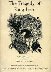
This draws a much more intriguing picture. It tells us that it’s a tragic story, for one thing. The style of the artwork reminds me of medieval art, but I don’t think it is. I think it’s implying that the story takes place in the distant past. I can even extrapolate that there’s an old man who suffers, and causes others to suffer too, based on the figures. At the very least, I could conceivably be intrigued by what’s inside. It’s an interesting enough story to have an interesting cover, and I might approach it differently as a reader if that was my first impression of it.

So I guess paratext serves the company first and the author last, while the reader either is or isn’t depending on the publisher’s approach. What do you guys think?

Contrasting Ideas concerning Death within Illuminated Manuscripts

     In two illustrated manuscripts, Plate 71, and Plate 74, from the British Library and the Bodleian Library, respectively, we see a lot of symbolism regarding death. Plate 71’s prominent picture is of Death, represented as a skeleton with a scythe, stands triumphantly in a beautifully constructed palace.

     In contrast, Plate 74 contains a scene depicting a burial, full of somber looking people dressed in black, with two Priests in the center. The Marginalia in 74 works against the predominant vibe of 71, in that 74’s Marginalia is just eight skulls, with one skull turned at a grotesque angle, and some without jaws. Plate 71’s Marginalia also contains skulls, but they are interwoven with serpents, and although the imagery is still deathlike, it does not feel as somber.

     An interesting question, or idea to look at, is what did these two specific manuscripts believe about death, and how did their views, positive (or accepting) or Negative, inform and affect their interpretation of life and death within the manuscript? While both Plates look to discuss death, they do so in different ways, and incorporate skulls as the pivotal symbol that everyone at this time period could easily understand as Death. What I find most interesting is the triumphal look of Death in 71. Even though Death may have triumphed over the world, or an empire, it seems like 71 is making the case that Death is a necessity, and thus must be respected.

The Deeper Meaning of Illumination

Often times when considering illumination and artwork, the first response someone will think of relates to the famous illuminated manuscripts from the Middle Ages.  However, as we were sitting in class today, viewing multiple examples of these manuscripts, all I was considering was what was the purpose and reason for illuminators and illustrators to begin using this technique for their manuscripts?  What does the use of illumination really mean?

Illumination is the act of illuminating, or creating and supplying with light.  For the Illustrators of the Middle Ages, the creation of this light I believe holds a much deeper meaning than being purely aesthetic.  Most of these illustrated manuscripts were religious texts, and they were portraying religious stories.  Looking at the image taken from The Book of Kells, one of the most famous and intricate illustrated manuscripts that survives today, the deeper meaning and purpose of illumination is clear.  For this post, I focused on the use of light and how it represented both God and the light of God.  This holds one of the deepest meanings and purpose of this time, and the artists are using these precious metals and colors to represent this light of God and the importance of religion in society.

Artists creating the light of God through illumination is an incredibly common technique throughout history, and it is seen in the artwork of different time periods for centuries to come.  Throughout the Renaissance, there were consistent portrayals of Jesus resurrecting surrounded by the light of God, or the Virgin Mary bathed in a gold and bright background in any portrayal of her.  Moving forward into the 20th century, while the light of God may not be as obvious as the Renaissance, the use of illumination and light to represent it is still very common.  Looking at a piece by Henry Ossawa Tanner, The Thankful Poor, the light of God is coming in through the window as a man and his grandson pray at the breakfast table.

While the light of God is only one of the themes that artists have portrayed through illumination over the past centuries, it has an important historical meaning, and it is why I focused on it for this post.  The theme “sheds light” on the ability of illumination to change the purpose and understanding of any piece of art.

The Book of Kells: Icon or Idol

The Book of Kells is an illuminated manuscript of the four Gospels of the New Testament. Most would consider Bibles or prayer books to be religious icons that provide a medium for prayer or connection with God. From what I have read about the Book of Kells, however, it seems as if this masterwork goes beyond its intended role of religious icon. Unlike the Golden Calf, the idolatry nature of the Book of Kells is not as blatant as worshiping a cult image in the absence of God.

The illustrations in the Book of Kells are far more ornate and detailed than any other Gospel book. Illumination is used to flaunt the spiritual aspects of the text to viewers and the large pages and drawings can be seen from a distance, perfect for a grand congregation. Not only was the Book of Kells used in services, it was also showed off in religious processions. The use of the book outside of services suggests that the object itself was practically an object of worship. The Book of Kells straddles the line between icon and idol.

Starry Night: Illustration vs. Illumination

The relationship between an illustration and an illumination is subtle. An artist’s illustration is their interpretation and representation of something. In the following example, the original artist, Vincent van Gogh, illustrated a scene where he was living. When creating the painting, Van Gogh made his own decisions on what parts of the scenery he wanted to emphasize. In an illumination of van Gogh’s painting, Dean Russo chose to emphasize different portions of the illustration to heighten the importance of aspects that he found interesting.

The painting Starry Night, by Vincent van Gogh is a well known piece of artwork that represents van Gogh’s illustration of the view from his bedroom at the Saint- Remy-de- Provence. The painting shows a small town that is surrounded by mountains. Van Gogh emphasizes the night sky, which takes up almost half of the painting. The sky is made up of an intricate mixture of blues and white that illustrate the clouds and sky itself. The stars and moon are surrounded by yellow “clouds” that highlight the light they give off. In contrast, the colors used for the mountains and the buildings are dull and dark, in part because the painting is set during the night. The brighter colors used in the top half of the painting draw the eye to the sky and the details found there.

The illumination of Starry Night, by Dean Russo, emphasizes the sky, but interestingly also places emphasis on the mountains surrounding the town. In contrast to the dark blues that van Gogh used to illustrate the mountains, Russo chose to illuminate the mountains by painting them in vibrant yellows and oranges. Even though Russo used bright colors to illuminate the swirls in the clouds, the eye is drawn more strongly to the mountains. Although Russo used a wider variety of colors throughout the whole painting, the illumination of the mountains and clouds is obvious in contrast to the duller colors found in the rest of the painting.

The Relationship Between Ekphrasis and Illumination

After our class discussion today, I found myself particularly interested between the relationship of ekphrasis and illumination. We discussed how they can coexist and also fail to work with each other when presented at the same time. There is no denying that when something is illuminated, the piece of art is visually enhanced. However, I would say the experience for the reader when viewing something where ekphrasis is present is more meaningful and impactful rather than simply viewing an illuminated piece of art.

My reason for this statement can be directly linked to the power of imagination. When something is left for the reader to imagine, such as it is with ekphrasis, I believe it creates a more powerful experience. Rather than being shown an image, the reader is left to interpret the text for themselves and envision what they are reading. This stance on ekphrasis is a personal opinion and I am well aware that some people might disagree.

I have always found that a successful book will force its readers to visualize what is occurring within the text. Because of this, the plot line and imagery stays with the reader for a long time because they were forced to come up with the visuals all by themselves. In contrast, when analyzing an illuminated piece of art, the image within the onlooker’s mind can be fleeting because the person is simply observing rather than creating.

The Golden Calf: One Story, Many Perspectives

The Bible is originally a book that consists purely of words and not illustrations. It has been up to different artists to interpret these stories and draw them according to what part of the story or what perspective they deem to be the most important. Images of Bible stories are found mostly in children’s Bibles because they need visual representations of text that they cannot yet read. We also see these images in Biblia pauperum, which are Bible stories that were drawn out for people who could not read in ancient times.

The following are a few examples of how a single story has been depicted in a variety of ways by different artists:

1.  
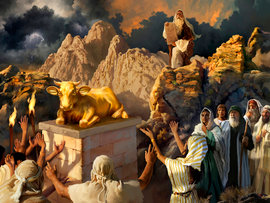
The Hebrews in the desert are jubilant and celebrating the idol that they just made for themselves. It shows their joy in having something to worship and a source of the hope that they had lost after Moses disappeared on the hill for too long.
 

2.  
Aaron is presenting the golden calf that he just fashioned from the Hebrews’ jewelry. Moses is drawn as a small figure in the background. He is barely noticeable. The artist decided the golden calf and the people worshipping it are a more important part of the story than Moses is.
 

3.  
Moses is furious about the Hebrews worshipping a false god and is just about to break the stone tablets with the 10 Commandments on them out of rage. Here, the people are scared of not only the wrath of Moses but also that of God.
 

4.  
Moses is about to demolish the golden calf and the people look distressed because their idol that they worship is about to be destroyed.

A simple Google search provided these different images that are based on the same story. In all of the images, one can recognize that they refer to this particular Bible story because of the iconic golden calf that is depicted. But the setting of the story and the emotions felt by Moses and the Hebrews vary depending on the artist. This is the beauty of images that interpret text. They provide different perspectives on a single piece of text, usually giving us, the audience, an insight to an artists personal take on the story.

Paratext in Nonfiction Books

If nonfiction is considered a genre of “truth,” how do these authors understand and approach the issue of paratext when their works are published? Paratext sets the authors at a disadvantage, placing the interpretation of their words one step further beyond their control. And in particular with nonfiction, I wonder if the danger of including some elements of paratext, particularly cover art. The truth and meaning of the text belongs, in disparate moments, to the author, and to each reader. Yet the design of any book cover inevitably influences the reader’s understanding—you see before you read.

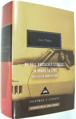
Joan Didion, one of my favorite authors, is something of an icon in the writing world. At once, a widespread reverence for her talent as a prose writer has given way in recent years to a commercialization of her image and brand. Her crisp taste, her minimalist aesthetic, and ability to simultaneously reflect upon and dismiss the blundesr of her youth are the envy of many a twenty something woman today. The cover of The Everyman’s Library anthology of Joan Didion’s nonfiction, We Tell Ourselves Stories in Order to Live, is plastered with the now cliché image of a young Joan leaning out the window of a convertible, looking ill-amused, cigarette dangling loosely from her right hand. This image fails to encompass Didion’s language, narrows her persona, and freezes her in youth. It does not do justice to the full scope of her prose—the breadth and depth of each essay, the deftness of her syntax.

So I wonder whether, for the sake of a genre that is, by definition, grounded in the real, nonfiction books might do better without cover art. If book covers were blank, would people still read? Without titles and cover art? With only words? And yet our visually oversaturated society calls, always, for images. Sometimes, it seems, for pictures before language in a world where the written word is increasingly phasing out of fashion. We cannot realistically afford to eliminate the visual. The connection between images and text and the space between them is flush with meaning. Yet as readers of nonfiction, it seems we are obligated to attempt to access the author’s story in its purest from. We owe it to them not to fictionalize fact.  At root, then, does paratext cheapen nonfiction text?

Cover of We Tell Ourselves Stories in Order to Live

Authorial Audience in Paratext and the Text Itself

Paratext, as we discussed in class, consists of contents other than the main text created by editors, printers, and publishers.  Each example of cover art for Homer’s “The Iliad” gave editions a certain context and would presumably appeal to different audiences.

Each story itself, without its paratext, has an authorial audience, or a group of people who the author intends the story to be read by. A narrator intentionally constructs the lens through which they tell their story, and a writer’s perception of their audience dictates the content that he or she includes.

For example, the book, “The Curious Incident of the Dog in the Night-Time” by Mark Haddon, is told through the lens of Christopher, a boy who has an autistic spectrum disorder. He is self-conscious about the pre-existing beliefs and biases that people have about those with special needs. His introspection and elucidation of his experiences, two skills usually not attributed to autistic individuals, disproves peoples’ expectations of him as unintelligent, unobservant, or insensitive. His audience, therefore, becomes  people who are uninformed about and biased towards his disorder. The intention of the author thereby is to educate them.

With this authorial audience intentionally imbedded in the text, I imagine that it would be incredibly frustrating for an author if the cover art wasn’t an appropriate representation. I wonder if the wrong cover could undo the carefully constructed intended audience due to the fact that we are so affected by the visual quality of something. Below is the cover art for “The Curious Incident of the Dog in the Night-Time”:

css.php