Gustav Dore~ More Depictions of Don Quixote

After looking at two Gustave Dore illustrations of Don Quixote in class, I was interested in seeing how else he depicted Don throughout the rest of the book. I was surprised at how many of the images depicted Don as old, tired, and beaten down. The first image is captioned “The Don is placed in a cage.” I find this image very captivating, and it conveys the idea that Don is trapped in his own head filled with stories. The second image is captioned “Don Quixote after his battle with the cat.” Bed ridden Don Quixote is pretty sad, and he has a very vulnerable and beaten down look on his face. The third image actually shows Don Quixote on his death bed, further showing him as a weak individual. I find it interesting that Dore portrays Don Quixote in this way, as a weak almost absent minded character.


Illustrating Don Quixote

One topic that caught my attention in class today was when we were talking about the decisions that artists have to make when deciding how to illustrate a novel such as Don Quixote. For example, Don Quixote had genuine intent behind his actions, but people often mocked him anyways. How would an illustrator choose to depict a scene where this occurs? Perhaps one might first decide what genre they believed Don Quixote to be and then attempt to convey these issues. The subtly and intricacy of depicting social issues such as this remind me of the illuminations that we have been looking at this semester.

The illuminations we have been looking at so far were intricately designed and there was a focus on using bright colors and gold leaf to enhance the picture. Illustrating a novel such as Don Quixote seems to require a different type of intricacy in order to convey such complex scenes. The illustrator must have a deep understanding of what is happening in the novel during the scene that they are depicting, otherwise the picture won’t accurately reflect the story. Additionally, the artist must be able to accurately convey their understanding of the story so that the audience can pick up on the more subtle aspects of the picture.

Scriptorium Workshop Struggles

Since I missed the first illuminated manuscript workshop, I was particularly daunted by the project ahead of me when I arrived on Monday. I had to condense the process of producing  an illuminated letter into one class time. It is safe to say that I would not have been accepted as a miniaturist in any sixteenth century scriptorium. I particularly enjoyed working with the gold leaf. Merely by adding small bits of it, the letter transformed completely. These luminescent patches scattered across the letter draw the eye in immediately. Still, the gold leaf was difficult to apply, and never stuck to the page in exactly the way I had intended. I have a deeper respect for the work of miniaturists having now gone through this process, only to produce one letter. This craft requires a level of patience and diligence that is nearly inconceivable to me. Catching a glimpse into the laborious process also made me think about the extent to which miniaturists devoted their whole lives to the craft. The scrupulous nature of the process demands vast spans of time and attention. How long would it have taken just to finish a single page?


(

(I didn’t get to use paints and had to finish outside of class, so I used markers and colored pencil only)

New Revelations

This week I realized the challenge with creating images for texts. I did not realize the level of thinking that went into making pictures for texts. It never dawned on me that in order to make pictures for a widely-read novel like Don Quixote, the illuminator has to ask himself so many questions. For example, in regards to representation there are many ways to represent a character in a text. Each way you express that character visually can change how the patron or the viewer will perceive that character. For example, today we looked at two different versions of Don Quixote. Each depiction showed each artist’s interpretation of Don Quixote’s characteristics and motives. One depicted Don Quixote as a rose-eyed intellectual that is haunted by his thoughts. It placed emphasis on Quixote’s disturbed mental state. However, the other depiction was much simpler. Drawn with pencil it simply featured a general outline of Quixote on his travels. This appeals more to Quixote’s journey rather than his mental affliction.

When considering making my own illustrations for texts, I realized I had to understand the goals of the subject that I am drawing. As someone who enjoys analyzing films, I often make the connection to a film writer’s choice in creating a character on the big screen. “What is the character’s socioeconomic status in society? They must dress as such. What does the character want to become? What do they want to avoid? How can we show that tension visually?” These are all thoughts that a film writer and director make when creating a character for film. In the same way, I have to ask myself the same questions when it comes to writing illustrating images for text.

What are other people’s thought processes on creating images for text?

Questioning Don Quixote’s History

I wonder if Don Quixote is considered one of the great pieces of literature because of the reaction it received when it was released to the public for the first time its long history. As we talked about in class, Cervantes grew up rather poor and experienced an adventurous life as a solider and being taken hostage. Because of these facts, the common individual most likely found him a more relatable and likable author, thus leading to Don Quixote being well received upon its release. While there is no denying that Don Quixote is a great novel, there are many instances of notable artwork and literature continuously staying prominent throughout time because of their famous history.


For example, the Mona Lisa is considered one of the most famous painting in the world, not because it’s the most astonishing thing to look at, but rather because of the painting’s history. The Mona Lisa has been stolen numerous times and has been photographed with extremely famous individuals. Because of its continuous prominence in the media, this painting has become a household name. I wonder if Cervantes’ novel has a similar story. Is it really one of the most well written pieces of literature ever, or has its history allowed the novel to stay prominent over many decades?

Comments on images for Don Quixote

This is a poster of a 2000 film called Don Quixote. On the poster, Don Quixote finally has his dream to be a knight come true. Such a positive image with none of his typical triangle hat, spear and the thin horse only reveals the inside beauty of his characteristics. The two windmills in the background are really a spark of this poster, symbolizing that Don Quixote conquered the giants as an extent to the story.  This poster shows that the movie must be more focused on the legendary journal and Don’s influence on the readers rather than the reality and the mockery in literature.


.

This is definitely a light mockery to the story. The owner of the windmill owns a sense of humor that applies the story to real life. This is such a funny picture that I just can’t help not to post it. It can also be a way to indicate that, the story is really popular and thus, influence the values of generations to generations.

The third image is still about the windmill. In the picture above, he wears his typical outfits and rides towards the windmill as if he is attacking some enemy. What I like about this picture is that, it is really suitable for a illustration in the book for children. It reveals nothing scary and pathetic about Don Quixote, but only shows the story itself. The artist tries not to have an attitude in this picture or he must have like this hero-like figure, because he blurs the fact that, Don is a fake knight in his 50s.

This is how different images can change the themes of the texts and reveal different authors’ attitudes. What do you guys think about those images?

Which Cover Works Best?

As we learned in class today, Don Quixote is the second most popular book sold in the history of the world.  As we were looking at the Dali pieces in the Wellin, which I am still shocked and happy that they are here at Hamilton, Professor Serrano asked us about where the image would fit into the story, and if it could potentially be the cover?  This was a question that stood out to me because I was left wondering what is the appropriate book cover for the second most popular book in history.  So obviously for this blog post I decided to Google a bunch of covers and discuss them.

First I have picked out the cover for the Salvador Dali illustrated book because I was curious as to what the famous artist came up with.  This was a very interesting cover, in my opinion, because the main character is not even the main focus on the image.  He is even cut off at the top of the image.  For Dali who illustrates Don as a hero throughout the book, it is surprising the the illustration chosen for the cover does not necessarily show off his triumphs.  It does show him in a proud moment being greeted by those watching him as he enters, but he is not doing something necessarily heroic.

That led me to the analysis of the next cover.  This cover, while less colorful and detailed truly depicts Don Quixote as a heroic protagonist of this book and story.  This graphic novel takes the story of Quixote and clearly depicts the action hero and heroism as he his climbing up this structure with his sword.  This cover also truly does feel like a graphic novel cover as opposed to a book cover.  I am genuinely interested to see what the inside of this book looks like, and Davis chose to illustrate it.

The final cover that I found, and was very intrigued by, was this cover set in modern times.  I honestly found this one to be a bit weird, but it is a New York Times bestseller.  I think the feeling that I got from this cover was more of a Dan Brown Da Vinci Code type of cover, as opposed to a historically famous book like Don Quixote.  It has all of the main parts: the hero himself, a sword and a ton of books.  However, I am unsure if Cervantes and Don Quixote were using laptops when the book was written.  I guess the editor or publisher felt it was time to add a modern touch to this old classic.  It was definitely the most interesting cover I found, but I am not sure if I truly get it.  Which cover do you think is the most fitting?

I have also added a few more covers at the bottom so you can truly see how different they have been over the years.


The Dangers of Literature

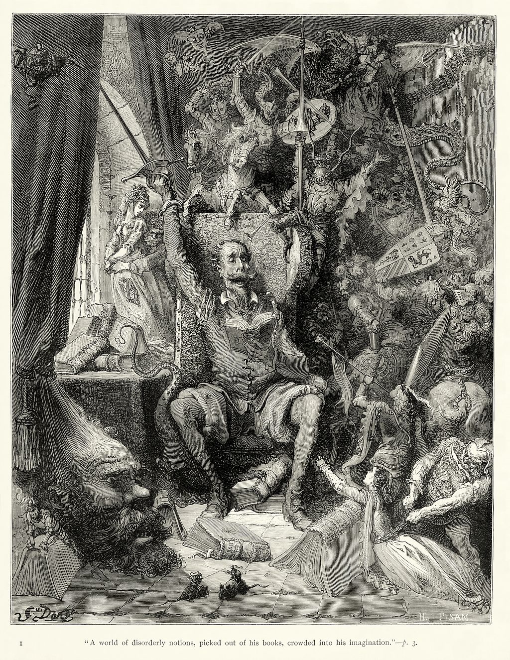
I found the image by Gustave Doré that we looked at in class today to be very interesting. It shows Don Quixote going mad from reading his books. This is representative of a common idea in the Middle Ages, that literature was potentially dangerous. Doré’s engraving depicts Quixote reading a novel and the novel coming to life all around him. The characters from the book, however, include knights, fighting, and monsters. His surroundings seem to be corrupting his mind.

I like the comparison of the dangers of literature to the dangers of video games today. It is commonly agreed upon that books are not very corruptive in nature (although some might argue that certain genres are not suitable for specific audiences). When it comes to video games, however, even the most innocent games, such as Tetris, are considered to be a waste of time, turning brains to mush.

What causes people to label books or games as corrupt? Does genre make a difference? Why do we not think books are dangerous today?

My Illuminating Journey

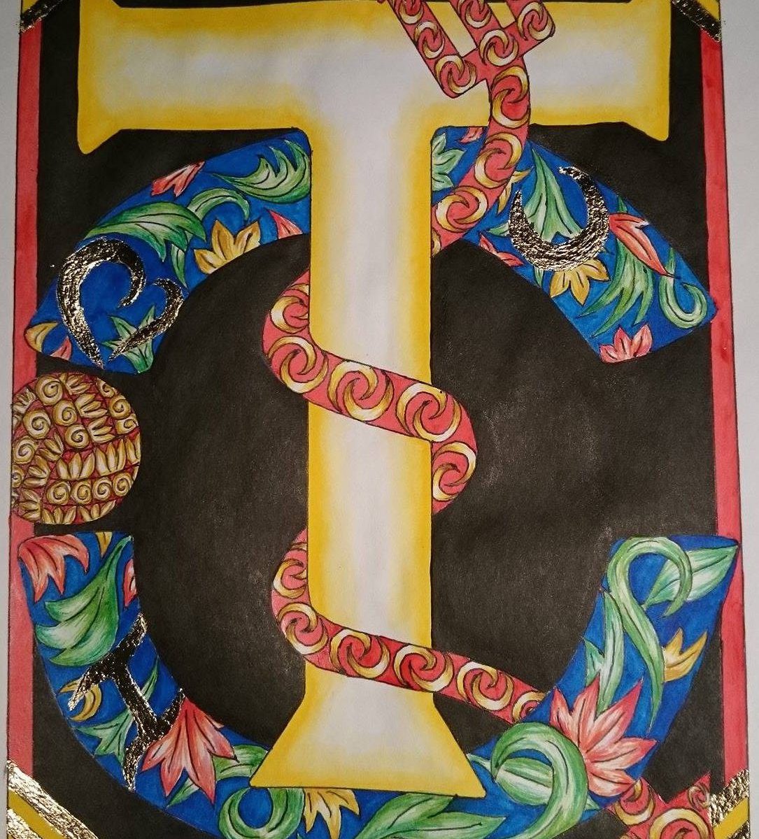
I decided to make my illumination a present for my best friend. He is the biggest fan of the European soccer team, Manchester United. Because of this, I chose to center the illumination around his name and Man United.

I started by drawing a T because that’s the first letter of his name. I then drew the Manchester United logo  behind the T.  I realized that if I took away the ball on the right side of the logo, it would make a C, which is the first letter of his surname. So I decided to have two, instead of the usual one, historiated letters in my illumination. I drew a red devil fork wrapping around the T because Man United’s nickname is “The Red Devils” which explains the character in the logo. I added some decorations in the fork and the C, along with some simple borders. I lay down the initial line work with pencil then went over it with black ball point pen (because it doesn’t bleed when painted over).

I used watercolor to paint some of the areas, then added gold leaf. It was the most tedious part of the illumination. It took a lot of time and patience. It took me a total of 2.5 hours to add gold leaf to the 16 areas that I put it on.

I initially thought my drawing was complete as it is in the image above. But I realized that the T, the most important part of the drawing, was being overshadowed by the darker, more detailed elements. To solve this, I stained the white background black using ink. The contrast between the dark background and the bright yellow T shifted the focus to the T, which is what I wanted.

Here are some details of my final illumination.


I used a lot of red and yellow because those are the colors of Man United’s logo and home jersey. I also used a lot of blue because that is the color of the team’s away jersey. There is also a “hidden” very cheesy message in it.

I really enjoyed creating this illumination (all 15 hours of it) and I am happy to have learned a new style of art. I am curious to know what everyone else did for their illuminations and what their final piece looks like! Post photos please! 🙂

Archangel Raphael talks Illumination

… I was about to try and pull an Orhan Pamuk and have the drawing I did in the scriptorium tell you about itself, but I thought twice (and apologize for even thinking of it). Anyway, as he would have told you, I had a great time with it.

I looked around online for awhile for different letters to draw inspiration from. I decided to do a letter T, for my last name (then I figure my parents could have it, and, you know, display some pride in their lineage), and these are the ones I decided to jump from:

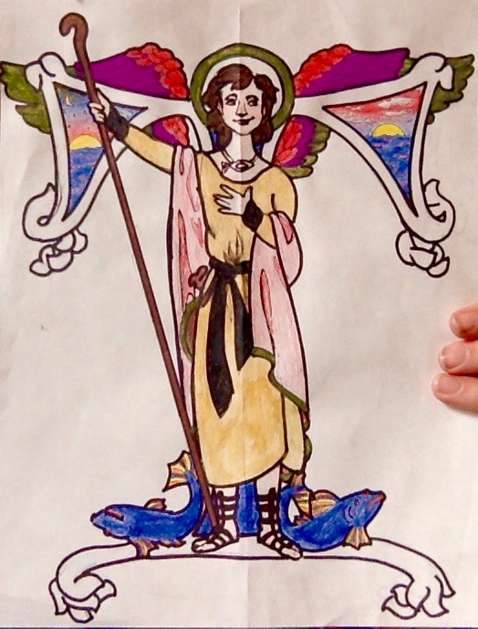
I thought an angel would be a lot of fun, and the letter seemed interesting, but doable– and not like it would distract from the angel part of it. I decided to make it a specific angel: the archangel Raphael, who is the Catholic angel of healing. He’s the youngest of the archangels (the others being Michael the warrior, Gabriel the messenger, and Lucifer the beautiful, who… well, you know), the only brunette, if you believe the paintings, and associated as well with fishermen and the sea. My family lives near the sea and is obsessed with boats, and my mother is a nurse, so it all seemed pretty appropriate for a family crest like I was going for. A little research also let me know Raphael’s usually pictured standing on the backs of fish, holding a staff, with the color green. So, I gave him a staff, some fish to stand not really on, but near, and a green halo. I borrowed his outfit from this painting:
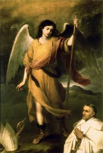
And added images of the ocean to the inside of the T. I went for water in the stem (he’s standing in front of it, anyway) and tried to illustrate “red sky at night, sailor’s delight, red sky in morning, sailors take warning” in the spaces in the crossbar.

Here’s the (not-quite-finished) product:

:
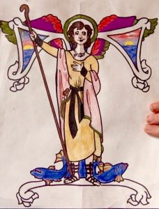
I didn’t get around to gilding, which is a shame, but I’ll do it another time. Still, I think I learned a lot, both about working biblical references into a drawing and about the lengthy physical process of sketching, outlining, mixing paints, and filling things in. Having used some similar paints, I’m even more impressed how precise and how evenly medieval artists were able to color!

What were you guy’s favorite parts of the scriptorium workshop?

css.php