The importance of faces in The Arrival

Shaun Tan’s The Arrival is strikingly effective in depicting the constant sense of displacement that immigrants feel, as well as the search for a sense of belonging that lies at the heart of the experience through faces. While I don’t deny the power of visual art to evoke strong emotions in viewers, I was particularly impressed with Tan’s ability to capture the complex/layered immigrant experience in a purely visual form. I think he captures the perpetual sense of “displacement” consistently through many aspects of the story, not least of all setting. But a single part of his drawings stand out: facial expression. Following the idea that this book presents like an old photo album, the faces throughout the story are essential to understanding the narrative. Tan seems to pay meticulous attention to each face, drawing out each particular moment and mood in the way that the features are frozen. This is what lets him get away with a wordless story. Tan depicts extremes: the main character’s pure, unbridled joy in his interactions with his family, the confusion and anxiety of his arrival in a new city, and the sense of bemusement and wonder as he discovers the stories of other strangers. Tan powerfully reasserts the individuality of the immigrant figure, pushing against the societal habit of generalizing and judging.

Which character or face stuck out to you the most?

(My personal favorite was the old man!)

Approaching Dark Themes in Children’s Literature

I was smiling through our entire class on Monday. Peter Rabbit and all of Beatrix Potter’s story were at the center of my childhood. The BBC version of her tales was one of my favorites as a child-I remember watching it many times over at my grandmother’s house on VCR. Still, I keep returning to the question posed in class about depicting death/difficult concepts in children’s literature. What is the right way to present dark topics to children? At what point should we draw the line in the genre of “children’s” literature?

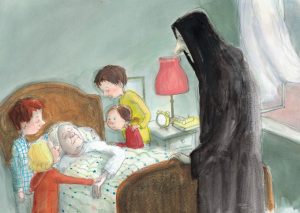
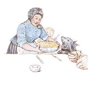
This question reminded me of a Danish children’s book I came across this fall that directly confronts the concept of death in a beautifully illustrated story while remaining distinctly within the realm of children’s literature. In my experience, it is more precarious to attempt to skirt around difficult topics with children, attempting to shroud their harshness, than to confront them more directly. Cry Heart, But Never Break personifies Death, drawing him into the household of four young children as he arrives to take their grandmother. The book strikes a really beautiful balance between the stark necessity of dying and the tenderness and sensitivity that the character of Death exhibits while carrying out his duty. Glenn Ringtved offers a poignant and age-appropriate, yet not overly shrouded way of teaching children about death. Of course, the illustrations, by Charlotte Pardi, carry the brunt of the emotion in this story. Like in Peter Rabbit, the images are almost more important than the text, particularly because   On the other hand, the story of Peter Rabbit is generally so whimsical in its tone that the few darker moments feel quite stark. The casual reference to Peter’s father being baked into a rabbit pie interrupts the gentle narrative of the story. This moment seems to break up the pitter-patter cadence of the rest of the piece, tripping up the reader. If these more difficult/severe lessons were more evenly interspersed throughout Potter’s story, the rabbit pie moment would feel less severe. At root, it seems the keys to successfully introducing darker themes in children’s literature are balance and forthrightness.


 vs 

If you want to know more, here’s a wonderful article about Cry Heart, But Never Break:

https://www.brainpickings.org/2016/03/08/cry-heart-but-never-break/


Visual/Textual Collaging

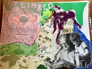
As many others have said, I really enjoyed Monday’s collage workshop. I didn’t have much of a direction when I began, but I found it was interesting to forego the use of scissors at times and rip out certain shapes with my hands. While purely visual collages are often beautiful and provocative, I was interested in introducing words into mine because I’m a creative writing major. I love playing with language on the page, and I was curious to mix poetic and visual play. I generated a loose theme about reading/poetry and teaching by using a large image of a grandfather reading to a child. I love using words as a decorative element too, so on one side of the collage I wrote “Teach your children well” (from the song by Crosby, Stills, Nash & Young) repeatedly to create a background in which the text is nearly indiscernible. I also used small bits from the magazines from the 50’s (I think they were called something like “Lifetimes), which had lots of poems and small stories within them. Repurposing and rearranging words in a new space and context really intrigues me. I took words and phrases from different portions of the magazine to make up no poetic fragments. For example, “Casual acquaintance/on my sunlit floor” and “Lead limbed/ lover/ in the kitchen.” It reminded me of magnetic poetry-the random word arrangements that people throw on their refrigerators. The realm of possibility for this type of wordplay is endless, and I love that. If we had more time in class, I would have continued to scrap different words and phrases from disparate sources to create new pieces of poetry, and perhaps create a more coherent poem? In addition to mixing the sources from which I gathered words, I also took this opportunity to play with different mediums in collage. I used glue and crumpled tissue paper (which I haven’t done since kindergarten!) as well as glitter, and even pieces of the Hamilton campus map. As collage itself is a conglomeration of disparate elements,  the open-ended nature of this workshop was quite fascinating and fun for me.

Image-text play and stylistic influences with Julia Jacquette

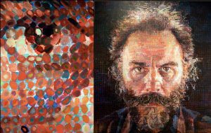
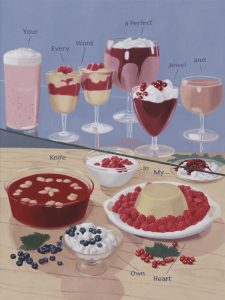
Like Jess, I fell in love with Julia’s art as soon as we walked into the exhibition! Two aspects struck me immediately: her style echoes that of the hyper-realist Chuck Close, who is famous for his portraits. To me, Jacquette’s work lands somewhere between Edward Hopper’s “Nighthawks” and a Chuck Close portrait. Close was left suddenly paralyzed in the midst of a blossoming career after suffering a sudden spinal artery collapse. He was forced thereafter to work from a wheelchair and to reconsider his technique, painting for a time with a brush strapped to his wrist. In turn, Close’s portraits became less rigidly hyper-realist, as he began to work with gridded paintings based on repeated shapes. Up close the forms were difficult to discern, but from afar, these portraits are not so different from the average hyper-realist work. While Julia is not working with portraits, stylistically I saw a parallel in the way that they both play with expectations//push artistic boundaries, as well as the use of color.

While Close reframed the boundaries of the hyper-realist genre with the painting style he established after his paralyzation, Jacquette conducts a similar genre or style-bending act in introducing text into her garish, almost ad-like images of food. In her various images, the text is presented as either labels or instructions. One could be reading either a text book, a children’s picture book, or the menu at a pastry shop upon first look at her images. Yet the text itself is striking and poetic, and at times deeply at odds with the bright imagery to which it is linked. I particularly loved “Your Every Word a Perfect Jewel and Knife in My Own Heart.” The stark contrast between the bright, romantic, pink and red tones of the desserts depicted and the sharpness-the bleeding-of the words, is quite striking. The dichotomy between image and text prompted my reflection upon the extent of an artist’s control over the way in which their work is viewed. Who sees what first/which side of the mirror? Jacquette forces you to either read a text expounded by an image, or an image elucidated through text. All semester, this course has centered on grappling with how to process this simultaneous bombardment with the visual and the textual-but to me this Julia Jacquette piece is the most overt example of the ways in which the two collide: a connection that is nuanced and undeniably symbiotic.

I am really looking forward to talking with her in class tomorrow!

“The Fatal Lozenge” : Alphabetizing Sin, Understanding Irrevocable Acts

“The Fatal Lozenge” is a dark alphabet that chronicles twenty-six different figures committing grave, largely irreversible sins. The characters that meet their doom down the alphabet are by turns ignorant and helpless. Gorey scratches at the surface of acts that are not entirely unconscious, but certainly rooted in hardwired impulses.

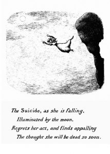
Like we discussed in class, the story seems to offer a comment on natural sin. Though some of the examples in this story are explicit instances of “sin” or even crimes, enacted, there is a psychological root to other examples. People driven to suicide give in to the psychosis of severe depression in any attempt to end their lives. Soldiers (the Zouave) returning from war wrestle with residual violent impulses because of PTSD. Though this is definitely a story about sin, Gorey doesn’t seem to place a heavy-handed blame on every character for the situations they end up in. He intermingles figures acting and being acted upon: the uncle who beats his young nieces and nephews versus the orphan child who perishes in the street. Yet the most troubling examples are those figures who meet failure or doom by their own design, yet as a result of [psychic] forces somewhat beyond their control. I was particularly struck by:

“The Suicide as she is falling/ Illuminated by the moon/ Regrets her act”

Gorey is circling back to acts of impulse and ignorance here, reminding us that they are irrevocable, and often, not without dire consequence. This moment reminded me that despite the macabre trappings of Gorey’s work, he taps into issues that are quite universal, or at least accessible. Statistically, most people who attempt suicide and survive admit that they did indeed instantly regret this act of seeking death. The Wanton, in making herself up with “dangerous” kohl, gives in to not only individual impulse, but also societal pressure for women to achieve beauty through artificial means. The Invalid suffers further because of the mystery of illness, and also because of the failures of his doctors: he is acted upon.

The common thread between every image in this story is the irrevocable nature of each act depicted. The Zouave, conditioned for war, stabs the baby because violence is second nature, and in a single motion, he becomes a child murderer. The suicide gives in to a psychological state that tells her death will relieve the pain of her existence, recovering her will to live only in the moment of limbo before fatal impact. Gorey strikes no middle ground-he draws these figures either right before or right after each one meets his doom or commits his crime. No fates can be reversed in the world or mistakes undone he has created, and though “The Fatal Lozenge” is full of hyperbolic examples, this seems a lesson worth holding on to. A hardened and moderated version of “think before you speak,” Gorey, in a most grim manner,  is counseling the reader (supposedly, the child), to also think before acting.
“Tuesday” in Une semaine de bonté

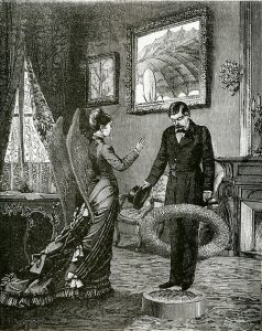
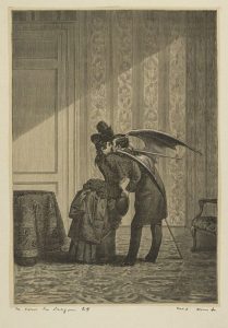
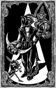
Ernst’s Tuesday chapter of Une semaine de bonté focuses loosely on the element of fire through imagery of dragons, but at root it is a commentary upon his society’s understanding of romance and sexuality. Figures in the collages are increasingly divorced from humanity by the growing presence of various beastly body parts: heads, wings, tails, and more. Ernst’s animalization of the female figures in his collages struck me as a commentary upon female sexuality. As society began to break out of the constraints of the Victorian era, women found themselves in a ‘liberated’ position in comparison to the past. This moderate degree of sexual freedom posed a fierce threat to Victorian masculinity. Throughout Une semaine de bonté,Ernst espouses this fear of compromised masculinity and attempts to compensate for it by animalizing the women in his collages. The “privilege” of the male gaze becomes an assumption, the  objectification of women: a natural way to view the opposite sex. Collage works to the artist’s advantage, for he often cuts out human heads to replace them with animal ones, while retaining the most sensual parts of the female body. This follows an understanding of the woman as “Other:” an exotic entity who perhaps required  objectification to be understood. Just as white males would do with people of other races, women were quite easy to exoticize and eroticize. Ernst’s collages in the Tuesday chapter are a hyperbolic expression of this perspective. He seems to see mere bodies instead of women, strange, static spectacles instead of living, thinking entities. Yet in these heavy-handed examples of objectification, is Ernst accidentally highlighting the power of women in his society? To reframe it with a question posed in class: Are men “trapped” by women and their beauty?

Letter Press Workshop

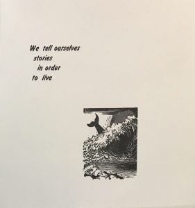
Spending the past two classes in the letter press workshop has been an incredible and enlightening experience- I really wish we could spend more time here! I now understand and appreciate the attention to detail, the conscientiousness and caution that goes into this craft. It is a far more manual process than I had anticipated, which, in my opinion, makes it a more satisfying art form. Julia and I worked together on a print, and I suggested we use a quote from my favorite author, Joan Didion. It reads: “We tell ourselves stories in order to live.” Although it seemed we were one of the only groups that chose a quote that didn’t directly link to My Name is Red or Don Quixote. Still, I think there’s something universal in this statement. The telling of stories can be equated with the creation of art: an act that is so often necessary, innate even. With the phrase “in order to live,” Didion suggests that storytelling, or writing, and, I would add, art, are a means of parcelling out the world, of absorbing experiences as we go forth. All art forms: writing, painting, printing, etc. become ways to digest lived experience. “In order to live,” to accept the chaos of the world, artists translate life into an accessible visual language. Still, Didion’s use of the term “stories” alludes to fiction, seemingly implying the idea that we strive not to confront the full truth of our experience in these crafts. Art is, then, a coloring of reality, but not necessarily a falsification. I think it’s fascinating to consider writing and visual art in these terms, as a reflexive means of processing the world  and as crafts that can offer both solace and criticism to society.

How do you understand this quote in terms of our class?

Goya as a printmaking inspiration

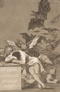
Francisco de Goya’s Los Caprichos, which I have studied in many different settings over the past few years, become particularly powerful in relation to later prints by other artists whom his work inspired. “The Sleep of Reason Produces Monsters” is a classic print, and a pivotal point in Goya’s turn towards social critique through art. Goya’s criticism is more nuanced than a surface reading suggests. “Reason” is a reference to the grounded, intellectual mindset of the Enlightenment, which was sweeping Spain when he produced this work. Goya warns, it seems, against giving oneself over entirely to rationality. Nightmarish elements of society will still emerge from shadows if men are governed solely by logic. It seems to be an argument for a balance between imagination or creativity and reason. If Spain continues on a path of stale logic and buried corruption, Goya hints that these nightmares might become a reality. The nightmarish quality of this print lies in what is left unsaid, and in the un-pictured images of horror from Spanish society that could not be written off as the product of dreams. In connecting Goya as an inspiration for Dali, and Eko, one understand the sinister undertones of all of these works. Though these artists have certainly taken a page from Goya’s book, none can quite measure up to Goya’s first illustrated nightmare, a suppressed siren for his corrupt society. It is less so the macabre quality of his images, so much as a sense of psychological resonance, of haunting, in Goya’s prints. Still, Dali and Eko effectively borrow the dual sense of parity and detail that defines Goya’s work, as well as a melding of images from the conscious and unconscious worlds that renders each print inexplicable, yet disturbing.

    vs.      

Eko print                                                       Goya

Which is more frightening to you? Why?

Scriptorium Workshop Struggles

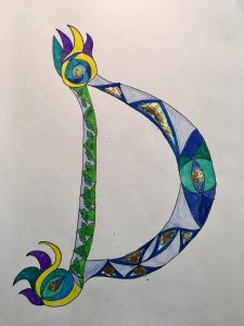
Since I missed the first illuminated manuscript workshop, I was particularly daunted by the project ahead of me when I arrived on Monday. I had to condense the process of producing  an illuminated letter into one class time. It is safe to say that I would not have been accepted as a miniaturist in any sixteenth century scriptorium. I particularly enjoyed working with the gold leaf. Merely by adding small bits of it, the letter transformed completely. These luminescent patches scattered across the letter draw the eye in immediately. Still, the gold leaf was difficult to apply, and never stuck to the page in exactly the way I had intended. I have a deeper respect for the work of miniaturists having now gone through this process, only to produce one letter. This craft requires a level of patience and diligence that is nearly inconceivable to me. Catching a glimpse into the laborious process also made me think about the extent to which miniaturists devoted their whole lives to the craft. The scrupulous nature of the process demands vast spans of time and attention. How long would it have taken just to finish a single page?


(

(I didn’t get to use paints and had to finish outside of class, so I used markers and colored pencil only)

Red: West bleeds into East

Through both form and content, Pamuk’s My Name is Red explores the subtle and non-linear ways in which Western ideas infiltrated Eastern art in the sixteenth century. The title emphasizes a western takeover in multiple ways. The very phrase “my name is” becomes a claim to subjectivity, an explicit assertion of agency. For this one one color to speak, while the others are not given voices in the novel, speaks to Pamuk’s wish to draw attention to the particular power of red.

The chapter on red begins with a sweeping paragraph that explains the enduring presence of the color. It bears witness to all of the core events of the world, subtler at first.  Still, the chapter closes with an authoritative statement. It states: “Thereby, as I bring my color to the page, it’s as if I command the world to ‘Be!’ Yes, those who cannot see would deny it, but the truth is I can be found everywhere” (188). Red addresses its own power to take over a page, and to capture the eye. The color acts like the West in the face of the world, inevitably dominating any image (i.e. any space/country) in which it appears. There is an oppressive, suffocating edge to this idea that recalls the violence and heedlessness of the West’s imposition upon the East. Furthermore, red is implicitly linked to pain and violence because it is the color of blood, and in turn, it is linked to fear.

The entire book circles around the Western concepts of individual style, originality and and agency that clash with Eastern cultural and religious values. As red bleeds, increasingly, yet somewhat imperceptibly, into eastern manuscript pages, the people resist its power and its connotations. Similarly, as Western artistic tendencies seep into Eastern communities, artists, like the miniaturists in the novel, actively resist. This color lends force to the artwork, and establishes a precarious artistic authority that eastern artists were largely uncomfortable with. Red eclipses, overshadows, ruins illustrations. It flies in the face of rigid tenants of faith that shaped Persian society, threatening to bring down structures upon which it seemed their entire world was built.  Red is the West.

css.php