Gorey’s Cats

I love cats (I love dogs too so let’s not start that debaccle).  Apparently so does Edward Gorey!  Gorey did the illustrations for T.S. Eliot’s “Old Possum’s Book of Practical Cats.”  As we discussed in class Gorey is a dark artist, but expresses his humor and white through “children’s” illustrations.  I find that cats are the ultimate metaphor of Gorey’s art.  They can be ferocious, playful, and scary.  Like Gorey, they have a style all their own.  What do you think?  Is Gorey a paradox of stoic and fun?  Or was he simply an artist trying to express real issues in a medium that was more socially acceptable?

Gorey’s Cats 

5 Reasons Why I Love Amphigorey

I have loved Amphigorey.

Here’s why:

1. Reading these short, illustrated stories was the highlight of my weekend. I cruised through the entire book without realizing it had only taken me a whopping 30minutes.

2. The stories are so extremely odd – it’s amazing. Kind of reminds me of A Series of Unfortunate Events, however, a bit more non sequitur in logic.

3. The surreal/gothic/dark humor vibe appeals to me… and honestly, I couldn’t tell you why.

4. The varied styles of illustration, the different fonts, & the wide range of plots… all these things make Edward Gorey seem like the jack-of-all-trades.

5. “The Listing Attic” was my favorite story… The randomness and the rhyme unite into something unforgettable to me.

Have other people enjoyed the book as well?

Gorey’s Choice of Font

When reading through Gorey’s Amphigorey: Fifteen Books, I noted how the fonts change from story to story, and how they indicate whether the particular section will be an intense and scary or a whimsical and funny.

For example, “Bug Book” is very childlike in its simplicity and charm. The font Gory uses follows suit, it has an innocence about it and almost looks like the handwriting of an adolescent (see below).

In contrast, I found “The Hapless Child” to be utterly terrifying and depressing, not at all fit for a child’s bedtime story. The font in this story is a gothic-style script that conveys a sort of melancholy and dramatic feeling (see below).

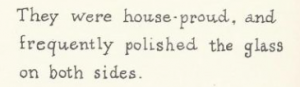
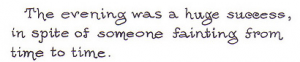
One more example is from “The Curious Sofa”. This story was quite erotic and bizarre, and I found that the font really fit with the themes. There is also something very playful about the way the letters curl at the ends that tells the reader to not take the story very seriously.

Examining Gorey’s font choice can provide insights into his intentions of the story and its meaning. It also shows the variety that Gorey is capable of–covering everything from an innocent children’s story about the teamwork of bugs to the horrifying death of a child to a pornographic story all in the span of thirty pages!

The Multifaceted Gorey

Perhaps it is because we just studied Max Ernst, but I was expecting Edward Gorey’s work to be much darker than it was. Gorey is known for his gothic pen and ink drawings for works such as Dracula and The War of the Worlds. His own personal stories as shown in Amphigorey: Fifteen Books, however, were far from dark or gory. In fact, I would describe the genre of many of the stories within Amphigorey: Fifteen Books as borderline nonsensical and silly.

It is this contrast between the darker gothic illustrations and the original text of Gorey that make his stories unique. When he is drawing gothic pictures for works such as Dracula, his talent can not be fully appreciated and he is pigeon-holed into a certain genre. It is only when he is allowed to put his artwork in his own context that he can reach his full potential.

Not only can Gorey create for a variety of genres, his work can also be appreciated by a number of different audiences. The stories in Amphigorey: Fifteen Books can be witty for adults and whimsical for children. This book truly reveals Gorey’s ability to create multifaceted genres and cater to a wide range of audiences.

css.php