Letterpress Studio Experience

Working in the letterpress studio this week has been a very enjoyable experience. I worked in this studio last year for my 19th Century American Literature class, and I was happy to learn I’d be coming back this semester.

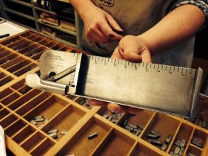
I think what has boggled my mind, both times I’ve worked in the studio, is the amount of meticulous work that is required to ensure a successful process. Type setting the sorts takes focus and time. Transferring the type to the press takes precision and time. Inking the press, prepping it with paper, making a few test prints, all take patience and time.

Time. The whole process takes time! When working, I asked Professor Rippeon how one would go about printing something like the Bible… Do you set all the pages of type, have them ready to go, and crank them out in one sitting? Nope. Instead, due to limited amounts of type, if one were printing something so large, they would have to set and press one page at a time, put all the type back, and start the process over and over again.

So, what I’ve gathered from this whole experience? I would’ve never had the patience!

Out of Sorts: The Letterpress Experience

I am having a blast with the letterpress workshop.  Not only did I not know we had a letterpress, I’m happily surprised at the fact that it’s offered as an XA trip option for incoming freshmen.  It was interesting to learn that the term “out of sorts” came from the tiny metal letters called “sorts.”  If you were putting together a book, say, the Bible, and you ran out of letters, I think that’s a fair claim to call yourself out of sorts.  Putting together the sorts for our phrase, “It’s not about you!” was time consuming.  It made our group rethink how we were going to center and frame the words.  We originally want to do each word on a separate line, but learning that we would have to fill all of those spaces with tiny blank metal pieces, we quickly opted out.  I wonder how many great works of letterpress art were changed for this very reason.  As I’m writing this, deleting words as I go, I must remind myself to take a moment and acknowledge the ridiculous ease of software writing.  It’s easier but it’s also less beautiful.  The lack of manual labor, patience, and time required in the letterpress process is an art that I hope more people learn to appreciate.

Font Choice

One of my favorite parts of the letterpress workshop today was getting to look at all of the different fonts that were laid out for us. I think font is something that we often take for granted because it is so easy to change on a computer, but looking at the individual sorts as physical objects makes it stand out more as a form of art. Each font is designed and created by someone and has its own connotations. We usually focus on the expressive quality of the words that a font makes up, but even the font itself can convey a certain feeling depending on how decorative, rounded, or severe the letters are.

I have had the opportunity to look at cases of fonts once before, when my lit class went on a field trip last semester to the Farmer’s Museum in Cooperstown where they have a 19th century printing press. The press itself was much bigger than the ones in our letterpress studio, but the fonts were very similar. When we printed posters there, we were allowed to choose our own fonts and use multiple fonts on one poster, which gave the experience a different feel. What role do you think font choice has in the artistic process of the letterpress workshop?

Letterpress Day 1 Reflections

Today’s class in the letterpress studio was great. Last year I went to a print shop in Cooperstown for a field trip to learn about the process, but because we only printed one page as a class, that experience involved less hands on type setting than I had today. It was surprising how long it took just to set 2 sentences worth of letters! It gave me a new perspective on some of the books we looked at from special collections, and how long it must have taken to make just one simple book. After admiring some of the prints on the wall of the studio, it is clear that the time and work that goes into a print is totally worth it–there’s something so clean and imperfect about a print and the way the text looks slightly raised on a page. I’m excited to incorporate this art into the collaborative project.

Letterpress Workshop

I enjoyed the letterpress workshop today and found it beneficial to learn about the history of the machines Hamilton owns as well as the various techniques associated with the old tools. I had no idea how expensive letterpresses were, but it makes sense considering they are no longer manufactured.

I also liked the fun facts about phrases such as “out of sorts” or “uppercase” and “lowercase.” Also, the terminology associated with body parts was interesting and actually helped me understand how everything fit together.

As far as actually organizing the letters my group wanted to use, it was a little tricky at first but flowed smoothly after we got the hang of it. I cannot imagine, however, creating a whole novel via letterpress. Proofreading must have been tedious yet essential. Our group also has the option of cutting around the text we print and pasting it onto our final project; it would be a lot more difficult if we had to consider alignment for our manuscript.

I am looking forward to actually printing the text next class!

Printing Press – Placement of Text

One of the things that my group had to take into consideration most during this activity was the placement of our quotation on the page from “My Name is Red”. While we haven’t actually made the print yet, we had to decide if we should center some of the lines or keep them aligned all the way to the left side. It made me think about how the way in which something is printed can affect its reading and interpretation. Top of the page or bottom, positioned toward the left or centered, quotes can be given different levels of importance. We decided that we will probably place the quote all the way to the top left, so that it catches a viewer’s attention immediately but does not necessarily dictate how they interpret picture that we will draw below it in the way that a centered quote might. We thought putting it to the side may imply a more loose or even fluid connection between the two ideas.

Our quote from “My Name is Red” is: “Try to discover who I am from my choice of words and colors, as attentive people like yourselves might examine footprints to catch a thief.”

The connection between this quote and the picture we plan to draw is the concept of differing perspectives, opinions, and writing/artistic styles of each of the characters that we read the narratives of throughout the novel.

Why does everyone know about the windmill scene in Don Quixote?

As we’ve been talking about and reading Don Quixote, I’ve been wondering why the most well known scene from the book is when he tilts at windmills. Even as a kid, not having read any of Don Quixote, I was aware of that scene, and aware of the expression “tilting at windmills” even though I hadn’t read the book. It is clear the windmill scene is the most illustrated part of the book – I wonder why that is when the larger message of the book is concerned with numerous other themes, including the rise of Spain after the Reconquista, as well as the question of whether the book is a novel, satire, or picaresque.

An easy initial answer may be that it is the concrete nature and physical size; after all it is much easier to draw a physical object than say an abstract notion of social commentary. However, the windmills might represent other more abstract ideas within Spanish society – perhaps they represent a cyclical nature of life and history? Seeing as the Spanish had complete the Reconquista, maybe the commentary is that Quixote represents the Spanish nation galloping towards goals or possible achievements, even if they are too grandiose to achieve.

I don’t believe it’s necessary a bad thing that the most well known scene is the windmills. Even Hamlet’s “To be or not to be” is the most well known of Hamlet, that does not mean the rest of the play is somehow lacking in significance or brilliance. Don Quixote is certainly full of other stories and scenes that carry similar weight of importance. My project will actually be about the windmills, and I wonder how my group can make it different from others before us.

The Illustrations of Eko: The Importance of the Hand

I was really fascinated by our discussion of the new illustrations of Don Quixote done by Eko. His illustrations were so unique and unlike any of the other illustrations we saw that all, in some way or another, resembled each other. Even in class today when we tried to come up with our own covers, even though they were all different in composition, colors, etc. there were some common themes throughout such as that of the old man, windmill, etc. Eko’s illustrations alone are eerily different and purposely reimaged in a completely different way. This prompted me to learn a little more; after some digging I found this interview of his in regards to his Don Quixote illustrations: http://www.restlessbooks.com/blog/2015/5/26/reimagining-don-quixote-an-interview-with-the-artist-and-the-publisher.

I would highly recommend reading the interview if you’re interested! It was fascinating to learn about the illustration from the perspective of the artist, to see what he intended and compare it to our own interpretations. The hand, for example, is actually symbolic of Cervantes’ own hand that he lost off at war. So Eko was actually placing Cervantes straight into the illustration of Don Quixote; a very interesting choice indeed. We had never discussed explicitly in class considerations of Cervantes himself in the illustration but had nonetheless come up with meanings and interpretations behind the hand. It’s always fascinating to see how a different audience can read illustrations in very different ways, no matter how purposeful the original illustration.

Chapman Brothers vs Goya

After learning about this debate in class today, it was something that I found incredibly interesting, and I wanted to do more research on the subject.  There have been opposing opinions on either side of this debate, and I feel as though each of their arguments do make a fair case to either justify or condemn the Chapman Brothers’ adjustments to Goya’s famous pieces.

One of the first articles I read was from The Guardian, where they felt as though these adjustments were disgracing Goyas memory in his death and that they were uncalled for.  However, I do not feel the same way that the Guardian does.  I look at the example of Bansky’s street work across the globe where people feel as though it is vandalism.  Taking the same approach to understanding this artwork, I do not view the Chapman Brother’s work as vandalism.  I think that they are reproducing in image in the way that it has affected them and their culture and ideas, just as Banksy depicts his opinions of society on street and city walls.   I do find the images to be rather creepy, but in that sense they are still beautiful.

What is your opinion?  Is this just another version of vandalism or do you think that it is artistic genius?

Art and Text

Since class on Monday, I’ve been thinking about  the question that was raised regarding whether or not there are any books/poems/etc. that should not be illustrated.  I’m somewhat caught in the middle with regards to my thoughts on the issue. In certain cases I feel as if artwork can fully capture the essence of a story or a scene within a piece of literature, and even add to it. Anyone who has reads pieces such as The Adventures of Huckleberry Finn or Alice’s Adventures in Wonderland, and seen the illustrations that accompany these novels would understand that the artwork serves not only to enhance the aesthetic appeal of the novel, but also to add meaningfulness to the story itself. I believe that the relationship between art and text is beneficial for both parties, but I remain skeptical as to whether or not this leads me to believe all novels or poems should be illustrated.

I was given a copy of one of my favorite books, A Farewell to Arms by Ernest Hemingway, by my grandfather in high school. It was a plain, hardcover book with just the title and the authors name on the spine. There were no images in the book, no illustration on the cover, and I had never seen any images depicting scenes from it prior to my reading. It remains to this today one of my most enjoyable reading experiences, and I believe this can be at least partially attributed to the fact that I was able to craft for myself, with the help of Hemingway’s language, the images being played out in the text. I imagined for myself what Fredric Henry, the protagonist, saw and experienced during World War 1. I gave meaning to the words on the pages, and was able to do so without being guided by images of what others believed I should be seeing while reading.

I have had experiences where images have added to the literary experience for me, and others where the lack of imagery has made my experience more enjoyable. I’m still torn between the two sides, and as so I think I will have to remain agnostic when it comes to this issue. I’m curious to know what other people think regarding the question that was raised on Monday.

css.php