What is the correct role of a book cover?

Before Monday’s class, I had never particularly given much time into thinking of the role and significance that a book cover holds. I came away from class concluding that the cover is essentially the introduction to the book. Before even reading a word, the reader’s mind has made some conclusion as to what the book’s content will entail. However, our examination of the very different book covers pertaining to Don Quixote left me feeling rather confused at the role a book cover should have. Whether it be the Spanish looking windmill cover or the westernized, metallic black cover, these illustrations were extremely different. While they differed, the content of the novel obviously stayed the same. The point I am getting at is before reading a single word Cervantes has written, an artists portrayal of his book has shaped the readers mind to form an opinion of Don Quixote in a manner that the author may not approve.


While the entire class agreed that the boring Penguin version was our least favorite, I think this cover might provide the most service to the actual text. As we concluded, the reader will pay no attention to the cover and will immediately divulge into the text. I would obviously prefer to have a wonderful and exciting book cover but it is important to think about the fact that an illustrator might not be capturing the essence of the text in a manner the author would have liked.

Revival of the Letterpress

Letterpressing was developed in the mid-15th century and remained popular until the second half of the 20th century, when offset printing was invented. Not until recently has letterpress printing had a revival as an art form. The second video we watched today showed a women making a career from letterpressing, crafting mostly wedding invitations and formal business cards. Doing some research, however, I learned that the modern attraction to letterpress printing was just the opposite of what the technique used to try to accomplish. The goal of letterpressing used to be not to show any impressions and to “kiss” the paper as lightly as possible. This varies today in that now the goal is to have a distinct imprint so that it is evident letterpress printing is being utilized.

Does this difference in final outcome goals of the technique affect the authenticity of the revival of letterpress printing? This is similar to the artwork we looked at in class today as well. Does painting over an authentic piece of artwork make it less valuable? Technically it is the same piece of work, the difference being the subject valued or stressed.

Don Quixote’s book cover and idea

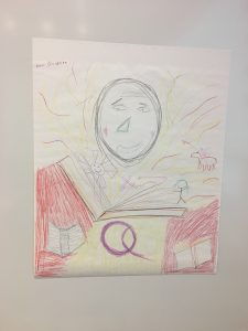
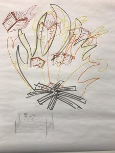
This is the cover Marie, Jack and I designed for Don Quixote in class today. At first,  we were thinking about drawing the typical scene– Don Quixote holding the shield and the spear on a skinny horse and his servant Sandro on a donkey. But then, it turned out to be really difficult to design a unique one without destroying the theme of the cover, so we decided to show the scene when the priest burned Don Quixote’s knight novels without notifying him.

According to the book, Don Quixote was not supposed to know what happened because people who burned his books told him that, there were never books, but they did only leave some of Don’s collections and hid them in the sealed library. However, we still decided to draw Don Quixote on the left bottom of the cover, waving his hands and legs in bed to show his anger. The fire and the burning books take up most space on the page, because we want it to be Don Quixote’s perspective of witnessing the fire. His fear of losing his books and dream enlarge the size of the fire as if the fire is burning on his heart.

Due to the time limit, we did not have time to write the title on the cover. Our idea was to fill the book title on the bottom right corner. What I like about this cover is that, it is not a typical Don Quixote’s cover. It doesn’t include windmills, or the horse or any of the popular scenes in the story, but it still reveals a certain aspect of Don Quixote’s craziness and the mockery of his knight dream. The burning fire also implies the ending of the story that, his dream to a knight would never come true.


Creating a Don Quixote Cover

When asked to draw a cover of Don Quixote in class today I didn’t really know where to begin. As we have talked about before, illustrating for a book is more challenging than one might initially assume because understanding the most important and intended themes, symbols, characters, genre, setting, and plot are necessary for creating an accurate depiction of the author’s story. Once my partner Will and I started brainstorming, we knew we had to include books, windmills, and Don Quixote, for they are main elements of the story. We also wanted to incorporate other parts of the story that seemed important such as Dulcinea, Don Quixote’s envisioned love, as well as Rocinante, Don Quixote’s horse who accompanies him on his journey. While we may not have the best artistic execution, I think our attempted cover still shows the themes of adventure, delusion, and imagination that we read about in the novel.


The Chapman Brothers vs. Goya

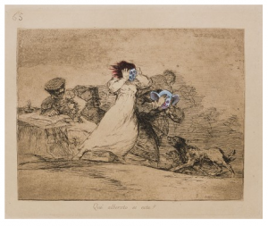
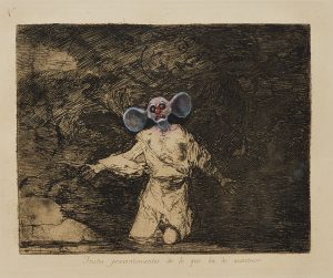
The Chapman brothers decision to revamp Goya’s The Disasters of War was very controversial. The brothers were accused of vandalism and faced harsh criticism from many of their peers in the art community. However, their intention was never to ruin Goya’s work, but to challenge people to think about it in a new light.

The images that Goya etched were dark and disturbing to begin with, but the use of colors added details that enhanced these feelings. The light blue color draws emphasis to the faces, making them pop and highlighting the emotions that they are conveying. The clown-like faces add a sense of eeriness, while also heightening the theme of a nightmare. The brothers addition of color modernized Goya’s work and added a 21st century spin on the etchings. The act alone of drawing on Goya’s artwork causes the audience to debate whether or not the meaning of what Goya was trying to depict was lost or enhanced with the new additions.

Do you think that Goya would approve of what the Chapman brothers did to his work?

Homages

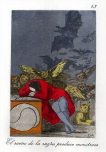
I thought it was really interesting looking at the different ways artists have altered famous prints in order to pay homage to other well-known artists. Though I appreciated the cartoonish, more modern element the Chapman brothers added to the Goya pieces, I still am unsure whether simply going over his original art isn’t vandalism and/or disrespectful. However, as this series of prints have now become  so widely admired, the Chapman brothers may have simply discovered a new way to pay homage.  In some way however, the first homage we looked at (the Dali homage to Goya) resonated more with me because since it is older, Dali had to replicate the print exactly as Goya painted it. There was no way to simply copy the original piece. That exhibits so much effort and time spent on the work of art that it seems to me like Dali’s piece is more of a homage to Goya than what the Chapman brothers did.

Goya as a printmaking inspiration

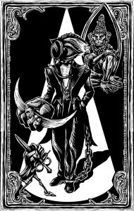
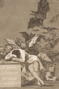
Francisco de Goya’s Los Caprichos, which I have studied in many different settings over the past few years, become particularly powerful in relation to later prints by other artists whom his work inspired. “The Sleep of Reason Produces Monsters” is a classic print, and a pivotal point in Goya’s turn towards social critique through art. Goya’s criticism is more nuanced than a surface reading suggests. “Reason” is a reference to the grounded, intellectual mindset of the Enlightenment, which was sweeping Spain when he produced this work. Goya warns, it seems, against giving oneself over entirely to rationality. Nightmarish elements of society will still emerge from shadows if men are governed solely by logic. It seems to be an argument for a balance between imagination or creativity and reason. If Spain continues on a path of stale logic and buried corruption, Goya hints that these nightmares might become a reality. The nightmarish quality of this print lies in what is left unsaid, and in the un-pictured images of horror from Spanish society that could not be written off as the product of dreams. In connecting Goya as an inspiration for Dali, and Eko, one understand the sinister undertones of all of these works. Though these artists have certainly taken a page from Goya’s book, none can quite measure up to Goya’s first illustrated nightmare, a suppressed siren for his corrupt society. It is less so the macabre quality of his images, so much as a sense of psychological resonance, of haunting, in Goya’s prints. Still, Dali and Eko effectively borrow the dual sense of parity and detail that defines Goya’s work, as well as a melding of images from the conscious and unconscious worlds that renders each print inexplicable, yet disturbing.

    vs.      

Eko print                                                       Goya

Which is more frightening to you? Why?

css.php