Questioning Don Quixote’s History

I wonder if Don Quixote is considered one of the great pieces of literature because of the reaction it received when it was released to the public for the first time its long history. As we talked about in class, Cervantes grew up rather poor and experienced an adventurous life as a solider and being taken hostage. Because of these facts, the common individual most likely found him a more relatable and likable author, thus leading to Don Quixote being well received upon its release. While there is no denying that Don Quixote is a great novel, there are many instances of notable artwork and literature continuously staying prominent throughout time because of their famous history.


For example, the Mona Lisa is considered one of the most famous painting in the world, not because it’s the most astonishing thing to look at, but rather because of the painting’s history. The Mona Lisa has been stolen numerous times and has been photographed with extremely famous individuals. Because of its continuous prominence in the media, this painting has become a household name. I wonder if Cervantes’ novel has a similar story. Is it really one of the most well written pieces of literature ever, or has its history allowed the novel to stay prominent over many decades?

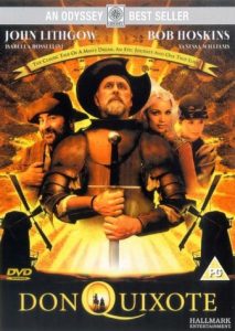
Comments on images for Don Quixote

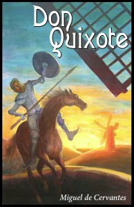
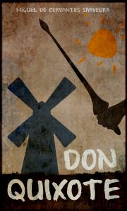
This is a poster of a 2000 film called Don Quixote. On the poster, Don Quixote finally has his dream to be a knight come true. Such a positive image with none of his typical triangle hat, spear and the thin horse only reveals the inside beauty of his characteristics. The two windmills in the background are really a spark of this poster, symbolizing that Don Quixote conquered the giants as an extent to the story.  This poster shows that the movie must be more focused on the legendary journal and Don’s influence on the readers rather than the reality and the mockery in literature.


.

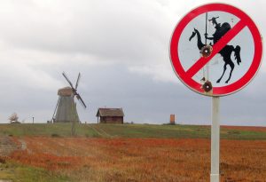
This is definitely a light mockery to the story. The owner of the windmill owns a sense of humor that applies the story to real life. This is such a funny picture that I just can’t help not to post it. It can also be a way to indicate that, the story is really popular and thus, influence the values of generations to generations.

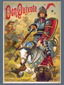
The third image is still about the windmill. In the picture above, he wears his typical outfits and rides towards the windmill as if he is attacking some enemy. What I like about this picture is that, it is really suitable for a illustration in the book for children. It reveals nothing scary and pathetic about Don Quixote, but only shows the story itself. The artist tries not to have an attitude in this picture or he must have like this hero-like figure, because he blurs the fact that, Don is a fake knight in his 50s.

This is how different images can change the themes of the texts and reveal different authors’ attitudes. What do you guys think about those images?

Which Cover Works Best?

As we learned in class today, Don Quixote is the second most popular book sold in the history of the world.  As we were looking at the Dali pieces in the Wellin, which I am still shocked and happy that they are here at Hamilton, Professor Serrano asked us about where the image would fit into the story, and if it could potentially be the cover?  This was a question that stood out to me because I was left wondering what is the appropriate book cover for the second most popular book in history.  So obviously for this blog post I decided to Google a bunch of covers and discuss them.

First I have picked out the cover for the Salvador Dali illustrated book because I was curious as to what the famous artist came up with.  This was a very interesting cover, in my opinion, because the main character is not even the main focus on the image.  He is even cut off at the top of the image.  For Dali who illustrates Don as a hero throughout the book, it is surprising the the illustration chosen for the cover does not necessarily show off his triumphs.  It does show him in a proud moment being greeted by those watching him as he enters, but he is not doing something necessarily heroic.

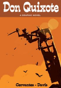
That led me to the analysis of the next cover.  This cover, while less colorful and detailed truly depicts Don Quixote as a heroic protagonist of this book and story.  This graphic novel takes the story of Quixote and clearly depicts the action hero and heroism as he his climbing up this structure with his sword.  This cover also truly does feel like a graphic novel cover as opposed to a book cover.  I am genuinely interested to see what the inside of this book looks like, and Davis chose to illustrate it.

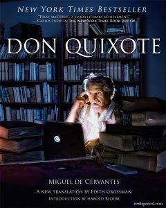
The final cover that I found, and was very intrigued by, was this cover set in modern times.  I honestly found this one to be a bit weird, but it is a New York Times bestseller.  I think the feeling that I got from this cover was more of a Dan Brown Da Vinci Code type of cover, as opposed to a historically famous book like Don Quixote.  It has all of the main parts: the hero himself, a sword and a ton of books.  However, I am unsure if Cervantes and Don Quixote were using laptops when the book was written.  I guess the editor or publisher felt it was time to add a modern touch to this old classic.  It was definitely the most interesting cover I found, but I am not sure if I truly get it.  Which cover do you think is the most fitting?

I have also added a few more covers at the bottom so you can truly see how different they have been over the years.


The Dangers of Literature

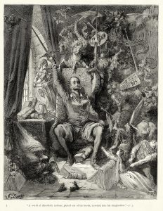
I found the image by Gustave Doré that we looked at in class today to be very interesting. It shows Don Quixote going mad from reading his books. This is representative of a common idea in the Middle Ages, that literature was potentially dangerous. Doré’s engraving depicts Quixote reading a novel and the novel coming to life all around him. The characters from the book, however, include knights, fighting, and monsters. His surroundings seem to be corrupting his mind.

I like the comparison of the dangers of literature to the dangers of video games today. It is commonly agreed upon that books are not very corruptive in nature (although some might argue that certain genres are not suitable for specific audiences). When it comes to video games, however, even the most innocent games, such as Tetris, are considered to be a waste of time, turning brains to mush.

What causes people to label books or games as corrupt? Does genre make a difference? Why do we not think books are dangerous today?

My Illuminating Journey

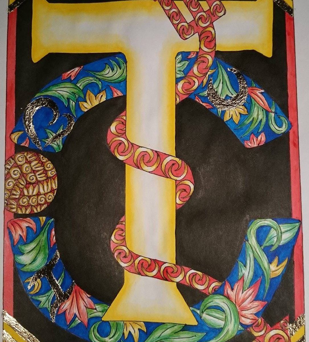
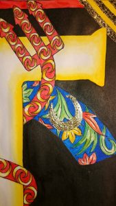
I decided to make my illumination a present for my best friend. He is the biggest fan of the European soccer team, Manchester United. Because of this, I chose to center the illumination around his name and Man United.

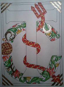
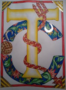
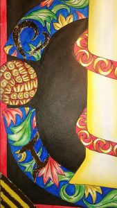
I started by drawing a T because that’s the first letter of his name. I then drew the Manchester United logo  behind the T.  I realized that if I took away the ball on the right side of the logo, it would make a C, which is the first letter of his surname. So I decided to have two, instead of the usual one, historiated letters in my illumination. I drew a red devil fork wrapping around the T because Man United’s nickname is “The Red Devils” which explains the character in the logo. I added some decorations in the fork and the C, along with some simple borders. I lay down the initial line work with pencil then went over it with black ball point pen (because it doesn’t bleed when painted over).

I used watercolor to paint some of the areas, then added gold leaf. It was the most tedious part of the illumination. It took a lot of time and patience. It took me a total of 2.5 hours to add gold leaf to the 16 areas that I put it on.

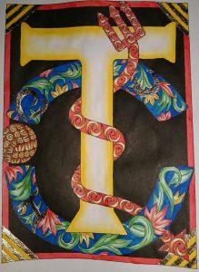
I initially thought my drawing was complete as it is in the image above. But I realized that the T, the most important part of the drawing, was being overshadowed by the darker, more detailed elements. To solve this, I stained the white background black using ink. The contrast between the dark background and the bright yellow T shifted the focus to the T, which is what I wanted.

Here are some details of my final illumination.


I used a lot of red and yellow because those are the colors of Man United’s logo and home jersey. I also used a lot of blue because that is the color of the team’s away jersey. There is also a “hidden” very cheesy message in it.

I really enjoyed creating this illumination (all 15 hours of it) and I am happy to have learned a new style of art. I am curious to know what everyone else did for their illuminations and what their final piece looks like! Post photos please! 🙂

Archangel Raphael talks Illumination

… I was about to try and pull an Orhan Pamuk and have the drawing I did in the scriptorium tell you about itself, but I thought twice (and apologize for even thinking of it). Anyway, as he would have told you, I had a great time with it.

I looked around online for awhile for different letters to draw inspiration from. I decided to do a letter T, for my last name (then I figure my parents could have it, and, you know, display some pride in their lineage), and these are the ones I decided to jump from:

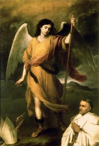
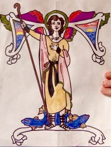
I thought an angel would be a lot of fun, and the letter seemed interesting, but doable– and not like it would distract from the angel part of it. I decided to make it a specific angel: the archangel Raphael, who is the Catholic angel of healing. He’s the youngest of the archangels (the others being Michael the warrior, Gabriel the messenger, and Lucifer the beautiful, who… well, you know), the only brunette, if you believe the paintings, and associated as well with fishermen and the sea. My family lives near the sea and is obsessed with boats, and my mother is a nurse, so it all seemed pretty appropriate for a family crest like I was going for. A little research also let me know Raphael’s usually pictured standing on the backs of fish, holding a staff, with the color green. So, I gave him a staff, some fish to stand not really on, but near, and a green halo. I borrowed his outfit from this painting:

And added images of the ocean to the inside of the T. I went for water in the stem (he’s standing in front of it, anyway) and tried to illustrate “red sky at night, sailor’s delight, red sky in morning, sailors take warning” in the spaces in the crossbar.

Here’s the (not-quite-finished) product:

:

I didn’t get around to gilding, which is a shame, but I’ll do it another time. Still, I think I learned a lot, both about working biblical references into a drawing and about the lengthy physical process of sketching, outlining, mixing paints, and filling things in. Having used some similar paints, I’m even more impressed how precise and how evenly medieval artists were able to color!

What were you guy’s favorite parts of the scriptorium workshop?

Genres in Illustration

Today in class, I found our discussion of genre + Don Quixote of particular interest. We discussed the necessity of artists who attempt to illustrate the story to pick a particular genre, and stick with said genre in their interpretation.

In my own opinion, I find that what makes Don Quixote so successful, is it’s ability to fulfill the needs of many genres/categories. It seems to be almost “uncategorizable”. The book has been around for centuries, enjoyed by children and adults alike. It’s appeal to a wide variety of audiences suggests to me that each reader gets their own preferred genre out of the text (whether it’s romance, farce, satire, etc). Therefore, Don Quixote‘s “adaptability” could be something utilized by artists in their visual interpretations. Instead of sticking to one genre in a depiction, demonstrating the malleability of the text seems appropriate.

Do you guys agree? Is it possible to create successful artwork when appealing to a large variety of genres? Does an artist have to pick just one?

Lessons Learned in the Workshop

During our first day in the workshop, I split my time between the collaborative illustration with my group and the illuminated letter. I spent the majority of my time on the former, and during our second class decided to focus more on my illuminated letter. I forced myself to think more acutely about the process and the design which I wanted to bring to life. At first, I found myself frustrated with my lack of creativity and general artistic ability, but once I got into a rhythm I began to really enjoy the exercise. While the finished product was certainly nothing to brag about, I found pleasure in knowing that I had sat down with a blank page and created something of my own. I gained an even deeper appreciation for the artists and miniaturists who worked on the illuminated images that we view weekly in class. I can say with the utmost certainty that I don’t posses the patience required to create illuminations as intricate and elaborate as the ones we view in class. I sit in awe of both the creative faculties and their patience. They are qualities that I wished I possessed.

I’d be curious to know if other people had similar reactions to the exercise, or if those of you who are more artistic found the time to be less stressful.

Obstacles of Illumination

The scriptorium workshop enabled me to see the difficulties of creating a narration of an illuminated letter. As mentioned in class today, in order for artists to illustrate effectively, they have to learn and understand the context of the story they are trying to exemplify through visual depiction. Since I did not have a story behind my letter “H”, it was difficult for me to add any surrounding detail beyond the lines of the letter. I chose this letter because it is my last name initial. This selection made me feel as though I needed to define myself and incorporate symbols of who I am. Summarizing one’s life or a creating emblems that are personal representations of themselves is no simple task. Similarly, as we talked about with Don Quixote, interpreting stories and illustrating scenes in a way that resonates with intended audiences and accurately depicts the author’s theme is a unique skill. This process of creating an illuminated letter allowed me to appreciate the creativity, patience, and reflection that illuminators and illustrators demonstrate in their art.

The Sane vs. the Insane

Since my senior year of high school, I have studied Don Quixote every single academic year. I have read multiple versions (in both English and Spanish), seen the ballet, listened to Spanish songs, watched movies, read poems, and seen many images that are based off the Spanish classic novel.

When I heard that I was, once again, going to study Don Quixote, and although I enjoy the story immensely, I was a little annoyed simply because I didn’t think we would study any new images. I’d seen the Picasso, I’d seen the Dali, I’d even seen some contemporary images of Don Quixote, Sancho Panza, and the windmills. However, as I often am, I was pleasantly surprised by the images used in the English translation we read for class today.

The above image followed the novel’s sixth chapter. I was struck by the Alice in Wonderland – like quality of the woodcuts featured in this particular translation. The interpretations to not match the images that filter through my imagination while I read, at all. And I liked that! It made me think about Don Quixote in a different way. I’ve always pictured Don Quixote as an old man shuffling around in the world – a character in a rather normal setting. But these images seem to suggest that it is not just Don Quixote that is the strange one. The priest and the barber in the above image look like disturbing dolls (nothing like sane human beings). The room in which the two stand do not have any sense of concrete space. Life-size scissors stand life-like in the corner (most likely there as an illusion to the fact that these men are cutting Don Quixote off from his most treasured possessions, and in turn, cutting him off from his fantasy world of chivalry). To me, this image shows that our actions, even those that seem logical, isn’t too others with a different option. While these men think it is best to destroy the books that Don Quixote loves, to Don Quixote and maybe to the readers too, destroying the books looks like an insane and insensitive action.

css.php