Orhan Pamuk’s My Name is Red observes the relationship between the East and the West and notably, the effects of Western influences on art. Returning to Istanbul after 12 years, Black notices the many things that have changed since his departure, recognizing they originate from the growing influence of Western civilization on the East. One of the central themes of the novel revolves around the clash between Eastern and Western methods of painting, which merely express different ways of seeing the world. Islamic painters attempted to depict the world from Allah’s point of view, whereas the Europeans from a human perspective. I really enjoyed looking at the different eastern book covers in class on Monday and seeing which ones seemed to accurately represent what art should epitomize in eastern countries: no discernible faces and no sense of hierarchy. The various narrators often bring up the idea of “signature” and “style” – in the East, all painters were to imitate the work of their older masters, there was no room for personal/identifiable style or technique. However, in the west, painters ubiquitously would take credit for their work by signing their art pieces or making them recognizable with a personal style. Being a westerner, I never really gave much thought to the idea of showing belonging with a signature on religious artwork. I don’t believe this is as controversial nowadays; however, it makes me wonder if any art work that has a religious purpose should be taken credit for, as opposed to merely dedicated to the Divine. I believe that in the end, the debate between East and West regarding art is somewhat futile and only reflects different ideas of devotion to religion, which the East and West may simply not share.
The Tres Riches Heures in Conversation
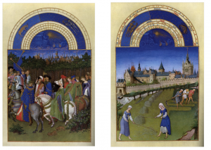
I really appreciated seeing the calendar months from Tres Riches Heures projected side by side in succession. Seeing the months next to each other as they would have been invites comparison and a conversation between the two. I realized that it was almost always an alternating presentation of the nobility/aristocrats and then the peasants save for a few exceptions. This thus allowed us to see both groups in wealth, prosperity, and happiness and there were always subtle unifying elements in the works that encouraged such a likeness to be brought to mind. For example, in the months of May and June:
The angle of the castle sloping in the background of June (on the right) mimics the procession of nobles heading to their summer palace to go hunting. The two complement each other as our eyes naturally follow both scenes from the right to the left where it disappears beyond the frame suggestive of the expansive lands belonging to Duc de Berry. To match the predominantly green scene of June, some of the nobles depicted in May have also been clothed in green. Similarly, the peasants in the foreground of June have been clothed the dark beautiful blue to match the rich robes of the nobility. The religious motif is present in both with the crossing of the trumpets in the month of May and the church depicted in June.
Just as interacting with the physical books last Wednesday added the additional dimension of sensory understanding, seeing the two calendar months next to each other enriched the meaning of each. The similarities that could be drawn between the two emphasized the highly romanticized depiction of the peasants that follows our discussion of the calendar meant to pamper the Duke’s vanity.
Objects vs. their meaning in art
In the chapter “I Am Tree” from My Name is Red, an illustrated tree from an illuminated manuscript actively distinguishes itself from the more intentional and realistic figures found in European art. This foreshadows the conflict at the heart of the book-the disparity between Islamic and European art and the way it reflects traditions of culture and of faith. The tree denounces the aspiration to realism and attention to detail in European art, clinging desperately to the decorative tradition of Islamic art.
The chapter closes with a declaration: “I don’t want to be a tree, I want to be its meaning.” Through the voice of the tree, Pamuk suggests that Islamic art (of the time) demanded a clean separation between art and life. Art is ornamental, fabricated, ethereal. The presence of the colloquial, of the faces of friends and community members in an artistic work, diminished its magic. The tree continues, “I thank Allah that I, the humble tree before you, have not been drawn with such intent.” In rejecting intent, the tree suggests an appreciation of the spontaneity and artistic liberty that characterizes the creative process in illumination. Illuminators were not necessarily given rigid instructions, and instead offered the freedom to articulation individual visions. In contrast, European artists were confined by the aspiration to imitate life as closely as possible, essentially unable to express individual styles.
Pamuk then draws a distinction between an object and its meaning. The object is plain and two dimensional, simple and undeserving of further explanation. Meaning can be entirely separate, and alive, animated, but not necessarily attached to its real life object. The tree in the manuscript declares itself “the meaning of a tree,” as separate from the tree itself.
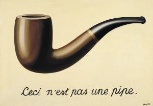
The issues that the tree raises reminded me of the Magritte painting, La trahison des images. Viewers have to think about the nature and meaning of images in this work…Is this a pipe, or is this a picture of a pipe?
The statement below the illustration declares, “This is not a pipe.”
Magritte at once acknowledges and pokes fun at the ambiguous language that blurs the separation between an image and a real object. The tree probes a similar distinction, yet declares one superior to the other. Meaning: liberal artistic expression rises above the actual object or any attempt to realistically imitate it.
The Apocalypse in Early Books and Illuminated Manuscripts
I was thoroughly intrigued with the earliest forms of bookmaking and manuscripts after we viewed them in the library today. Two of my other classes for History involve lots of readings of old manuscripts, so it was great to see these books up close.
I believe it was a large book of the history of the world that contained a few blank pages at the end, followed by a large etching or picture of the apocalypse. It depicted the AntiChrist being urged on by the Devil, while a crowd of onlookers listened with rapture. Above them, a wild tumult is occurring, signaling the final struggle at the end of the world.
I find this line of thinking to be a bit counter intuitive: Even as humankind was creating and transforming their world over five hundred years ago, and making new technologies to further assist their artistic and spiritual learning, they were still completely afraid of the impending doom. Whether this was due to the religious sentiment of the time across Europe, or simply a fear of the unknown and strict adherence to old principles, it still struck me as odd to be so afraid that someone would include a massive page of the apocalypse at the end of what was otherwise an incredible and beautifully crafted book.
The invention of the printing press allowed regular people, not just nobles and the Church, to more easily attain knowledge. The Protestant Reformation was largely galvanized by the printing press, and this spread of knowledge, whether religious or otherwise let common people in on the artistic secrets that had eluded them for centuries. While the Apocalypse has not happened (yet) it interests me as to why these images of apocalyptic notions are prevalent in these illuminated manuscripts and early books. Perhaps it kept people grounded into the world they knew, or perhaps it gave them a reason to strive for living the best life possible.
Illumination and the Printing Press
The collection of books on display at the library today had a range of pieces, from lists of cattle written on papyrus to books printed with a printing press. So far in class we have been focusing on illuminated manuscripts. The manuscripts shown today were beautiful, with historiated letters and some marginalia colored in with pigments from different plants. One of the hymnal books on display featured many pictures with gold and bright colors, although not all of the pictures were filled in. It is possible that the pictures were left blank by mistake, but it was interesting how closely they resembled the pictures that were found in the books that came from the printing press.
One point made in the discussion today was that some nobility had the pictures in their printed books filled in with color after the book was complete. Out of the printed books on display, I was only able to find one picture that was actually colored in. It seems that the art of illumination shifted with the creation of the printing press. Now, instead of enhancing images with gold and brightly colored paints, the quality of the image could be enhanced by adding extra detail to the plate used to make the image. Additionally, the medium used to create the plate played a large role in determining how fine the details in the image could be. As the class progresses, it will be interesting to examine how illumination evolves in the presence of new technologies.
The Nuremberg Chronicle
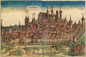
I enjoyed looking at the wide range of books presented to us this morning, but one in particular piqued my interest: The Nuremberg Chronicle. This text is essentially a history book from Genesis through the early 1490s. So far in class we have viewed illuminated manuscripts that have served solely religious purposes, but this book combines religion with, at the time, modern history. This offers a glimpse into life in the 15th century and emphasizes the tight-knit relationship between every-day life and religion. There are even pages devoted to the future, suggesting that Judgement Day is approaching.
Aside from the content of the text, the pictures are extremely impressive and, I find, are the primary allure. The woodcut illustrations depict hand colored, elaborate cityscapes, kings, and battles.
In the 15th century, this book was one of the most extensively illustrated of its time, and one of the most important. This makes me wonder, six centuries later, what is our modern day Nuremberg Chronicle? Is it even a book?
Bookmaking
Speaking broadly, we, as a species, seem to have placed great value on making our mark on the world. There are relics from nearly every culture that have been preserved and that are now displayed for people to learn from and sit in awe over. This truth not only illustrates our efforts as humans to create and make known our cultures through the arts, but also the notion that such efforts are appreciated by those who come after us. Listening to the presentation this morning on the history of booking making and illuminated manuscripts only furthered my appreciation for such a rich human history. Being able to touch and look through books from centuries ago was both fascinating and thought provoking. After learning about the process of book making and the various mediums on which books have printed over time, I found myself wondering what the next medium for this process will be. Have we already found the answer? In the digital age, are kindles, nooks and iPads the new medium? If so, what will come in next? If not, and paper is still king, what will eventually take its place?
The Illustrated Rime of the Ancient Mariner
I was fascinated by all of the books and manuscripts we got the chance to look at today, but the one that most absorbed me was The Rime of the Ancient Mariner, by Samuel Taylor Coleridge with engravings by Gustave Doré. I’m sure I’m not the only one who felt this way, not just because I saw a bunch of other people sitting down to read it, but because the engravings were such an engaging mix of beautiful and grotesque.
More importantly, they let me experience the poem in a way I hadn’t before. I have seen it before, I’m pretty sure– I know a couple famous lines from it– but I didn’t remember what actually happened in it, and I probably found the antiquated language a little distancing. The intricate engravings closed this distance for me. Interestingly, they seemed like the illustrations were more central to the volume than the text, which was printed small beneath full-page spreads of Doré’s illustrations. I think I could have gotten as accurate an impression of the prom from the illustrations alone as the text alone, and that has to speak to a job well done.
Zooming out a little, I can’t decide if this kind of book is a step closer to an illuminated manuscript (in that the pictures successfully illuminate the message of the text) than, say Diderot’s encyclopedia, or a step further (since the text is actually de-emhpasized in a way, in favor of spelling out events in illustrations). What I’m pretty sure of is that these illustrations weren’t really metapictures. The scenes and characters are contained in their frames, without any apparent awareness either that they are acting out a poem or that they have an audience. It’s funny, because the poem is really a poem about someone telling a story. It’s a meta text without meta pictures.
What do you think?
The tale before the invention of papermaking
The revolution of papermaking experienced a long progress starting from 105 CE in ancient China. Cai Lun mixed mulberry and other bast fibres along with fishnets, old rags and hemp waste to invite the first sheet of paper. Around 6 CE, paper was widely used as toilet paper and tea bags. Later in 9 CE, paper-printed money was officially applied all around China.
Before the invention of paper, writing materials in China, different from the western world, included bamboo slips, wooden boards and tortoise shells, while the parchment paper was the luxurious raw material for the Bible and praying books.
The difference of the selections of materials before paper is mostly due to what the region is suitable for planting and what people used to make a living for. For example, in Europe, farming and animal caring were the two main sources of food and shelters, but in Asian, especially before the invention of paper, the source was from the harvests of crops and rice. Not only the region differences, but the influence of religions is crucial. Christianity was built on the bright colors such as gold, silver, blue and red and the architectural style tended to be overly ornate, while, for Buddhism, simplicity was the core of the dogmas. The tortoise’s shells were the representation of nature and longevity as well as the bamboo slips were symbols of peace.
What do you think are the other factors of the differences of the selection of raw materials before the invention of paper?
Illustration & Meaning in The Secret of Kells
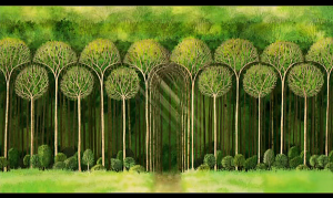
I loved the illuminated forest scenes in The Secret of Kells because of the bright colors and juxtaposition between sharp geometric shapes and lines, and the movement of the watercolor-like animation. As we mentioned in class, the forest resembled a place of wonderment outside the walled-in community of Kells. While watching the film I distinctly remember noting the interesting wall-like appearance of forest from the outside view. I paused the scene and looked at the following image:
This image could be interpreted in a variety of ways. At first glance I did not even notice the path or the entryway of the forest, I just saw a barrier of trees, but now looking at the image the entrance seems obvious. The trees were illustrated in a way that gave life beyond the walled in community a meaning of wonder and intrigue. As mentioned in class, illustrators actively make decisions on what to include, what to leave out, and how to style things in a way that articulates the right meaning. Viewing the forest entry as only slightly emphasized, I’m led to believe that the animators wanted to send a message about the characters’ relationship with nature and exploring outside of the norm. In the movie, Uncle viewed going into the forest as unacceptable because it seemed dangerous, but exploration of the forest was encouraged by Aiden and fascinated Brendan. I think the animators decided to present the forest as this barrier to show the Uncle’s feelings, but intentionally included beams of sunlight over the subtle entryway to represent Brendan’s underlying curiosity. The illustration of the exterior line of trees are all uniform and symmetrical, which represents order, and I though this was interesting because usually when one thinks of a forest it’s typically irregular and disorganized. Do you think this has any significance? I think the trees could have been illustrated in a totally different way that still invoked a place of wonderment, but it might have missed the forbidden forest symbolism. The animators were extremely thoughtful in creating scenes, like this one, that would represent important ideas surrounding The Book of Kells. What do you think this image represents?


