Post-Grad Dreams

Confession: my favorite type of shopping is stationary shopping. I am obsessed with Rifle Paper Co., Papyrus and PaperSource. I just love paper and print! However, even though I am a frequent visitor of these stores, I very rarely buy anything because of the prices.

$12 for a Valentine’s Day card! That’s crazy.

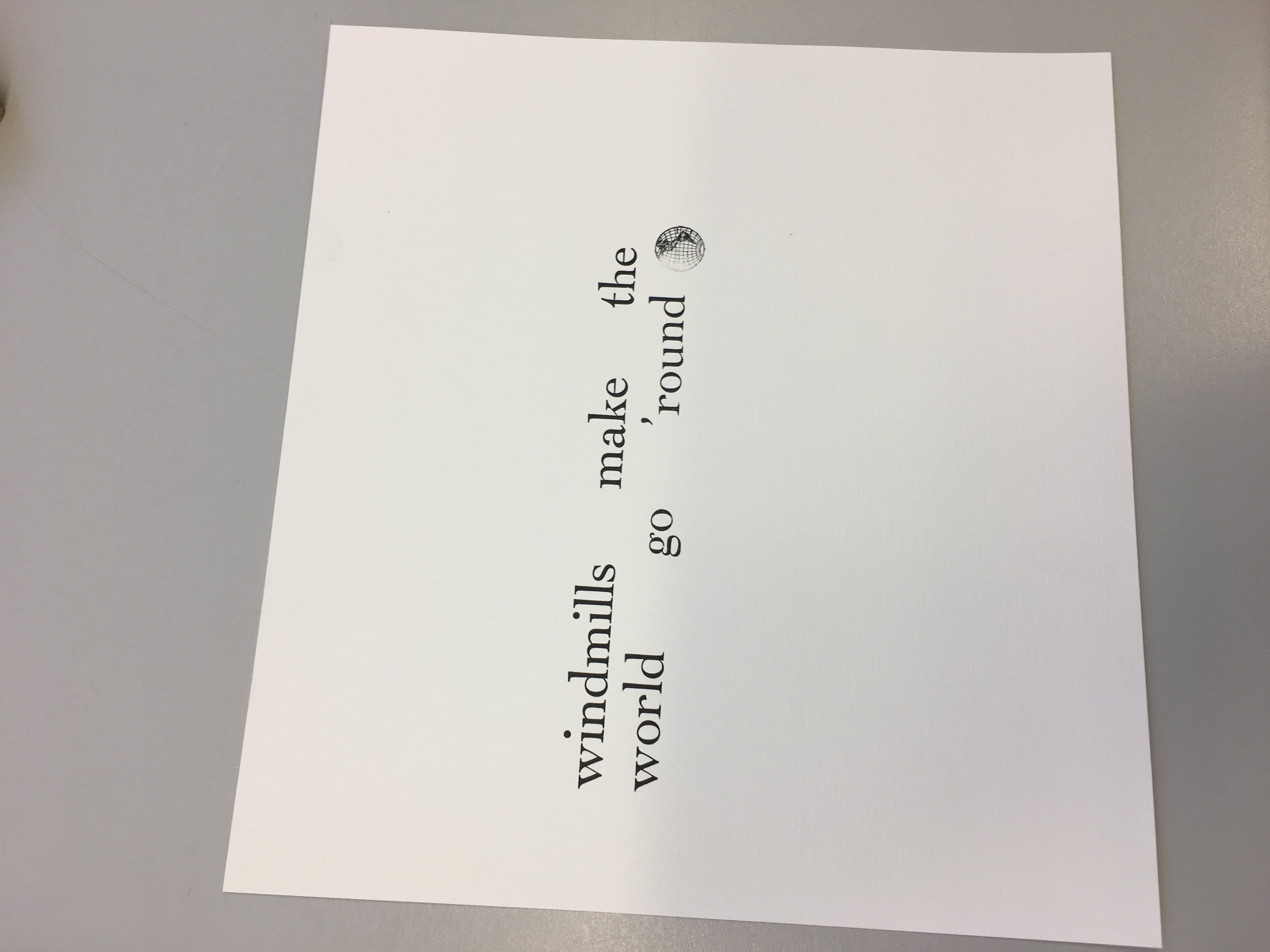
But after spending two days at the letterpress, I now understand why. These prints are work! I guess it never registered to me that all the pretty cards that are displayed on the walls of my favorite stationary stores were hand printed, not digital. Those cards don’t just roll through a printer in hundred; they must be wheeled through a press one by one.

Another confession: over winter break, I applied to multiple printing presses – Steel Petal Press, The Found, Printventory, Snow and Graham… all those expensive cards (but also the ones that look the prettiest!) Now I feel silly for applying because I really didn’t understand all the labor that goes into their products. I really thought it was more about the art and the words. Then run it through a computer and then BAM product ready to sell. But no, this is more art than corporate. I now realize I’m probably not qualified for these companies because of my modest art background but hey, now that I have a little bit of experience with a printing press, maybe I’ll be a little bit more desirable.

Avoiding Clichés in Book Covers

It was interesting in class today to see everybody’s cover designs– I always love to see what different people come up with for creative tasks like that. As much as I enjoyed seeing them, though, it did strike me that the same imagery was present in each: Quixote and either a book, a windmill, or both. That held for all of the covers we saw earlier in the slideshow, as well. These are effective images for sure, and there is a lot lot of creative expression to be had in the way they are combined, but it seems strangely limiting that this pattern held for every single cover we saw or created.

So here’s the question: is it cliché or is it shorthand? I mean, I suppose that’s what a cliché is already, a way to let a reader or viewer on on something without their having to analyze it. It’s when  things like that are overused that we take issue with it. And I do think it’s arguable that a 100% rate of occurrence is overuse. So what’s the alternative?

I’ve been trying to think of a different image that might pack a similar punch on a Don Quixote cover, and it’s not easy without having read the entire book. Besides, it doesn’t do to be too obscure just to try and avoid cliché. I once saw an edition of Les Misèrables that had a painting of some boots on the cover. Like, I’m sure somewhere in there they must mention boots. They mention everything else. But why boots? it gives the reader no information and no lense to read through, no comment on the plot or meaning, nothing to focus on– just something that looks kind of old and is probably worn. Sometime. So, a balance must be reached. If Don Quixote and a scary windmill is too specific, than a Spanish flag or a horse is too general. A book or some fire are integral enough they might work.

My favorite idea, though, was to give Sancho the cover. The poor guy deserves it, and it’s something not often seen. It would be a comment, besides, on what perspective to take. He is unarguably integral. Why shouldn’t he get as much focus as a windmill?

Playing with the Printing Press

The printing press workshop workshop was fun for many reasons. I enjoyed looking at the various printed images and words on the walls and feeling almost as if I had traveled back in time. I liked learning about the machine (which looks highly complex, but turns out to be pretty user friendly) and understanding the steps it takes to get a print to turn out clean. From inking the cylinder to clipping in the paper at the right point to checking to see if all the letters are in the right place, I was able to appreciate the thoughtfulness required for a successful printmaking process. Playing with the different fonts, and devising potential images and spacing to go along with my group’s selected quote was creatively stimulating and I would have loved to spend more time thinking of quotes and matching them with available images. Being able to see and use a real printing press is something I never would have thought I’d be able to experience.

The pictures below show our printmaking process and how preparing the print is not as easy as one might think. Will and I kept getting confused as to whether or not our print would read the right way, and it turns out we had initially written our quote the wrong way from right to left, instead of left to right. After fixing that we thought we were good to go, but our first print revealed that we mixed up our ‘b’ and ‘d’ lettering in the word “windmill” and “round”. The mistakes made in the printmaking process add character to the paper and don’t always have to be viewed as mistakes that need to be thrown away. There is value in the learning process, and I am grateful I had the opportunity to learn about old-fashioned printmaking in an era of digital and automatic printing, so that I could appreciate mechanics behind making a print. 

Our Two Days In The Letterpress Studio

During our two days in the letterpress studio, I was particularly astounded at the lengthy process that is required to create a single page. Even with an instructor by our side, it still took us nearly two hours to create one phrase accompanied by an image. This process made me appreciate the luxuries we have currently with computers and that we do not need to go through this process as people once did. In addition, working with the letterpress made me further appreciate what individuals went through years ago to create a book. It must have taken months! Furthermore, when specifically dealing with the Bible or any other religious text where it needs to appear perfect, it must have been an extra grueling process. Any minuet mistake would not have been accepted and they would have had to start over. I will have to go back to the special book collection at the library and revisit any of the letterpress made items. This process has given me a better understanding of what it took to create them and I now have a greater appreciating for their value!

The Printing Press as an Art

It’s interesting to think about the various forms art takes while undergoing changes in contemporary times.  As college students, we are constantly asked to used modern technology to accomplish daily academic tasks, type up essays, print out readings, photocopy notes, and so on. I never really thought of printing as a form of art until I got a chance to work with the printing press this week. It’s such a meticulous job choosing the font, picking out each letter, taking care of the spacing, getting the ink ready, and lining everything up. Though it takes much longer and requires more effort than our regular modern printer, I thought the experience was really fun and it’s crazy to think people had to print out massive numbers of copies back in the day. In some sense, every single one of those scrupulous tasks is its own form of art, and has become a lost art nowadays, replaced by convenience and modern technology. It’s crazy how new inventions and technology can simply just in someways, eradicate a specific type of art (even if perhaps, the people using the printing press at the time did not think of it as an art, rather just work).

Letterpress Studio Experience

Working in the letterpress studio this week has been a very enjoyable experience. I worked in this studio last year for my 19th Century American Literature class, and I was happy to learn I’d be coming back this semester.

I think what has boggled my mind, both times I’ve worked in the studio, is the amount of meticulous work that is required to ensure a successful process. Type setting the sorts takes focus and time. Transferring the type to the press takes precision and time. Inking the press, prepping it with paper, making a few test prints, all take patience and time.

Time. The whole process takes time! When working, I asked Professor Rippeon how one would go about printing something like the Bible… Do you set all the pages of type, have them ready to go, and crank them out in one sitting? Nope. Instead, due to limited amounts of type, if one were printing something so large, they would have to set and press one page at a time, put all the type back, and start the process over and over again.

So, what I’ve gathered from this whole experience? I would’ve never had the patience!

Out of Sorts: The Letterpress Experience

I am having a blast with the letterpress workshop.  Not only did I not know we had a letterpress, I’m happily surprised at the fact that it’s offered as an XA trip option for incoming freshmen.  It was interesting to learn that the term “out of sorts” came from the tiny metal letters called “sorts.”  If you were putting together a book, say, the Bible, and you ran out of letters, I think that’s a fair claim to call yourself out of sorts.  Putting together the sorts for our phrase, “It’s not about you!” was time consuming.  It made our group rethink how we were going to center and frame the words.  We originally want to do each word on a separate line, but learning that we would have to fill all of those spaces with tiny blank metal pieces, we quickly opted out.  I wonder how many great works of letterpress art were changed for this very reason.  As I’m writing this, deleting words as I go, I must remind myself to take a moment and acknowledge the ridiculous ease of software writing.  It’s easier but it’s also less beautiful.  The lack of manual labor, patience, and time required in the letterpress process is an art that I hope more people learn to appreciate.

Font Choice

One of my favorite parts of the letterpress workshop today was getting to look at all of the different fonts that were laid out for us. I think font is something that we often take for granted because it is so easy to change on a computer, but looking at the individual sorts as physical objects makes it stand out more as a form of art. Each font is designed and created by someone and has its own connotations. We usually focus on the expressive quality of the words that a font makes up, but even the font itself can convey a certain feeling depending on how decorative, rounded, or severe the letters are.

I have had the opportunity to look at cases of fonts once before, when my lit class went on a field trip last semester to the Farmer’s Museum in Cooperstown where they have a 19th century printing press. The press itself was much bigger than the ones in our letterpress studio, but the fonts were very similar. When we printed posters there, we were allowed to choose our own fonts and use multiple fonts on one poster, which gave the experience a different feel. What role do you think font choice has in the artistic process of the letterpress workshop?

Letterpress Day 1 Reflections

Today’s class in the letterpress studio was great. Last year I went to a print shop in Cooperstown for a field trip to learn about the process, but because we only printed one page as a class, that experience involved less hands on type setting than I had today. It was surprising how long it took just to set 2 sentences worth of letters! It gave me a new perspective on some of the books we looked at from special collections, and how long it must have taken to make just one simple book. After admiring some of the prints on the wall of the studio, it is clear that the time and work that goes into a print is totally worth it–there’s something so clean and imperfect about a print and the way the text looks slightly raised on a page. I’m excited to incorporate this art into the collaborative project.

Letterpress Workshop

I enjoyed the letterpress workshop today and found it beneficial to learn about the history of the machines Hamilton owns as well as the various techniques associated with the old tools. I had no idea how expensive letterpresses were, but it makes sense considering they are no longer manufactured.

I also liked the fun facts about phrases such as “out of sorts” or “uppercase” and “lowercase.” Also, the terminology associated with body parts was interesting and actually helped me understand how everything fit together.

As far as actually organizing the letters my group wanted to use, it was a little tricky at first but flowed smoothly after we got the hang of it. I cannot imagine, however, creating a whole novel via letterpress. Proofreading must have been tedious yet essential. Our group also has the option of cutting around the text we print and pasting it onto our final project; it would be a lot more difficult if we had to consider alignment for our manuscript.

I am looking forward to actually printing the text next class!

css.php