Pop Art’s Emergence Through Collage

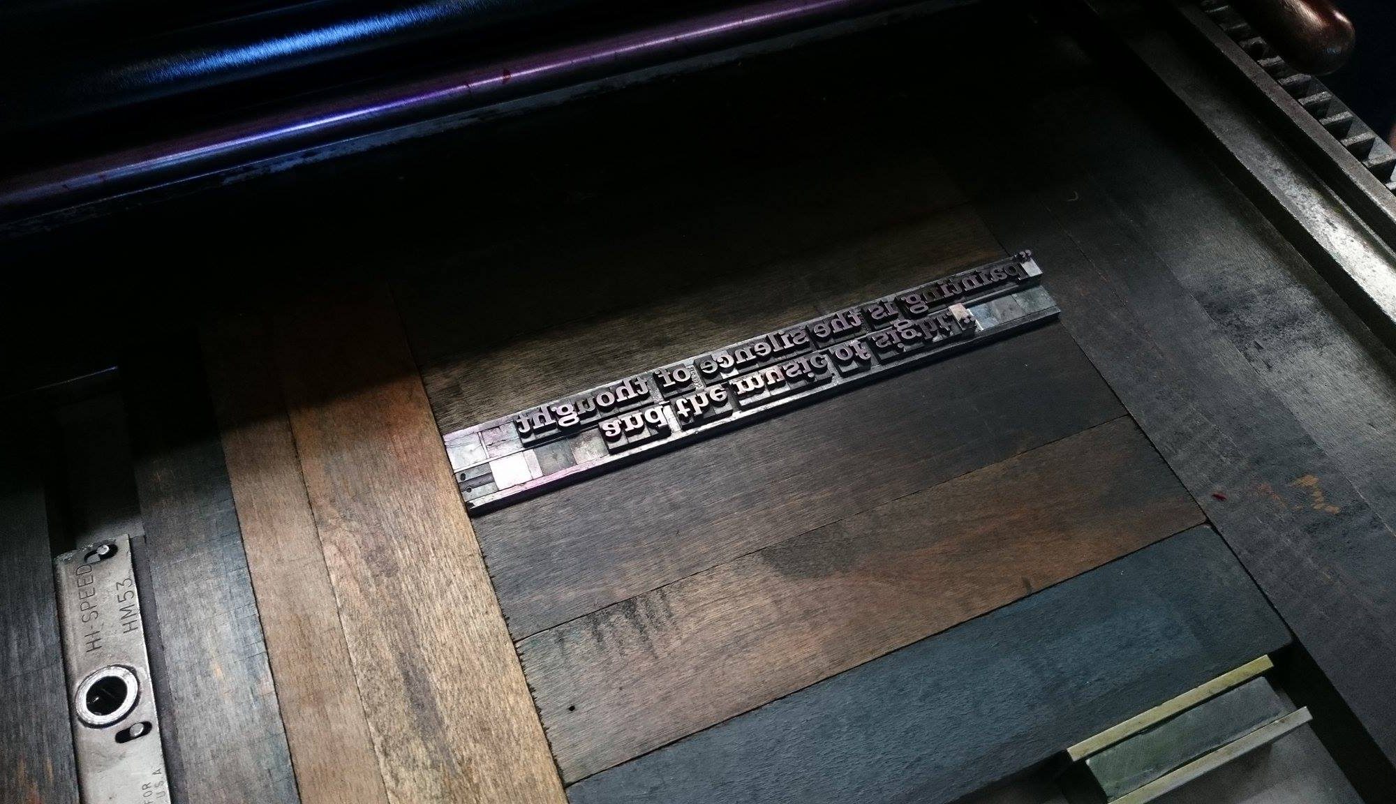
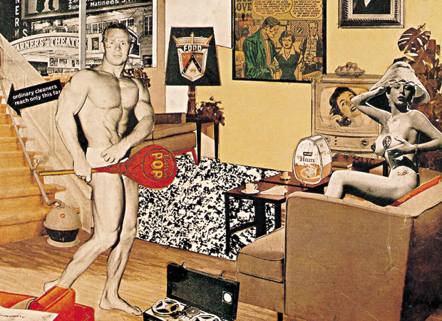
After looking at the Richard Hamilton image in class today, I wanted to look at more collages from the Pop Art movement.  It was so interesting to learn that the term “Pop” originated from this image in regards to the Tootsie Pop. I found some collages from artist Robert Rauschenberg that I though also embodied this style of collage using elements from Pop Culture.

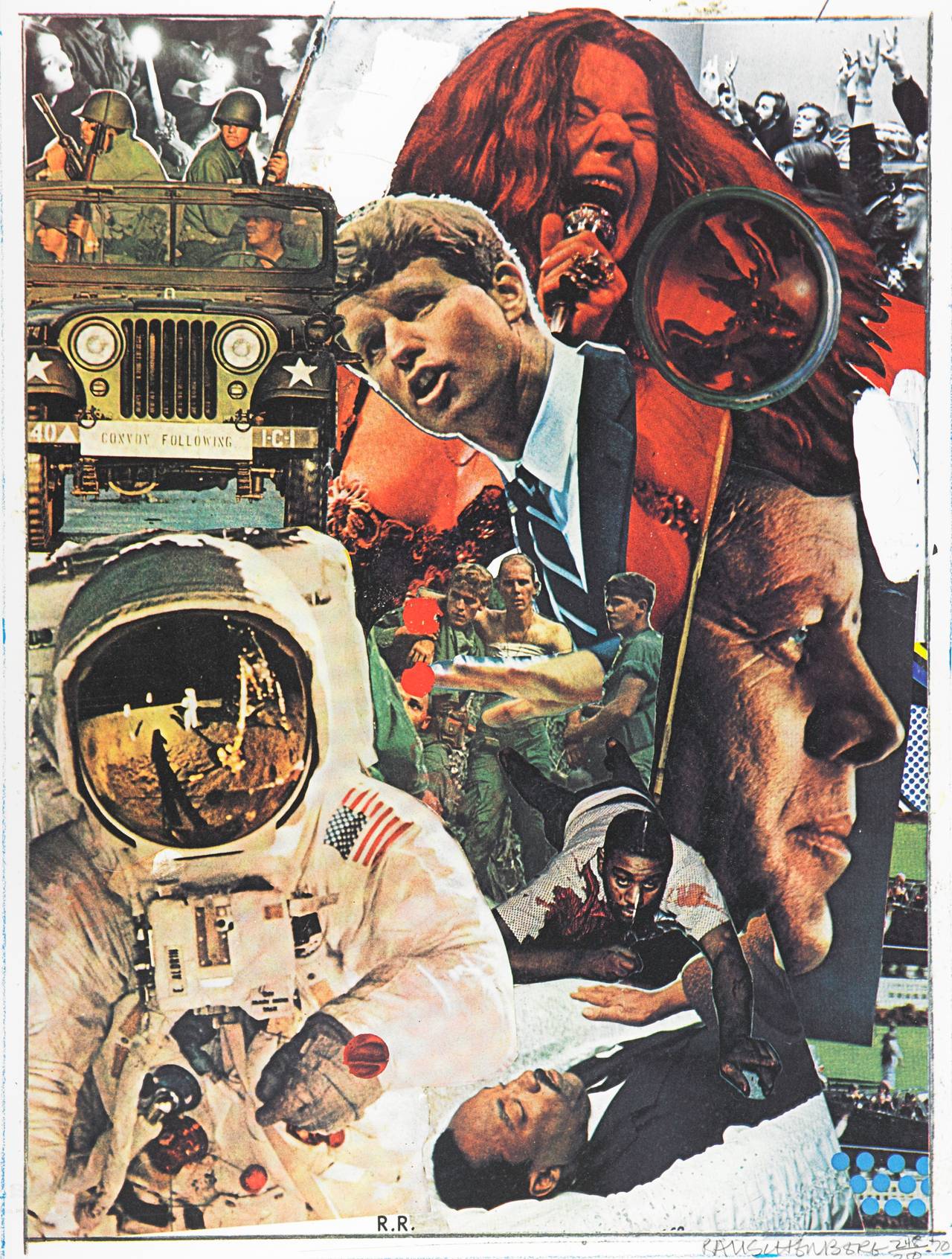
The image above is  Rauschenberg titled “Signs”, 1970. The image conveys a sense of chaos as a multitude of different pop culture elements are assembled together. The image covers everything: peace, war, violence, science, and artistic expression. Seeing the combined chaos of all these historical elements elicits a powerful effect on the viewer.

The second Rauschenberg image (above) is titled “Windward” 1963. This one appears more abstract than the first, with softer edges and more muted colors. I find the addition of brush strokes as an element of the collage a unique part of this assemblage. There is also repetition  and distortion in this image. The image of the statue of liberty is in both corners, with the bottom left image being somewhat darkened out and less hopeful. The Sunkist oranges at the top of the collage are also repeated just below, except the image has been whited out except for one vibrant orange. It’s been fun to look at other early images of Pop Art, and think about the intention of the artist in their compilations and critiques of culture.

Romare Bearden’s Collages

In class today, I found it super interesting to look at the comparative methods of collage that different artists used. One example that caught my eye especially was “Tomorrow I May Be Far Away” by Romare Bearden whose collages captured and commented on African American life. After doing some additional research on him, I found out that his work was influenced both by high modernists like Henri Matisse and by African slave crafts such as patchwork quilts and the usage of random materials due to the lack there of. If we think about Bearden’s work in the context of the definition provided to us in class today of collage – a form of visual art that assembles different forms resulting in a new whole – we can see how he collected different fragments, torn photographs and magazines, to create a powerful message on the African American experience.

Below, I’ve attached a small selection from his larger work called “The Block”, which depicts an entire block of buildings made from collage.  I found this one particularly interesting because of how he depicts different figures with different materials. The figures on the ground, carrying the coffin to the car and congregating outside, don’t have features that are distinguishable and are made from the same blue and white print-like material. This is juxtaposed to the face imbedded into the building on the left, which is an African American human child’s face. It makes the viewer wonder if that face, which is of a completely different scale and material, is meant to be more representative than literal.

Works Cited: http://www.theartstory.org/artist-bearden-romare.htm

Working Title/Artist: The Block
Department: Modern Art
Culture/Period/Location:
HB/TOA Date Code:
Working Date: 1971
photography by mma 1992, transparency #3c
scanned and retouched by film and media (jn) 8_25_04

Political Commentary in Une Semaine de Bonté

When I first flipped through Une Semaine de Bonté over break, it seemed like a book full of bizarre images that were slightly random and hard to draw a continuous narrative out of. Even the chapter headings seemed confusing, including “elements” that mostly departed from the traditional four of fire, water, earth, and air. After our class discussion today though, it is much easier to draw out familiar symbols that make the book possible to read. The elements, quotes at the beginning of each section, and the images themselves all make more sense when looked at together to create a relatively cohesive story.

The first section, Dimanche, seems to be about the corruption of the ruling classes and social elite. The element mud makes sense in this context because it has a connotation of being dirty, just as those with political power, often represented by lion-headed figures, are shown to be dirty through the images of debauchery and corruption that make up the body of this section. The quote at the beginning also ties into this theme. It reads: “The ermine is a very dirty animal. In itself it is a precious bedsheet, but as it has no change of linen, it does its laundry with its tongue.” The fur of the ermine is traditionally used to line the collars of ceremonial robes and the animal can therefore be read as a symbol of royalty. The quote seems to imply that although the ruling class may appear proper and even enviable on the surface, looking more deeply into their actions (which is done through the book’s images) will reveal that they are really involved in disreputable and unsavory actions.

A Few Pressing Thoughts

It was a lot of fun working at the letter press this week and learning about all the instruments, some interesting facts about roots of different words and phrases, and of course making our very own print.

I was really excited to learn how to make a simple print. From how to arrange the letters, to how to ink the machine, and finally how to print.

I was surprised to find that many phrases that I use everyday originated from the letter case. E.g.:
-Upper case and lower case– the capital letters were stored at the top while the small letter were stored at the bottom.
-Out of sorts– to not have enough lead letters to finish a print.
-Missing the deadline– when letters and printing pieces go beyond the maximum area that a machine can print on.
-Hot off the press– well that’s pretty self explanatory.

I also enjoyed making our print. We wanted to be very innovative with out letters so we made the two sentences face each other so that they can be read by readers on either side of the page. This was a cool idea but it took some time to figure out the second sentence because it had to be both upside down and the wrong way round. But in the end, we made a pretty unique looking quote.

We first printed the quote in just red.

Then we printed the quote in just black.

Finally, we tried to overprint the red quote with the black quote. They ended up not aligning how we hoped it would because we printed the red and black on separate days so the pieces on the printing press had been moved. I still think it looks like a pretty cool print even though it was not what we had expected it to look like.

I am hoping the press has open hours because I am definitely interested in going back and making some more prints. I enjoyed the challenge of figuring everything out and the satisfaction of seeing such a unique, neat, final product.

Sayings from the Press

I loved our workshop at the printing press; perhaps even a little more than our illuminating manuscripts workshop because we had the chance to work with actual old printing presses and type. I had worked a little with printing in the past but only in art class where the focus was more on carving out our designs than the actual printing process. It was very much as Professor Rippeon said — the one operating the printing press (rolling the pin, etc.) needs to effectively be a part of the mechanized printing press. There can be no distraction from looking at the print, taking it out, lest accidents happen and so there would have been someone else there to do the “quality control”. I had never before seen it as such an efficient assembly line but after our workshop was able to imagine a little bit more how they would have printed thousands of pages and books manually. Even so, it’s incredible to think of the amount of work and time that went into each printed page.

In addition, all of Professor Rippeon’s fun interjections of sayings that derived from the printing press really inspired me to do a quick google search for other sayings: https://www.instantprint.co.uk/business-boost/everyday-phrases-you-didn’t-realise-originated-from-print. Turns out others such as “mind your p’s and q’s” and even “stereotype” and “cliche” are all “hot off the press”! I always find it fascinating to learn about the roots of sayings and idioms that are still used today, a lot more so than the printing press.

Printing Press

I really enjoyed this week’s exercise, just as I have enjoyed the hands on activities we have done in the past.  One of the most interesting parts of this class so far, have been these opportunities where I have seen resources that, even as a senior, I didn’t know existed on campus.  While I originally found this activity to be fairly challenging because my group managed to put our letters completely backwards more than once,  I think I truly enjoyed our finished product and I look forward to using it in our completed project that is due after break.  I have also attached a few photos from this week’s exercise.  I look forward to reading everyone else’s  responses about this exercise.


Letterpress

I was so fascinated today to learn about the wonderful world of letterpress machinery. I definitely gained a new respect for the craft. I never realized how much work actually went in to getting letters on a page. Microsoft Word makes it look so easy. For example, I took so many things in Microsoft Word for granted like the Font (or typeface), font size, line spacing, words per line, etc. Many of the features that I use every day in Microsoft Word actually came from letterpress. Even though it is so easy to change any of the above-mentioned features in Microsoft Word, it is actually a very physical and arduous process to change it on a letterpress. I could not believe how long it must have taken to press actual novels, especially lengthy novels.


It seems that, just like illustration, letterpress is also an art. Getting inked letters onto a page was a very subjective task. You can arrange the letters pretty much however you want on the page. You can mess with the spacing of the lines, the offset of the characters on the page, the margin width, and so on. Even though we can quickly do this with Microsoft Word, it seems you become much more in tune with the tools you are using when you must physically add line spacing yourself. It is the difference between drawing with a pencil and paper and drawing on a digital pad that transcribes onto a computer. Either way, you are drawing, but pencil and paper attaches the illustrator to the work.

Letter Press Workshop

Spending the past two classes in the letter press workshop has been an incredible and enlightening experience- I really wish we could spend more time here! I now understand and appreciate the attention to detail, the conscientiousness and caution that goes into this craft. It is a far more manual process than I had anticipated, which, in my opinion, makes it a more satisfying art form. Julia and I worked together on a print, and I suggested we use a quote from my favorite author, Joan Didion. It reads: “We tell ourselves stories in order to live.” Although it seemed we were one of the only groups that chose a quote that didn’t directly link to My Name is Red or Don Quixote. Still, I think there’s something universal in this statement. The telling of stories can be equated with the creation of art: an act that is so often necessary, innate even. With the phrase “in order to live,” Didion suggests that storytelling, or writing, and, I would add, art, are a means of parcelling out the world, of absorbing experiences as we go forth. All art forms: writing, painting, printing, etc. become ways to digest lived experience. “In order to live,” to accept the chaos of the world, artists translate life into an accessible visual language. Still, Didion’s use of the term “stories” alludes to fiction, seemingly implying the idea that we strive not to confront the full truth of our experience in these crafts. Art is, then, a coloring of reality, but not necessarily a falsification. I think it’s fascinating to consider writing and visual art in these terms, as a reflexive means of processing the world  and as crafts that can offer both solace and criticism to society.

How do you understand this quote in terms of our class?

Letter Press

Each time we take part in a workshop, I find myself growing more enamored with the people who used to and continue to create with these mediums. Even with help, it took my group nearly the full two days to assemble our phrase, choose a picture and then print the text and the images. The sheer amount of hours that people must’ve spent using the printing press to create books and accompanying images is astounding to me. I did however find a clear difference in the quality. The images and text that come out of the printing press, in my mind at least, are much more aesthetically pleasing than modern print today. I understand the appeal, and why it is that the use of the printing press is still preferred today for things such as wedding invitations and business cards. The quality of the pieces produced is second to none, and the fact that people still look to use printing presses in modern times speaks to that fact. I really enjoyed learning about the printing press, and being able to use one. It’s an activity I’m sure I never would’ve taken part in if it weren’t for this class.

The Letterpress

Spending the last two class periods doing the letterpress workshop helped me appreciate the artistry that goes into using a letterpress. Before the workshop, I had viewed the letterpress as an old tool that had mainly been used to print text in black ink and not as a tool that could be used to design images as well. Actually using the letterpress helped me learn about the planning and design process. An artist must determine where on the page the letters will physically appear and then adjust the spacers and furniture on the machine accordingly. A decision must be made about how deeply the letters should make an impression on the page. For example, when we printed our text with three sheets backing the page rather than two, the letters made deeper indents on the paper. The artist must also determine how dark they want the ink to appear on the page and vary the number of sheets used to back the piece of paper being printed on accordingly. One especially interesting aspect of the design process is the fact that only one color can be used on the press at one time. The artist must determine how they want the colors layered on their paper and then run each sheet of paper through the press color by color.

The process of creating a book with the letterpress must have been an enormous undertaking. Setting each letter into its proper place was difficult and time consuming for one sentence and the idea of having to create an entire page of text seems daunting. Although using the letterpress was fun, I think that it would be more enjoyable to use the press for the creation of cards and posters rather than for books or newspapers. This workshop introduced me to new uses of the letterpress that I was not aware of before and it was a very enjoyable experience overall.


css.php