The creatures in ‘The Arrivals’

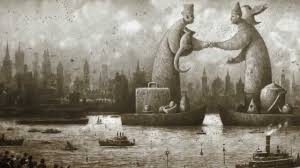
(graph 1)

‘The Arrivals’ for me is a really interesting illustration book not only because of its focuses on immigrations and family structure, but because of its application of imaginary beings into the human world.

For graph 1, the two men standing on boats with all their belongings aside. The left man looks more like a western figure due to his hat, suitcase and the British teapot, while the right man looks more like a Eastern figure with his little triangle hat, the Chinese teapot and the pigeon on his shoulder symbolizing peace and friendship. The conflict and encounter of these two cultures and the way they shake hands are an indication: the place where the protagonist moves to is a place full with immigrations. It also shows the protagonist’s high expectations on his future life in this strange city.

(Graph 2)

For graph 2, it is the bird-eye view of the whole city. The whole image is set in a peaceful tone. Besides the different languages it uses and the status of the creature holding an egg, it looks like any industrialized city in western countries: the smokes, the cross on the top of the church, and the crowded constructions. The status of the creature can be a sign of development and protection from god. The wings are like those of an angel and the egg could symbolize protection or baby Jesus.

(graph 3)

For graph 3, however, the theme is totally different. It includes fear, power and catastrophe. The creature that should be the symbol of the theme turns out to be human beings ourselves. It also reminds me of Nazi and their chemical poisons.

I really love the way Shaun Tan uses creatures to represent humans’ society. What do you guys think?

‘Miss Potter’ and her Peter Rabbit

The movie ‘Miss Potter’ that we watched in the last ten minutes in class really drives my attention to Beatrix Potter and her adult’s imagination of childhood. Even though we only watched the very beginning of the movie, it is not hard to find out that, there are two main lines in this movie– the publication of the story ‘Peter Rabbit’ and her creation of Peter Rabbit in her childhood.

There is a scene in the movie when the publisher visits Miss Potter in her house for the first time and acts like a rude young fellow. Miss Potter is surprised to see his obtrusive behavior due to her education from a upper middle class family. However, the book Peter Rabbit reveals the opposite side of her– admiring nature and freedom. It seems that, the publisher awakes her hidden childlike quality and plays an important role in completing Peter Rabbit.

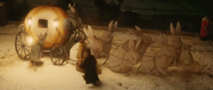
The picture inserted in this post is from the scene when Miss Potter and her brother are about to go to bed while their parents are going to this banquet. She leans on the windows and watches her parents getting on the carriage. All of a sudden, the horses turn into huge bunnies and the carriage turns into a pumpkin lantern cart. The sudden transfer of scenes mimics the transfer from reality to imagination, which is exactly how children’s imagination works when they read children’s books. It may also represent the rebirth of her childhood characteristics.

The movie does a good job in personalizing the author through both connecting  her closely with her work and connecting her work with her experience. The beautiful and warm colors used in the movie also follow along the tone of Peter Rabbit.

Collage workshop

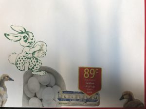
The Monday’s Collage workshop was so much fun. Because of the Julia Jacquette’s exhibition on meat and salads, my eyes were  immediately to the supermarket promotion pages and found the bowl of eggs in the image above. The eggs then reminded me of the past Easter and bunnies, so I looked through another magazine called ‘Easter Ideal’. The green bunny on one of the pages was really catchy. At the moment I saw it, I started to wonder if I could not only create a picture, but imposed a story about the green bunny stealing eggs from the ducks’ houses like those stories in children’s books. Also, I am always wondering about the origin of Easter and its relationship to eggs and bunnies, so it will be great to have another story to tell kids about Easter just like Santa Claus to Christmas. Thus, I found two ducks in the same magazine and the only thing left would be the background.

I should have done the background first before I glued any of the figures. I started to realize how hard it was for Max Ernst to build the structure in his minds and finish the whole book in three weeks. He must have had a nature of talent and a passionate soul to work days and nights on it. Since our class will cover another children’s book on bunnies next week, I figure it would be a good idea to include this collage into the final illustration project.

Julia Jacquette and her element of water and food

After this morning’s lecture and tour, I learned a lot about the elements Julia Jacquette chose for the book and the exhibition, and the meanings after the elements. Among the many elements such as the food, consumption posters, library resources, feminism and water, I am most interested in water and food, because they act as such common but unique elements in daily life.

As told in the tour, the two huge shadows of the water pools were selected from other small images exhibited as the side. It is really fascinating how water plays not only as life support but as a camera or an document. It records the interaction of people’s life, but since the shadow in the water is too easily disappearing, it hints at the fleeting of lifespan. Also, it shows the audience how variety of a object can be used.

Also, I find two other images– the one painted from the meat leaflet and this other one with different salads and dressings. Food can be really personal and sensitive as for indicating one’s personality. Different from other images exhibited, these two images feel more personalized and intimated. They connect the audience with the artist in a way that, audience feel a sense of belongings in the exhibition and pull art which seems like a remote and undefined terms closer to the audience.

Therefore, the most moving part of the exhibition of Julia jacquette for me is how she makes art is a daily life element and how good she is at using those elements to create an art that’s close enough to real life, but still above the real life.

Comments on The Gashlycrumb Tinies

The first thing I find interesting is about the use of times. The ‘tinies’ are all experiencing near-death, but Edward Gorey uses past times to suggest that, they would not be rescued and that they are meant to die.  Also, in some of the 26-letter story, the children are not dying, but seem to play for fun without the illustration of the texts below, but for others, it is clear that, they are died in a tragic way.

I think, the use of 26 letters symbols the situation of the whole society which includes everyone. The names after each letter further support his idea.  Also, the magic of this story is that, without the texts below, the image cannot be fully understood. For example, for letter Y, it says, ‘Y is for Yorick whose head was knocked in.’ The question raised here is who knocks Yorick in and where, because in this image, it is only Yorick standing in front of the wooden-like cylinder, constantly starring at it with curiosity. I guess Gorey here wants to illustrate something that is between children’s book and the adult’s book. Because when it is children who are reading this, they only look at the image, but for adults, because we are always told to read and analysis in class, we will look at the texts first. This difference gives children and adults a completely opposite view of this single image.

One last thing about his story is that, the children only contain one really tiny part of each image, which sends the messages that, humans are only small parts of the world, but they think of themselves as the ruler. And this is an obvious difference from Gorey’s work and typical children’s books– children’s books are all about the characters’ stories, but Gorey’s work is about the environment that contains the characters.

Thursday-the blackness

Blackness is to hard to define and demonstrate with images, because the word only describes a status, but not a real material that can be  touched or directly depicted by the use of language. However, Max Ernst, in his section of Thursday, uses a roster in almost every picture throughout the Thursday story as an observant. It quietly watches everything happening and turns into different forms. For example, on page 152, the roster becomes the main nobility in the scene, wearing a fancy fur and attending the scene as he is no longer an observant.

His existence suggests that the there is always brightness coming after the dark and the roster is the symbol of awaken and awareness of the hidden meanings of the whole book– what’s behind violence, blood, death and manhood?

The creation is about birth, hope and nature, but even though all seven days match the description in the creation, the themes are merely the same. For example, blackness– the word for Thursdays is all about monsters coming out of the darkness of the human minds. The roster can be the Max Ernst who sees through the frost and stands outside the crowd to reveal the truth.  Also, the scenes in Thursdays contain mostly women who either are the victims or the witnesses of all the tragedy.

So what do you think about the meaning of the roster? And the hidden messages in other scenes?

Don Quixote’s book cover and idea

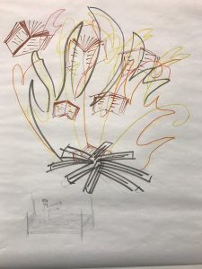
This is the cover Marie, Jack and I designed for Don Quixote in class today. At first,  we were thinking about drawing the typical scene– Don Quixote holding the shield and the spear on a skinny horse and his servant Sandro on a donkey. But then, it turned out to be really difficult to design a unique one without destroying the theme of the cover, so we decided to show the scene when the priest burned Don Quixote’s knight novels without notifying him.

According to the book, Don Quixote was not supposed to know what happened because people who burned his books told him that, there were never books, but they did only leave some of Don’s collections and hid them in the sealed library. However, we still decided to draw Don Quixote on the left bottom of the cover, waving his hands and legs in bed to show his anger. The fire and the burning books take up most space on the page, because we want it to be Don Quixote’s perspective of witnessing the fire. His fear of losing his books and dream enlarge the size of the fire as if the fire is burning on his heart.

Due to the time limit, we did not have time to write the title on the cover. Our idea was to fill the book title on the bottom right corner. What I like about this cover is that, it is not a typical Don Quixote’s cover. It doesn’t include windmills, or the horse or any of the popular scenes in the story, but it still reveals a certain aspect of Don Quixote’s craziness and the mockery of his knight dream. The burning fire also implies the ending of the story that, his dream to a knight would never come true.


Comments on images for Don Quixote

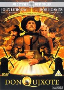
This is a poster of a 2000 film called Don Quixote. On the poster, Don Quixote finally has his dream to be a knight come true. Such a positive image with none of his typical triangle hat, spear and the thin horse only reveals the inside beauty of his characteristics. The two windmills in the background are really a spark of this poster, symbolizing that Don Quixote conquered the giants as an extent to the story.  This poster shows that the movie must be more focused on the legendary journal and Don’s influence on the readers rather than the reality and the mockery in literature.


.

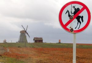
This is definitely a light mockery to the story. The owner of the windmill owns a sense of humor that applies the story to real life. This is such a funny picture that I just can’t help not to post it. It can also be a way to indicate that, the story is really popular and thus, influence the values of generations to generations.

The third image is still about the windmill. In the picture above, he wears his typical outfits and rides towards the windmill as if he is attacking some enemy. What I like about this picture is that, it is really suitable for a illustration in the book for children. It reveals nothing scary and pathetic about Don Quixote, but only shows the story itself. The artist tries not to have an attitude in this picture or he must have like this hero-like figure, because he blurs the fact that, Don is a fake knight in his 50s.

This is how different images can change the themes of the texts and reveal different authors’ attitudes. What do you guys think about those images?

The tale before the invention of papermaking

The revolution of papermaking experienced a long progress starting from 105 CE in ancient China. Cai Lun mixed mulberry and other bast fibres along with fishnets, old rags and hemp waste to invite the first sheet of paper. Around 6 CE, paper was widely used as toilet paper and tea bags. Later in 9 CE, paper-printed money was officially applied all around China.

Before the invention of paper, writing materials in China, different from the western world, included bamboo slips, wooden boards and tortoise shells, while the parchment paper was the luxurious raw material for the Bible and praying books.

The difference of the selections of materials before paper is mostly due to what the region is suitable for planting and what people used to make a living for. For example, in Europe, farming and animal caring were the two main sources of food and shelters, but in Asian, especially before the invention of paper, the source was from the harvests of crops and rice. Not only the region differences, but the influence of religions is crucial. Christianity was built on the bright colors such as gold, silver, blue and red and the architectural style tended to be overly ornate, while, for Buddhism, simplicity was the core of the dogmas. The tortoise’s shells were the representation of nature and longevity as well as the bamboo slips were symbols of peace.

What do you think  are the other factors of the differences of the selection of raw materials before the invention of paper?


The color of Virgin Mary and the meanings behind those colors in different illuminated manuscripts.

The colors of Virgin Mary’s clothes always include one most important element– blue. Blue is the symbol of peace, royalty and nature, which is the quality of a great mother of Jesus and the example of females in the traditional biblical culture.

On the  cover of the ‘Books of Hours’ , wearing a pink cape and a blue dress inside, Virgin felt the Christ Child in her womb with the greeting of St Elizabeth.  Another one of the uncountable examples from the book would be plate 29. A young man kneed before Virgin Mary and her child, praying ‘I beseech you, holy lady!’ The blue is the same blue except that, it decorates a fabulous cape with delicate golden edges.

However, other colors were also used in the portrait of Virgin Mary, such as orange, pink and white in different scenarios. So my question would be: what are the symbols of these different colors? What do those colors illuminate or hide? What roles do colors in general play in the depiction of the glorious figures?

css.php