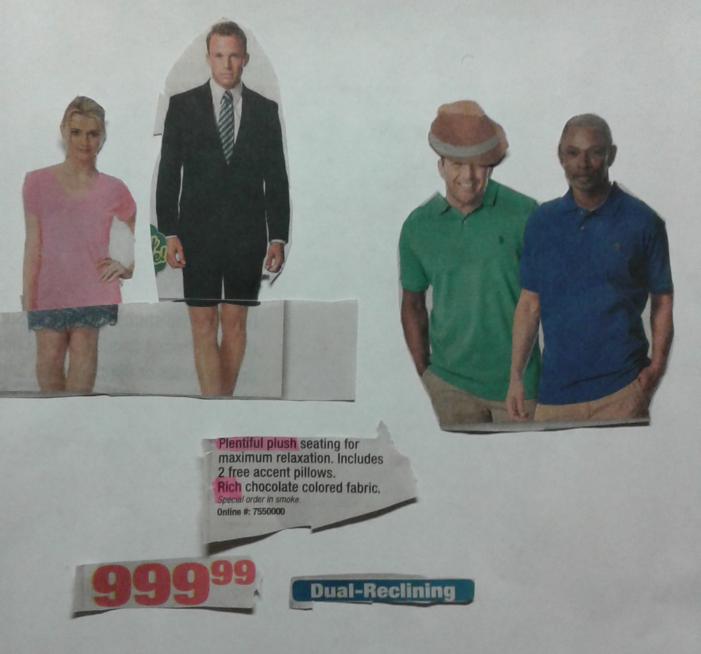
American Beauty

I really enjoyed the activity we did on Monday. I was trying to deal with themes of body image and the narrative that American fashion places on people of all genders. I know the idea has probably been done before by collage artists, and I am sure it has been tackled by artists that work in other mediums, but it was a new area for me to tackle. I wanted to show the absurdity and specificity of the American standard for “what looks good”. I was also interested in how that is portrayed. I felt that the catalog portrayed a strong sense of male and female archetypes in order to sell the images. The men and women wore typically straight cis-gendered clothing that appealed to the typical traits of masculinity and professionalism, and femininity and style, respectively. I wanted to play around with these images to see what implications arose when I mixed and matched the traits of the different traits the models seemed to portray. So, I cut out some of the heads of the models and placed them on the bodies of different models. I also replaced some of the men’s legs with women’s legs.

I was inspired by how the catalog creators chose the images and the models they thought would appeal to a general audience. They had men’s bargain suits, blazers, and pants. They also had women’s blouses, pants, purses, and hats. These are pieces of clothing that everyone needs at some point in their life (women’s accessories and the men’s clothing are not everyday essentials, however). In other words, the catalog, based on the items it featured and the models it featured, is meant to appeal to everyone between the ages of 18 and 55. The catalog creators do not necessarily want to discriminate a certain demographic from buying their material. On the contrary, they want everyone to buy their products – they want the most business possible, after all. However, I did find it interesting that the models they showed wearing their products were mostly young or youthful-looking, attractive white men and women. This, of course, is nothing new – catalogs and magazines have always used these kinds of models because that is what looks best and that is what sells their product.

The problem for me arises when companies expect people who do not look like their models to buy their products. Again, this is nothing new and I am sure most people have recognized this by now, however it exposes a problematic presumption that companies have about the American consumer: it is that the American consumer will buy anything in a catalog that looks appealing in order to make themselves become more appealing. Why do we automatically default to young, white attractive people when considering if we should buy something to make ourselves look better? The obvious answer is that the majority of people who look at these catalogs will likely be white. But what about the people who are not white? Are they to buy the items from the catalog too? There is an unintended arrogance embedded in the composition of these catalogs that non-white consumers should buy these products even they are not considered or minimally considered. That said, there were a few black male and female models. To be clear, it’s not that having predominantly white male and female models is inherently wrong – on the contrary, it makes sense to have so many of these kinds of models. But, in an America headed by the Trump administration (and all the social implications that that title entails), and in a time when Americans seemingly or split on key societal issues, it is worthwhile to take a closer look at images we so often take for granted and deconstruct why we believe in them or why we agree with them. The same arrogance (or ignorance, or apathy) that catalog creators have when catering to its audience, is the same arrogance that Donald Trump has as he sets the tone for his presidency in a post-Obama America. In turn, this arrogance will inevitably be “bought” by those who choose to support him and so lives on the cyclical nature of arrogance. It is not that Donald Trump is necessarily a bad person, just like the catalog creators did not set out to marginalize minorities, it is that when these images and ideas are consumed by the masses, we are buying into ideologies that may end up hurting us.

Jacquette Exhibit

Although I did not get to see Julia Jacquette in person, I did visit the installation at the Wellin. I was enthralled by Jacquette’s “American advertisement” exhibit which engages with contemporary art in the form of advertisement. The exhibit exploits the methods through which American advertisement convinces viewers to purchase products, while critiquing that very behavior. Jacquette took pieces of American fashion and beauty magazines and painted them on a large scale. The effect is what often looks like a close up shot of a Coca-Cola advertisement, but instead is an expanded version of a 4”x4” cutout of a picture of a dress. The size of these images in the Wellin make the statement that our coveting for new products is a phenomenon that encompasses the American experience. The colors from the above piece are an inviting shade of caramel and white. Vogue Magazine, one of Jacquette’s influences for this project, intends to immerse viewers. I have long been interested in how artists for companies make art for advertisements. Beauty magazines often eschew uplifting substance with vapid images of blatant consumerism. An entire industry that is just devoted to selling products. There are no column pieces or editorials sharing interesting points of view on societal issues. Instead, there are only pictures that enchant viewers into buying their products. Jacquette seems to recognize this phenomenon of American consumer’s fascination with magazines and general consumerism. In addition to recognizing it, she aims also to show what captivates us about the lust for more, but she also critiques the companies that feed off of America’s consumerist society. In summary, even though Jacquette, once again, adds to the consumerist cycle by displaying these images for more people to see thereby supposedly giving the original company’s products more exposure – it is the company that loses in the end because there name does not appear on any of the pieces. Maybe this is the answer that Jacquette puts forth: we must take back the beauty that “they” try to sell us and recreate it for free.

Letterpress

I was so fascinated today to learn about the wonderful world of letterpress machinery. I definitely gained a new respect for the craft. I never realized how much work actually went in to getting letters on a page. Microsoft Word makes it look so easy. For example, I took so many things in Microsoft Word for granted like the Font (or typeface), font size, line spacing, words per line, etc. Many of the features that I use every day in Microsoft Word actually came from letterpress. Even though it is so easy to change any of the above-mentioned features in Microsoft Word, it is actually a very physical and arduous process to change it on a letterpress. I could not believe how long it must have taken to press actual novels, especially lengthy novels.


It seems that, just like illustration, letterpress is also an art. Getting inked letters onto a page was a very subjective task. You can arrange the letters pretty much however you want on the page. You can mess with the spacing of the lines, the offset of the characters on the page, the margin width, and so on. Even though we can quickly do this with Microsoft Word, it seems you become much more in tune with the tools you are using when you must physically add line spacing yourself. It is the difference between drawing with a pencil and paper and drawing on a digital pad that transcribes onto a computer. Either way, you are drawing, but pencil and paper attaches the illustrator to the work.

New Revelations

This week I realized the challenge with creating images for texts. I did not realize the level of thinking that went into making pictures for texts. It never dawned on me that in order to make pictures for a widely-read novel like Don Quixote, the illuminator has to ask himself so many questions. For example, in regards to representation there are many ways to represent a character in a text. Each way you express that character visually can change how the patron or the viewer will perceive that character. For example, today we looked at two different versions of Don Quixote. Each depiction showed each artist’s interpretation of Don Quixote’s characteristics and motives. One depicted Don Quixote as a rose-eyed intellectual that is haunted by his thoughts. It placed emphasis on Quixote’s disturbed mental state. However, the other depiction was much simpler. Drawn with pencil it simply featured a general outline of Quixote on his travels. This appeals more to Quixote’s journey rather than his mental affliction.

When considering making my own illustrations for texts, I realized I had to understand the goals of the subject that I am drawing. As someone who enjoys analyzing films, I often make the connection to a film writer’s choice in creating a character on the big screen. “What is the character’s socioeconomic status in society? They must dress as such. What does the character want to become? What do they want to avoid? How can we show that tension visually?” These are all thoughts that a film writer and director make when creating a character for film. In the same way, I have to ask myself the same questions when it comes to writing illustrating images for text.

What are other people’s thought processes on creating images for text?

css.php