My Personal Experience as a “Legal Alien” in the U.S.

This particular page really resonated with me. For those of you who do not know (or haven’t been able to tell from my accent), I am not American. I was born and raised in Tanzania and the first time I came to the U.S. was in 2013 to start my freshman year here at Hamilton. In order to be able to legally stay in the U.S., I had to get an F-1 student visa. To do this, I had to go for an interview with the American Embassy in Tanzania. My experience was actually exactly like this man’s. I went through all the emotions the man is going through, and weirdly enough, in pretty much the same order. Below is a shortened transcript of my interview in association with the images above:

Image 1-2: 
Lady: Your name and documents?
Me: (A little confused by the lack  of a greeting and unable to initially understand her strong American accent.)

Image 3-6: 
Lady: (Already visibly annoyed by me) Your name and documents and why you want a visa?
Me: Umm, Neema Lema. I got accepted into a college in the U.S. so I’d like a student visa.

Image 7-8: 
Lady: What proof do you have of not using this visa to permanently stay in the U.S. instead of you eventually returning to Tanzania as you should?
Me: Well, I have no family in the U.S. My entire family is here in Tanzania. They will be my reason for returning to Tanzania when I’m done studying.
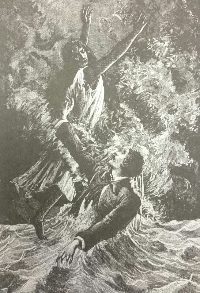
Image 9: 
Lady: What will you study in college? And what exactly do you plan to do with your degree post graduate?
Me: I have always been interested in Economics, particularly Development Economics. Uhh, well, I am not sure now what I’ll do with my degree. I am hoping to use my years in college to figure that out.
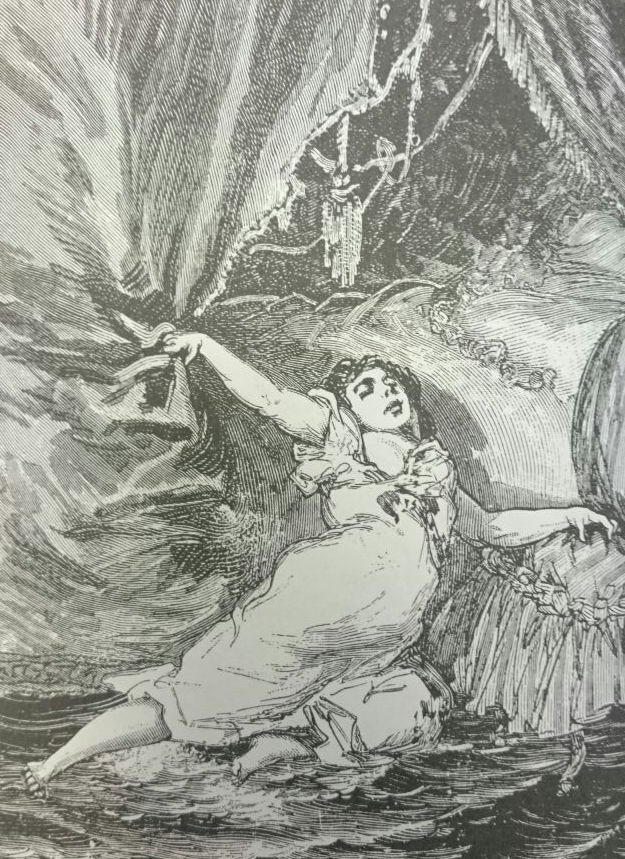
Image 10-11: 
Lady: So what you do not know what you want to do with your life.
Me: (After being extremely shocked and offended by her response, I get incredibly worried and the worst thoughts all flood into my mind: Had I just messed up my chance of getting a visa because I didn’t have a solid life plan to lay out for her? She had denied almost 10 people in a row a visa just before me so why should she break her streak now? How do I tell my family I won’t be able to attend college after the high hopes and their huge financial investment in me? I have no back up plan if college doesn’t work out, oh Lord what now?!)
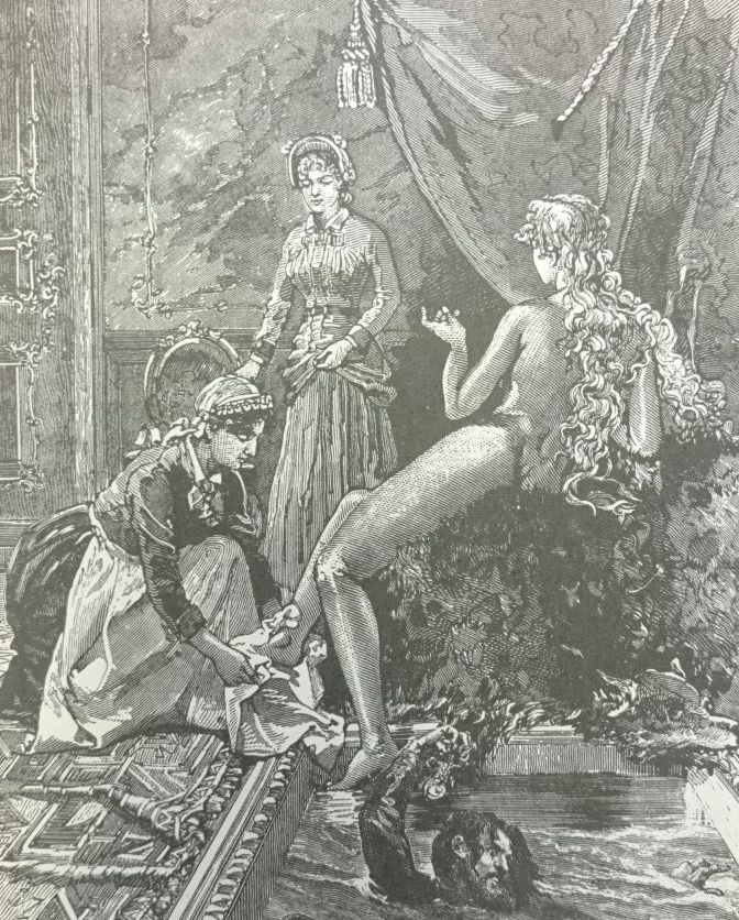
Image 12: 
Lady: (Silent, hasn’t said a single word to me in almost 3 minutes as she busily types things on her computer.)
Me: (Still drowning in my fears and worries for what seems like the longest wait of my life.)

Seeing as I am here at Hamilton, you can tell that this negative experience had a positive ending.

This interview was the first time in my life that I felt I was different. I had always lived in a place where everyone else was pretty similar to me. But after this interview, I felt the weight of a thousand negative labels on me- just like how they are weighing down the man in the images. I wore those labels when I started Hamilton and they made me insecure about my accent not being understood, offended by the African stereotypes people associated me with, and hurt when people did not believe that I was smart enough to belong at Hamilton simply because of where I am from. I am proud to say that I felt like I have shed all those negative labels and that helped me thrive at Hamilton. The only labels I will be wearing, and proudly so, in a few weeks will be “Hamilton graduate class of 2017,” “Economics major,” “Art minor,” “recipient of 12 academic honors.”

Shaun Tan’s lack of words helped me to easily draw on my own experience while reading this book, which elicited a greater emotional response from me than I would have had had Tan explicitly described this man’s personal experience. Tan’s powerful way of telling a story through images alone made this my favorite book of the semester.

Down the Rabbit Hole from Potter to Disney

Before this class, I had never read Beatrix Potter. So while reading Potter’s The Tale of Peter Rabbit, I noticed a number of similarities to Disney, which I did grow up reading and watching. It appears Disney took many cues from Potter for the characters that it has created for its various fairytales. Here are a few examples:


Mama Rabbit’s blue dress and white apron looks a lot like like Alice’s from Alice in Wonderland.


Like Mama Rabbit, Snow White cooks on the same kind of apparatus for those who are under her care.


Peter and Snow White both communicate with woodland creatures.


Peter and Cinderella both communicate with mice- well the mouse wasn’t all that communicative with Peter.


Also like Peter, Cinderella left her shoe behind.

Some of these examples may just be coincidences, but it looks like Disney took a lot of inspiration from Potter. To me, it feels like these things are more associated with Disney than they are with Potter. Disney made things like the Alice’s dress and Cinderella leaving her shoe more iconic. This begs the question, did Disney pay homage to Potter with some of these illustrations, or did Disney plagiarize Potter? 

“Playing Was Different When I Was a Kid”

For my final project, I will be working with the book My ’70s Book: The “When I Was A Kid…” Book For The Generation That Grew Up In The ’70s by Darryll Sherman. In this book, the author is reminiscing about the good old days and various forms of play that he participated in as a child. He talks about how he played outside, played board games, played cards, played the piano and various other things. He also comments on how children’s play now is so different from what it was back then. Nowadays, play largely involves technological devices. He personally prefers his version of play (and I agree with him!)

I chose the book after the collage workshop. I was lucky enough to find a story that fit my collage. Currently, the collage shows a man (the author) recounting his childhood to his wife. Underneath them are the memories of his play. The chess board represents the board games that he played. The three characters in the front are the author, his brother and his sister who he mentions in the book.

Now that I have the book, I will add more elements from it to the collage such as music and instruments. I will also add a quote from the book. I will do some more collaging and draw somethings by hand or use what I will learn in the digital workshop. I am excited to finish this project!

Also after making this collage, I really admire Max Ernst. Cutting and pasting images turned out to be so much more difficult than I had initially anticipated. I commend his patience and how quickly he completed entire stories completely in collage. Props to him!

All that Glitters is Jacquette’s Gold Paintings

It was such a privilege getting to speak to Julia Jacquette today and have her walk us through some of her paintings and the thought processes behind them. The longer I looked at the paintings, the more impressed I was. For some of her paintings, Julia used advertisements as inspiration. I was very impressed by how she managed to pick out these beautiful intricate aspects of advertisements and paint them in a way that is so realistic that I had to do a double take when I learned that they were not photographs.

I was particularly drawn to Julia’s “gold paintings.” I like how she is able to use whites, browns, yellows, greens, and purples to make a painting look gold.

My favorite painting by far is the one of Charlize Theron’s J’adore Dior gold dress detail. I cannot gush enough about how beautiful and accurate this painting is, so I will let the comparison between the painting and photo speak for itself.


I also really like this painting with a similar color palette- the painting of a whiskey glass.

Even though this painting is not gold, it is in the warmer temperature hues, so close enough. The bottom left face reminded me a lot of Mandy Moore. I wonder if she is who Julia painted there? Do the other faces remind you of any celebrities that you know?

Perceived Timelessness

I usually try to pay particular attention to small details and I get really excited when I notice them, especially recurring ones. Gorey’s Amphigorey provided me with a plethora of these. One story with these subtle details is The Doubtful Guest.

To be honest, I did not notice this detail until the very end of the story. I did not know what kind of time period this story spanned until the very last image under which Gorey tells us that this story is 17 years long. After learning this, I flipped back through the story to look for evidence of this passage in time. I followed the guest and it didn’t seem to change with time. But then again, it is a creature that is unknown to us so maybe one of its characteristics is that it does not age. I then decided that the best way to follow the human characters was to count how many there were and see if they changed as the story progressed. I followed the four adults and they did not seem to change that much throughout the story. Then I paid attention to the little, fair haired boy and finally found evidence of this passage of time!

In the beginning, the boy is very young. Young enough to be clinging to, who I perceive to be, his mother’s hand and where a typical English boy’s outfit.

As the story goes on, the boy grows up a little and wears more grown up clothes and is a little more independent.

By the end of the story, he is so grown up that he is roughly the same height as the adults, and is dressed in very formal, grown up attire.

I think I did not notice the little boy at first because I was more interested in the creature and following all the peculiar things he did. I was also interested in the adults because they showed an active response to the creature, whereas the boy was just a passive observer in all these shenanigans. It is beautiful how Gorey incorporates very subtle details in his stories. They add more depth and nuances to the stories than the readers initially recognize when they read the stories for the first time.

I Guess Mondays Are Universally A Nightmare

In Une Semaine De Bonté, Max Ernst portrays Monday as a great flood of destruction. To understand that this was a commentary on technology and industrialization, one needs to know the historic and economic context of the time period in which Ernst created these collages. I personally did not know that this was one of the interpretations of these collages until today’s lesson.

Up until today, I was convinced that Ernst was depicting a woman’s recount of her nightmare to her maids. I guess the prominence of sleeping women throughout Monday is what made me reach this conclusion.

I thought pages 41 to 47 show the horrible dream that a woman was having.

Then pages 48 to 51 show the slow switch from the dream to reality because we see the woman in the real world as well as the water from the flood in her nightmare.

Then on page 53, we see her telling her maids about her dream in the real world in real time. I decided that this was the real world because of the lack of violent flood waters. Then on page 54 to 67, we are taken back to her dream world and we see the rest of the dream that she is telling her maids about.

Maybe this was just me projecting my own (and perhaps the popular) opinion of what a nightmare Mondays are. In my case it would be because of either having a flood of unfinished work from the weekend, and/or receiving a flood of new assignments on top of the ones I am yet to complete. 

This is the beauty of a novel without any words. It leaves the images up for countless different interpretations by the audience. These interpretations usually reflect the reader’s emotional state, mental state, or subjective opinions on certain matters, which was definitely the case in my understanding of the collages.

A Few Pressing Thoughts

It was a lot of fun working at the letter press this week and learning about all the instruments, some interesting facts about roots of different words and phrases, and of course making our very own print.

I was really excited to learn how to make a simple print. From how to arrange the letters, to how to ink the machine, and finally how to print.

I was surprised to find that many phrases that I use everyday originated from the letter case. E.g.:
-Upper case and lower case– the capital letters were stored at the top while the small letter were stored at the bottom.
-Out of sorts– to not have enough lead letters to finish a print.
-Missing the deadline– when letters and printing pieces go beyond the maximum area that a machine can print on.
-Hot off the press– well that’s pretty self explanatory.

I also enjoyed making our print. We wanted to be very innovative with out letters so we made the two sentences face each other so that they can be read by readers on either side of the page. This was a cool idea but it took some time to figure out the second sentence because it had to be both upside down and the wrong way round. But in the end, we made a pretty unique looking quote.

We first printed the quote in just red.

Then we printed the quote in just black.

Finally, we tried to overprint the red quote with the black quote. They ended up not aligning how we hoped it would because we printed the red and black on separate days so the pieces on the printing press had been moved. I still think it looks like a pretty cool print even though it was not what we had expected it to look like.

I am hoping the press has open hours because I am definitely interested in going back and making some more prints. I enjoyed the challenge of figuring everything out and the satisfaction of seeing such a unique, neat, final product.

Just a Man on a Horse and some Windmills

After class, I was interested in looking further into how various artists have illustrated Don Quixote. By doing a few simple Google searches, I found dozens of beautiful pieces of art (and with a lot of thought and indecisiveness, I narrowed it down to 9 images to include in this blog).

The primary commonality that I found in all of them is that they include a man, a horse, and windmill(s). When these three icons appear together, they make a piece of art identifiable as one that relates to Don Quixote. This illustrates to me the importance of knowing the story when creating an image from it. All these artists knew that those were the aspects that stood out in the story, and would therefore be familiar to the audience. 

I really appreciate the different styles that each one of the images below have. The fact that they all look so different yet pertain to the same story speaks to how classic the story of Don Quixote is. All of the artists created pictures that are an extension of the story, instead of images that told a story of their own. Because of this, they portrayed the same story, but in the different, unique styles of their respective artists.

Below are the 9 images that I selected. My personal favorite is the very last one because the style is quite similar to my country’s, Tanzania’s, cultural art. Which one is your favorite and why?


My Illuminating Journey

I decided to make my illumination a present for my best friend. He is the biggest fan of the European soccer team, Manchester United. Because of this, I chose to center the illumination around his name and Man United.

I started by drawing a T because that’s the first letter of his name. I then drew the Manchester United logo  behind the T.  I realized that if I took away the ball on the right side of the logo, it would make a C, which is the first letter of his surname. So I decided to have two, instead of the usual one, historiated letters in my illumination. I drew a red devil fork wrapping around the T because Man United’s nickname is “The Red Devils” which explains the character in the logo. I added some decorations in the fork and the C, along with some simple borders. I lay down the initial line work with pencil then went over it with black ball point pen (because it doesn’t bleed when painted over).

I used watercolor to paint some of the areas, then added gold leaf. It was the most tedious part of the illumination. It took a lot of time and patience. It took me a total of 2.5 hours to add gold leaf to the 16 areas that I put it on.

I initially thought my drawing was complete as it is in the image above. But I realized that the T, the most important part of the drawing, was being overshadowed by the darker, more detailed elements. To solve this, I stained the white background black using ink. The contrast between the dark background and the bright yellow T shifted the focus to the T, which is what I wanted.

Here are some details of my final illumination.


I used a lot of red and yellow because those are the colors of Man United’s logo and home jersey. I also used a lot of blue because that is the color of the team’s away jersey. There is also a “hidden” very cheesy message in it.

I really enjoyed creating this illumination (all 15 hours of it) and I am happy to have learned a new style of art. I am curious to know what everyone else did for their illuminations and what their final piece looks like! Post photos please! 🙂

Put Some Respek on Illuminators’ Names!

Today we had our first scriptorium workshop. I left class with a new found appreciation for illuminations and their illuminators.


First, I saw how the paints were mixed. It is a meticulous process that takes time and patience to start from powder and water to eventually obtaining paint of the consistency that the artist wants. The paint also dries very quickly so the illuminators must have had to either work really quickly, or continuously keep mixing small amounts of paint.


I then moved on to creating a historiated letter. After one hour, I had only finished putting down some simple line work. I hadn’t added any details yet. When I look at the details in the illuminations in the Book of Kells, Book of Hours, or Très Riches Heures, I am stunned by the amount of time it must have taken to complete them.

After class I started thinking about how I have only done drawings that I have got to keep. I cannot imagine having to produce an illumination for someone who commissioned it. Furthermore, the illumination would have to incorporate all of the specifications that the patron wants in it. The fact that many of the patrons back then were rich and powerful would add extra pressure to produce a high-quality piece.

I also thought about how I was only able to draw what I did in class because I used reference images from the internet. The illuminators back then did not have smartphones on which they could casually quickly look up a vine, or a person, or a landscape. They had to work from memory from the things that they had seen with their eyes during their travels, or invent their own original designs.

It was also easy to draw because the room was well lit with consistent lighting. Back then, illuminators worked with the sunlight and possibly candles when it got dark outside. This must have made it difficult because paints look different in different lighting, so when the sun came up, they may have realised that what they spent the whole night working on did not turn out how they wanted it to, which must have been very frustrating.

After today’s lesson, all the illuminations that I have looked at look more beautiful that they did when I saw them before the class. Being able to get a hands on experience like today really made me appreciate the time and effort that illuminators put into their work.

css.php