Different Ways to Illustrate Emotions

The most impressive component of Shaun Tan’s work emanates from his capacity to convey wordless emotions. He does such a great job depicting anger, frustration, fear, sadness, confusion, helplessness and many more emotions merely though the illustrations of his characters. I noticed this in The Arrival but also in the short animated film The Lost Thing, which I watched after having read the book out of curiosity because I had never heard of Shaun Tan’s work previously. I noticed parallels between the two stories. For one, both depict a lonely and isolated character in a alienating landscape. Though it is easier to illustrate emotions on a human face as in The Arrival, Shaun Tan somehow manage s to give “the lost thing,” a faceless creature, emotions. I think although he is successful in both projects, conveying emotions through an animated film may be easier because the soundtrack is very telling of how the characters feel. Shaun Tan thus wonderfully illustrates emotions in both stories, though he does it slightly differently for his wordless book character and his wordless animated film character.

The Missing Illustration

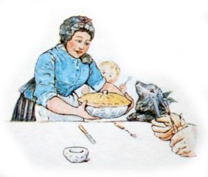
I was surprised in class when we stopped to discuss the picture of Mrs. McGregor cooking Peter Rabbit’s father into a pie because it wasn’t in my edition of the book at all. I proceeded to look at a couple other versions of Peter Rabbit online and noticed a bunch of other editions had also completely omitted that image and combined the text to fit a single image. I even had a hard time finding the image at all for the blog.

We talked about how this image really kind of interrupts the narrative because it is frightening and depicts a certain level of violence. Its style differs from the other romanticized, whimsical illustrations of nature and animals. I think the depiction of Mrs. McGregor and this seemingly hungry dog/wolf gives a more tangible idea of what could happen to Peter and generates a heightened sense of fear throughout Peter’s adventure that is not present without the illustration. I found strange not to have it in my edition of the book because I am sure it would have caught my eye as I was reading the story. On the other hand, I thought the narrative and the images flowed really well, which I think would not have been the case with the image above inserted in the story. However, Beatrix Potter likely intended the image to be shocking for the readers since the style appears to be so different just for that one image. Why do you think some publishers chose to leave it out?

Digital Illustration

After reading other people’s posts I noticed that like a lot of people in the class, the collage workshop was much more enjoyable for me than the digital illustration. I am not a really good artist and I doubt anything will change that, but collaging actually allows me to create some type of art by just being creative and combining small parts from different sources. There are really no limits to what you can create with a collage and I will definitely by using this method for my final illustration.

However, I found the digital workshop challenging, in part because there were a lot of glitches and because unlike manual art making, if you’re not very technologically apt like me, it was quite frustrating not being able to create what I was picturing in my head and would have been able to produce on paper. I think another reason the process was difficult was that we got a short tutorial and that one class period is obviously not enough to master the whole program. I had never done anything like it before so I felt I faced a lot of limitations in what I was trying to create. Overall though, digital illustrations are perhaps the most modern way of making art and I really enjoyed the experience and getting to try it.

Seeing vs. Interacting With Art

I absolutely loved getting to meet Julia Jacquette this morning. Her answers to the class’ questions helped us understand her as a person better, and I think it was interesting to go through a few more generic question before focusing more specifically on a few pieces of her work. As someone in the class brought up, someone with no background knowledge of what Julia’s work represents, especially in regards to the zoomed-in, abstract pieces and her interest in stylizing advertisements, might not fully understand what it symbolizes. Having the opportunity to see paintings is amazing and while art is about interpretation, I found it crazy how much the meaning of a piece can change with explanation of its original message or method of production by the artist. Seeing pieces of art is a completely different world than hearing about them.

Gorey’s Unconventional Genres

I loved Amphigorey, mainly because of the mix of genres present within the book. Every story conveyed different emotions, some being less dark than I thought Edward Gorey’s stories would be; however, some stories, The Unstrug Harp for example, seemed oddly somber for a children’s book. The relationship between images and words changed the entire message that the story is conveying, because while Mr. Earbrass tells a rather pessimistic narrative, the images appear as funny and very clearly would appeal to children. While most of the stories are in black and white, which is unusual for children’s literature, the images are still amusing and some of the rhymes in a few stories might also appeal to younger readers.

Additionally, I found interesting that Gorey chose The Unstrug Harp as the first story of his book, mainly because the story narrates the “unspeakable horrors of literary life” and the difficulties that Mr. Earbrass, or any author, faces while writing his novel: isolation, writer’s block, procrastination, dissatisfaction, boredom. Could that be how Gorey feels about being an author, or even writing Amphigorey?

Collages as Political Cartoons

The last couple classes showed me ways of utilizing collage techniques that I had never seen before. The concept of juxtaposing different sources and of combining parts from fiction and non-fiction to form a greater whole gives the audience a chance to look at the piece from different angles and with different perspectives. A collage thus can never be “one-sided” as its essence resides in that it encompasses many points of view to create something original that has never been crafted before. Often times, the collages we looked at in class were politically inclined and used the different parts of the collage to create a stinging satire on politics. For instance, some of the ones we looked at exemplified black rights, post war representations, and issues with gender roles and class-consciousness. Thus, collages remind me of perhaps an early form of political cartoons contrasting and comparing different styles and sources in order to comment on events.

The Printing Press as an Art

It’s interesting to think about the various forms art takes while undergoing changes in contemporary times.  As college students, we are constantly asked to used modern technology to accomplish daily academic tasks, type up essays, print out readings, photocopy notes, and so on. I never really thought of printing as a form of art until I got a chance to work with the printing press this week. It’s such a meticulous job choosing the font, picking out each letter, taking care of the spacing, getting the ink ready, and lining everything up. Though it takes much longer and requires more effort than our regular modern printer, I thought the experience was really fun and it’s crazy to think people had to print out massive numbers of copies back in the day. In some sense, every single one of those scrupulous tasks is its own form of art, and has become a lost art nowadays, replaced by convenience and modern technology. It’s crazy how new inventions and technology can simply just in someways, eradicate a specific type of art (even if perhaps, the people using the printing press at the time did not think of it as an art, rather just work).

Homages

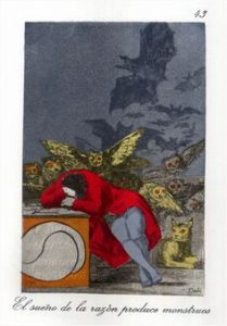
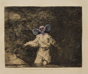
I thought it was really interesting looking at the different ways artists have altered famous prints in order to pay homage to other well-known artists. Though I appreciated the cartoonish, more modern element the Chapman brothers added to the Goya pieces, I still am unsure whether simply going over his original art isn’t vandalism and/or disrespectful. However, as this series of prints have now become  so widely admired, the Chapman brothers may have simply discovered a new way to pay homage.  In some way however, the first homage we looked at (the Dali homage to Goya) resonated more with me because since it is older, Dali had to replicate the print exactly as Goya painted it. There was no way to simply copy the original piece. That exhibits so much effort and time spent on the work of art that it seems to me like Dali’s piece is more of a homage to Goya than what the Chapman brothers did.

Should Novels Be Illustrated?

After we looked at several illustration of the novel Don Quixote and compared them in class, we raised the question of how to depict the depth of a character’s thoughts accurately. Illustrations are supposed to add a third dimension to a story without adding substance that was not there in the first place. There are always some aspects that cannot be fully grasped from reading, such as the internal mind of a protagonist. The readers must merely be able to understand the character by reading about him or her to then trigger their imagination. Where is that limit in creating an illustration for its maker? The role of illustrations should support the story without adding new information that is not explicitly concrete in the book. Is it fair to add details that the author perhaps didn’t want in their story that might distort the story or highlight subordinate ideas in the novel?

Is it possible that novels are designed to trigger the imagination and not to be accompanied by illustrations? Maybe the beauty of novels reside in that they create a different experience for each person and that this experience cannot be modified or mainstreamed by an illustration.

Art and Time

A recurrent theme in Orhan Pamuk’s My Name is Red is the the relationship between time and art. Stork tells three stories to suggest the idea that books “last until the end of the world.” (69) It is interesting to consider that while miniaturists, artists and even their masters pass away – such as with Elegant Effendi and Enishte Effendi, books and manuscripts may be bound to be finished and live on. Whereas the miniaturists in the novel speak about the art they create as the only focus of their life and the proof of their devotion to Allah, it is possible the art doesn’t need the artist the way the artist needs the art. However, Enishte Effendi stated the opposite when he claimed that  “In the end, our methods will die out, our colors will fade. No one will care about our book and our paintings […]. Not only our own art, but every single work made in this world over the years will vanish in fires, be destroyed by worms or be lost out of neglect” (171). While it is true historical events and time sometimes destroy art works, I cannot help but feel like humans create art in order to leave a mark that is going to transgress the boundaries of time in ways we can’t.

css.php