Accessibility of the Novel

I think a wordless novel was the perfect format for telling the story of The Arrival. It is a story about immigration and the struggle to communicate and connect in a new place, where people speak different languages and come from different backgrounds. In using solely images to tell his story, Tan found a way to communicate in a language that can be read by almost everyone, no matter where you come from in the world.

The idea of art as a universal language seems to be one of the themes of the book. When the protagonist first arrives in the new city, he does not speak the language, so he communicates largely through drawing in his notebook and showing his sketches to those around him. He uses this method to acquire the necessities of survival – food and shelter. This shows how important art can be as a means of communication.

In using a language that everyone can understand, Tan also shows that the story of the immigrant is universal. Being from near New York City, I saw that as the city in the book, with the protagonist getting off the boat and getting his ID on Ellis Island, and the big statues he sees as the Statue of Liberty. However, it seems like this city could really be anywhere. The fact that it lends itself to being interpreted as any number of large cities reinforces the universality of the narrative.

Gender Coding in Peter Rabbit

Our class discussion about the ways in which Beatrix Potter imposes gender roles in Peter Rabbit today was fascinating. I think the most interesting character to look at in terms of this discussion is Peter’s mother. While the daughters wear only red and Peter wears only blue, his mother switches back and forth between the colors from one illustration to another.

This could be interpreted as her having to serve the double role of both mother and father, since Peter’s father was baked into a pie. As a single parent, she has to take on aspects of both traditional male and female roles. She is responsible for caring for her children, but also for providing for her family. It is interesting that when she goes out in public, she puts on the feminine red cloak that her daughters wear. Only in private is it acceptable for her to demonstrate masculine characteristics.

Collage Workshop

Yesterday’s collage workshop gave me much more of an appreciation for all of the work that went into Max Ernst’s book. He cut out all of the images he used so well that they almost seamlessly blend together, which it turns out is pretty hard to do. The workshop also made me wonder about Ernst’s creative process. How much of each section or page did he have planned out ahead of time and how much did he allow the images he had on hand to influence him? I went into the workshop with a couple ideas about scenes that I might like to use for my final illustration and then let the images available influence which of those ideas I chose.

Collage is an interesting medium because it seems like the images you have available will always influence the art you produce, at least to some extent. The images you use can inspire you, but it seems like they could also be potentially limiting. It at least forces you to get more creative with your materials if you go in with a specific image in mind that you want to create, for example with the Nancy Goodman Lawrence image that was in our collage powerpoint in class.

Personal Nature of Memoir

Julia Jacquette’s Playground of My Mind can be defined as a visual memoir. Although it does not go as in depth into her personal history as a typical memoir would, its visual elements present their own ways of creating a personal feel to the book. One way in which Jacquette accomplished this is through the appearance of the text, which looks as though it has been hand-written. The look of having every word written out by hand imbues the text with more personal meaning and importance than can be felt by looking at the text of a typical printed book, which gains import only after it has been read. The handwriting works together with the placement of the images and the way that these pictures are presented almost as looking like polaroids to create a kind of scrapbook feel.

Another strategy Jacquette uses to create a more intimate feel to the book is leaving some of the pale gray and blue lines she used to plan out the spacing of the pages in the background, as can be seen in the image above. This allows the reader/viewer to feel as if they are getting an inside look into Jacquette’s process of creation. The lines are made even more interesting with the fact that they are only included in some pages, while other pages have totally clean white backgrounds. This reveals the intentionality of leaving the lines behind, possibly as a device to draw in the reader.

The Purpose of Illustration

I usually think of illustrations in books as meant to depict the action in the story through a visual representation of what is being read. They add to the story by showing the reader exactly what the words on the page are describing. However, Edward Gorey subverts this convention through The Curious Sofa.

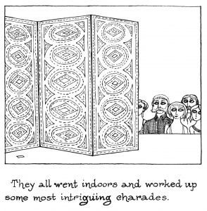
Rather than having his pictures show what the sentences underneath describe, he leaves the main action hidden from the reader, only accessible to the characters themselves. For example, the guests in the picture above get to see what is being acted out in charades while we do not.

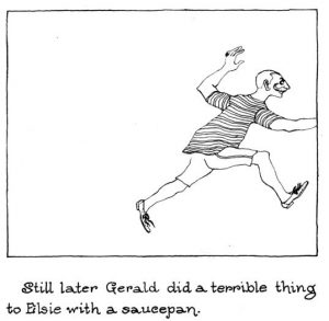
Gorey further makes clear his deliberate severance of the reader from the action with panels like the one above, which shows Gerald cut off from our view with part of his arm outside the frame and Elsie not visible at all. What do you think Gorey’s intention is in using his illustrations to cut the reader off from the action rather than to give a clearer picture of what is going on? Is he trying to leave more room for the imagination or is there another explanation?

Political Commentary in Une Semaine de Bonté

When I first flipped through Une Semaine de Bonté over break, it seemed like a book full of bizarre images that were slightly random and hard to draw a continuous narrative out of. Even the chapter headings seemed confusing, including “elements” that mostly departed from the traditional four of fire, water, earth, and air. After our class discussion today though, it is much easier to draw out familiar symbols that make the book possible to read. The elements, quotes at the beginning of each section, and the images themselves all make more sense when looked at together to create a relatively cohesive story.

The first section, Dimanche, seems to be about the corruption of the ruling classes and social elite. The element mud makes sense in this context because it has a connotation of being dirty, just as those with political power, often represented by lion-headed figures, are shown to be dirty through the images of debauchery and corruption that make up the body of this section. The quote at the beginning also ties into this theme. It reads: “The ermine is a very dirty animal. In itself it is a precious bedsheet, but as it has no change of linen, it does its laundry with its tongue.” The fur of the ermine is traditionally used to line the collars of ceremonial robes and the animal can therefore be read as a symbol of royalty. The quote seems to imply that although the ruling class may appear proper and even enviable on the surface, looking more deeply into their actions (which is done through the book’s images) will reveal that they are really involved in disreputable and unsavory actions.

Font Choice

One of my favorite parts of the letterpress workshop today was getting to look at all of the different fonts that were laid out for us. I think font is something that we often take for granted because it is so easy to change on a computer, but looking at the individual sorts as physical objects makes it stand out more as a form of art. Each font is designed and created by someone and has its own connotations. We usually focus on the expressive quality of the words that a font makes up, but even the font itself can convey a certain feeling depending on how decorative, rounded, or severe the letters are.

I have had the opportunity to look at cases of fonts once before, when my lit class went on a field trip last semester to the Farmer’s Museum in Cooperstown where they have a 19th century printing press. The press itself was much bigger than the ones in our letterpress studio, but the fonts were very similar. When we printed posters there, we were allowed to choose our own fonts and use multiple fonts on one poster, which gave the experience a different feel. What role do you think font choice has in the artistic process of the letterpress workshop?

Doré’s Illustrations of Don Quixote

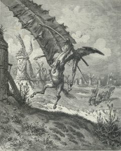
After class, I decided to look at more of Doré’s illustrations of Don Quixote. It turns out that while some of them are fantastic and surrealist, like the two we looked at in class, others are much more realistic. One example is the scene in which Quixote is ‘defeated’ by the windmills.

Unlike Dali’s interpretation of this scene, or the windmills shown on the cover of the Spanish version of the book that we looked at in class, Doré depicts the windmills for exactly what they are and shows Quixote and his horse mid-fall. This artistic choice turns Quixote into a tragic character rather than a comic one. Instead of showing Quixote as a hero bested by a monster like he sees himself, or as one with the windmills like Eko and Dali depict him to show that the monsters are in his mind, this illustration emphasizes the reality of the situation and makes the viewer wince at the real pain that Quixote and his horse will feel as soon as they hit the ground. It shows the power of illustrations to influence a reader’s attitudes toward the words on the page. Whereas the scene can be read as amusing, with this picture it turns into an instance evoking sympathy for the main character of the novel. In showing scenes realistically during Don Quixote’s various moments of defeat, Doré reminds the reader that although the monsters are in his imagination, Quixote is a ‘real’ man who is going through various painful situations, thereby making the reader almost feel bad for laughing at him.

Scriptorium and Style

Working on our own historiated letters in the scriptorium workshop for the last few classes has been a great experience. It has been fun while also making apparent just how much effort goes into a single letter of a manuscript. After this exercise, I can’t even imagine how long it would take and how much patience you would need to illuminate an entire book, especially since our letters were on a much larger scale than they would be in a manuscript, which made the detail work easier. While working on my own letter, I also saw a connection to the idea of style brought up in in Pamuk’s My Name is Red. I tried to combine my own geometric style with more traditional nature-inspired designs for my letter. In the novel, certain characters, like Enishte Effendi, assert that new styles can emerge from combining pre-existing methods of illumination. He says that  even workshops can develop their own styles, which emerge from the individual techniques of each of the illuminators building off of one another and combining with the style of the old masters. However, in some passages of the novel, the characters wonder whether it is really possible to combine two different styles. According to Master Osman, the combination of Eastern and Western art in Enishte’s manuscript results only in illuminations that reflect less skill than those created using only one style. To what extent can you keep your own style while taking influence from other artists?

Identity of the Artist

A central theme in My Name is Red is the struggle between Eastern and Western art. The Eastern ideal states that the viewer should not be able to tell who the artist of an illumination is because by incorporating his own signature into his painting style, the artist seeks to take credit for his work and is therefore creating it for his own benefit instead of for Allah. Throughout the novel, it is shown that even those who outwardly profess to believe in this Eastern ideology do not truly buy into it. For example, Nuri Effendi tells Black, “it is important that a painting, through its beauty, summon us […] toward reflection and faith. The identity of the miniaturist is not important” (58).

However, on the next page Nuri shows off his own work to Black, “proudly [stating] that he finished a gilded royal insignia for Our Sultan” (59). In showing pride in his work and wanting Black to know that it was he who the Sultan hired to paint, Nuri betrays that he really does put stock in the identity of the miniaturist. I wonder if these inconsistencies in ideology are Pamuk’s way of showing how Istanbul is changing and becoming Westernized, or if he believes that the Eastern stance on art is an impossible ideal. Is it really possible to create a great piece of art without wanting credit for one’s work?

css.php