What is that creature?

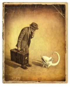
The cover of “The Arrival” is a sepia tone photograph of a man (we soon learn he is an immigrant) and a creature peering up at him. This creature continues to be present throughout the majority of the graphic novel and can perhaps be interpreted as the man’s roommate. I think the use of an indiscernible creature instead of a human is an interesting choice. It illustrates that people view other cultures and races as possibly subhuman. I think that the creature in this story pokes fun at this notion and emphasizes that although strangers may seem like monsters, they are really that different.

What are other people’s interpretations of the creature? Why do you think Shaun Tan includes it? Especially on the cover of the book!

The Moral of Peter Rabbit

I used to think Mr. McGregor was my neighbor when vacationing in Nantucket during the summers when I was very little. He was old, had glasses, and his garden had bunnies in it so it must have been him. I remember waking up in the mornings, rolling over and looking out my window into the garden and feeling very worried for Peter and his friends.

I thought the class discussion about the moral of The Tale of Peter Rabbit was very interesting because growing up I did not realize the book was telling me “listen to your mother” (at least not consciously). Rather, I took the book and applied it to the real world, believing the characters in the book were feet away from me. I think that this approach was probably similar to a lot of other children and I think the anthropomorphism of the realistically drawn rabbits cater to this interpretation. To a little kid, it is not a huge stretch to believe that a rabbit can talk or wears clothes, after all, you have been told that the Easter Bunny is real!

While I think the moral of the story is an important lesson for kids to learn, I don’t believe that I learned obedience from The Tale of Peter Rabbit. I wonder at what age a child would be able to constructively learn a lesson from a book such as this. Then again, maybe my concern for Peter translated into my own future actions.

Collage Workshop

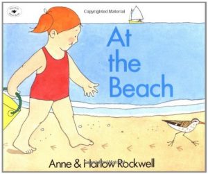
I really enjoyed the collage workshop today and instantly picked out the two L.L.Bean magazines I wanted to use. When I think of play, my mind moves to exploring the beach with my younger sisters, playing in the sand and water, then at night sitting by a fire just off the porch of the house. A book that illustrates just this is Anne & Harlow Rockwell’s At the Beach, which depicts a little girl’s first time at the beach. 

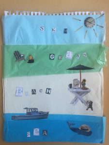
My goal during the workshop was to illustrate a passage from this children’s book. I think that my collage works well in the context of the book because it is both realistic of what a little girl will find at the beach but is also playful. For example, my final DIY illustration accurately depicts the setting of the beach yet adds a playful touch with a hat on the whale and a clock as the sun. The illustration also provides a teachable moment for very young children who are just learning how to read because “sky,” “grass,” “beach,” and “sea” are all spelled out. I look forward to the digital workshop on Wednesday!

Gray Play

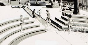
When I think of playing as a little kid, one of the first things that comes to mind is color. Children love to color at restaurants, draw with chalk on the sidewalk, look at colorful books. The lack of color in Julia Jacquette’s Playground of My Mind is a little surprising. The cover of the book has hints of color and the fist page includes a bright blue jacket, but all color then disappears until the last few pages. I wonder why Jacquette decided to use color so sparingly. The lack of color also stands out from her other pieces of artwork on display at the Wellin which use bold colors.

The colorless pages kind of remind me of a coloring book. Perhaps this is what she was going for. Or maybe she wanted the reader/viewer to have to “play” and use his or her imagination to fill in the missing details. Although this book is a memoir, Jacquette allows the reader to add a personal touch by not including every feature. Do people think the book is more effective being mostly black and white?

The Multifaceted Gorey

Perhaps it is because we just studied Max Ernst, but I was expecting Edward Gorey’s work to be much darker than it was. Gorey is known for his gothic pen and ink drawings for works such as Dracula and The War of the Worlds. His own personal stories as shown in Amphigorey: Fifteen Books, however, were far from dark or gory. In fact, I would describe the genre of many of the stories within Amphigorey: Fifteen Books as borderline nonsensical and silly.

It is this contrast between the darker gothic illustrations and the original text of Gorey that make his stories unique. When he is drawing gothic pictures for works such as Dracula, his talent can not be fully appreciated and he is pigeon-holed into a certain genre. It is only when he is allowed to put his artwork in his own context that he can reach his full potential.

Not only can Gorey create for a variety of genres, his work can also be appreciated by a number of different audiences. The stories in Amphigorey: Fifteen Books can be witty for adults and whimsical for children. This book truly reveals Gorey’s ability to create multifaceted genres and cater to a wide range of audiences.

Collage in Film

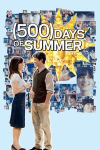
Before class on Monday, I had never really given much thought regarding what a collage was. The first thing that comes to mind when I think of collage is the organization of newspaper, magazine, or picture cutouts that are displayed artistically. I recently, however, watched a movie called “500 Days of Summer” and realized that collage has a place in film as well. The movie cover itself consists of scenes compiled close together, slightly overlapping (possibly 500 pictures of the character named Summer). A bright yellow sun is also overlaid transparently over a section of the faces. Finally, the two main characters look as if they have been cut out and pasted in front of the face collage, each person outlined with a sliver of white boarder.

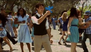
Collage is also apparent within the movie, as fictional items (such as the bird shown below) are sporadically juxtaposed with the realistic setting and actors and actresses. This example of collage illustrates the versatile nature of the art form. For example, the term can even be extended to music in the form of a montage. The unifying theme that relates all these forms of collage is the notion that they all use different forms that result in a new whole.


Letterpress Workshop

I enjoyed the letterpress workshop today and found it beneficial to learn about the history of the machines Hamilton owns as well as the various techniques associated with the old tools. I had no idea how expensive letterpresses were, but it makes sense considering they are no longer manufactured.

I also liked the fun facts about phrases such as “out of sorts” or “uppercase” and “lowercase.” Also, the terminology associated with body parts was interesting and actually helped me understand how everything fit together.

As far as actually organizing the letters my group wanted to use, it was a little tricky at first but flowed smoothly after we got the hang of it. I cannot imagine, however, creating a whole novel via letterpress. Proofreading must have been tedious yet essential. Our group also has the option of cutting around the text we print and pasting it onto our final project; it would be a lot more difficult if we had to consider alignment for our manuscript.

I am looking forward to actually printing the text next class!

Revival of the Letterpress

Letterpressing was developed in the mid-15th century and remained popular until the second half of the 20th century, when offset printing was invented. Not until recently has letterpress printing had a revival as an art form. The second video we watched today showed a women making a career from letterpressing, crafting mostly wedding invitations and formal business cards. Doing some research, however, I learned that the modern attraction to letterpress printing was just the opposite of what the technique used to try to accomplish. The goal of letterpressing used to be not to show any impressions and to “kiss” the paper as lightly as possible. This varies today in that now the goal is to have a distinct imprint so that it is evident letterpress printing is being utilized.

Does this difference in final outcome goals of the technique affect the authenticity of the revival of letterpress printing? This is similar to the artwork we looked at in class today as well. Does painting over an authentic piece of artwork make it less valuable? Technically it is the same piece of work, the difference being the subject valued or stressed.

The Dangers of Literature

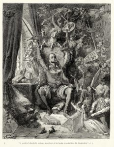
I found the image by Gustave Doré that we looked at in class today to be very interesting. It shows Don Quixote going mad from reading his books. This is representative of a common idea in the Middle Ages, that literature was potentially dangerous. Doré’s engraving depicts Quixote reading a novel and the novel coming to life all around him. The characters from the book, however, include knights, fighting, and monsters. His surroundings seem to be corrupting his mind.

I like the comparison of the dangers of literature to the dangers of video games today. It is commonly agreed upon that books are not very corruptive in nature (although some might argue that certain genres are not suitable for specific audiences). When it comes to video games, however, even the most innocent games, such as Tetris, are considered to be a waste of time, turning brains to mush.

What causes people to label books or games as corrupt? Does genre make a difference? Why do we not think books are dangerous today?

Scriptorium Workshop

The first workshop today was very insightful. Although we have learned a lot about manuscripts and illumination through studying images and handling ancient books, the hands-on experience today was invaluable. We observed a shortened process of making paint and I can only imagine that grinding down the materials into the powder must take a lot of work and time as well.

I am not the most artistic person, therefore drawing the historiated letters was a bit challenging. I wonder how much planning, or how many drafts the illuminators did before they were satisfied with the final product.

I am guessing that the artists had formal artistic training (at least that is what I am telling myself so I feel better about my historiated letters). Hopefully with next class to practice some more, my letters will improve dramatically!

css.php