Munson-Williams-Proctor Arts Institute Reflection: Hopper and Pollock
By Satchel McLaughlin ’22
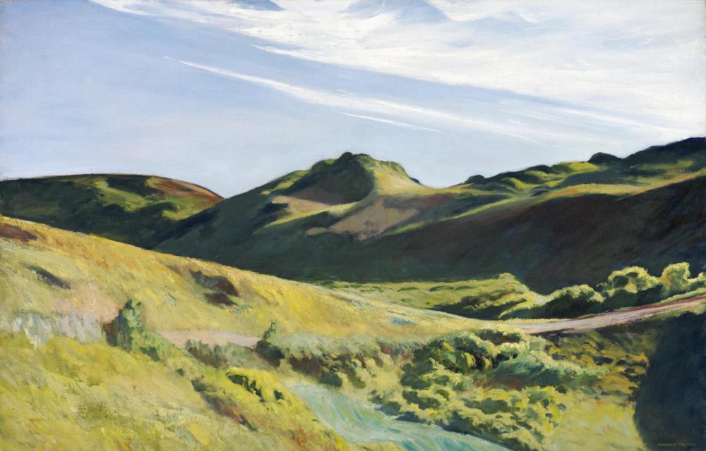
Edward Hopper
Oil on Canvas
32.25 x 50.25 in.
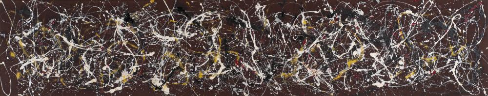
Jackson Pollock
Oil, Duco and aluminum paint on unsized canvas
38 x 189.5in
Edward Hopper’s The Camel’s Hump depicts a green landscape dominated by hills and sand dunes illuminated by sunlight in South Truro, Cape Cod. The left foreground of the artwork depicts the top of a warm, green hill with a path that travels right and out of the frame. In the background there are hills dotted with doons. The front side of the distant masses are shaded, while the tops are lit by the sun. The sky is light blue with wispy clouds. Hopper painted the foreground using an impasto technique. Therefore, the texture of the dune grasses and the bushes stand out against the smoother mountains in the background. The smoothness of the hills in the background emphasizes their distance from the front hill, creating a larger sense of space in the painting. The Camel’s Hump is in very good condition. One can see creases in the canvas because of the stretcher, but this does not take away from the quality of the piece. The large wooden frame it is displayed in compliments the landscape because of its rustic quality, it looks like a frame you could find at a beach home on Cape Cod.
The effect of Hopper’s technique and composition is a luscious, warm, and inviting landscape. The combination of the soft strokes in the background and the thick strokes in the foreground allows the viewer to feel the landscape. One could imagine standing in the grass with a soft breeze, staring into the distance at the dunes. The different shades of green, slight yellow and pink hues, and the intensity of light contrasted with the shaded areas all add warmth to the scene. The landscape is in direct sunlight. The smooth, flowing lines make the scene more calm than if it had been painted with harsh, rigid strokes. This landscape invites the viewer to participate in a moment of peaceful, quiet, beauty.
Jackson Pollock’s 1942 Number 2, is a very large painting composed of splatters, drips, and splotches of white, black, grey, yellow and red paint on a maroon, fabric canvas. The irregular marks dance across the page in every direction. From far away, the white paint stands out most against the canvas, but moving closer the viewer can see the intricacies of the layers of paint and colors. Some of the paint has soaked into the fabric, especially the yellow, creating a fading aura around the thick paint splatters.
Because this painting lacks a clear subject such as a landscape or a figure, the painting becomes about the marks and Pollocks interaction with his work. The caption accompanying Number 2 at MWPAI, reveals that Pollock painted on the ground, moving around his canvas while he worked to see the whole painting from every angle to make intentional choices about placement of splatters and color. Knowing this, the large size makes the painting both more powerful and personal, because you understand the action and physical work that went into creating such a large scale piece and can also feel Pollock’s presence. The caption also states that his “paintings represent both the activity of painting as well as deeply personal feelings.” Instead of creating a subject to represent his emotions, he used the medium, line, shape, and motion to express them.
The works of Hopper and Pollock differ dramatically. Hopper’s painting is soothing, due to its color palette, subject, and smooth flowing lines. His strokes, even with the thicker application of the paint are very controlled. Pollock’s painting on the other hand is stimulating and full of Pollock’s energy. He does not try to overly control the medium. His marks are for the purpose of conveying emotion through the actual nature of the paint and not the subject they are creating. Both Hopper and Pollock create successful works of art using dramatically different techniques.