Mark Rothko’s Number 18
By Lydia McGinn ’22
Up close, Rothko’s abstract painting, Number 18, seems to vibrate—its softened geometric forms simultaneously receding and advancing in space due to their ambiguously blended edges. The composition is deceptively simple: four hazy rectangles of alternating orange and white float over a peach-colored background. The shapes vary drastically in size, with the largest white one dominating the lower two-thirds of the painting. A narrow orange rectangle sits atop this, followed by a slightly thinner white stripe, and finally a medium orange rectangle which occupies most of the top third of the painting. At first glance, Rothko appears to have reduced his palette to these warm oranges, peaches, and whites, but a closer look reveals the intricate layering of purples, blues, and even a fiery red that act as accents, subtly adding depth and motion to the composition.
Initially a viewer would hardly notice the thin red stripe running along the top edge of the hazy white rectangle that dominates the lower two thirds of the painting, but the juxtaposition of red and white is nevertheless crucial. Though minimal, the color acts as a dynamic barrier between the painting’s orange and white portions, electrifying both adjacent colors.
Similarly, the yellows that shine intermittently through the hovering orange rectangles make these areas so luminescent that they seem to be fashioned out of stained glass and sunlight rather than paint and opaque paper. These forms are framed and enveloped by the painting’s light yellowish-pink background, and separated by a narrow yet astonishingly complex swath of intensely deep indigo, purple, and red. Here the colors seem to seep into one another, swirling and blending with all the depth of a midnight sky. The darkness is interrupted, however, by the lively white stripe layered over its center.
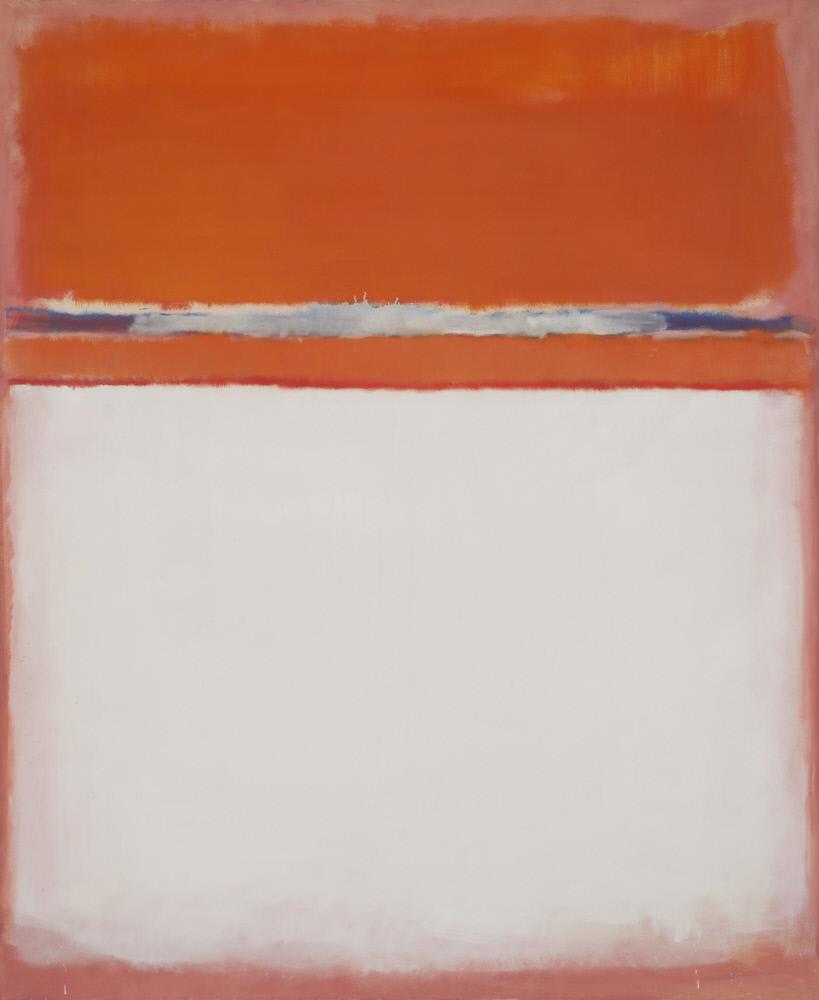
This area seems a perfect foil to its much larger white counterpart at the painting’s bottom. The two white sections reach a kind of harmony through opposition: one’s size suggests a vast void, the other a short spark; one’s misty edges recall the patient drifting of a cloud, the other’s chaotic contours are a frenzy of blending and drips; one stoically holds its ground at the painting’s base, the other vies with its neighbors for center stage, its drips even intruding on the color above it, suggesting that Rothko may have spun the canvas while working.
Motion
and stillness, chaos and tranquility, apparent simplicity that masks immense
nuance and complexity—Rothko has coaxed a great deal of seemingly contradictory
elements into seamless coexistence on this canvas. With pure, liberated color
as his vehicle, Rothko holds up a mirror to life’s incongruities, in a composition
that, following its dichotomous themes, simultaneously confronts the viewer and
creates space for contemplation.
Bibliography
Rothko, Mark. Number 18, 1951. Oil on canvas, 81 ¾ by 67 in. Utica, Munson-Williams-Proctor Arts Institute.