I find it interesting from an art history perspective how the formal and compositional elements of illustrations in these illuminated manuscripts interact with the work’s content. The image of the Virgin Mary on the cover of the copy of the Book of Hours we’ve been studying is an intriguing example of this concept. The use of curved lines and saturated colors draws attention to the Virgin Mary’s pregnancy. The lines draw the eye toward Mary’s stomach, where John the Baptist’s mother, Elizabeth, places her hand. Mary’s torso, arm and Elizabeth’s arm create lines pointing toward this focal point. The use of intense primary color—the red and blue in Mary and Elizabeth’s clothing—also draws the eye to the part of the image closest to Mary’s stomach. These formal elements, in addition to an understanding of Elizabeth’s story, render an emphasis on fertility and the growth of family. The viewer is inclined to admire Mary and to admire her fertility. I find it fascinating that both formal elements, which might seem subtle or unnoticeable to a layperson, and the broader story or content of the image are employed very purposefully by the artist to make the viewer look at the image with a certain attitude—with a specific gaze or way of seeing things. It’s interesting that in our discussion of this image the Gaze does not refer to the male gaze, or the notion of women in art being presented in ways that emphasize their status as sexual beings or maternal figures in an objectifying way. Mary’s fertility and status as a maternal figure is certainly highlighted in this image, but for the purpose of instilling admiration in the image’s viewers rather than objectifying or sexualizing her. Should this be attributed to her status as an important religious figure, to the nature of religious art of the Middle Ages, or to something else?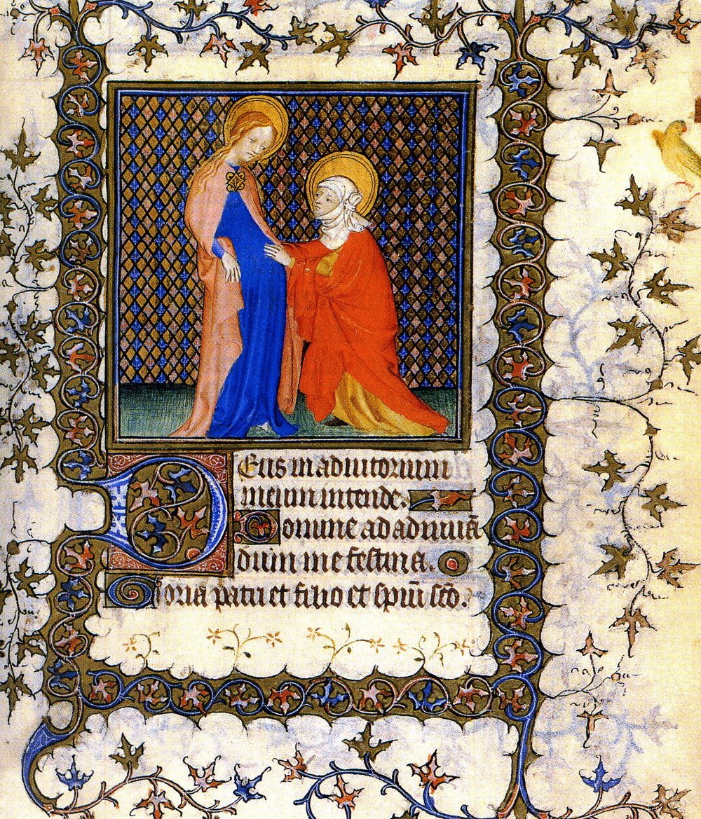
Skip to content
Just another WordPress site