Animation and Narrative

“The Lost Thing” was a very cool animated film. Not only did it provide a great story and moral for children, but it also incorporated some interesting narrative elements. For example, some characters speak but they cannot be understood, while others can be. Furthermore, the main character sometimes will narrate how people say things, as if he is reading from a book to a child. This could be Shaun Tan – the author of the short story that later got translated onto the silver screen – using the narrative of his book and putting it into the form of the animated film. This would keep the elements of reading the book, either to yourself or out loud, in tact.

In terms of the film being an animation, it definitely caters more towards kids. Maybe by infusing narrative elements into the short animation, Shaun Tan is attempting to promote that aspect to children a little bit. Something to keep in mind is how dull and repetitive the normal world is in the film. This definitely speaks to kids being creative, in that the world where all the lost things are seems very colorful and unique. Shaun Tan does a very nice job in terms of fusing the narrative elements of a book and the animation elements of a film. After all, it did win an Academy Award.

The Benefits of Dark Themes in Children’s Books

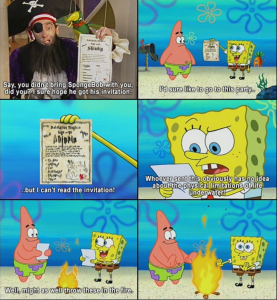
In recent weeks, we have discussed the mature and dark themes that appear in many children’s books. From Amphigorey to The Arrival, we see stories that are stylistically similar to the children’s books that we all know and love, but in fact, have a dark thematic undertone. I have always found adult themes hidden in media designed specifically for children to be interesting. For example, SpongeBob Squarepants is loaded with innuendo and adult jokes. In fact, many cartoons have such components – perhaps to entertain adults who may be watching along with their children. I’m not afraid to admit that I still watch (and enjoy) watching SpongeBob, but I must say that my enjoyment has shifted focus a bit. A lot of jokes that I find myself laughing at now, I do not think I would have understood as a child. This is why I feel that it is sometimes appropriate to integrate some dark humor and subtle adult content into media designed for children (and when I say ‘some’ I certainly mean less than in Amphigorey). Below is an example of humor that a child might not understand, but is funny to an adult. It’s not obscene (although such examples do exist in SpongeBob) but is an example of mature humor nonetheless:

Screen Shot 2016-05-04 at 2.58.22 PM

Certainly, as we have discussed in class, this phenomenon is not isolated to television and extends to many children’s books as well. Looking back on some childhood favorites, it is evident that dark themes are abundant. For example, Where the Wild Things Are could be very frightening to a child. After all, playing with monsters on an island isn’t every child’s idea of a good time. An example that hits closer to home is Harry Potter and The Sorcerer’s Stone. While this novel is not your typical children’s picture book – many elementary school students read this book. I remember being absolutely terrified by this book the first time I read it. I was nervous to talk about the popular story with my friends in school because the thought of three-headed dogs, trolls, and men with two faces kept me up at night. It took me years to get back on the Harry Potter bandwagon. Another interesting example is The Lorax. It is a fun picture book and a classic, but the underlying theme about destruction and the takeover of industries is a bit dark. Nevertheless, it allows parents and children to begin a discourse about such topics early in life. Indeed, the content of The Arrival is similar in this way. The themes themselves are mature, but disguising these themes in a more playful setting introduces children to important historical events from an early age. Thus, I feel as though these themes are actually very important and can be both entertaining and educational.

Memory and/in Motion

From the paratext, content, and style, it is clear that The Arrival is meant to mimic a photo album or more broadly, an era of photography. Tan’s skylines and photo-realistic portraits are obviously alluding to the early 20th century photographers who were interested in cities and immigrant populations. The allusion to photography is an interesting one; since both photographs and graphic novels are ‘still images,’ the connection raises the question of what it means to freeze an action and why it is that we do this. Further, given the theme of the immigrant’s journey, the allusion to photography is also an allusion to the journey of memory and history.

We typically think of memory as beginning at the point of absence: the moment something is removed from our present state by any span of time is the moment when we say we ‘remember’ it. So memory is like a mental journey in that it traces our lineage through time up to our present point. The story of The Arrival evokes a journey from its title onwards. We start at the beginning, at the point of assimilation and new experiences, rather than beginning at the point of departure and leaving behind the past. Yet the journey is not as straightforward as a move from past to present because the nameless protagonist is pulled back to his homeland by the ties he has to his family. Though he has begun a new life in a strange and unfamiliar land, his ties to his past are not severed but very much present. This is emblematized in his photographs of his family. Tan also uses the imaginative form of his story to give the reader glimpses into the protagonist’s mind. At the moment when he opens his suitcase to unpack for the first time, the panel shows his inner desire through a miniature version of his family and old home that appears to be inside the suitcase. The next panel, a close-up of his face, is followed by a smaller panel showing that the contents of the suitcase are just ordinary clothes. The sequence reveals that the miniature of his family inside the suitcase was the product of his imagination or memory, triggered by the contents of his suitcase which represent his past.

The panels in The Arrival are reminiscent of photographs in that they are always rectangular or square. Though some of the splash panels or pages stand alone, others are arranged in a grid that progresses action-by-action or even moment-by-moment. One sequence in particular stands out: when the protagonist is going through the immigration process, Tan uses a full-page grid to show the character’s mounting frustration. Each panel is slightly different than the subsequent ones so that the variation in the character’s expression is the most prominent change. The result is that the supposedly static images take on motion as each ‘freeze frame’ becomes part of a cumulative experience of the man’s confusion, frustration, and disappointment. We typically think that photography ‘captures’ something, which implies making the subject still or motionless. Yet Tan creates motion out of these still images, not just in the sense of time progressing, but in the greater journey of memory.

Time, as much or moreso than distance, is a separating force. It divides past and present, where we were from where we are, the beginning from the end. We take photographs to memorialize things, to aid our memory, to make time still so that it cannot intervene and separate us from whatever it is we are memorializing. But even though we freeze moments as emblems of memory, the act of memory is human and imperfect: it appears to make static something that is in actuality fluid.
Defining the ‘Fantastic’

I really enjoyed our class discussion on what exactly is ‘the fantastic’. Connor Murray noted it’s something too great or wild or unnatural to be real. Professor Serrano said it’s the juxtaposition of the real and the unreal, the moment of hesitation in distinguishing the two. But I also wonder what I should call the emotion that I felt looking at one of the first few pages featuring objects of ownership. The image of the family drawn in child’s scrawl was the most powerful to me. It made me sympathize with the immigrants in that I felt upset imagining losing that hand-drawn picture. Could that renowned, real emotional feeling for an image, something that is unreal, be considered fantastic? It is the combination of a real response for something fictional… And I think the word fantastic denotes something of great power, something moving and strong and provoking. Although my emotional wasn’t a “hesitation” exactly, it was overwhelming. What do I call this?

The Arrival

The Arrival was a unique reading experience. Without any words, the reader has to rely on the images and their mind to fill in the gutter space between panels. The way the pages were drawn, in a familiar yet foreign style. The animals, buildings, and objects all have a feel of familiarity, but are unrecognizable. This style of drawing gives the reader a sense of the life an immigrant faces, and the challenges they are put through daily as they attempt to deal with the culture shock of entering a completely different world. The people remain a constant in the book as familiar and comforting, giving a sense of belonging of the characters and their ability to connect with one another. The color of the images gave the sense of a photograph and seeing the world through the immigrant’s eyes, while also giving a sense of darkness and foreboding because of the lack of color. This tied well to the theme of immigration and the need to acclimate to a new life, and the stories that the reader sees of the many immigrants and the struggles they went through. I found this book heartening because it shows the world from a different person’s perspective and shows why immigration was important to the people portrayed.

Asterios Polyp

Asterios Polyp is a graphic novel that is printed in an extremely limited color scheme. For most of the novel David Mazzuchelli utilized only four colors: all three primaries (yellow, red, blue) and purple. The last chapter also uses the rest of the secondaries (green, orange). The purple is the only consistent color throughout- it is the color that provides the structure of the novel. It creates all of the outlines, the shadows, the volume. This is significant for two reasons, the first being that it creates a failed symmetry between the three primary colors. This is because purple is a mix of blue and red. The metaphor is the mixing of Asterios’ and Hana’s worldviews. Whenever yellow interferes, something bad is happening, or Asterios is not where he is meant to be, such as an working as a car mechanic.

Amphigorey

Darkly humorous, Amphigorey displays a unique style. It is completely black and white, with the line quality alternating in between sketchy and clean. It is clearly rooted in surrealism, although perhaps straying from this theme to mere nonsense tales. This makes sense, however, because Amphigorey is taken from the word amphigory, meaning nonsense composition. “Gorey” is obviously a derivative pun of “Edward Gorey” and the actual word meaning bloody violence. Near every story has an underlying tone of violence, whether or not the main theme of that segment consists of sex, absurdities, couches, or penguins.

Songs of Experience

Looking at the Sick Rose in class, was interesting. When we talked about the significance behind the symbols, I found it more interesting. It was very nice of Professor Janelle to visit and discuss with us what exactly was going on within the images. The illustration is directly showing the text, while expanding on it with visual metaphors. This is what illustration is meant to do- although it can be done a lot more beautifully. Blake has the basic concepts of illustration down pat, although I have to say that his execution is god-awful. This is especially pertinent because he is a poet, and the words are supposed to be highly importnant. However, because of the way that he has done his typography, it just takes away from the subject matter.

Scriptorium Workshop

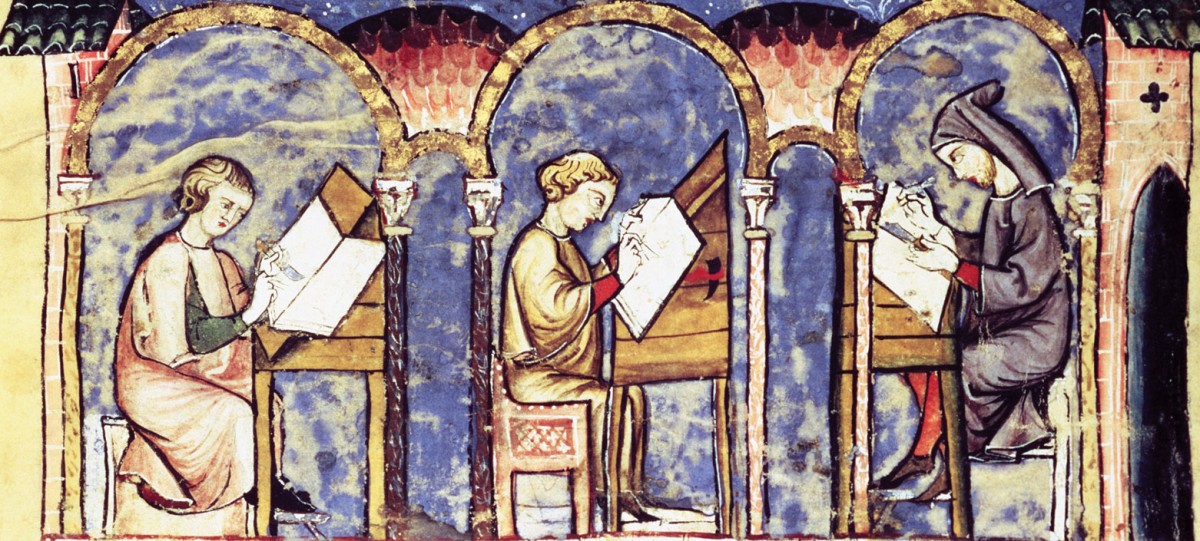
The scriptorium workshop where we got to use a traditional printing press was a lot of fun. Over the summer I had the opportunity in Rome, Italy to attend a week long typography workshop. In the workshop, we also used a kind of letterpress- although the way we went about it was different. Because the workshop dealt in actual prints, meaning acid-etched metal plates, rather than the keys straight onto the paper, the format of the press was different. We put together the keys into the arrangement of text we wanted, added texture to the plate, and literally lit the ground on fire. I have a short video of one of my professors holding up a plate and taking a blow-torch to it. Inside, of course. Europeans don’t have the overly-safe obsessions that Americans do. It was a lot of fun to see how the process worked in both cases, especially since there seem to be many ways to do it and I am very interested in book arts.

Los Caprichos

Goya is one of the originators of surrealism, which here stems more from the idea of mixed metaphors than the surrealism of Freud and Carl Jung. The surrealism of Goya does not stem from dreams, it stems from a critique of society. The collage aspect of his work that later became such a staple in surrealism in this case is due to plate etchings. Each etching plays directly off of a colloquial saying, meaning that you have to have experienced and grown up in Goya’s culture in order to understand it without analysis. It also is more grounded in reality than most surrealism- it has a direct relationship to everyday life, and a specific message. A lot of other surrealism tends toward lofty ideas and obscure messages, so it was nice to see something that was not that way.

css.php