Where Did All The Tulips Go?

What beauty have we lost in mass-producing books?

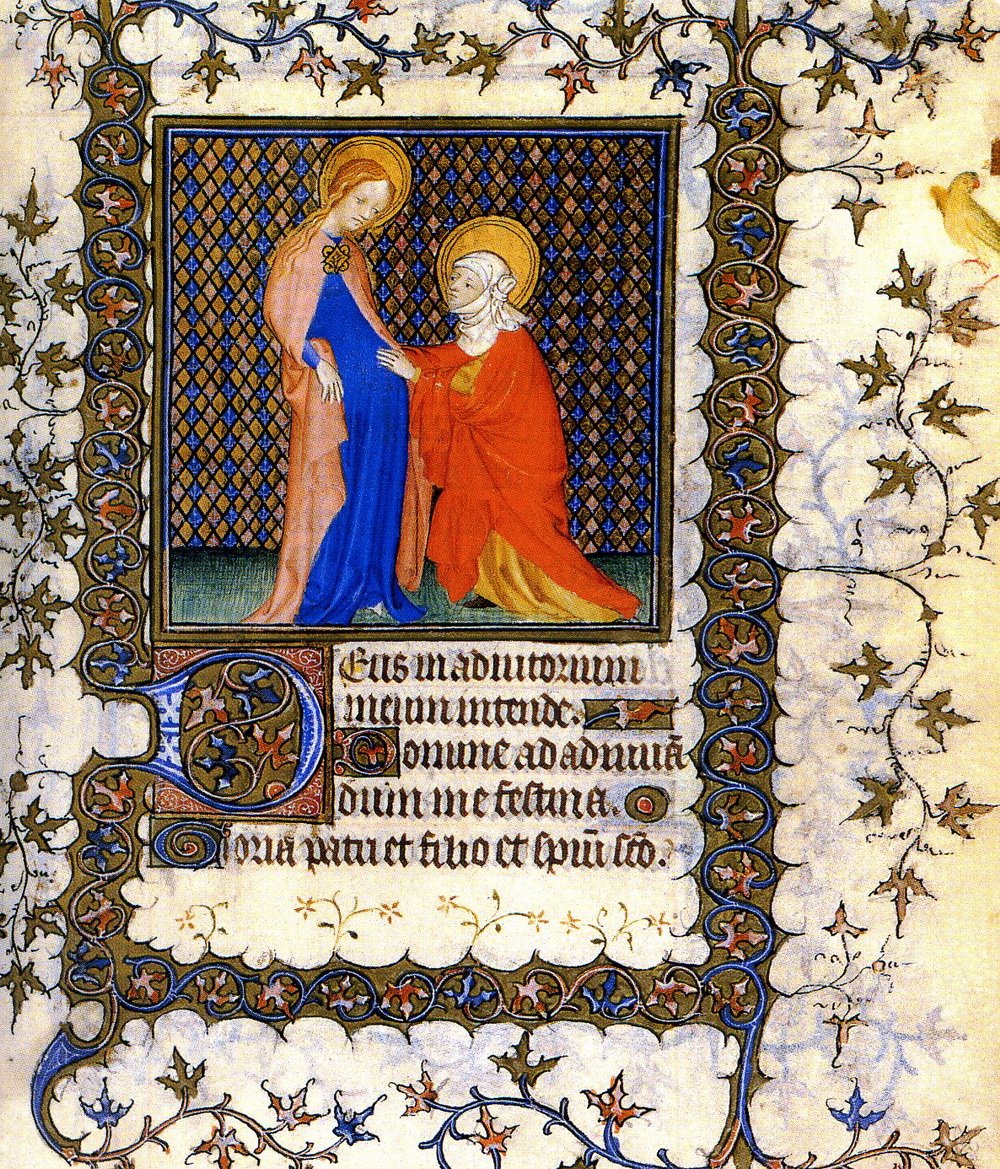
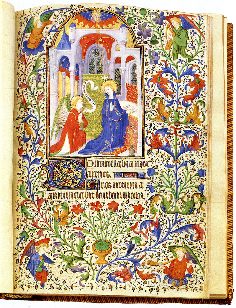
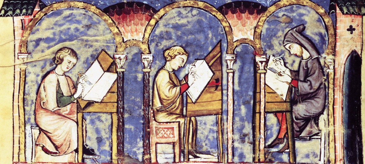
The, so to speak, “laborious process” accompanying the illuminated manuscripts reinforced their ‘primary’ identity as ‘a work of visual art with complementary ‘ekphrasis’’ as opposed to ‘a book with images’. And, I find, that in the modern era, we have forgotten the book is a piece of visual art, that the text itself is calligraphy, the page a canvas! Today we read, and do not see.

Consequently, the expertise and virtuosity present in the artwork of the illuminated manuscripts, qualities associated with the aesthetic, were lost at the birth of the printing press. We have thus misplaced, as an audience, our ability to appreciate virtuosity when the line between image and text is obscured.

The presence of an ‘anthropomorphic initial’ amidst a text today is perceived almost as tacky. Typewriter art, altered book art, and, indeed, Guillaume Apollinaire’s calligrammes – forms of literature which unsuspectingly attempt to reconcile current, perhaps flawed, aesthetic values with the notion of ‘book as image’ – are relegated to embody only ‘experimental’, literary practices; an almost demeaning term.

And so, I ask why can’t a text be visual art, be illuminated, or “filled with light”, once more? Why not embolden words with vast technicolor? Why not see the letter ‘m’ as both from the alphabet and also as an impression of a bird at the back of a painting flying away too soon.

Books of Hours

I find it interesting from an art history perspective how the formal and compositional elements of illustrations in these illuminated manuscripts interact with the work’s content. The image of the Virgin Mary on the cover of the copy of the Book of Hours we’ve been studying is an intriguing example of this concept. The use of curved lines and saturated colors draws attention to the Virgin Mary’s pregnancy. The lines draw the eye toward Mary’s stomach, where John the Baptist’s mother, Elizabeth, places her hand. Mary’s torso, arm and Elizabeth’s arm create lines pointing toward this focal point. The use of intense primary color—the red and blue in Mary and Elizabeth’s clothing—also draws the eye to the part of the image closest to Mary’s stomach. These formal elements, in addition to an understanding of Elizabeth’s story, render an emphasis on fertility and the growth of family. The viewer is inclined to admire Mary and to admire her fertility. I find it fascinating that both formal elements, which might seem subtle or unnoticeable to a layperson, and the broader story or content of the image are employed very purposefully by the artist to make the viewer look at the image with a certain attitude—with a specific gaze or way of seeing things. It’s interesting that in our discussion of this image the Gaze does not refer to the male gaze, or the notion of women in art being presented in ways that emphasize their status as sexual beings or maternal figures in an objectifying way. Mary’s fertility and status as a maternal figure is certainly highlighted in this image, but for the purpose of instilling admiration in the image’s viewers rather than objectifying or sexualizing her. Should this be attributed to her status as an important religious figure, to the nature of religious art of the Middle Ages, or to something else?91ULGX+lRIL

Illuminated Manuscripts in Animation

kellsAfter watching The Secrets of Kells, I began to search for other animations that referenced illuminated manuscripts. What I found was interesting. I found the reference to illuminated letters in the well known children’s showSpongeBob SquarePants. The illuminated letter was used to invoke humor. In class we were told that these embellished lettered marked the beginning of chapters since illuminated manuscripts lacked punctuation. In this children’s show the Illuminated letter represented both the beginning of a written essay as well a source of procrastination.

spongebobThe other reference I found was in the movie Shrek. The beginning of the movie starts with a book that appears to have illuminated manuscript characteristics. It tells a story that also accompanied by illustration. While not as embellished as The Book of Hours, the introduction of the movie mimics storytelling. I am sure that there exists other sorts of animations that have referenced illuminated manuscripts or have been inspired by the art work, that I might have missed. What do you think?

shrek

The Secret of Kells

I thoroughly enjoyed watching The Secret of Kells. Initially, I did not really enjoy the animation style of the film. In fact, after watching the first few minutes I assumed the movie was very old based on the seemingly antiquated animations. I was surprised, therefore, to learn that the movie was released recently. Upon further reflection, I realized that the animation style of the film was no accident. The movie is about a famous illuminated manuscript after all, so it fits to incorporate some creative license. After making this realization I think I enjoyed the movie even more, especially because the light-hearted animations were refreshing in the context of some of the dark scenes. I definitely understood the story, but there were a few questions I was left with primarily concerning the identity of Aisling and the history of the Abbot as an illuminator and his prior relationship with Aidan. I found the parts of the movie that concerned the making of the illuminated manuscript to be very interesting. These parts of the film backed up some of what we read in the Clemens & Graham reading and what we talked about in class regarding the making of parchment, ink, and illuminations in general.

There were a couple of things about the illuminations themselves that I found very interesting. Firstly, throughout the film, when Brendan was creating an illumination the pictures came to life on the page. The insects moved, and depictions of Aisling and Brendan climbed through the images. I thought that this part of the movie exemplified the personal twist that an illuminator could add to any given illumination. Each illumination, while similar in style, has its own added flair that may be informed by the experiences of the author. I thought that the way the movie depicted Brendan’s illuminations suggested that his ideas were informed by many of his experiences in Kells, in the forest with Aisling, and in the scriptorium with Aidan. Secondly, I found the commentary on the detail of the illuminations to be interesting. When training Brendan, Aidan emphasizes the importance of the eye of Colm Cille in making manuscripts. I think this emphasis on detail speaks to the intricacy of the manuscripts in The Book of Kells. Aidan suggests that, without the eye, Brendan will never be ready to create the manuscripts needed to complete the book, underscoring the importance of attention to fine detail in each illumination. I really enjoyed this movie, as I thought it was a great story that gave great insights into the creation of illuminated manuscripts.

The Secret of Kells: Manuscript Making & Significance

In addition to the rich illustrations and lovely music, I enjoyed The Secret of Kells because of its 1) depiction of the manuscript making process and 2) portrayal of what manuscripts meant to people at the time. For one, the film’s representation of the writing quill was really impressive to me. Before this course, I thought the shape of the quill tip was basically like that of a pen’s. However, the Getty Museum video demonstrated the intentionality of the tip shape, how it was carved and trimmed down depending on the type of writing needed. As I’m Googling “cartoon quill,” I see that many images leave out the unique quill tip shape. Thus, in retrospect, it was nice to have an accurate portrayal of the quill, and to see how it worked (i.e. how it held ink) when Brendan spilled some on the parchment. The representation of parchment also referenced facts in the Clemens Graham “Writing Supports” reading. The animated parchment carried a certain texture that was similar to that of real parchment, which varied based on the type of animal or animal part used. The film’s parchment was pulled taut on a wooden frame as well.

Several parts of the film reminded me of the labor that went into creating a manuscript, and thus how much people valued them and their potential. Brendan’s long and strenuous quest for gallnuts demonstrated the difficulty of finding materials to produce ink. More specifically, his journey helped me better grasp what scarcity meant when it came to bookmaking in the medieval ages, and thus better appreciate the significance of the use of rare colors. Perhaps my favorite mechanism used in the film was when the screen was divided into three sections with characters crossing over each one to show the laborious passage of time and across space. Also, just as we had discussed in class, Brendan and Aidan worked with dedication by candlelight. Given the Book of Kells’ ornateness, it is no surprise that it seemed to take more than the couple of years (i.e. Brendan went from child to adult) that we suggested would be needed to complete an illuminated manuscript. I also liked the scenes when Brendan leafed through the manuscript, experiencing its images and texts glow and leap off the page, and when Brendan and Aidan read the book huddled together in a hut with others. These were affecting visual representations of the two’s trust in the book to “light the way in [those] dark days.”

Office of the Dead

I found the Office of the Dead section of the Book of Hours to be very interesting. Death is a subject that is usually dark and gloomy, but the portrayal of death in many of the images is filled with bright colors in combination with darker themes of death, portrayed by a sickly man lying in bed being prayed for in Plate 73, a burial and multiple skulls in Plate 74, and a skeleton holding a scythe surrounded by a border of snakes and skulls. This contrast between light and dark imagery shows the solemnity of death and the hope of heaven. They seem to serve as both a reminder of the inevitable while still working to inspire hope in the viewer with bright color and images of angels and the church. They are each intricately painted, and the detail of these pages is amazing. Plate 75 especially stands out with its variety of images. The decorated initial and other text is coupled with an image of skeletons approaching three men on scared horses. This image and the text is framed within a larger image of a man digging a grave and other men praying in a graveyard. Lastly, two more characters are seen sitting in the trees growing up around the text. The complexity and detail put into such a small image is quite impressive, especially since each of these images was handmade and each page has its own style.

Illuminati Manuscript

imgres

Illuminati = 9,12,12,21,13,9,14,1,20,9

9+12+12+21+13+9+14+1+20+9 = 120

120 = 1,2,0

800px-Boucicaut-Meister

This illuminated manuscript has one archway (1) containing two main figures (2) with haloes in the shape of zeros (0). Coincidence? I THINK NOT! ILLUMINATI MANUSCRIPT CONFIRMED.

In all seriousness though, this page is from a French book of hours. The scene itself is the Annunciation, in which the angel Gabriel tells the Virgin Mary that she will be the mother of Jesus.

What really caught my attention in this illumination was the intricate and symmetric floral detailing, and I really wanted to share it with you guys –I thought you might like it since we just watched The Secret of Kells.

So what does everyone think of my theory? 😀

The Secret of Kells Review

The Secret of Kells was a a pleasant surprise for our class movie. When we were told on Wednesday it was primarily a children’s movie, I was doubtful to how it could have an impact on our unit on illumination. However, I was proved wrong as elements of illumination were incorporated throughout the entire film, elegantly flowing across the screen. The director and animator clearly spent a great deal of time studying the art of illumination and the intricate designs of the Book of Kells to bring them to life in their film.

The details of illumination were not just seen in the images Brandon was drawing into the Book of Kells.  From the characters to the forest, there was always the combination of uniform symmetrical patterns with flowing designs. I was first struck by the silhouettes of the other monks. Some were rounded and tall, while some were very rectangular. Then there is the abbey of Kells. The thousands of huts and the scriptorium created a pattern of arches, and contrasted against the straight lines of the tower and wall. As the film progresses, and Brandon’s perspective of the world grows, the patterns of illumination become more pronounced. The forest has the straight lines of the tree trunks paired with the curving of the branches. This is also Brandon’s introduction to brilliant color, which influences his artwork once he acquires the vibrant ink colors made of ingredients from the forest. Brandon would not have been able to create the Book of Kells without his excursions into the woods because the trips help him grow as an artist. Even his encounters with the darkness are illustrated with illumination designs, but there is a stark contrast between dark and light. Think of the serpent monster that Brandon must fight. The path of the snake is jagged and is opposed by the circle Brandon draws, similar to the contrast we have seen, however this scene lacks the golden light of illuminations, indicating to the viewer it is not the same. Illumination designs are everywhere within this movie. The Book of Kells is wonderful film that brings to life the world of illuminations, and creates a story for a treasured manuscript.

The Secret of Kells

The Secret of Kells explores the artistry of illuminated manuscripts, providing a mythological background for the famous Book of Kells, and perhaps my favorite aspect of the film is its mystical animation style and the rich colors used throughout.  Every scene was beautifully drawn, helping to capture the true essence of the art of illuminated manuscripts.  In my opinion, no other animation style would’ve done justice to the subject matter, as the intricate and awe-inspiring drawings made the film almost seem like an illuminated manuscript in and of itself.  From the detailed sprawling green foliage in the forest to the bright red fires sparked by the Vikings, color is an important tool in the style of the film and is used in a similar way to the vibrant details in the pages of many illuminated manuscripts.

Another aspect of the film I enjoyed is its homage to Irish culture.  Despite its fantastical elements, The Secret of Kells seems authentically Irish, exploring the tradition of written legends and depicting the rich greenery of Ireland. Additionally, the Celtic music playing throughout the movie transports the viewer to the world of Brendan and helps us connect to the plot and characters. Ultimately, The Secret of Kells is a work of art that embodies the magnificence of the illuminated manuscript while connecting to audiences of all ages and educating them on Irish culture and artistry.

The Office of the Dead

The images found in the “Office of the Dead” portion of The Book of Hours are very interesting to me.  Bible scenes, with the exception of interpretations of the Last Judgement, aren’t actually the most common images in this section, which seems strange in a book so devoted to saints, prayers, and depictions of scenes specifically found in the Bible.  In fact, the very first image right across from the description of what is contained within the “Office of the Dead” is very grim and grotesque.  Skulls are intertwined with serpents and dismembered bones as decoration around the central image of a grim-reaper like skeleton wielding a scythe.  This image is foreboding, and a little bit scary as well, which could serve as a source of reverence in the power of death for the person praying.  These images serve as a reminder and are powerful images that force the devoted to think about the future and their fate.  I find it very interesting how death was depicted in this prayerful book, and according to the description the images only got more dire as the centuries progressed.

css.php