Different Styles of Illuminated Manuscripts

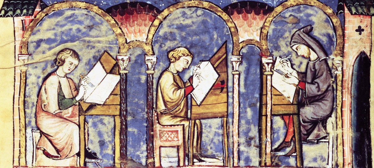
It was a great experience to look at the Persian manuscripts in class on Wednesday morning. I appreciated getting to look at them because it broadened my knowledge on the different types of style for illuminated manuscripts. From the Book of Hours and Les Tres Riches Heures, illuminated manuscripts to me seemed to follow the general mise-en-page of the template we were given in class. An image would take up all or part of the page. The images of the Limbourg brothers are particularly fascinating because there are multiple scenes going on within one image. A decorated of historiated letter would begin a section of text with rubric marking different sections. Marginalia, sometimes gilded, would go next to the text and create a sort of border. All of these aspects made the page seem very solid and filled with color and text. The Persian manuscripts to me seemed to contrast this. Most the pages had one image that was their focus point, surrounded by the text. Only one of the pages we saw had a marginalia. Of course, we only saw four samples and other texts could be very different. Another point the was made Professor Serrano was their exposure to elements. The Book of Hours pages’ are so colorful because they were closed off to the elements while the Persian pages were not. Perhaps these pages were more colorful and seemed to “fill” the space like the European texts before they faded over time.

These similarities and differences will be interesting to follow as we continue to read My Name is Red. It was partly the passage on the Venetian portrait in the palazzo that inspired me to about this topic of different styles. I loved how Enishte Effendi described how detailed it was and, that you could recognize the gentlemen in a crowd by going off of that painting. He waanted to do the same in a portrait of the Sultan because he was so inspired. While each region has their own style of manuscripts, there are definitely some over arching themes that can be seen in all of them.


The Writing Style in My Name is Red: Somewhat Confusing, yet Masterful

I have found the style of Pamuk’s My Name is Red to be fascinating, yet hard to follow. I have found myself a bit lost at times, but I think I am finally starting to pick up on the story. As we talked about briefly in class on Wednesday, the story is a murder mystery. However, I don’t think I truly realized that until after we spoke in class. I think because of the way the book is written there are a few directions one can see the story going, especially early on. Initially, I thought that the story was going to be a tale of two lovers reunited. Then, I thought it was going to be a tale of the revelations of a man returning to Istanbul after many years. After discussing the murder mystery aspect of the story in class, I am starting to understand the progression of the plot better. The very first chapter (fittingly titled “I Am a Corpse”) introduces the murder. Then, the important characters are introduced and their stories are told. This progression certainly seems more like a murder mystery now that I am reading with a more informed frame of mind. That being said, I do not think my initial perceptions of the story were unfounded, as the narrative certainly includes aspects of a love story and a tale of revelations. After firmly grasping the basic plot ideas of the novel, I have had time to reflect on the style some more.

The writing style in this book is a bold and courageous undertaking by Pamuk. Each chapter is short and is from a separate point of view. The way he seamlessly integrates the stories of each character (and occasionally a dog, or a tree) is masterful and adds to the story. The short chapters allow Pamuk to create many ‘cliffhangers’, making the reading fast-paced and exciting. In a story that focuses on illuminations, it is fitting that the writing style itself is a work of art. I struggled at first to follow the writing, but now that I know the characters better I can truly appreciate the decision to break things up in this way.

Class in Tres Riches Heures

One of the things about Tres Riches Heures that has been really interesting to me is the presentation of the upper class vs. the middle class. For example, the March image is of peasants working on the land, while the April image next to it depicts a wedding involving wealthy people. The disparity is incredibly evident in the juxtaposition of the two. Considering the fact that this book and books like it could only be afforded by upper class people, it is intriguing that the poor are even pictured, let alone in such stark opposition to the wealthy. Does it serve as a reminder to the rich of their position, or is it an attempt to accurately portray the lifestyles of all people who lived during the time? Either way, it makes me think of just how much class determined identity and lifestyle during the time (and even today).


A Question for You Guys

Last class someone (sorry I’m not good with names or faces) brought up the idea of the Middle Eastern illuminated manuscript being influenced by Asian, specifically Chinese and Japanese art and vice versa; however, I’m at a loss as to what specific influences Middle Eastern art has had on those cultures’ arts, especially Japanese art, since Japan was a distant, mostly isolationist (even exchange with China was limited) island. If anyone could point me in the right direction towards some examples or historical references, those would be greatly appreciated 🙂

P.S. Can someone tell me if this class is writing intensive? Because you people are writing a LOT on these blog posts.

Facebook

I’ll consider this post my throw-away, because it’s slightly ridiculous and I have more that I’d like to write about. Just some random musings. But after skimming through some of the posts from last Friday, I came across a very interesting post by Jack that discussed the ways in which we’re losing the visual literary traditions we’ve been studying.

I 100% agree that our contemporary Western culture undervalues calligraphy and the talent required to quite literally sculpt a book from natural materials. When it comes to script, I believe we’ve lost a very intriguing art form. However, I believe that current methods of Western communication retain many visual elements that correspond to illuminated manuscripts, perhaps in unexpected places.

Am I the only one who sees an eerie similarity between the Facebook layout and the illuminated manuscript template we got in class the other day? I couldn’t find a pdf of the handout on Blackboard, but here’s an example of a Facebook profile:

The profile picture stands in for the historiated letter, the bar reserved for ads on the right corresponds to the marginalia, the different sizes/colors of text resemble rubrics (words highlighted in red to designate a new section), the cover photo is the main miniature, and the various posts/announcements are presented in a manner akin to the succinct and simplified verses copied into manuscripts for the illiterate. Of course, that last observations begs the question: are we reverting to a textually simplified, semi-illiterate means of obtaining our information, heavily based upon obvious visual cues and pictures? No, I don’t think so. But it could be the ultimate throwback.

Contrary to popular belief, the United States is not an entirely literate nation. However, broadly speaking, literacy has become inconceivably more accessible in the past 100 years than it ever would have been for medieval laypeople. Facebook is different in that its ultimate goal is to communicate written ideas accompanied by pictures, whereas for owners of Books of Hours, the written text was unnavigable territory only decoded through the use of miniatures.

Still, I think it’s significant that our minds apparently continue to find the general layout of the illuminated manuscript intriguing and pleasurable. Much of this has to do with the incorporation of visual signs; they grab our attention and are aesthetically enjoyable. Facebook may have replaced hand-drawn illustrations with a wide array of imagery (photographs, video, digital art, and pictures of paintings) but one can’t ignore its focus on the visual aspect of storytelling. Some of my friends post nothing but photos. The images we encounter continue to tell stores in a compelling way; that’s something literacy hasn’t been able to eradicate.

I think we underestimate the presence of visual literary traditions and their “unconventional” narratives.

Très Riches Heures

The contrast and compositional parallelism in the different months of Très Riches Heures is quite striking. The May-June images particularly stand out to me. May depicts an outing of nobles on horseback led by musicians. They are pictured in front of a forest with a castle in the background. The action in this image is not bound in the frame, with many figures being partially out of the frame. June depict in the foreground peasants during harvest time, with a castle in the background. The peasants are hunched over in their work, contrasted to the nobles in the previously picture sitting upon horses’ backs. The composition of the images is extremely similar, which I find very interesting. The wall of the castle in June and the tree line in May are reflective of one another. The lines in both images are very similar, giving them the same structure even though their content is very different. One depicts hard work in the fields, while the other depicts a jovial event.

The Limbourg brothers were very successful in capturing the two different social classes and their differences while still having the images be connected. These are masterfully painted, and the actions all have a great deal of life to them. This gives a cohesiveness to the different months, and gives a sense of cohesiveness to the lands under the Duc de Berry. These images effectively represent both the joys of the nobles and the important work of the peasants under them. The brightness of the images also gives a sense of unity and harmony to the images and the people portrayed in them, giving a sense of splendor to the Duc de Berry’s land.

Buying a Book of Hours

I found the video streaming in class on Wednesday, February 3rd on how to purchase a Book of Hours slightly conflicting, but interesting. Particularly, I thought that the video came off as a sales video for artifacts – historians have to make a commission somehow I suppose. Moreover, I think the video could be characterized as an advertisement under the guise of a “how-to” approach. I was conflicted in that I usually view historians and artists as individuals invested in the study for the love of the subject, and not the type of individuals to make a kind of advertisement for their  services. The video detailed the ways to purchase a Book of Hours (who to go to, what to look for, etc.), however, as we discussed in class, the prices were slightly inflated.

Looking at the video through a marketing perspective, it is a crafty way to attract buyers. If I had money to spend on a Book of Hours, I would do so, because the creators of the video chose two highly informed speakers who are very passionate about their field of study. Their passion for Books of Hours came through the video, and they heightened the worth and importance of Books of Hours for me from a more contemporary standpoint. I am torn between appreciating the video as a testament to Books of Hours, or depreciating it as a “sales” video. I suppose it’s a little of both.

Metafiction in My Name is Red

We have spent a considerable amount of time in class discussing  metapictures – images that in some way reflect or comment upon themselves without departing from the genre. Perhaps it is appropriate, then, that we encounter the literary equivalent of this phenomenon in My Name Is Red. Pamuk is unapologetically self-referential from the early pages of the novel, the result being a narrative that is complex, clever, and amusing.

Following a short bit of exposition in the first chapter, the narrator, whom we know to be the late Elegant Effendi’s ethereal counterpart, offers a claim as to what might happen “if the situation into which [he has] fallen were described in a book” (5). Another character contemplates a similar fate in a later chapter. Shekure, daughter of Enishte, muses, “perhaps one day someone from a distant land will listen to this story of mine” (43). In these particular passages, the narrators don’t claim knowledge of their circumstances within the pages of the story; this ignorance is stripped in the next instance of metafiction, in which a painted dog directly addresses the reader. In context, the painting hangs behind a speaker who is voicing the sentiments of the dog to the patrons of a crowded coffeehouse. In a justification of his vocal abilities, the dog says, “I’m a dog, and because you humans are less rational beasts than I, you’re telling yourselves, ‘Dogs don’t talk'”. This passage alone suggests that the dog is speaking to the crowd in front of him. However, he continues, “nevertheless, you seem to believe a story in which corpses speak” (11). This latter quote affirms that the dog is indeed addressing the reader, and consequently, that he knows that he is a character in a book.

Pamuk’s metafiction is evidence of the inter-genre blending that takes place in My Name Is Red. There is a constant dialogue between art and literature that manifests itself in various permutations of commentary – art commenting on itself, literature commenting on art, art commenting on literature, and literature commenting on literature. This meta cocktail produces a book that, like the borders of an illuminated manuscript, interweaves, winds and crosses over itself, and uses space effectively.

Très Riches Heures

The Images within the Très Riches Heures are not very religious. In fact, they are secular of nature. This is very interesting seeing as it is a book of hours in which, ideally, the owner of it would pray to every day. The owner and commissioner of the Très Riches Heures was the Duc de Berry, who was extremely wealthy at the time and controlled vast amounts of land. This is all displayed in one form or another through the Très Riches Heures, seeing as each miniature is a landscape in which a different castle is shown each time, as well as the great detail in the illuminations. However, I am not fully convinced that the Très Riches Heures is the best example of a book of hours – even if it is extremely lavish in its quality and detail – because it is a secular book.

In my eyes, books of hours should depict scenes that remind the reader of certain events that are religiously important. On the other hand, the miniatures in the Très Riches Heures show the seasonal events of the peasants and wealthy, not of religious scenes. Not to say that the Très Riches Heures is not valuable, because it is. But it gives more of a glimpse into how seasonal changes affected the population in and around modern-day Paris than it does with a proper religious book of hours, because one is secular and the other is not.

The Meaning of a Tree

“I don’t want to be a tree, I want to be its meaning” implores the tree, or the picture of the tree, that narrates chapter 10 of My Name is Red. Pamuk’s novel is full of imaginative postmodern identity-play, frequently calling attention to the book as an object, to all books as objects, to the artifice of narrative, and to the narrative of artifice.

The chapter I Am A Tree was particularly interesting not only because an ‘inanimate’ object is narrating, but because of the interplay between the image, the description, and the actual. “As a tree, I need not be part of a book. As the picture of a tree, however, I am disturbed that I’m not a page within some manuscript.” The tree raises in this passage a question of dual identity; it refers to itself as having two potential and perhaps coexisting self-concepts: that of a tree and that of a picture of a tree. The relationship between these is fraught because of the complicated nature of images and icons. Earlier in the novel, a character describes how he had to draw horses ceaselessly in order to figure out what a horse of his own imagining would be. The tree is a tree of our own imagining, but what is that? Do we draw upon an icon of ‘tree,’ a kind of mental stock image? if so, this is not ‘a tree’ but some general kind of tree-archetype that could possibly be one tree in nature but not every tree of our imagining. Yet the tree introduces itself as being both, or having the potential to be both a tree and a picture of a tree. As readers, we cannot know if there was ever a chain of identity leading from a ‘real tree’ to a depicted tree to the voice we read in the novel. Of course, the fact that we are reading the words ‘I am a tree’ means that there is a descriptive element, or perhaps more accurately and ekphrastic one, in our reading. The competing identities of the tree are a source of anguish because the tree has fallen from its story; it was meant to be part of a manuscript but does not know what part and therefore has no identity beyond its general tree-ness.

However, as the quote “I don’t want to be a tree, I want to be its meaning” indicates, the question of identity has an added transcendent layer. The narrating voice desires an identity beyond that of a symbol; it wants to be symbolic, it wants to be that which is indicated by the use of a form or image. In a novel as full of questions of the validity of iconography as My Name is Red, this plea is especially significant. We question whether the tree, isolated from its story, transposed into another story, with an identity that exists in a state between real, described, and depicted, can achieve this kind of status as ‘meaning.’ But then again, what is the ‘meaning’ of a tree? Is a physical tree a meaningful object? Is a description of a tree, or a drawing of a tree? Perhaps our connection of a tree with a meaning is arbitrary and not suggested by anything in the form or function of a tree, since those features change depending on whether the tree is physical or described or depicted. Images and descriptions both are tools for meaning in our typical usage. The narrating tree has no fixed identity precisely because the multiplicity of words and images, or the multiplicity of the levels on which words and images are operating, brings with it a multiplicity of meanings.

css.php