Illumination as Meditation

I’ll be honest- I usually have a little trouble keeping my eyes open during the first few minutes of class at 8:30am on Mondays and Wednesdays. It isn’t because I’m not interested, I am just not operating on all cylinders quite yet.

However, this Wednesday was totally different. We had such a nice and relaxed set up, with food and paints and even music. I started planning out my letter, and was soon totally absorbed in the activity. I don’t think I looked up from my project once during class. I got in a real rhythm while retracing my lines and listening to the Gregorian chants. I found myself wishing we had more time to finish the letters when class was over. I left class feeling totally energized and ready for the rest of the day.

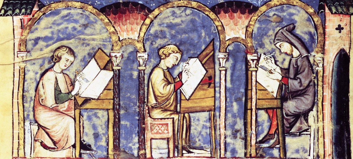
I think our little scriptorium was therapeutic in that it made me slow down and realize that having time to something like draw and paint is really relaxing. It also made me appreciate even more the historated letters we’ve been looking at in class. The detail and concentration that they require is truly impressive. Looking around at all the letters we made in class, I was struck by how differently each person addressed the assignment. I am really excited to see what everyone does for the larger assignment. Maybe we should have a scriptorium every Wednesday???

Knots and Water Colors

I chose my own initial for my letter in the scriptorium exercise.  I chose a design incorporating Celtic knots, which proved to be more than I could handle in the allotted time.  I found a renewed respect for the monks that would spend weeks completing a design as the knot proved a far more laborious design than I anticipated.  To try and personalize the letter, I replaced the animal imagery in the design I was loosely basing my work with a black dog, specifically my grandfather’s dog Sam.  Where the original design had a bird head holding the sun in its beak, mine had a dog holding an oversized frisbee.  I never did get around to using the gold leaf, but I look forward to working on my letter in my spare time this weekend.

In the meditative environment of Gregorian chant, I can see how an illuminator could spend such an extended period of time working on a manuscript.  I had a lot of fun and I may find myself drawing more letters on my own time.

The Illumination Process

When starting on this illuminated letter, I knew of the amount of detail that would have to be involved after reading the Book of Hours and My Name is Red.  Both works either showcase the intricate designs or describe them through words.  However, in both cases the books let the reader know just how much time and effort is put into creating an illuminated manuscript.

When entering the scriptorium, I knew what I wanted to do with my letter and the context (song lyrics) that would go along with it.  However, I didn’t realize just how long the process of even creating a simple pen-and-watercolor design would be.  I didn’t finish putting al of the colors into my letter, let alone adding gold leaf or writing down the rest of the lyrics!  This scriptorium project allowed me to have an even greater appreciation for the works that illuminators did in the past with even fewer resources and longer waiting periods.

Wednesday Workshop

This past Wednesday workshop was fun. It was the first time since elementary school that I worked with watercolors. Although I was excited about working with a new medium, I spent too much time focused on the aesthetics of my letter. Unfortunately I was unable to even get started on my watercoloring.

I decided to do the letter F. I took a different approach and instead of making my letter rigid with straight lines, I made everything cursive. This change in style was mostly likely what caused the most time consumption during the scriptorium. I spent too much time making sure certain areas of my drawings did not look awkward. Another dilemma that I seemed to have was deciding the size of my illuminated letter. The size might have also contributed to the time spent drawing. Although many might disagree, I believe that the scriptorium workshop enabled us to notice the amount of time it takes to illuminate anything. While it might look simple, it really isn’t. Many decisions need to be made before creating and illuminating a letter. I believe I may disregarded some decisions that may have prevented me from finishing my illuminated letter. What do you think? Was there anything you could have done better before creating your letter?

‘J’ or an umbrella?

The scriptorium workshop this week, whilst no doubt illuminating (forgive the pun), was perhaps inauthentic in its portrayal of miniaturist art practices. I do not mean this in the sense that the class failed to recreate the environment of a sixteenth century monastery. This is of course impossible, as time machines are not yet sold. Rather, I found it confusing to have to embellish an initial without a greater text to guide my illustration.

Our text was simply a letter. In my case, my letter was ‘J’. And I would argue that a ‘J’ is already the perfect calligraphic embellishment of the letter ‘J’.

Yet we all engaged in elaborate illustrations without anything to illustrate.

I wonder then, which came first: the illumination or the text? Did anthropomorphic initials provide inspiration for a manuscript, or, did the manuscript guide an illustration?

Nevertheless, if I was to engage in ekphrasis, and so create text for my anthropomorphic initial, my ‘J’ would have reflected perhaps a rainy day as my ‘J’ was an umbrella. Under the umbrella, safe from the rain, hot air balloons flew; stick figures fished off clouds and flew kites; and a garden of roses grew below.

Indeed, just from this stimulus, I believe it is fascinating to consider just what text would accompany our initials, initials whose embellishments are undoubtedly subconscious and thus surrealistic.

Without a strict purpose for our illuminations have we then stumbled upon surrealist illuminations?

Have we stumbled upon a blending of modern and ancient art?

Surviving the Scriptorium

On Wednesday I picked up watercolors for the first time since middle school, and once again I learned the importance of having watercolor paper to use with watercolors. Before the scriptorium, I had decided to illustrate a Celtic letter “U” with some spirals between the two posts of the “U”. All was going well with the sketching and coloring -I was pretty much done- until I decided to try my hand at gilding. Things swiftly went downhill as my once somewhat decent letter “U” turned into a mess of running felt-tip ink, sticky glue and flaky gold.

But, despite this post sounding overwhelmingly negative, I actually had a lot of fun. It was like I was back in carefree elementary school for an hour, trying to color between the lines, and the presence of food definitely helped.

Religiously Protective Western Art

While viewing a picture of crucified Jesus, it occurred to me that the purpose of radical representation in Western artistic tradition is somewhat protective. It is possible that the monks did not want Christians to forget how they saw Jesus, they wanted to make sure he would be remembered in a certain way and documented their theories through representational illuminations by conveying them to artists.  Jesus is usually depicted with his slender form, his head tilted to his right in a submissive attitude that implies satisfaction by God’s will, with the sky as background in most illuminations, all which convey a strong sense of perspective tailored by the monks (I am unsure about the historical starting point of these illuminations, whether it is the Middle Ages or the Renaissance or something else). The monks could have deduced this perspective from the Bible, the only thing that lies in question is that the Bible was not interpreted until after the invention of the printing press by Gutenberg, meaning that the representations of Jesus in art could be interpreted as an attempt on behalf of the monks to “confirm” the supremacy of Christianity compared to other religions.

Scriptorium Reflection: The Role of the Viewer

One thing I experimented with during the workshop was how true to life I wanted to make my images look. When I was drawing parts of maps for the background of my “J,” I thought, well I could make these look as accurate as possible and have what I want to communicate (i.e. the map locations) strictly laid out. Or, I can try to evoke images of maps in general, of the world, or of traveling — basically, leave it up to the viewer to decide. This dilemma reminded me of the contrast between Western and Eastern manuscript traditions. The Western style represents people and scenery recognizably. Once we studied a few manuscripts, like the Très Riches Heures, I realized, yeah, it’s relatively clear what people are doing, what season it is, and that the Duc de Berry is proud of all his castles. For other illuminations, I feel like the symbols, especially the flowers, have a pretty one-to-one relationship in that each is used specifically to show a certain trait or virtue.

Meanwhile, the Eastern style is more abstract because the concept, meaning, or scene is supposed to be in one’s mind already; one doesn’t need a visual representation of it. It’s almost as if the artist trusts that the viewer will interpret the illumination in an appropriately religious and spiritual way (this is not to say that Western artists don’t trust the viewer). This speculation made me better understand the importance and influence of audience when making art. Do I trust viewers to interpret it in a way that I want them to? Do I even want my viewers to share my specific interpretation in the first place? These questions can also apply to how Pamuk presents the tensions between Eastern and Western styles in My Name is Red. I feel like Pamuk walks a fine line between explaining the pros and cons of each style, thus leaving it up to the reader to form an opinion, while showing acceptance of the Western style, or at the very least the mixing of both, thus nudging the reader towards a certain direction as well.

Scriptorium

I really enjoyed Wednesday’s scriptorium exercise for many reasons (including, but not limited to, the fact that we could bring coffee). I’ve never considered myself a big artist, but I’ve always liked watercolor painting. The biggest challenge was figuring out how I wanted to decorate my letter and actually getting my ideas on the paper. I’ve never been very good at sketching, so I stuck to adorning my letter with simple flowers, vines, and birds. The exercise helped me appreciate how tedious and detailed the art of illumination is, as I did not even come close to finishing in time and mine was nowhere near as intricate as the letters in the manuscripts. Overall, the exercise made me respect the illuminators and miniaturists who devoted so much time and creative energy to their craft.

Scriptorium Exercise: A (Reasonably) Unbiased Review

I anticipated Wednesday morning to be a relaxing departure from the monotony of academic routine. However, I was met with a challenge of a different sort entirely: I am rarely, if ever, confronted with my own severe artistic inability. I understand that the goal of the exercise was not to actually create a beautiful piece of art, but rather to garner a personal understanding of this type of art. However, this knowledge did not prevent me from growing frustrated with myself – because I so often neglect my artistic side (for good reason), I felt like a 3rd grader during arts and crafts.

As I left Root with a underwhelmingly illustrated “J” in my hand and good-humored self-deprecation in my mind, I realized that I had successfully completed the exercise. I succeeded not because I had drawn a block “J” adorned with some dinky leaves, not because I had managed to paint inside the lines, not because I had proven myself as a competent adult with average motor skills, but because I experienced firsthand how laborious the process of illuminating is. I cannot fathom the collective amount of time and energy artists of the past have spent poring over these historiated letters. It requires the sort of emotional investment that, while I myself do not share, ignites the passions of artists everywhere. It necessitates deep pride – or considerable fees – to fastidiously design and paint these complex pieces of art.

css.php