After looking at some of Goya’s prints, I started thinking that his illness provided him with a great advantage that enabled him to produce impressively critical works. Goya’s illustrations are characterized by penetrating sharpness, their effect is quite resonant and this primarily stems from the fact that they demonstrate a strong voice. Goya’s prints are quite lively, the people’s expressions are effectively articulated on their faces and there is a strong impression of texture, both which affect the viewers intensely. In my opinion, this sharp effect was purposefully incorporated by Goya as a way to transmit the irony of his opinions after he was inflicted with deafness. Goya’s illness made him secluded to some extent from the world around him and must have provided him with a different vintage point in his viewing of society.
Last of the Old, First of the New
In class, we talked about how Goya is considered both the last of the Old Masters and the first of the new. The reasoning behind this is easy to see in the difference between his two phases, particularly in how he interacts with the elite class. Phase 1 of Goya’s work was commissioned and classically trained by the ruling class; his work cooperated with the existing relation between art and elitism. (Of course art still carries a sense of exclusivity, but in Goya’s time the intensity and cost of labor made art less a matter of aesthetics than wealth, at least for the patron.) In this context Los Caprichos is even more bizarre–Goya completely rejects the institution by which he was raised, trained, and employed. It’s not even a matter of leaving it behind; he openly mocks it in the prints, almost brutally tearing down the Church, the monarchy, the elite, and the Inquisition. The change is so abrupt it’s rather extraordinary, with or without taking into account the circumstances in Goya’s personal life.
Pamuk and Books
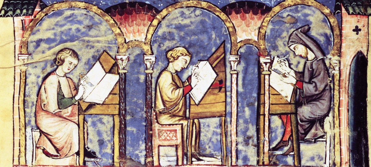
Looking at the special collections this week was very interesting and I enjoyed the illustrations. In particular I took note of the way scenes were illustrated, in part because of the time I have spent writing our first paper. My mind is still immersed in Orhan Pamuk’s descriptions and notions of illumination. I keep thinking about all the care and expertise that went into creating an illustration in his descriptions. The first printed works we looked at were remarkably detailed, but I found myself wondering what might be lost with mass production. In the illuminated works, I can see the strokes of the artist in the letters and pictures. Everything seems so painstakingly done and I am constantly reminded that an actual person spent hours to weeks laboring over this page. With the printed works, there was obviously just as much skill and care put into the engraving, but knowing that this is one reproduced copy among many disenchanted me somewhat. I don’t mean to belittle the work, but there’s a personal sense to the non-printed illustration that is lost to me.
Los Caprichos: A New Type of Illustration
Goya’s Los Caprichos is probably my favorite text we’ve looked at in class thus far. It is such an interesting juxtaposition of words and images, and so different than all the other manuscripts we’ve looked at. Los Caprichos was created solely for the viewer’s entertainment, rather than for religious reasons, like a book of hours. While viewing the images and their captions, I found that the humor Goya intended them to have still worked. I’m always interested in watching old comedies to see if their humor still holds today. I find that most things lose their humor with the passage of time, and few are able to make viewers laugh many years into the future. I think that Los Caprichos still works today because it pokes fun at universal themes like relationships between men and women and between the rich and the poor.
It was also fun to look at a different type of illustration. I really enjoyed watching the video about printmaking, which is not something I was very familiar with prior to class. It made me appreciate Los Caprichos even more. Though they seem a little simplified and gestural, those etchings were made in a complex, laborious process.
A Little Bit of Both
The visit to the library to see the special collections was fun. I had previously visited the museum to look at Ezra Pound’s collection. I do not remember if we were able to touch his letters or not but we did get copies of his letter. Anyway, the illuminated manuscripts were gorgeious. I find it outstanding that the library has such a collection of books and that they let us touch them. I doubt any other library would let us do that. Not only did I like the illuminated manuscripts but also the printed books that showed a variety of apocalypstic pictures.
The printed books reminds me of Goya’s series “Los Caprichos.” I find Goya’s work to be entertaining. While his work needs descriptions to be able to understand its meaning, I find it entertaining to try and decifer what he is trying to say.
Sacred and Secular, Once Again
When looking through the rare books, the two images that stuck out to me the most were the images of the constellations with their ancient Greek/Roman names and images depicted. Then, when Professor Serrano pointed out that the Christian version with Saints’ images and names attached to the same constellations was on the next page, I found it incredibly ironic. This ties into our previous discussions on how artists incorporated the secular into the Book of Hours and other illuminated manuscripts, ironically during a very religious time period and often with texts that were considered sacred. This practice continued throughout the middle ages and crossed over from hand-painted art to woodblocks and engravings. This type of intersection always draws my attention, so to have there two large images take up two full-page spreads back to back in a huge book really grabbed me. What went through the artists’ mind as they crafted these two juxtaposing images? Did they feel that it went against their religion to show such pagan imagery next to sacred images? Did those questions even register at all, or was the pagan just accepted seamlessly next to the Christian images?
A Quick Thought on Surreality
My immediate reaction to the Goya Los Caprichos prints were their uncanny resemblance to political cartoons of the late 19th and early 20th centuries. They both are founded in reality, take liberties in bodily proportions, and equate human fallacy to animals.
I feel very often we also forget that the all surrounding and rather immediate visual culture is quite new. For a few hundred years, people did not have access to images readily until the invention of etching and printing, at which point these images were the only visual connection people had to the world. These were their photographs. For this reason, I am surprised by the surreality of Goya’s aquatints. Although I do find flaws in them compositionally and technically, I appreciate is integration of imagination with reality. There are times where people or clothing is depicted wonderfully, but then include at the same time mannerist choices in facial structure and body positioning. Also similar to the surrealist movement just over a century in the future, the use of cultural or dream —or nightmare— symbolism is adamant, particularly in Plate 43. For something that acted as one of the very limited ways through which people saw the world, this combination of reality and surreality is intriguing and colorful.
Comparing Illuminations and Prints
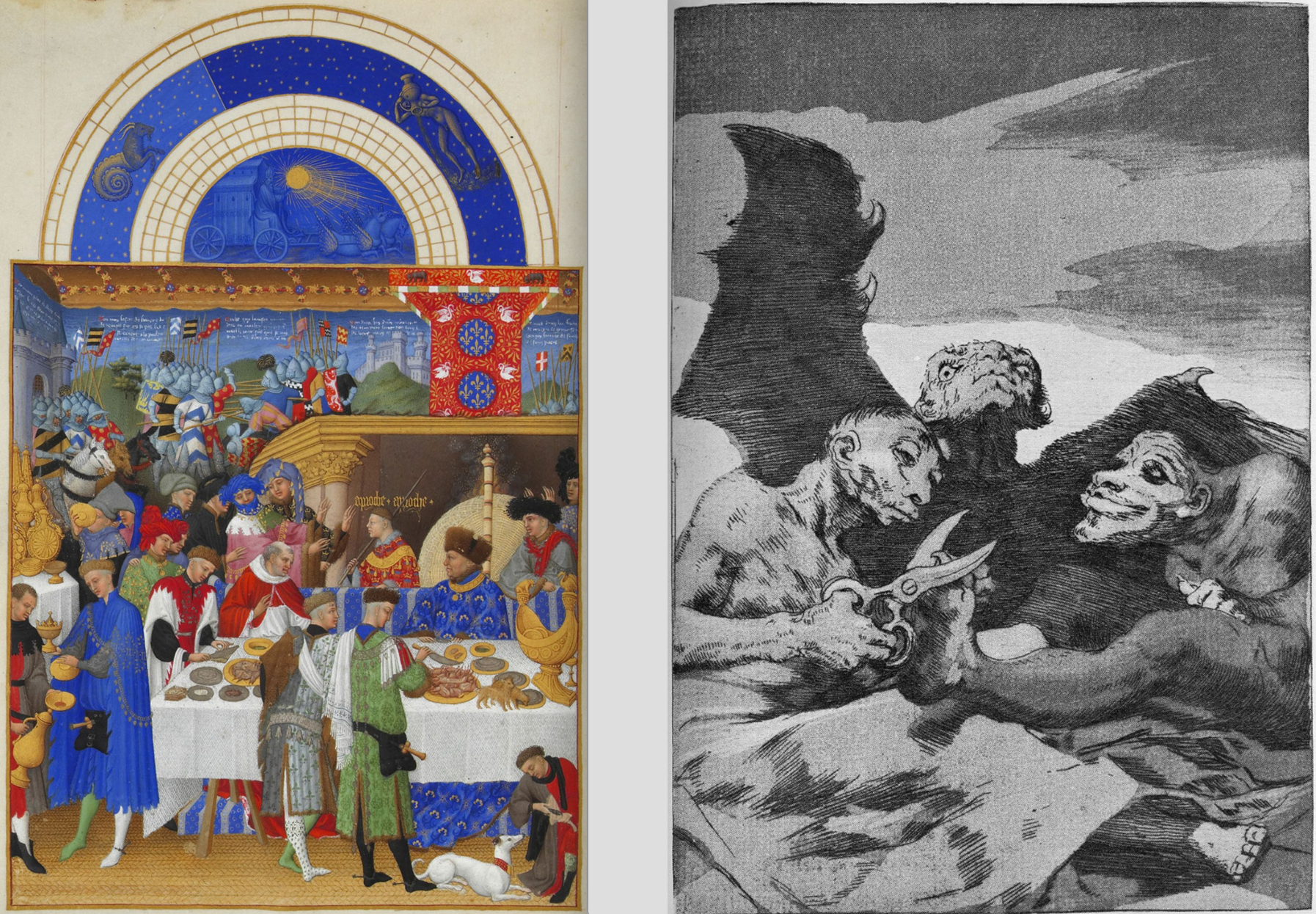
As we transition from looking at illuminations to looking at prints (and in light of our recent comparative paper), I have started comparing and contrasting the notion of illumination with that of printing. It seems as though the goals of illumination and printing are similar: to create an aesthetically pleasing work of art that provides an accompanying narrative. In illuminations such as Books of Hours, the narrative is hidden in metapictures and background details. The narrative is a bit more overt in prints such as Los Caprichos, as the crude prints provide commentary in a much more “in your face” fashion. So, the content of the illuminations and prints share many components (e.g. strong narrative and artistic appeal).
These side-by-side works provide insight into this difference. Each of the works provides some commentary on a social issue. The print (by Goya) paints a caricature of high-society by showing demonic creatures giving one another makeovers. Similarly, the presence of the working class throughout illuminations in the Tres Riches Heures (just like the one shown here) provide commentary on the place of the working class in society. Thus, both works aim to say something about the time period during which they were created. Where printing and illumination differ, however, is in their creation.
We have had the opportunity to watch several videos and read a few articles that have given us insight into the process of illumination and printmaking. The video we watched in class on Wednesday showed just how difficult it can be to create a print. The aquatint technique used in Los Caprichos requires attention to detail and the investment of a lot of time. Interestingly, the way prints are created allows them to be created in mass – adding to their availability to all types of people while simultaneously subtracting from their uniqueness. We have also learned a lot about the process of illumination through My Name is Red, The Secret of Kells, the scriptorium workshop, and various articles. Creating an illuminated manuscript requires making inks, creating the parchment, and then actually producing a final illumination. Hence, the process of illumination certainly takes a great deal of time as well. However, illuminations are unique and cannot be easily reproduced, limiting their availability to those with better resources. These differences in technique are interesting to consider, though the goal of illumination and printing is very similar.
Tunnels in the Book!
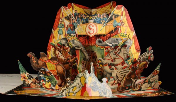
Monday’s class saw us engage with the library’s many ancient, illustrated texts. Whilst they were all fascinating, what truly ‘stuck out’ to me was Edward Gorey’s Tunnel Calamity. This was the first time in class that a text’s illustration had delved into three dimensions and sculptural representation. Naturally, Gorey’s ‘accordion’ book reminded me of ‘pop-up books’ that I read as a child where the pictures would jump out at you as you turned the pages.

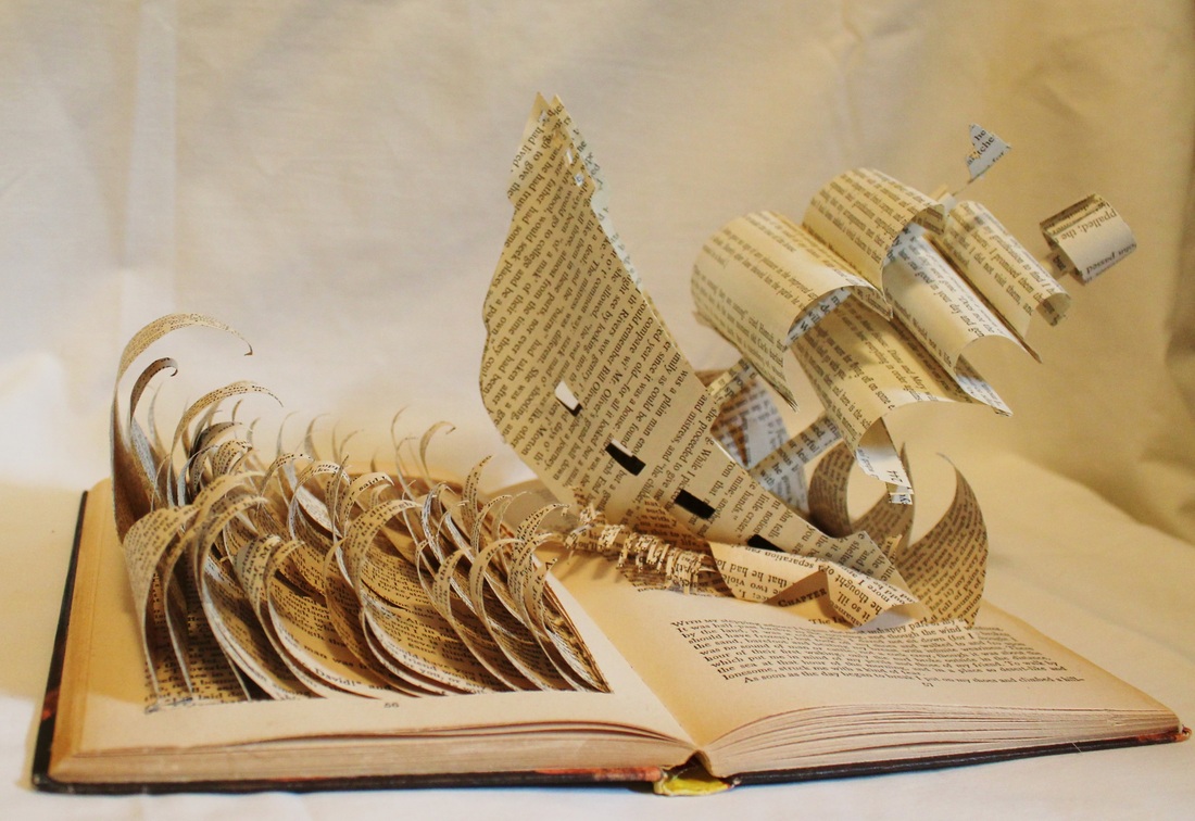
Similarly, if you are to look up ‘book sculpture’ in Google you will find a beautiful rebellion against two-dimensional representation.
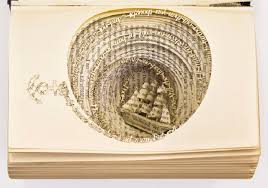
And I wonder how an added dimension of representation influences the embellishment of words? Indeed, how does the ekphrasis of a given three-dimensional piece, which would incorporate depth, differs from two dimensional pieces and illustrations?
Is it inappropriate to treat the book as sculpture?
Los Caprichos
I found Los Caprichos to be a very interesting read (perhaps “view” would be the better word). The images were crude but detailed, intense but confusing, evoking a myriad of emotions. The themes of violence against women and the restrictions of marriage particularly interested me, even though I found it frustrating that Goya portrayed the women deciding to marry as foolish.
One element of Los Caprichos that intrigued me is the captions. I understand Spanish, so I was able to read them in both the original language as well as the translated version. However, what I don’t understand is how people were able to grasp what each picture meant with just the few word captions and not the added paragraph with more explanation. One of the pictures’ captions is just “They are hot.” The added paragraph going with it adds that the men in the picture have eaten very hot food. I don’t think I would’ve been able to understand what’s transpiring in the picture without the paragraph, so I wonder how people reading Los Caprichos without that understood it. Perhaps Los Caprichos is better viewed when the images speak for themselves, but I’m just not sure I would grasp it without the added explanations.