The Sleep of Reason Produces Monsters (43) by Goya is no doubt a chilling image. The animals hover over the man, seemingly a representation of the fears within his mind. The shadowy bats’ creepiness, the owls’ screeching faces and wide eyes, and the glowing glares of two lynxes do a fantastic job of instilling fear. The scary creatures in our nightmares terrify us when we sleep, but sometimes they represent actual stressors which affect us in real life. The owl directly to the left of the man’s head is clutching one of his tools, maybe a magnifying glass. Goya takes this print to the next level by making the owl physically interact with the man’s life. One of his fears, represented by this owl, is so severe that it has crept into reality, perhaps interfering with his work. I think Goya might have been depicting the human tendency to keep certain fears buried within our minds until they get so bad that they start noticeably affecting us. Worse still, I noticed that the black lynx or cat at the center of the image is not attacking the man or even looking at him: it’s looking at us, the reader, crouched as if ready to pounce. Perhaps Goya is sending us a warning to confront our fears head-on before they take control of us and put us in danger.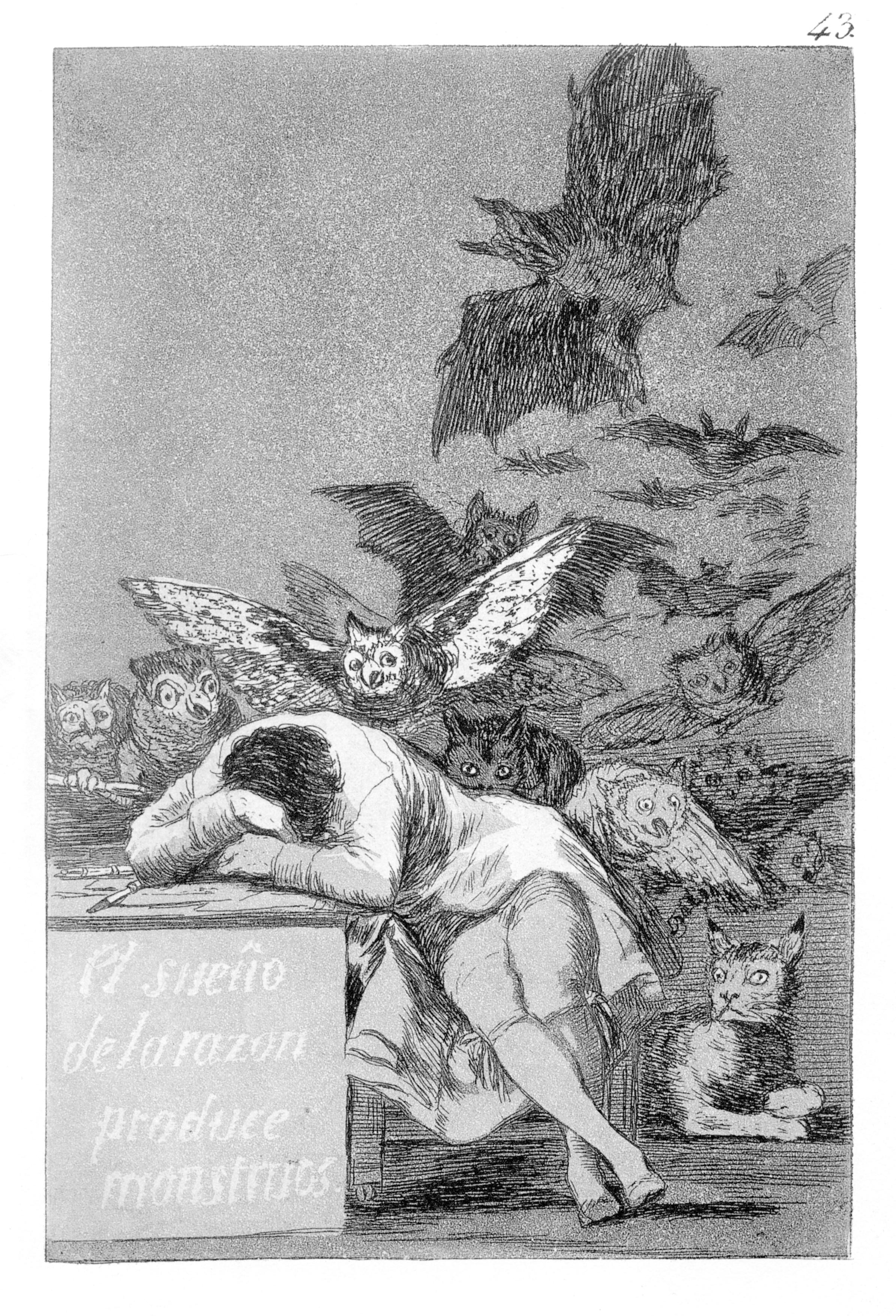
Dark Imagery and History in “Goya in Bordeaux”
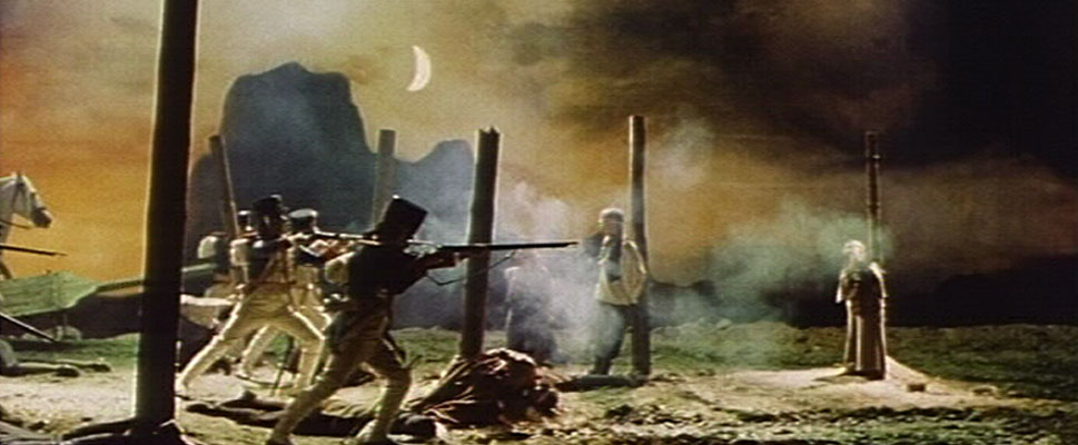
I found Goya in Bordeaux (1999) to be very informative and interesting as someone who came into this class with fairly limited knowledge regarding Goya’s life and history. I learned, or was reminded of many important aspects of Goya’s artistic life, including his inspiration by Velazquez, his voluntary exile and political involvement during the rule of Ferdinand VII, his relationship with the Duchess of Alba, his deafness, and his incredible imagination, which was often infiltrated and inspired by nightmares. I really enjoyed the dramatized and abstract scenes, which represented Goya’s nightmarish visions, because they gave me a sense of his imagination, artistic genius and the ways he was haunted by war and political corruption. Many of these scenes reminded me of images from The Disasters of War; even the dark style and scenery of the cinematographic images resemble the heavy shading of Goya’s prints. Seeing what Goya may have imagined made me feel that I could better understand his creativity and inspiration. The film also reflected the multifaceted nature of Goya’s artistic career—from his work as a court painter to his later printmaking, and even his more intimate and private portraits of the Duchess of Alba. I got a sense of the depth of Goya’s career, the periods of his life, and the ways his work reflect what he was going through at different points in his life. The scenes in which the young Goya walked through a corridor bordered by quadrants of his own life help frame this journey for the viewer. The dramatized scenes—such as the scenes of Goya painting at night with a ring of candles balanced on his hat—also did seem to reflect the degree to which the Spanish tend to admire and take pride in Goya and his work.
Just When I Thought It Couldn’t Get Any Weirder…
I’ve honestly found the transition from illuminations and My Name is Red to the printmaking and Los Caprichos to be startling. There is certainly a stark contrast between the visual nature of an illumination and a print. However, the biggest differences to me thus far have been in the message. Even the darker illuminations had a lighter feel than Goya’s prints. The prints are funny, granted, (at least in Los Caprichos) but are also extraordinarily crude and dark. I started becoming accustomed to Goya’s style, and the shock factor was wearing off, but just when I thought it couldn’t get any darker and weirder, along came Goya en Bordeos. There were two scenes that I believe captured the “dark and weird” aspect of the film. The middle of the film has a scene where Goya is working at night and he is surrounded by people with demonic masks and the end of the movie has a scene with the soldiers shooting innocent people. These scenes were both dark and very strange. That being said, I think they did a good job capturing some of the things that Goya incorporated into his art. The last scene seemed to represent a motivation for Disasters of War, and the scene in the middle captured the general crude and dark sentiment present in his prints.
It may seem like I don’t like Goya, but my “aesthetic discernment” (if you will) has not been clouded by my inability to get over the crude nature of his prints. I think the messages in Goya’s prints are witty, creative and insightful. I enjoy looking at his work and interpreting what he is trying to say. Moreover, the prints are beautiful, and I appreciate the skill that is required to make such detailed drawings. As for the movie, I was not a huge fan. However, I did appreciate the ways in which the film weaved Goya’s inspirations and his biography into the plot. Through his interactions with Rosario, Goya tells the story of his life and simultaneously reveals why he paints and prints the way he does. The style of this film certainly pays homage to Goya in a very fitting way.
Experience without Innocence
When I read the publisher’s note that prefaces Blake’s Songs of Experience, I wondered what would be missing from the experience given that we cannot also read Songs of Innocence. It’s interesting that the two collections of poetry are seen as being related to one another, and I was wondering about not only the relation of text and image within one book, but the relations of the two texts, or the two series of images, or the text-image relation as it spans both Songs of Innocence and Songs of Experience. Certain poems appear in both works, but I wonder if the images are different; the note mentions that there are distinct changes in Blake’s coloring technique from book to book. The relationship between the two books intrigues me, since they are meant to be approached as distinct yet paired or intertwined, which raises the question of what each text, each image, and the relation therein in one book has to offer for the other book.
Looking deeper into Songs of Experience, I noticed that this trend of treating texts as partners or pairs is really pervasive. The first poem, “Introduction,” calls out to the Earth. Then in the next poem, the Earth responds. Elsewhere, poems like “The Little Girl Lost” are answered by “Little Girl Found,” which is even more interesting given that “The Little Girl Lost” also appears in the earlier collection, Songs of Innocence. Then to add to that partnering there is the fact that, later in Songs of Experience, there is “A Little Girl Lost”- though it’s possible that this poem is similarly-titled but unrelated. The structure reminds me in a way of call-and-response songs, where certain verses set up a subsequent response, either as a constant pattern or as a gradual build to some kind of climax. I am not sure yet if Blake is working towards a climactic point or establishing a pattern of repetition. Perhaps the answer lies in the fact that Blake saw ‘innocence’ and ‘experience’ as ‘contrary states of the human soul.’ The arrangement of the collections into stages with a clear chronology- first innocence, then experience- leads me to believe that Blake might have seen these poems as progressing representations of the state of the human soul. Chronologically, the girl is lost then found in Innocence, then lost and found again in Experience, each stage of the cycle progressing Blake’s themes and commentary. The progress might be a contrast that demonstrates how ‘contrary’ the two states are, or it might be a transition that mirrors the growth from innocence into maturity; without the accompanying text it is difficult to say. But what interests me about this is the fact that Blake is working across media by incorporating text and image as intertwining units, and then locating those relationships within the scheme of a larger relationship within the individual text and across the partnered texts. Like a rhizome in structure, the multiplicity of partnerships and pairings, and the use of the texts as progressing stages of life and development, create a complex system of conversation between the individual pieces of art and poetry.
Thumbs Up to Los Caprichos
I really like the aquatint style that Los Caprichos is in. I think it allows Goya’s figures to look pretty realistic, even the horror- and fantasy-based ones. I don’t know how to explain it, but if I were to imagine what a monster looked like, Goya has created it pretty accurately. The use of tones and shading and the way Goya chose to position the figures are really impressive. These techniques add fluidity to the characters and bring them to life, which are qualities that go well with the humor in the captions. I feel like I’m getting glimpses of a comedy skit. While I appreciate the Dover edition’s good quality reproduction of the prints and accompanying explanations, I’ve found the high resolution images on Wikipedia to be super helpful. The clarity of the images is useful for seeing what’s going on, getting a better sense of the variety of tones, and distinguishing the individual etched lines and how they work together in the print as a whole.
I also enjoy the content of Los Caprichos. I like that Goya reveals the sometimes absurd, ridiculous, and/or ironic nature of societal conventions and norms, such as the woman getting married in “They say yes and give their hand to the first comer” (2). In addition to critiquing society on a larger scale, I like that Goya also comments on individuals and the human condition, like how greed gets in the way (“For heaven’s sake: and it was her mother,” 16) or how we are sometimes too preoccupied (“Which of them is the more overcome?,” 27).
Text and Image
As I was looking back through Los Caprichos, I couldn’t help but think of my class last semester that dealt with comics and graphic narratives. One of the major focuses of the class was the relationship between text and image. In many of the comics we read, the text and images were both vital to the narrative. Neither could tell the entire story without the other. If you lost the images, the text often made very little sense whatsoever. If you lost the text, a vague narrative could be conveyed, but much of the depth was lost. I find myself feeling rather similarly about Goya. In almost every image I’ve seen so far, I feel like it requires both the image and the text for me to gather a deeper understanding of the pieces’ intricacies. The text and images CAN be viewed independent of the other, but it is only when the two are put in communication that I feel any sort of deeper understanding. Perhaps that’s just my own disposition to art, but I thought it was interesting nonetheless.
Should’ve Would’ve Could’ve
As we transition into Goya, once again I find myself wishing I had taken Spanish in elementary school rather than French. Living in California, it seemed natural to me at the time that I should learn Spanish, but my parents’ wish was that I take French. I complied and now remember none of it. The only phrases I know by heart are “where’s the toilet?” and “I’m a fruitcake.”
But I digress. Talking with my native Spanish speaking roommate over the past few days, I’ve grown increasingly confused. We’ve been discussing the intricacies of Spanish and the subtle nuances/implications behind certain phrases, an English dictionary in my hand as I feverishly try to find suitable English synonyms for difficult words. As all of this is happening, I wonder if I would still have this much trouble understanding if I had learned Spanish in elementary school. I still have trouble with Cantonese and Japanese, which I speak proficiently, but I can’t help but have a nagging feeling that it would be easier if I had.
Is anyone else having this much trouble and/or wishing they spoke Spanish?
Why I Am Excited to Try Printing…Again
My first experience with printing was in 6th grade for a history project. We were studying Ancient China and each group had to create a hands-on project for the final, so my group tried block printing. I remember being so excited to carve out the individual blocks, partly because we had special permission to use swiss army knives, and partly because I couldn’t wait to see the final product. It was a long process to decide which characters we wanted, stencil the blocks so our characters would not be backwards, and finally carve the pieces of wood. Of course, after all of this work, when we went to print the characters on paper, they didn’t show up very well because there was not enough pressure and the paper didn’t hold the ink. However a classmate discovered that the block prints showed up really well on skin, and soon the whole class was walking around with characters printed up and down their arms.
Reflecting on this project really makes me have an appreciation for a master printer. It’s one thing to crudely carve into a block when you’re eleven, but another thing to go through the process we watched in class. The printers are so patient with every technique they use, recognizing a piece can require many rounds in the acid bath using different types of printing styles to be finished. They also check the print after each step, a method my group mates and I could learn from. Even though the process is long, it is worth it to get all the textures and tones for the final product. Of course, a piece does not need to use all the techniques we went over in class. Goya’s Los Caprichos just uses the aquatint method and his pieces are just as impressive. For the Los Caprichos aquatint works because it makes the pieces very dark and sets the tone Goya wants. The darkness also highlights the parts that are in light, and it adds to the dialogue Goya creates with his work.
Goya
The most fascinating thing I learned about Goya was his transition from traditional painting to the aquatint found in Los Caprichos. Observing this change, you can really gain insight into his own personal experiences and how these affected his outlook on life. Comparing something like The Parasol which he did in 1777 to something like Out Hunting for Teeth which he did in 1797-1798, you might not even believe that the same artist was responsible. The rich colors versus the etching and the different emotions you can draw from these works are amazing. I see The Parasol as an image of traditional beauty: a sunny day, a handsome young man and a beautiful, smiling young woman decked out in a luxurious dress with a snoozing puppy on her lap. There is not a care in this world, no sense of danger, and a calm, content feeling. In Out Hunting for Teeth, we see terror, death, suffering, and get an overall grotesque feeling. Goya’s art provides a unique look into his transforming reactions to the world around him. 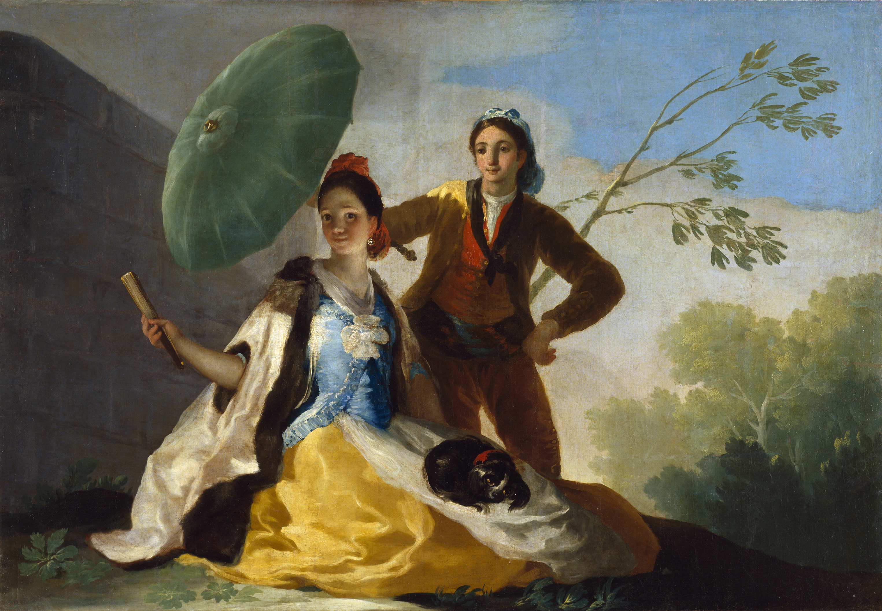
Translation
As a Hispanic Studies/Comparative Literature double major, I feel like my entire college career has prepared me for this moment. I find it fascinating to read and interpret this bilingual text, especially since, as the professor mentioned on Wednesday, translations can be problematic.
Something I always valued about the Comparative Literature major (RIP) was its intensive multilingual requirement. I think being able to read texts in their original language is a very important tool. Much is lost in translation and dialectal variability: ideophones, idioms, sarcasm, slang. I really appreciate this opportunity to compare a translation with its original in a classroom setting.
One particular translation that I found fascinating was the 32nd plate. The title says, “Porque fue sensible” which translates to “Because she was susceptible.” However, “sensible” more directly translates to “sensitive.” Perhaps the word was used differently 300+ years ago. It would be interesting to study the changes in lexicon. In this case, the word “susceptible” doesn’t dramatically alter the meaning of the image.
In 48, the caption reads “Soplones,” which means tattle tales/rats. It comes from the verb soplar, which means “to blow.” The engraving depicts flying witches/demon spreading meaningless gossip. However, the English translation adds extra descriptions: “Tale-bearers–Blasts of wind.” This isn’t a mis-translation, but I think it’s always interesting to note how languages vary. In referencing the verb “soplar”, “soplón” aquires a visual, rather comical description of the act of speaking (blowing air about) and the augmentative ending “ón” functions as a superlative noun that emphasizes the intensity of this act. The word’s literal definition would be close to: “someone who blows a lot of air.” We don’t, to my knowledge, have one word in English that can describe this particular idea. The difference in translation here highlights the diversity of language due to idiomatic and referencial differences. I think that’s really really cool.
Panel 71, the original caption reads, “Si amanece; nos vamos,” which translates to: “If day breaks, we will be off.” However, the book uses this translation: “When day breaks we will be off.” Not sure why that change was necessary.
I hope we spend some time on translation in class on Monday.