Word in the Image

This week in class we looked at Blake’s poems and artwork.  I was personally drawn to them more than Goya’s, for while I appreciated Goya’s grotesque work and the social commentary in his captions, I enjoyed the interplay between Blake’s poems and his images.  I enjoy the process of looking for the connection between the word and the image, which is often rather cleverly hidden, as with the rose poem we looked at in class.  They might not be the most high quality illustrations, compared to Goya’s work, but the level of thought and effort that went into their composition is readily evident.

It is in that process of looking for the connection between the word and the image that helps the viewer think about concepts and ideas that might not be easily expressed in word or image alone.  Together, the artist is able to put both forms of art into a new light and direct the viewers thinking beyond what is evident at first glance.

Images and Text

Both Goya’s and Blake’s prints are accompanied by text that elaborates and offers descriptions about the images.  Goya’s words are drenched in satire in a more mocking, sometimes prodding undertone that digs at the reader or the reader’s beliefs.  Goya’s texts are also typcally not incorporated into the printed images, but rather placed at the bottom or off to the side.  Blake’s descriptions aren’t as satirical, but more reflective of short stories and narratives.  Blake also embedded his text within his prints, often centering the print around the text in a way where the image is meant to enhance the text versus Goya’s texts that serve to enhance his images.   I found it very interesting how the text was (or was not) incorporated into the image and what type of text the artist chose to accompany the print.  The style of Goya’s art – darker, more dramatic, more detailed, done in black and whie- calls for darker and more satirical descriptions.  Meanwhile, Blake’s brightly colored images were enhanced by descritive poetry that forced the reader to pay closer attention to the details of the images and how these nuances intertwined with the poems.  It was very interesting to see how printed images could interact with text and be interpreted in such different ways after being produced through a similar medium.

The Sick Rose

Wednesday during class, a fellow class,ate criticized Blake’s illustrations. I partially agree.Even though Blake’s illustrations can not be considered the epitome of artwork, one has to also take knot account that he was mainly known for his poems. Someone referred to his illustrations as doodles and yet I feel that Blake’s illustrations were mostly a result of experimenting.

In class we analyzed William Blake’s “The Sick Rose.” It was not difficult too analyze the verses of the poem yet we did have a bit of trouble interpreting the illustration. While many may criticize his illustrations, I find his illustrations fascinating. In my opinion, I believe that William Blake was effectively able to translate the meaning of the poem into illustrations. Although the illustrations may not seem the best, I believe it contains some aesthetics that are pleasing to the me. What do you think?

Goya Thoughts

Yes, the movie was a bit weird. Yes, the movie was surreal with its winding time line. But there were two smaller stylistic decisions that attracted my attention- one for the betterment of the film and the other as a distraction. A brilliance on the film is the use of shadow and darkness within the bedroom scenes. Where as many times the outside world is lit significantly softer, in a pastel pallet. It is reminiscent of Goya palette within his court painting, and stirred a fair amount of emotion, which is his fingerprint upon the Spain art scene.

The stylistic choice I had the largest issue with was the disparaging interplay between a contemporary aesthetic and the romantic empire style of the set. When Goys interacts with the outside world either in his memory or in his current time, the style is historically detailed. However, there are scenes in which Goys enters his own mind, either speaking with himself in the past or future, and at that moment we find ourselves within a set with distinct and clear contrast between a utter blackness and a graphic representation of Los Caprichos for example. These images, and their source of inspiration/imagination were not molded into any wondrous dreamscape. Rather they were plopped down into place outside of time or place, outside of any contextual setting and blown up in a presentational style that would suit instillation art, not the mind of a 19th century artist. They were plotted down into an empty mind dressed as a blacked-out sound stage.

Blake and Visual Textuality

I have been confused about the main idea of this course, which I have not really started to ponder until our first writing assignment, when I was viewing Blake’s The Sick Rose. The delightful analysis we did in class made me think about the specific integration of symbolic elements through which Blake was able to deliver a comprehensive portrayal of the idea of procreation and the resulting transition from innocence to experience. The inclusion of the changing worm on top of the ecstatic/suffering female figure, the dying flower on the ground, using a moth as a reference to a male phallus, all such elements and more are carefully and purposefully organized in a scene that is intended to carry the viewer’s gaze from one point to the next to highlight the main idea behind the poem. This astute representation is one that allows viewers to understand the symbolic nature of pictures because of its conceptual simplicity, it integrates elements about the nature of life that everybody can relate to.

The Sick Rose-Blake-Print

As for the relatively poor technique of the print, I incline to attribute that, like Prof. Janelle said in class, to Blake’s purposeful integration of image and text. In Adam and Eve, it is clear that Blake was a versed artist, which directs one to think that his style in The Sick Rose must have been employed to serve a purpose related to meaning. Possibly, Blake could have produced the print with such a technique because of an awareness that it is impossible to fully embody a universal nature. This idea stems out of my belief that illumination is primarily non-visual, I am not sure if this hypothesis would be reasonable given Blake’s artistry in his other works before or after doing The Sick Rose.

Adam and Eve William Blake

In spite of my grounded belief that concepts cannot be visually illuminated, I believe that pictures urge people to think deeper by confronting them with piercing questions, it occurs to me this might be the result of our visually-dependent culture, but I have not given that much thought or study. The juxtaposition of the print with the poem “speaks” effectively of the nature of visual pictures, a metapicture.

Goya in Bourdeux

I really enjoyed the dialogues Goya had with his younger self in Goya in Bourdeux. Since reading Los Caprichos, I always wondered how the artist reconciled his high status as a painter for the royal court with his criticism of the Spanish government. The two scenes in the film, first with Goya looking at Los Caprichos and at (what I assume were his) portraits, shed some light on this contradictory situation. Although I’m not sure what Goya’s relationship with the court was or how they received Los Caprichos, based on the film it seemed like Goya struggled a lot internally with his thoughts and opinions on Spain’s future. Thus, I appreciated the film in that offered a biographical lens through which I could further understand Goya’s work.

Young/old Goya’s commentary on Los Caprichos brought to life what was going through the artist’s mind when he created these prints, or how he intended them to be interpreted. In the later scene, his ambivalence about who has chosen to paint (“to think once I was proud to be there [in the] […] ‘court of puppets'”) makes me think about the role of art and its consequences — after all, portraits last. His conflict with his conscience and eventual reconciliation with it (“But I had no choice. I did paint people I admired,” “In my defense I must say that I have worked a great deal […],” “I have sacrificed and persevered to overcome the hostility and envy of my colleagues, the criticisms of some, and the dangers of the Inquisition”) helps me piece together the dialectical relationship between the artist and his art.

Overall, I liked the technique of learning about Goya’s earlier life through the perspective of old Goya. The inclusion of his self-reflection in those two scenes (and in others as well) indicates the significance of art in his life, especially in relation to the social and political climates in Spain at the time. I realize that an artist’s career can’t only be summed up with an evaluation of all of his/her works from an aesthetic perspective, but might also include the biographical stories and contexts that have affected these works.

Comparison of the Poem “The Tyger”

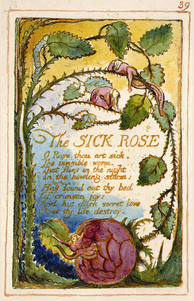
Honestly, I never knew that William Blake had been a printmaker and a painter in addition to being a poet. I remember studying William Blake during my freshmen year of high school, but it we had examined his poems within a larger collection of British poetry, alongside the work of William Wordsworth, and other English poets. The collection did not include any prints or illustrations, so visuals to go along with the poems was left to the imagination. One poem my class studied extensively was “The Tyger.” I even remember my teacher having each person in my class read the poem out loud so we could have a personal interpretation of how the poem is read. I personally thought the poem was very dark, and had a heavy tone to it. The poem starts off with the lines “Tyger Tyger, burning bright,/ in the forests of the night;” and I imagined a tiger emerging from a dark forest, a beacon of light. The fourth stanza really establishes the rhythm for me, and it incorporates the heavy tone I associate with the poem.

“What the hammer? what the chain,/ In what furnace was thy brain?/ What the anvil? what dread grasp,/ Dare its deadly terrors clasp!”

From this stanza, I imagined a furnace, which is something that is usually surrounded by darkness, but within the furnace there are embers and fire that emit light. The imagery in my head was similar to the tiger being illuminated within the dark forest. Overall there was still a sense of darkness and power in the poem. The way I pictured the poem without illustrations in high school definitely influenced the way I perceive the poem today. I was surprised by the way William Blake printed “The Tyger” in Songs of Experience because it seemed too happy to me. It’s not the most colorful poem in the book, but the color scheme is made of pastels, giving it a lighter tone. The sky is kind of dark blue in one corner but it does not indicate the dark forest I had pictured five years ago. The tiger is the focus of the print, but it doesn’t pop out from the page because it is “burning bright.” Instead the tiger contrasts the pastels since it is drawn with such heavy lines. I imagine the page looks the way it does because of the way Blake printed, working with the positive instead of the negative. I’m just shocked at how differently I had picture the poem just based on the words from the way Blake chose to show it in the Songs of Experience. I wonder if anyone else in the class did not expect the Songs of Experience to be like this.

Printmaking Process

“Los Caprichos” by Francisco Goya utilizes printmaking techniques to produce a piece of art. The images found in “Los Caprichos” are often satirical and dark, but are enjoyable to look at. To me, the thing that is most interesting about these prints is the process it takes to make them. I have some experience in etchings before, and can attest to Goya’s mastery in the art. It is not easy to print with metal. Furthermore, Goya also uses aquatint. The difference in a regular etching and aquatint is easily noticeable in a print and definitely adds to the character of “Los Caprichos.” Regardless of the technique, printmaking is a very labor-intensive process and can be quite time consuming. This adds to the commitment that Goya had in creating pieces that stimulated social and political conversations.

Something that is very intriguing about “Los Caprichos” is the tone in which they communicate. Using only black ink on all of the prints, Goya uses his prints as a satirical device. They surely would have a different mood if bright colors were used. Seeing as “Los Caprichos” contains prints that challenge social and political norms in Spain, the usage of black ink definitely adds to the satirical aspect and makes the prints more serious.

Printmaking involves the creation of many layers that all add to the final image. It also requires the artist to carefully plan out what he or she is going to etch into the metal, seeing as all the prints are based off of the physical piece of metal. These aspects of pre-determination adds even more to the messages being sent to the viewers. Just like the printmaking process itself, each image is layered with meaning. On the outside, they may look comical. But this joking quality adds to the satirical nature because a deeper political or social message is hidden underneath all of the bizarre imagery being portrayed.

BBC Documentary – Goya by Jake Chapman

Early this week, I had the pleasure of watching the BBC documentary on Goya, hosted by Jake Chapman. Throughout the ~:30 minute documentary, Chapman goes to numerous sites in Spain that feature Goya works and/or inspired his famed creations. In one such museum, Chapman observes Goya’s dark etchings, work from his later years in life after he lost his hearing and his wife had died.

I found it fascinating that Chapman mentioned the “blurred line between biography and portrait”, a phrase that perfectly captures the relationship we seek to understand in class. Chapman goes on to say that his morbid creations at this time indicate his mental state – some of the faces look like they are from an insane asylum in deep anguish.

Yes, Goya’s works at this time provide insight into his mental state, but I think they function as a signature as well. Just as signatures change over time (when we are young and first signing documents, our signatures are clean and pristine; full of life. As we age and grow comfortable [maybe too familiar] with signing things, our signature becomes a “dead” scribble) Goya’s works are a darker signature, one worn with age and the routine of life. As Jake Chapman notes in relation to Goya, “In order to be good, you have to see some bad things.”

Goya in Bordeaux

The movie Goya in Bordeaux did a good job giving a sense of Goya’s art and the circumstances under which he created it. The color palette of the movie was very interesting to me, and I felt many scenes reflected the style of prints well. Many scenes were monochromatic, which is similar to how many prints are made. The color red was heavily used, and the red acted as a nice compliment to the dark scenes of Goya’s art and the chilling feel of the movie when Goya saw his work coming alive or transforming into memories of the past. Goya, portrayed predominantly in white, was nicely contrasted to the Duchess of Alba, portrayed in black, who seemed to be a figure representing death.

While the movie visually interesting, I found the convoluted plot to be confusing at times. The switches between his time at the end of his life with his daughter and his youth with the duchess occasionally left me confused about who the characters he was interacting with were, and left me questioning their significance to him. This, however, was beneficial in terms of portraying the struggles Goya went through in losing his hearing and the troubles he faced in his life with his illness and inability to let go of the past.

css.php