Printing Press Idioms

During our class on Wednesday, Professor Rippeon went over some of the printing press nomenclature with us. He also explained that the expression “out of sorts” arises from being out of a particular kind of type. As it were, the printing press era gave rise to a number of commonly used idioms. I took the liberty of looking some up.

One such expression is “mind your p’s and q’s”. Because they could be so easily mistaken for one another, especially in a backwards or upside down orientation, type setters had to pay extra attention to ensure they were using the correct sort. In the conventional type case, they are also right next to one another.

The designations “uppercase” and “lowercase” also have their roots in printing. The large letters would be kept in a case high on a shelf, while the small letters would be below that. In that time, the “uppercase” and “lowercase” letters rested in their namesake locations.

A final expression is “hot off the press”, for reasons that are fairly obvious. I always find it interesting to learn the origins of common expressions; the printing press revolution had not shortage of these.

Thoughts on Printmaking Workshop

I’m really glad our group decided to go with woodblock instead of lead, because my preconception of how the printing process would go involved moving pieces around relatively easily. I enjoyed working with the woodblocks because it offered the right amount of artistic freedom with a good degree of restriction and limitation. The process was like putting together a puzzle / problem-solving on two levels: first, we had to use what we were given (the parts) to make something (the whole); second, once we decided on our parts, we had to make sure they fit together given the boundaries and capabilities of the galley and magnets. I appreciated how the process of putting together this puzzle was an iterative: if a piece didn’t work (as in, physically fit into wherever we wanted it to go), we had to put it back and rethink what we wanted to represent. Going back to the drawing board multiple times made getting to the cohesive design in the end all the more rewarding.

Using the printing press was very cool, and gave me a newfound appreciation for the invention. I’m probably going to look up the mechanics behind how the different gears and parts work together; I’d like to demystify (in a good way) this magical machine. I almost expected a “ding!” sound when the cylinder hit the end of the “track” (I’m pretty sure it’s not called that) and made a click. It was instantly gratifying to have such a quick feedback: you ink your pieces, feed paper into the clips, turn the handle, and out comes a print that you would see hanging on a wall or in a book. Going from blueprint to final product within the timespan of a class was a satisfying experience.

There are two things I’d like to recall from the workshop but can’t seem to remember:

  1. The brand name of the printing press (I think it was van something… I would love to find out more about the company’s history!)
  2. The name of the science of making the woodblocks the same level so that they get inked evenly (Prof. Rippeon mentioned this as he slid paper underneath our stag woodblock to elevate it to the right height)

Rembrandt and Goya

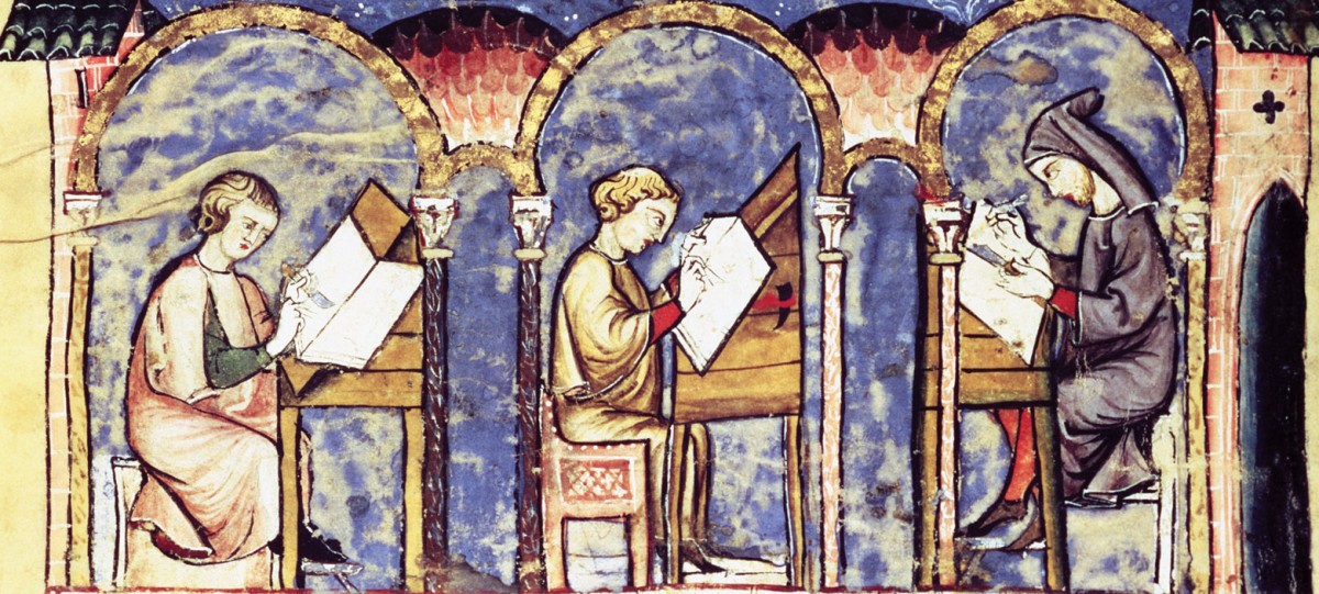
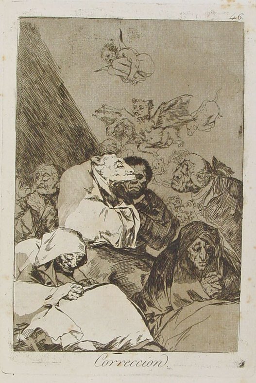
I have been thinking about the reason artists use printmaking to produce their works when they could draw sketches. I remembered Rembrandt, by whom Goya was influenced, and his innovative use of the medium, Rembrandt revolutionized printmaking by simple additions that made a drastic difference in his art. Rembrandt used a soft ground of his own devising to protect the acid plate which allowed him great flexibility in his use of the etching needle that is close to that of drawing with a crayon. Rembrandt’s lines were quite flexible and his influence on Goya is clear. It is mostly clear in the way his portrayal of the grotesque is mitigated, the wrinkles in the old people’s faces in Correction do not make looking at them difficult for the audience, but the point about their old age or being metamorphoses is delivered.

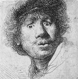
This self-portrait by Rembrandt demonstrates his flexible technique and his mastery of portraying vivid emotions on his subject’s face, the expression is quite bewildering, it could be disbelief or fear or a mix of both.

98

In Goya’s Correction the demon figures are drawn in a flexible technique that is close to Rembrandt’s style and the difference in focus between the demons, the shady figures to the left and the white figures in the right side could be inspired by Rembrandt’s style.

Goya-Corrección

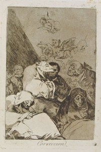
Apparently, artists used printmaking because it mostly allowed for a freedom and subtlety that is not found in un-colored sketches. Rembrandt is a pioneer of printmaking although he is not one of the very first artists who devised this technique. Even in techniques so flexible as Goya’s viewers can have some idea of visual textuality: the difference in focus between the characters, the careful distortion of the people’s features in a way not too repulsive, but just enough to drive his point home, the balance in the arrangement of characters (notice how there are two white figures to the right, two shady figures to the left),  and the juxtaposition of all such elements produces the illustration of an idea that does not need words to be clear, it is readable on its own if viewers are familiar with the social context from which the idea comes. This reveals how printmaking is quite an intelligent practice.

However, does that mean that every artist, in printmaking or painting, had visual textuality on mind when he was composing an artwork?

How Printmaking is an Art Form

I never considered text to be an art form because in the modern world there is a separation between the final product of the book and the creative process. The systemization of printing has been an innovation for the modern world. It has made books cheaper, and easier to access, which is a benefit for society. Printing has also become less the labor of humans and more of computers. I think mass printing has made me consider books not an art form, but a product of manufacturing. The printing workshop this past Wednesday helped me overcome that assumption.

A final print has so many decisions that go into making it just right. The text on the page must be placed on the galley properly, and this means the sorts should not be broken, upside down, or backwards. The sorts also have to tightly and evenly be locked into the galley. Even if everything is placed properly on the galley, the test prints can still show something is wrong, like that the text is off-centered, or not even on the page. Getting to run the printing press myself and go through the process made me appreciate printing as an artwork. Similar to setting up the layout of a painting and executing it, there are so many details that must be considered with printing a page of text. Text is an art form because ever step contributes to the final picture that is to be created on the page. The words themselves are really a meta picture because they also form an image in our heads in addition to their formation on the pages of a book.

When Can We Go Back?

I had a lot of fun on Wednesday -it helped that the print workshop was a nice change of pace from regular class and the weather was really nice. Learning about the printing process was interesting. I wish we had gotten to use the clamshell press, since it looked really cool (mostly I wanted to see what happened if someone put a soda can between the plates of the press).

Anyways, once we got started with setting up the letters, Araseli and I found a good rhythm (apparently she had memorized the key that showed which letters were in which compartments by the end of the first sentence, which is a little scary if you ask me, and I discovered a trick in which I pressed my index finger into the grooves of letters to determine if they were the right way up, resulting in black lines all along my fingertip) and finished our two sentences fairly quickly. We originally planned to do two paragraphs, which was then reduced to one sentence and finally extended into two, but I really wish we could have done more and that we could go back again…

Print Workshop

I was initially hesitant about the print workshop, mostly because it’s difficult to imagine a creative and enjoyable space in the basement of Dunham. I ended up really, really enjoying the process. I wasn’t expecting the process to be as labor intensive as it was–going through and finding each letter, arranging them, transferring them onto the printing press, preparing the ink, getting the ink on the rollers, printing proofs, and then printing a second set of proofs took a lot more time than I would have imagined. Having always considered the print revolution as a huge step into modernity, it was surprising to see how slow and manually dependent it was from a modern perspective. I really appreciated the opportunity to try the process myself, however, and I’m definitely a lot happier with the takeaway product than I was after the last workshop.

Printing and Divinity

During the print workshop, I overheard professor Rippeon talking about how the printmaking process essentially meant that no two forms of a printed work would be the same: for a start, it would be impossible to complete a large volume all at once because the printer would run out of sorts or paper or other materials, so books were produced in stages. Furthermore, several printers or apprentices might be working on a book at once. I found this point interesting because it is sort of antithetical to our idea of the modern printing process. Xerox machines and printers are supposed to produce a series of identical iterations of a page of type. Of course all machines have their slight variations, but these too are assumed to be reproducible. Printing by press leaves the type vulnerable to a greater scope of variation because the process depended on human labor. I found myself thinking back to My Name is Red and the questions Pamuk raises about art, style, reproducibility, and variation.

Part of the mark of a master illuminator, according to the novel, was the extent to which he was able to mimic a form that encapsulated the sight that Allah has of the world; deviation from the style established by the old masters was a mark of incompetence because the artist was representing what he saw with his own eyes. This means that style and variation are idolatrous because they privilege the sight of mortals over the ‘seeing-blindness’ that allowed the artist to approach Allah’s sight. A representational artwork could come to crudely replace divine authority. I wonder if the same is true of text, if text can have the marks of ‘style’ and ‘representation’ that might make art into idolatry. There are text artists who use a representational form of type, like the example of concrete poetry by George Herbert that Sabrina pointed out. But could the text just as it exists on a regular page of type, full of the human variations that would make an artwork unique and recognizable, be idolatrous? Would people have revered texts themselves as religious objects? The first book ever printed was the Bible, solidifying the connection between printing presses and religion. And it is worth noting that, at least in Christian doctrine, there is a connection between words and divinity in the form of Jesus, the Word Made Flesh. Perhaps the first printed books, were seen as being invested with the divine and were venerated or even worshipped for their novelty, individuality, and association with the process of printing.

Print Workshop

Getting to work with letterpress printing on Wednesday was really cool. It was intriguing trying to figure out how and where to place our text on the page to get the right intended message and design. My group and I found ourselves analyzing and going over every small decision on how to place the letters, because we knew how much of an impact it would have on the presentation and message of our collaborative print. This is indicative of special type of interaction between text and image; the text takes on the role of an image because its placement and style matters very much in sending the right message.  I think that’s really interesting – it isn’t an image with a text nor is it an image within a text; it’s text working as an image.

Text as an Art Form

One thing I started to think about at the printing workshop this week is how text can sometimes take on the characteristics and implications of visual images. Although we were printing text and forming words as part of our print, the questions we asked ourselves regarding where we would place the words on the page, what style of letters we wanted to use, how we should space the words, where we should place the words in relation to each other, etc. reminded me more of creating a visual image than simply printing or writing text. In concrete or visual poetry, the visual effect of words is more important in conveying meaning than the verbal significance of the text. So in certain works of creative writing, the visual appearance of words does become an image with significance and purpose. Although all the works we’ve looked at in the class thus far have incorporated visual images with text, it’s interesting to consider how text alone can become an image. The process itself of printmaking also felt like an art process, rather than an act of writing, and I think it still would have felt like an art process even if we had chosen to solely print words and not include any images of birds, faces, etc. in the print. The act of finding individual letters, lining them up, creating space in the right places and running the paper through the press gave me the sense that we were creating something. Maybe this is simply because writing in today’s culture has come to mean typing on a laptop keyboard or scribbling notes in a composition book, so I wonder how the conception of this process was different in the time it was commonly used.

An example of concrete poetry: George Herbert's "Easter Wings" (1633)
An example of concrete poetry: George Herbert’s “Easter Wings” (1633)

Printing Press

Before today’s printing workshop, I did not fully understand just how cumbersome it is to print from a printing press. And, on that note, I did not fully appreciate it. Now, with the electronic printer being the norm, it is easy to take printing papers that are quite long for granted. The process actually can take some time, particularly with the fine-tuning needed to ensure the final print is flawless. The printer has to first set all of the letters in place (backwards, of course) and then secure them so they do not shift when they are pressed. I have done printing before but mainly with silk screen or rubber blocks. The method of laying out letters and images inside a frame is something entirely new to me.

While the final print can be altered at any point (unlike a print using wooden or metal etchings), it still forces the printer to have a premeditated idea of what the final product is going to be. Furthermore, I came to learn that, when using big blocks that have a lot of surface area, ink has to be applied after every few presses in order to maintain a smooth print. I cannot imagine how time-consuming it must have been when the printing press was first invented to create long books. I can say that my understanding of the process is a little better, but then again I was only printing two words and an image, not a novel.

css.php