A Quick Comparison of Western and Eastern Illumination

The amazing thing about Persian manuscripts is the similarity it holds to Asian manuscripts. In particular what I was drawn to the the asymmetric play with void that appears to be a unique to the eastern manuscript aesthetic. For this comparison I will use the Persian illumination “Leila and Majnun in the Desert” , along with the Trés Riches Heures. per-163-120

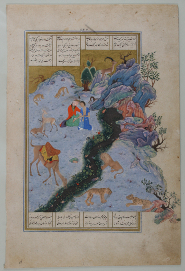
If we look at the western aesthetic choices made for an illuminated page, the West preferred the perfectly symmetrical appearance. In the Trés Riches Heures the image is split down the middle even in the astrological chart above the scene. The symmetry continues in the mirror self-reference to the composition of the previous and alternative page. However, looking at the Persian illumination this is not the case. Balance in the image is accomplished by building a juxtaposition between the void on the left (the relatively big open plane of pale blue) and the weight of the detailed and protruding mass on the right. This one sided balance is not typical of Western art. The focus in this image is on the rhythmic movement of the forms that carry the eye upward. The Trés Riches Heures is static in comparison. Although the figures portray movement and action, the image on the whole does not guide the eye rhythmically, but rather randomly.

Purpose of Manuscripts

The intriguing aspect about many of these illuminated manuscripts is their lack of utility. They were paid for by people who couldn’t read, written by monks who could read, and handed to patrons who relied on pictures to understand the print. Interestingly, one could only understand the picture if at one point, orally, they received the information necessary to decipher the imagery. Hence, despite being a visual culture of some sort, the majority of users of the manuscripts still required the older practice or oral communication.

In fact, when reading about the evolution of illuminated script in the Renaissance, I could only think of the art theories of John Berger. In his Ways of Seeing he discusses that the way we look at the art shouldn’t be just on its formal or thematic level. The picture of St. Augustine provided in the PDF demonstrates the early development of depth and volume (although rather cluttered and rationally incorrect) is fascinating on the formal level to see illuminated manuscripts develop as painting technics developed as well. Berger claims that the physical art and paint are simply a representation of societal peacocking by social standards. To look at the art for what the physical manifestation means – often the declaration of wealth and taste – is most likely the correct way to go about understanding the importance of illuminations. If it is useless in utilitarian way, it must have been a visual status symbol. The more gold, jewels, and detail the books held, despite what information they held, the more powerful the patron would appear. Thus reading the illuminated manuscript as tactile symbol of power decipherable by all those who lived within and could read the social structure and its cues.

css.php