Animation and Narrative

“The Lost Thing” was a very cool animated film. Not only did it provide a great story and moral for children, but it also incorporated some interesting narrative elements. For example, some characters speak but they cannot be understood, while others can be. Furthermore, the main character sometimes will narrate how people say things, as if he is reading from a book to a child. This could be Shaun Tan – the author of the short story that later got translated onto the silver screen – using the narrative of his book and putting it into the form of the animated film. This would keep the elements of reading the book, either to yourself or out loud, in tact.

In terms of the film being an animation, it definitely caters more towards kids. Maybe by infusing narrative elements into the short animation, Shaun Tan is attempting to promote that aspect to children a little bit. Something to keep in mind is how dull and repetitive the normal world is in the film. This definitely speaks to kids being creative, in that the world where all the lost things are seems very colorful and unique. Shaun Tan does a very nice job in terms of fusing the narrative elements of a book and the animation elements of a film. After all, it did win an Academy Award.
Color and Dimension

“Asterios Polyp”by David Mazzucchelli takes place, for the most part, within two dimensions. Obviously some aspects of shading come into play when Mazzucchelli made the graphic novel in order to give it some three-dimensional aspects, but it is mostly two-dimensional. However, when we put on the 3-D glasses, the graphic novel truly became something of three dimensions. While some of the pages did not jump out at me as much as others did, the ones that did jumped out a lot. Not only does this bring to life certain aspects of the page that might have gone unnoticed before, but it emphasizes the things that do not jump out as well by creating a three-dimensional border of sorts. This could be a very interesting way of viewing the graphic novel, whether or not Mazzucchelli had this in mind when he created it. Regardless of this, the color in the book speaks to the scenes as well. When things are good, the colors are vidid and bright. But when things are bad, Mazzucchelli utilizes darker and more washed-out tones. This creates an overall aesthetic to the graphic novel that lets the reader know what is going on even before they read the text.

Illustrator

The workshop on Wednesday where we worked with Adobe Illustrator was really fun. Personally, I have used the program before and am very familiar with it. I think it’s a great tool that can be used effectively to illustrate ideas and create pieces of art. And, in terms of a collage, I think that it could be extremely useful. Piecing together different parts of pictures is really fun and should come out well when using Illustrator. Furthermore, I find that, because there are so many ways to use the program, many different types of artwork can come out of it as a result. Both using images on the internet as well as drawing something from scratch can all produce different results that have the possibility of being really cool.

The collage itself is a very interesting art form. It prides itself on solely taking things from other people and compiling them into one image, therefore creating something from the mind of the artist doing the collage. While I believe that this is a very valid way of expression when it comes to art, Adobe Illustrator also introduces the possibility of adding some original aspect to the collage, thus making it more of an individual piece instead of a compilation. Whatever one chooses to make when using Illustrator during the collage project, it is still a very useful tool that I believe is perfect for this assignment.

Child Stories

Gorey’s “The Gashlycrumb Tinies” is a satirical alphabet depicting children dying in various ways. while the subjects in the book are extremely dark, I do have to say that the rhyming in it makes it extremely catchy. Which is a little messed up. Today in class we discussed how Gorey is not necessarily fully portraying what happens with each letter. The majority of the images seem to occur right before the children would die. But it is the viewer who imagines what would happen next. Edward Gorey places the guilt with the viewer, and instead turns the bad thoughts on them rather than himself. It is an interesting concept because it requires the viewer’s participation. But both Gorey and the viewer contribute thoughts to the twisted images of children dying.

While the subject matter of “The Gashlycrumb Tinies” contains children, it is not meant for children at all. Most stories or images meant for children have some sort of playful or uplifting element in them. Gorey plays with this, setting expectations for the viewer. However, the dark images of death provide quite the opposite effect. This failure in meeting expectations along with the viewer’s participation in fully completing the events depicted in each image lends a hand in shattering the idea of a playful child story. This is surely the effect after seeing “The Gashlycrumb Tinies.”

Ernst and the Collage

The collage is a very particular form of art in that it is solely composed of other people’s work. Where the collage stands out is in the artist themselves. It is more about the idea that is being conveyed than the composition itself. This leaves more than enough room for interpretation about each piece. But regardless, questions are raised about where the materials that make up the piece come from. In terms of Max Ernst, he takes images of people, animals and mythical creatures, combining them all into dreamlike collages. But the way in which he does it creates a seamless composition that gives an almost lifelike quality to these fantasy images.

I enjoy how Ernst released “Une Semaine de Bonté” in multiple editions, each following a particular theme. It gives the viewer something to look for, as well as something to think on. These themes, such as water and a lion, give meaning and flow to the book as a whole. It seems as though these themes, while incorporating different dreamlike qualities, talk about different things. I feel as though I could spend hours looking at the collages from “Une Semaine de Bonté” and continuously find new meaning. Furthermore, what makes Ernst’s collages very unique is that, while they are seamless in terms of combining the different sources on the page, they are grainy and rough images to begin with. This sets the viewer apart from the image and makes them more surreal, even though the individual elements appear seamless. When it comes to creating dreamy collages, Ernst is extremely good.

Wellin Workshop

Meeting Yun-Fei Ji on Wednesday was very inspiring. Being able to hear him talk about his work was a very interesting experience. it is not often that you get to hear artists talk about their work in such an intimate environment. While he may be soft-spoken, he gave valuable insight into the art he creates. His work is extremely conscious about the environmental state of China, which I admire. Art can often be hollow in meaning, and hearing Yun-Fei speak on behalf of his work shed light on how impactful it can be. I got the sense that Yun-Fei had a lot to say about China, and uses his art as a medium to express his thoughts.

A lot of his work that was on display in Wellin – particularly the scroll that wrapped around the center wall structure – seemed to exist in an undefined dimension. In other words, the presence of the ground and sky and so on was not the most defined. This was displayed the most inside the center wall structure; The scrolls displayed there took on a darker tone and seemed to float within the borders of the page. This creates a very interesting effect, as if Yun-Fei is not depicting a scene but rather a stand-alone idea that he is trying to get across to the audience. Overall the experience on Wednesday was an extremely interesting one, in which I learned a lot about Eastern art as apposed to Western art, which I am more accustomed to seeing.

Printing Press

Before today’s printing workshop, I did not fully understand just how cumbersome it is to print from a printing press. And, on that note, I did not fully appreciate it. Now, with the electronic printer being the norm, it is easy to take printing papers that are quite long for granted. The process actually can take some time, particularly with the fine-tuning needed to ensure the final print is flawless. The printer has to first set all of the letters in place (backwards, of course) and then secure them so they do not shift when they are pressed. I have done printing before but mainly with silk screen or rubber blocks. The method of laying out letters and images inside a frame is something entirely new to me.

While the final print can be altered at any point (unlike a print using wooden or metal etchings), it still forces the printer to have a premeditated idea of what the final product is going to be. Furthermore, I came to learn that, when using big blocks that have a lot of surface area, ink has to be applied after every few presses in order to maintain a smooth print. I cannot imagine how time-consuming it must have been when the printing press was first invented to create long books. I can say that my understanding of the process is a little better, but then again I was only printing two words and an image, not a novel.

Printmaking Process

“Los Caprichos” by Francisco Goya utilizes printmaking techniques to produce a piece of art. The images found in “Los Caprichos” are often satirical and dark, but are enjoyable to look at. To me, the thing that is most interesting about these prints is the process it takes to make them. I have some experience in etchings before, and can attest to Goya’s mastery in the art. It is not easy to print with metal. Furthermore, Goya also uses aquatint. The difference in a regular etching and aquatint is easily noticeable in a print and definitely adds to the character of “Los Caprichos.” Regardless of the technique, printmaking is a very labor-intensive process and can be quite time consuming. This adds to the commitment that Goya had in creating pieces that stimulated social and political conversations.

Something that is very intriguing about “Los Caprichos” is the tone in which they communicate. Using only black ink on all of the prints, Goya uses his prints as a satirical device. They surely would have a different mood if bright colors were used. Seeing as “Los Caprichos” contains prints that challenge social and political norms in Spain, the usage of black ink definitely adds to the satirical aspect and makes the prints more serious.

Printmaking involves the creation of many layers that all add to the final image. It also requires the artist to carefully plan out what he or she is going to etch into the metal, seeing as all the prints are based off of the physical piece of metal. These aspects of pre-determination adds even more to the messages being sent to the viewers. Just like the printmaking process itself, each image is layered with meaning. On the outside, they may look comical. But this joking quality adds to the satirical nature because a deeper political or social message is hidden underneath all of the bizarre imagery being portrayed.

Library Class

Monday’s class was extremely interesting. Not only did we get to see illuminated manuscripts, but we also got to view papyrus. Both of these items were very unique, and I had not seen anything like them before. I do have to say that the papyrus was a completely different texture than the illuminated manuscript paper. It was an eye-opening experience to feel the parchment. I did not realize that it would be so thick and heavy. Then again, it is made from animal skin. Furthermore, it was cool to see the illuminations and text themselves.

It is one thing to view these manuscripts on a projector, but it is a very different experience to physically interact with them. It is incredible that these manuscripts have survived so long. Also on that note, I was not expecting to be able to touch them. All of the other pages we have seen before this visit to the library restricted us from touching them. It is hard to believe that our hands coming into contact with these pages would not deteriorate them. But I am not complaining, because the experience was amazing. It is almost like I was thrown back in time and viewed these manuscripts like any other book I would regularly read.

Scriptorium Workshop Thoughts

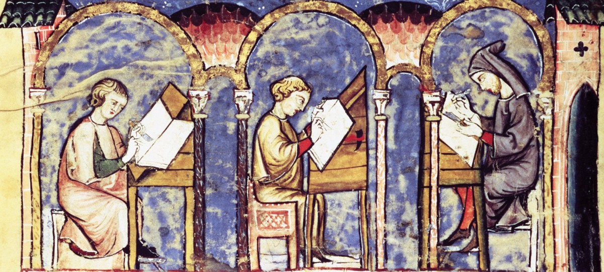
The scriptorium workshop exercise we did on Wednesday was a great first-hand recreation of what it would be like to actually work in a scriptorium. At first, I expected it to be relatively easy. In all honesty, creating a historiated letter can be as easy or as hard as the person doing it decides. Initial outlines can be very easy and fast to do. However, I found that, with the more detail I added to the letter, the more time it would take to complete the illumination. After doing this exercise, I now fully understand the commitment that had to be made by the illuminators in making the manuscripts.

Furthermore, the Gregorian chants that we listened to during this exercise actually helped. I found that I got really into the historiated letter I was making and became extremely focused. But with this focus came a want for perfection. I realized that I felt an urge when coloring to fill each outlined space precisely, and not go over any lines or leave any white space visible. This required even more focus and discipline. On top of this, I also found myself choosing between various choices when it came to deciding what color to use and where to put the gold leaf. Overall, the experience of the scriptorium workshop was a very cumbersome one. However, I now fully understand the extent of detail and work that was done in the crafting of illuminated manuscripts.

css.php