Industrial Dr. Seuss

One of first thing I thought of when I began looking through Shaun Tan’s The Arrival was Dr. Seuss.  This mostly came from the fantastic designs of the creatures and Tan’s alternate industrial style, vividly expressed in The Lost Thing.  This has the odd of affect of combining a sometimes whimsical artistic style with a much more grim subject matter.

This has an interesting way of recreating the immigrant experience in The Arrival.  All of the fantastical beasts, structures, and strange symbols create the feeling of an alien and mystifying world that is difficult to decipher at first glance.  Like the protagonist, we are put into a strange place.  However, in some ways the new city is not entirely unfamiliar.  Even if the shape of the specific objects is unfamiliar, they often still serve recognizable functions and one can guess their analog, such as the flying steam ship-like vehicles and real world blimps.  The landscape is thus not completely incomprehensible.  There’s a layer of familiarity that lets us read what we’re seeing while only making it seem all the stranger with the way it deviates from expectations.
 

Twins

This week we read and discussed David Mazzucchelli’s Asterios Polyp, the story of an architect told in a graphic novel.  One of the most interesting pages for me was the page where Asterios’ unborn twin recounts his brother’s childhood.  Perhaps this is because I have a twin myself.  I was interested by how Mazzucchelli managed to work so many references to being a twin  into one image and it said a lot about Asterios relationship with his brother.  The books on the desk are stories about identical twins that switch places, suggesting that Asterios is constantly thinking about how it could very easily have been his brother living his life.  Other references to twins include the DNA strands on his bed.  There is also a picture of a famous statue of Romulus and Remus, the twin founders of Rome, and what I think are Tweedle Dum and Tweedle Dee from Alice in Wonderland.  This is a character that defines himself in relation to this person, identical to him, that never got a chance to live.  I find it incredible that he managed to get across such a crucial aspect of the character in one scene and it really sets up his later interactions with his brother.

Collage Composition

In working in the collage workshop on Monday, I had no real plan regarding what I wanted to do.  I began by finding scenes that looked like they went together, namely winter scenes from the Christmas magazines.  I began to entertain the idea of simply creating an amalgam of winter scenes that looked like they belonged together but were slightly different.  Over time, things began taking a turn for the absurd and I became more comfortable with creating more bizarre images that reminded me of Max Ernst.  The first was a large kitten’s face I put in to make it look like the giant baby cat was peaking around the tree a man was about to cut down.  Eventually I used the rest of the cat in conjunction with a picture of a stuffed bear and cupcake to make a new creature altogether.


Over the course of this exercise I became more comfortable with combining apparently discordant images to try and create new images.  I used it to create something rather silly, but the experimentation helped open my mind to the possibility of more deliberate and meaningful combinations.

Word in the Image

This week in class we looked at Blake’s poems and artwork.  I was personally drawn to them more than Goya’s, for while I appreciated Goya’s grotesque work and the social commentary in his captions, I enjoyed the interplay between Blake’s poems and his images.  I enjoy the process of looking for the connection between the word and the image, which is often rather cleverly hidden, as with the rose poem we looked at in class.  They might not be the most high quality illustrations, compared to Goya’s work, but the level of thought and effort that went into their composition is readily evident.

It is in that process of looking for the connection between the word and the image that helps the viewer think about concepts and ideas that might not be easily expressed in word or image alone.  Together, the artist is able to put both forms of art into a new light and direct the viewers thinking beyond what is evident at first glance.

Pamuk and Books

Looking at the special collections this week was very interesting and I enjoyed the illustrations.  In particular I took note of the way scenes were illustrated, in part because of the time I have spent writing our first paper.  My mind is still immersed in Orhan Pamuk’s descriptions and notions of illumination.  I keep thinking about all the care and expertise that went into creating an illustration in his descriptions.  The first printed works we looked at were remarkably detailed, but I found myself wondering what might be lost with mass production.  In the illuminated works, I can see the strokes of the artist in the letters and pictures.  Everything seems so painstakingly done and I am constantly reminded that an actual person spent hours to weeks laboring over this page.  With the printed works, there was obviously just as much skill and care put into the engraving, but knowing that this is one reproduced copy among many disenchanted me somewhat.  I don’t mean to belittle the work, but there’s a personal sense to the non-printed illustration that is lost to me.

Knots and Water Colors

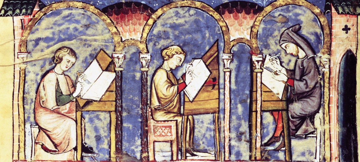
I chose my own initial for my letter in the scriptorium exercise.  I chose a design incorporating Celtic knots, which proved to be more than I could handle in the allotted time.  I found a renewed respect for the monks that would spend weeks completing a design as the knot proved a far more laborious design than I anticipated.  To try and personalize the letter, I replaced the animal imagery in the design I was loosely basing my work with a black dog, specifically my grandfather’s dog Sam.  Where the original design had a bird head holding the sun in its beak, mine had a dog holding an oversized frisbee.  I never did get around to using the gold leaf, but I look forward to working on my letter in my spare time this weekend.

In the meditative environment of Gregorian chant, I can see how an illuminator could spend such an extended period of time working on a manuscript.  I had a lot of fun and I may find myself drawing more letters on my own time.

Pamuk’s Commentary on East and West

Orhan Pamuk’s My Name Is Red brings up a fascinating conflict between the traditional Eastern illumination style and the European style that so disturbs the miniaturists.  I find the concern for idolatry fascinating; it extends to the point where developing one’s own style is seen as being too prideful.  The miniaturists are so concerned about deviating from the old masters that they are constantly tormented by their work.  Enishte Effendi outlined how miniaturists go about their work consumed by guilt for fear that they are committing sin and stepping on Allah’s toes as creators.  Meanwhile, there seems to be hardly a hint of such concerns in the western illuminated manuscripts given that such manuscripts were generally created by monks.  Effendi’s fascination with the venetian masters seems to be where Orhan Pamuk tries to outline his commentary on the two styles.

The eastern style portrays a scene in a top down perspective, in a way, displaying everything in a scene at once.  There are no shadows and all the figures tend to have the same faces.  What disturbs the traditional miniaturists and even Effendi about the western style is that it renders each figure distinctly and unique.  Each individual is unique and each artist seeks to distinguish himself by creating his own style.  Some argue that this rendering of the individual as unique and special is arrogant, tantamount to idolatry or worship of the self.  There’s an argument to be made for those rich men that commission portraits of themselves, but Pamuk presents it as not being such a terrible thing.  It is not an awful thing to wish to distinguish oneself.  In fact he seems to suggest that the reason the old masters are so scared of the venetian style is because they fear it will become more popular and attractive to people than the traditional styles because of its lifelike depictions.  Pamuk doesn’t necessarily reject tradition, but he doesn’t believe it should stop people from embracing new things.

The chapter I Am Red has also set me to thinking about the implications of color and I am currently trying to decide which ones I will want to employ on Monday…

Secular and Sacred Elite

In looking into the Book of Hours, Tres Riches Heures, and My Name is Red, I have found myself wondering about the role of the elite patrons of the illuminated manuscripts.  The Duc de Berry was a secular elite whose wealth and influence allowed him to sponsor a religious work that served as a survey of all his lands, juxtaposing the Duc’s extravagance with his subject’s conditions.  It seems like a very odd choice for a book of prayer.  I would like to know just how much influence he had in what was being depicted and how much was the Limbourg brothers’ choice.  Did they view their work as inherently religious or did they see it as a job for a patron?

The Persian illuminated manuscripts we looked at were not religious at all, probably partly owing to an aversion to idolatry, and  My Name is Red seems to portray illumination as a largely secular pursuit in its account of the men working on the Sultan’s Book of Festivities.  Illustrations are reserved for secular activities and traditional stories rather than religious devotion.  In some ways they seem to be the opposite of the European focus for illustrations, with exceptions like the Tres Riches Heures.  I look forward to more insights as we read more of the story.

Illumination and the Secret of Kells

In the course of the past few weeks I have been struck by the incredible beauty and intricacy of the illuminated manuscripts.  Though they are often directly intended to convey part of the written narrative, it seems clear that they go beyond.  After all, most of the patrons (The few that could afford such works) who commissioned illuminated texts could not read.  They needed to inspire awe and religious feelings without words.  I did not realize before how important such a task was nor the dedication required to execute.

The Secret of Kells helped get across not only the amount of detail but also the intricacy of the designs.  They were intricate but always enhanced the story in surprising ways.  The scene with three panels of Aedan and Brenden walking and growing older was one of my favorites.  The film also helped illustrate the environment these works were often created in as monasteries, especially in England, were preferred targets for viking raids.  The message in the film seemed to be that people should not be so consumed by fear that they forget to keep making beautiful things.

css.php