Snapshots on a Page

In class we have discussed how The Arrival mimics immigration photographs from the early twentieth century because the use of sepia, and the snapshots of daily life. These glimpses into everyday life give us insight to the world immigrants lived in not just from their actions but the emotions portrayed. Of the photos we looked at in class, one that really sticks out to me is the one of the female cell at the police station. The one woman crying out is particularly powerful because she is not posing for this photograph, she is revealing the struggle she is experiencing at that moment.

Shaun Tan does a wonderful job of showing the candid moments in his work. It helps evoke motion from panel to panel but it also expresses the emotion the father and other characters feel. Tan even includes the poised family portraits to contrast those ‘picture perfect’ moments and the natural ones. Their are a lot pages that have these natural moments but I particularly think the page when he getting his picture taken is gut wrenching. There are other sad moments in the story but that last panel on this page to me is the essence of sad anxiety. No words are needed to see how lost and uncomfortable the father is. As he looks to the left of the page you can tell he isn’t just looking to the left, he is looking to the past, to his home- longing to go back. Tan’s ability to express emotion so well makes the book incredibly sad but also happy at times, and it’s also why this book needs no text to express the story.
Character Development Through Imagery

When characters develop in a story, their development is typically seen through their actions. In the context of novels, or books where text is the primary medium, character development must be shown through words. It is the job of the author to properly describe this to the reader. The wonderful thing about graphic novels is that there is the opportunity to create a character’s personality through words and images.

In Asterios Polyp David Mazzucchelli is able to utilize so many different styles to fabricate his characters. One of my favorite pages is in the apple chapter (why is there no pagination??) where Ignazio plays with the thought that the reality we perceive is just an extension of ourselves. The illustrations on this page are fascinating because Mazzucchelli really plays with all sorts of different visual designs that could make up a persona. It really would be something if we could each color the world to the way we portray ourselves. Although this page is by far the most exaggerated, Mazzucchelli uses different techniques with each character in the book to develop their personalities beyond their actions or words. Take Asterios for example. He is defined by linear lines and planes, hinting to the order he strives for in life. Even his speech bubble is not really a bubble because it is a rectangle. Mazzucchelli creates different speech bubbles for every character, playing with the fonts and the shapes, but Asterios is the only person to have a polygon as his speech bubble shape. The change we see in Asterios is at the end when his rigid speech bubble is able to mold and intertwine with Hana’s. Of course there are also Asterios’ actions to show his personality and how it changes, but Mazzucchelli demonstrates how he can use the storyline and the visuals to depict his characters’ personas.

Seamlessness of Collage Art- Digital vs Ernst

Sometimes I think digital art can be seen separate from traditional art. The fact that everything is done on a computer adds an element of distance that is not the same as using a paint or pencil to create a piece of work. When you draw a red circle on a piece of paper with paintbrush, you understand that there is red paint, created with red pigments, and brush made of hairs and wood, and there is no secret to how you make the red circle appear in front of you. I know this sounds incredibly simple, almost too simple, but now think of a computer. How do you create a red circle on your computer? You click a button, drag your cursor, pick a color and there you go. Do you actually know the process of how that circle got there? Not the average person does and that’s what creates the distance. People don’t respect what they don’t understand. At the end of the day, a computer and a pencil are not that different artistically because they are both tools for creativity.

Today, I feel that photoshop, which would fit into the category of digital art, never really gets recognized as art. I’m not trying to say magazine covers with girls altered to look thinner is art but there is something to be said when you see an image of something completely imaginary that has been made on a computer but it is so seamless it looks real. These pieces are just as seamless as Max Ernst’s work but they are never revered on the same level. Of course, Max Ernst did not believe his art was first interpreted properly, so it will be interesting to see if attitudes toward digital art will change, and if it will become more of an art norm in the future. I know the workshop on Wednesday taught me to have a little more respect for it.

Surrealism and Dadasim Across Disciplines

It has been a really interesting week to study Max Ernst for me because in my Nazi Germany class we happened to be talking about surrealism and Dadaism as well. During the Third Reich, Surrealism and Dadaism were considered degenerate art forms because they did not portray the world as it really is. Hitler believed that artists who depicted the sky as yellow or bodies with abnormal limbs were not true artists because they were not giving a real representation of the world. To depict objects and people in such uncommon ways meant that the artist had to be physically ill and not see the world properly, or the artist was purposely trying to trick people the world was that way with their art. The restriction of expression (which was not just limited to art) lead to a very restrained culture. Attendance to movies, theater, and art galleries actually decreased because the work became so bland without any variation.

I personally enjoy the freedom of being able to explore other perspectives through art because I think that is what makes it enjoyable. In the case of Max Ernst, he had a history of having hallucinations so he probably did see the world differently than others, but that should not mean his art should be condemned. Surrealism can be an escape from the real world because it explores the unconscious mind, but as we have seen with Max Ernst’s work, it also helps you see the real world more critically. The lions, water, and wings may seem fantastical at first but the more we look at how they elevate his work, the audience can see how Ernst is commenting on social issues of his time. Sometimes you have to see your world differently to understand its flaws. This probably why Hitler did not want Surrealist artists or their work in his society out of fear they would critique the actions of Third Reich. I know Ernst did not want his work on display because he thought people were not interpreting it properly, but I wonder if there were people who just did not want to show it at the time it was published because they did not agree with his perspective of society or if it wan not until later on. I also wondering if Ernst was specifically on Hitler’s list of banned artists.

How Can an Artist be Inspired by Another’s Work While Retaining Their Own Style?

A question I had for Yun-Fei Ji was if he had ever studied Francisco Goya. The demons he depicts in his work, especially in the most recent scroll, seem to mimic Goya’s style. Although I did not get to ask this question myself, someone in our class asked a version of it. I expected Yun-Fei to know of Goya, but his response was more enthusiastic than I expected. Francisco Goya is an artist Yun-Fei has heard of and admired. In the exhibit, the scrolls outside and inside the moon gate had the most figures mimicking Goya’s dark, animalistic figures. There were human qualities but the forms were still had grotesque elements. When I observed this and came up with my question, I thought, how does Yun-Fei retain his own personal style while trying to incorporate themes from Goya’s work? How does any artist keep themselves from crossing that line of copying another artist?

THe best way to do that is to add another type of style to the one the artist wants to imitate. Yun-Fei still creates his own style by combining the techniques of traditional chinese scroll art with modern themes. Landscape plays an important role, but there are industrial objects, such as freighters and decaying buildings situated throughout the works as well. Yun-Fei also uses a different medium than Goya. Even though his most recent scroll was mostly black and gray, looking like Goya’s Los Caprichos at first glance, the brush strokes in the scroll create a completely different texture than the aquatint printing method Goya used. In similar way, my group mimicked Goya’s style for our collaborative project but we used watercolors and a felt tip pen, and a different illustrating style to create our own approach to the piece. Incorporating other artist’ styles can give us a better understanding of those works.


How Printmaking is an Art Form

I never considered text to be an art form because in the modern world there is a separation between the final product of the book and the creative process. The systemization of printing has been an innovation for the modern world. It has made books cheaper, and easier to access, which is a benefit for society. Printing has also become less the labor of humans and more of computers. I think mass printing has made me consider books not an art form, but a product of manufacturing. The printing workshop this past Wednesday helped me overcome that assumption.

A final print has so many decisions that go into making it just right. The text on the page must be placed on the galley properly, and this means the sorts should not be broken, upside down, or backwards. The sorts also have to tightly and evenly be locked into the galley. Even if everything is placed properly on the galley, the test prints can still show something is wrong, like that the text is off-centered, or not even on the page. Getting to run the printing press myself and go through the process made me appreciate printing as an artwork. Similar to setting up the layout of a painting and executing it, there are so many details that must be considered with printing a page of text. Text is an art form because ever step contributes to the final picture that is to be created on the page. The words themselves are really a meta picture because they also form an image in our heads in addition to their formation on the pages of a book.

Comparison of the Poem “The Tyger”

Honestly, I never knew that William Blake had been a printmaker and a painter in addition to being a poet. I remember studying William Blake during my freshmen year of high school, but it we had examined his poems within a larger collection of British poetry, alongside the work of William Wordsworth, and other English poets. The collection did not include any prints or illustrations, so visuals to go along with the poems was left to the imagination. One poem my class studied extensively was “The Tyger.” I even remember my teacher having each person in my class read the poem out loud so we could have a personal interpretation of how the poem is read. I personally thought the poem was very dark, and had a heavy tone to it. The poem starts off with the lines “Tyger Tyger, burning bright,/ in the forests of the night;” and I imagined a tiger emerging from a dark forest, a beacon of light. The fourth stanza really establishes the rhythm for me, and it incorporates the heavy tone I associate with the poem.

“What the hammer? what the chain,/ In what furnace was thy brain?/ What the anvil? what dread grasp,/ Dare its deadly terrors clasp!”

From this stanza, I imagined a furnace, which is something that is usually surrounded by darkness, but within the furnace there are embers and fire that emit light. The imagery in my head was similar to the tiger being illuminated within the dark forest. Overall there was still a sense of darkness and power in the poem. The way I pictured the poem without illustrations in high school definitely influenced the way I perceive the poem today. I was surprised by the way William Blake printed “The Tyger” in Songs of Experience because it seemed too happy to me. It’s not the most colorful poem in the book, but the color scheme is made of pastels, giving it a lighter tone. The sky is kind of dark blue in one corner but it does not indicate the dark forest I had pictured five years ago. The tiger is the focus of the print, but it doesn’t pop out from the page because it is “burning bright.” Instead the tiger contrasts the pastels since it is drawn with such heavy lines. I imagine the page looks the way it does because of the way Blake printed, working with the positive instead of the negative. I’m just shocked at how differently I had picture the poem just based on the words from the way Blake chose to show it in the Songs of Experience. I wonder if anyone else in the class did not expect the Songs of Experience to be like this.

Why I Am Excited to Try Printing…Again

My first experience with printing was in 6th grade for a history project. We were studying Ancient China and each group had to create a hands-on project for the final, so my group tried block printing. I remember being so excited to carve out the individual blocks, partly because we had special permission to use swiss army knives, and partly because I couldn’t wait to see the final product. It was a long process to decide which characters we wanted, stencil the blocks so our characters would not be backwards, and finally carve the pieces of wood. Of course, after all of this work, when we went to print the characters on paper, they didn’t show up very well because there was not enough pressure and the paper didn’t hold the ink. However a classmate discovered that the block prints showed up really well on skin, and soon the whole class was walking around with characters printed up and down their arms.

Reflecting on this project really makes me have an appreciation for a master printer. It’s one thing to crudely carve into a block when you’re eleven, but another thing to go through the process we watched in class. The printers are so patient with every technique they use, recognizing a piece can require many rounds in the acid bath using different types of printing styles to be finished. They also check the print after each step, a method my group mates and I could learn from. Even though the process is long, it is worth it to get all the textures and tones for the final product. Of course, a piece does not need to use all the techniques we went over in class. Goya’s Los Caprichos just uses the aquatint method and his pieces are just as impressive. For the Los Caprichos aquatint works because it makes the pieces very dark and sets the tone Goya wants. The darkness also highlights the parts that are in light, and it adds to the dialogue Goya creates with his work.

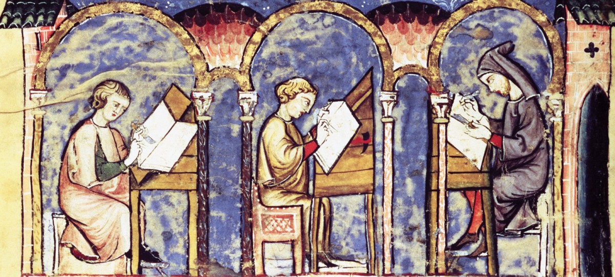
Thoughts on the Scriptorium

It was so nice to work with watercolors again, and I throughly enjoyed the workshop in class. I have not used them in over two years since my AP Studio Art days in high school, and it took awhile to get use to them again. The water to pigment ratio drastically changes the richness of the color, as well as the mixing of other colors such as black. Some people complain there are not a lot of color options on a watercolor palette, but if you are creative, a variety of shades can be conjured. The biggest adjustment was the time constraint of class, and realizing that it was not about finishing, but enjoying the process. Of course, I had to remind myself to not get too caught up in the flowing designs of my illuminated letter while working with the felt pen, otherwise I never would have started on the watercolor. I did not finish the piece in class but I look forward to working on the piece later this week and incorporating the gold leaf.

So how does this workshop relate to the readings we have been doing in class? It has given me a new appreciation for miniaturists. We have color at the touch of our fingertips, and with a little bit of water, the possibilities are endless, and that doesn’t even include other types of paint. Paintbrushes are manufactured in countries far away in a fraction of the time, for a fraction of the cost, compared to medieval methods. While it required lot of labor for miniaturists to produce the materials, it was part of the process that made it so special. It’s also important to remember miniaturists had a lot more tim, than say a college student, to make their tools. I’m slightly jealous that miniaturists could spend the entire day working on their art. I wish I could have stayed working on my letter all day instead of being called away to another class. Even though I had to leave, at least I can look forward to working on it more in the future.

Persian vs. European Illuminated Manuscripts

As we read more of Orhan Pamuk’s My Name is Red, the differences between eastern and western illuminated manuscripts become very important because they determine life and death in the novel. The techniques Enishte wishes to incorporate into the secret book he is organizing do not seem that significant to us, but they go against the culture that exists in Instanbul at the time.

An important difference between the east and the west is style. In western culture, some works are characterized by the style of the miniaturist who paints them. The Tres Riches Heures for example is defined by the distinguished techniques of the Limbourg brothers. The one page done by Jean Columbe, instead of the Limbourg brothers, stands out from the others because the attention to detail and scale is not as precise. The motions of the figure and and the pigs are very passive. In eastern texts, if a miniaturist were to be as unique as the Limbourg brothers, they are not a true master.

Another difference is the level of extravagance in the pages we have looked at. At the end of class, Professor Serrano mentioned that common manuscripts do not survive because they would be used as scrap paper, but with the ‘nicer’ western  and eastern manuscripts we have seen there is still a difference in the amount of color, gold leaf, and designs being used. In the Book of Hours, pages that use a lot of blue or red, and that have intricate scenes, suggested that whoever owned the book was wealthy. The Tres Riches Heures is also used to display the wealth of the Duke of Berry. Each month includes one of the Dukes chateaus, and displays all the land he owns being worked in some months. The Persian manuscripts that we have viewed in class are less busy. They depict one figure, or a single scene. There are not many objects in the pictures, and there seems to be less use of color and gold leaf. These features could have faded away over time, but there is still a lot less activity in the Persian illuminated manuscripts than western manuscripts. I think that this reflects the differences in culture, but it would be interesting to know the dates of the Persian manuscripts, and look at later ones to see if we see any interchanging of techniques between the east and the west, which is starting to happen in My Name is Red.

css.php