The Arrival was a unique reading experience. Without any words, the reader has to rely on the images and their mind to fill in the gutter space between panels. The way the pages were drawn, in a familiar yet foreign style. The animals, buildings, and objects all have a feel of familiarity, but are unrecognizable. This style of drawing gives the reader a sense of the life an immigrant faces, and the challenges they are put through daily as they attempt to deal with the culture shock of entering a completely different world. The people remain a constant in the book as familiar and comforting, giving a sense of belonging of the characters and their ability to connect with one another. The color of the images gave the sense of a photograph and seeing the world through the immigrant’s eyes, while also giving a sense of darkness and foreboding because of the lack of color. This tied well to the theme of immigration and the need to acclimate to a new life, and the stories that the reader sees of the many immigrants and the struggles they went through. I found this book heartening because it shows the world from a different person’s perspective and shows why immigration was important to the people portrayed.
Author: Maraina Adams
Asterios Polyp
I found today’s reading of the beginning of Asterios Polyp very beneficial. I hadn’t finished reading this graphic novel before class, so our class discussion of it drew my attention to certain elements in the beginning of the book that I hadn’t focused on before, like the objects Asterios chose to take with him when he fled his burning building. As I read the remainder of the book I realized how well planned out the narrative was, so that each element mentioned had its purpose later. This was a very enjoyable read, and I can see that it does have a lot of value to be read again. With the many images with a lot of little details, I’m sure there are important things that I missed on the first read through that would add even more to the story if I read through it again knowing how the story ends. It was also very fun to look at the book with 3D glasses and see how that altered the images and feel of the book.
Collage
Yesterday’s workshop was a good reminder of the amount of work it takes to make a collage. I mentioned before my amazement that Ernst made his book in three weeks, but actually attempting to make my own was a reminder of just how impressive Ernst’s work is. It was a fun experience to browse through magazines looking for images that would work well together in a collage. I became more aware of how much precision is required in cutting to get a good image that doesn’t look like it’s been pulled from multiple sources. Frequently the images in magazines have text or other things on the image that aren’t necessarily something I would want to include in my print, so I had to make choices of whether to try to cut out the object or leave it in the image and put it into my collage. I also thought about the fact that since we were using many different magazines, the sizes of images varied. In some pictures the people were the main focus of the page and in others they were in the background. Finding images that work together spatially and proportionally takes a lot of work if you’re looking to make a cohesive, consistent image. This workshop gave me even greater appreciation for Ernst’s work.
Amphigorey
I’ve really enjoyed reading Edward Gorey’s Amphigorey. I find myself most interested in the pieces where each individual image is read by itself, like The Listing Attic. The short poems have the feel of a children’s book with their rhyme scheme and attached image, but the content is very much not what a parent would give their child to read. They have a dark humor and and many satirize sociocultural concepts.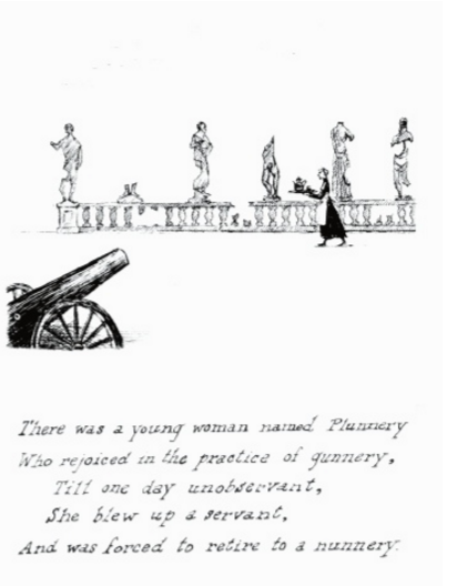
Here is an example of one such piece. While the image doesn’t actually show the moment of the death, it shows the preceding events and foreshadows the coming murder. The poem is dark but its combination with the image and the way it is written gives it humor. The page finds humor in an event that should not be seen as humorous, since a servant was killed and the woman goes to the nunnery to repent for her crime. There is also humor in the statues behind the servant mostly destroyed by Plunnery’s use of the cannon, showing that her use of the cannon has been careless in the past. These pages are fun to read and make the reader engage with them.
Une Semaine de Bonte
Reading through Une Semaine de Bonte in class was very useful to my understanding of the book. Describing it as a wordless novel made me consider the book in a way I hadn’t when I had looked through it before class that day. I had seen the different sections as collections of images with similar themes and characters portrayed in them. After looking at the pages in class, I understood they could be read as having a connected narrative, with one page moving to the next as a cohesive story. I especially liked the two images of the woman in the bed, and considering whether it was meant as a single image from two angles or as two separate instances. I am also amazed that he was able to complete this book in such a short period of time, and find all the images he needed to make the pages as they are. The variety of images and his ability to give them a cohesive feel is very impressive. While there were some places where the different elements could be seen added together, overall the pages looked complete. His talent is clearly seen by his ability to make the images so seamless.
Yun-Fei Ji
I was glad we had a chance to meet with Yun-Fei Ji in class today and get to hear directly from the artist about his work. It was very enlightening to hear about his work and the historical influences on his art. The time period he grew up in China was extremely turbulent. I studied abroad in China over the summer and was able to hear about the time period from others who’d lived through it, and I find it very interesting to hear different people’s perspectives about the period. His discussion about art he saw as a child in the history museum and how it was altered, in addition to the fact that we can’t read Yun-Fei’s works because it is written in Chinese reminded me of another Chinese artist I’ve studied whose work is also influenced by the Cultural Revolution. This artist named Xu Bing made one piece using thousands of fake Chinese characters to respond how language was used in the Cultural Revolution to push the ideas of Mao. He made characters that are aesthetically made to appear to be real characters, but have no meaning and make audiences uncomfortable because they are incomprehensible. I find works that respond to this time period and China’s current environment to be very fascinating. As an artist myself, I always appreciate getting to hear the perspective of the creator and understand better what they are responding to when they make their works.
Print Workshop
Today’s print workshop was a valuable experience. I have made intaglio prints in the past, but I had never tried using a printing press like the ones available today. Relief and intaglio printing have many differences, so I was glad to have the opportunity to see the print studio today. It was fun to see the three presses and get a better sense of how they work. I liked the ability to choose between wood and lead for making our prints and seeing how to line up the blocks in the galley.
Getting to work in groups to design a print was a nice experience, since we all got to participate and voice our own ideas of how the image should look. My group decided to use the wood blocks to print. I liked the wood blocks because there were a large variety of images we could use in addition to text. I’ve never printed text before, so I found it challenging to think about the fact that since it was a print, the words would be printed backwards. I didn’t get to help with the actual printing process, but I’ve seen the product of our work and think it turned out really well. The image is crisp and has a rich color, and I can see how useful printing presses were in the past for mass producing a text. While it took a while to make our galley to print, once it was made it could be printed as many times as we wanted.
Goya in Bordeaux
The movie Goya in Bordeaux did a good job giving a sense of Goya’s art and the circumstances under which he created it. The color palette of the movie was very interesting to me, and I felt many scenes reflected the style of prints well. Many scenes were monochromatic, which is similar to how many prints are made. The color red was heavily used, and the red acted as a nice compliment to the dark scenes of Goya’s art and the chilling feel of the movie when Goya saw his work coming alive or transforming into memories of the past. Goya, portrayed predominantly in white, was nicely contrasted to the Duchess of Alba, portrayed in black, who seemed to be a figure representing death.
While the movie visually interesting, I found the convoluted plot to be confusing at times. The switches between his time at the end of his life with his daughter and his youth with the duchess occasionally left me confused about who the characters he was interacting with were, and left me questioning their significance to him. This, however, was beneficial in terms of portraying the struggles Goya went through in losing his hearing and the troubles he faced in his life with his illness and inability to let go of the past.
Library Visit
I found the library visit on Monday very enjoyable. It was great to have an opportunity to see such ancient books in such an informal and hands on setting. I hadn’t realized how many books our library had, or that they were so accessible to students. I was especially amazed that we were allowed to touch the books ourselves. I consider them pieces of art, and art is generally put on display and not allowed to be handled. It was a great opportunity since when we had looked at illuminated pages in the Wellin, I felt distanced from them because of the setting and inability to touch the pages. In the library, I was able to better examine and appreciate the books. Being able to manually handle the books gave me a much better sense of their weight and value, since I could see and feel how much work went into them.
The large music book was very interesting to me because of its immense size. It was very different from previous books we’ve seen since it was for music and designed for many people to view at once. The sheer size of it reminded me of how much time and effort went into making these books, since each page was made from an animal skin and the book had around a hundred pages. Getting to turn the pages also made me aware of the delicacy of these books. I was glad to get to see a variety of these books.
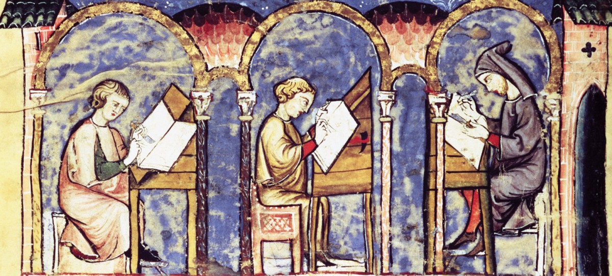
Scriptorium
The scriptorium workshop was a great opportunity to really understand the work of a miniaturist. Spending the hour and fifteen minutes working on our illuminated letters made me more conscious of the amount of time it would take to make a page like the ones in our Book of Hours. We were using large paper, which was much easier to work with than having a page the size of a Book of Hours, and while I didn’t put a large amount of detail into my painting, it still took the whole class period to only complete part of my image. The amount of detail that went into a miniaturist’s illuminations is astounding, especially considering the small sized paintings they made. The focus and precision necessary to make these illuminations requires a lot of talent and patience. I also appreciated listening to the Gregorian Chants, which gave our workshop more of the atmosphere of a scriptorium. The time passed very quickly and it was nice to get a chance to have a hands-on chance to use what we’ve been learning about in class to make our own letters.