Animation of The Arrival

I was looking up more information about The Arrival and found a wonderful animation adaptation of it (below). I think it does justice to Tan’s story, although it only focuses on the main character and loses some of the other stories that are embedded in the book (specifically the parts that have different colored gutters; some sacrifices probably had to be made when going from book to animation). I particularly liked the use of sound in the animation — did anyone read the book with sound? Below are some points in the video in which sound was particularly effective for me:

  • 3:50, when the main character is with all the other newcomers, getting his information taken for his ID. The constant murmur of people in a large, echoey space while you’re trying to get something done is familiar to me (reminds me of when I pass through Grand Central Terminal).
  • The cacauphonous sounds at 1:02, which made me uneasy and indicated the uncertain journey the main character had ahead of him, and the one at 1:23, which indicated to me how this new place might be scary
  • The rustle of bed sheets when waking up (7:32), of wrapping photos (0:33), and of tying shoes (7:44) bring to life the details of the main character’s daily life

The animation, from its zooming and panning, also really brought my attention to the grainy photorealistic technique that Tan utilized in his images. Additionally, I appreciate how the animator organized the images, shuffling through the square snapshots of the main character’s experiences and spending more time on splash pages. I think these approaches mimicked the pace of the book well.

The Arrival feels like something I can read over and over again, especially if I’m feeling lost, like I don’t fit in, or when I’m in a new place (job, city, etc.) that is brimming with unfamiliar stimuli. I think without words, Tan’s sole use of images both allows me to sort of know what is going on and affords me greater connection with the story because if I want, I can interpret the images subtly in a way that resonates with me. Or, I can see the story playing out in other people’s lives as well. In other words, The Arrival has a universality from demonstrating a wide array of experiences (which may have been lost in the animation).
Sounds and Pauses: The Comics of David Mazzucchelli

In Thursday’s class, we touched on how comics, or Asterios Polyp specifically, should be displayed in museums. When I found that David Mazzucchelli’s work was the subject of a 2009 exhibition, Sounds and Pauses, at the Museum of Comic and Cartoon Art (MoCCA; now seems to be closed but continues programming), I was curious as to how the comics were actually shown.

Sounds and Pauses focused on Asterios Polyp, but also featured Mazzucchelli’s City of Glass adaptation, some short stories, and some Batman and Daredevil stories. In addition to published pages from Asterios Polyp, the exhibition included original sketches and notes as well. Altogether, these materials highlighted both Mazzucchelli’s process and finished work. I think this approach allows viewers to experience the comics more in-depth, though not exactly in the same way they would if they were reading them at home. Instead of the viewer piecing together the graphic narrative story as they would when they read it from page to page, they are instead imagining the story behind the artist and his artwork. This imagining is just as valuable. I think knowing more about Mazzucchelli’s process, for example, how he adds color and texture after he draws, informs my interpretation of Asterios Polyp. Knowing that he works with the finished product in mind helps me better see the repeating motifs and full-circles that the narrative features.

Even though MoCCA’s exhibition potentially gave more context to visitors for Mazzucchelli’s work, the museum’s primary audience is/was people who are already familiar with comics. For Sounds and Pauses, visitors probably had read some of his publications or were knew about his style and working process. In this situation, the exhibition probably more likely served as a supplement rather than an introduction to comics as an art form or to the narrative of Asterios Polyp. This perspective in who an exhibition’s audience is, in addition to which works would be representative of the artist’s career, plays a role in how the curator decides to display the works and what kind of exhibition text to provide.

Sources:

http://artforum.com/words/id=23076

https://macaulay.cuny.edu/eportfolios/saslow09/visual-arts/group-4the-museum-of-comic-and-cartoon-art/

Collage and Digital Image Workshops

I’m glad we had the chance to do both workshops, as each medium had its own merits. Collage had certain limitations that working with Adobe did not. I’m not sure if collage artists find it appealing to work with what they can find that already exists, but I liked that I already had some of what I was going to use in front of me. This limitation sort of narrowed down the options in terms of what I could make. On the other hand, as I started working on my collage, I did find myself wishing for certain images I couldn’t find — I wonder if this is when collage artists start to draw or make their own pieces to include (like Matisse did)? Anyway, artist processes probably aren’t so linear.

Ironically, the limitations of collage actually also sparked creativity. The images I picked from the magazines led me to think of different concepts I could portray that I probably wouldn’t have otherwise, especially if I had started with a single concept in mind like I did with Adobe. The images opened up new paths, whereas with Adobe, I feel like I was limited with my lack — or abundance of — ideas (sometimes I had too many things I wanted to do, and wound up staring at the screen thinking about which one I should pick). However, unlike collage, I could create anything I wanted in Illustrator. Even though I didn’t know all the functions of the program, I knew it was powerful enough that I could do basically anything, which was definitely different from the feeling I got with collage. I’m not sure which medium I liked better — it probably depends on the mood I’m in, but I think it’d be interesting to find out more about why artists would choose, say, acrylic paint over pastels, sculpture with steel over sculpture with wood, etc. For example, I wonder what Yun-Fei Ji experienced when he worked with paper to make a 3D work, which was a departure from his 2D handscrolls.

“The Listing Attic” from Amphigorey

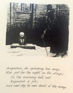
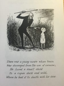
“The Listing Attic” is one of my favorite sections from Amphigorey. It’s another example of Gorey putting a dark spin on usually non-dark forms of writing (e.g., children’s books, panoramic postcards). In this case, he plays around with limericks, which are usually humorous, lighthearted, and sometimes nonsensical. Weirdly, Ithink Gorey doesn’t necessarily abandon these qualities in his works — he just has a different take on them. I feel like I uncomfortably laugh at his limericks because the humor is unexpected and points out absurd, often frustrating situations in life. My thought process when I see some of his works in “The Listing Attic” and other sections is: “Oh my gosh, this should not be happening, but it is, and it just goes to show you how ridiculous life — or people — can be sometimes. I should try not being so serious all the time, because bad stuff is going to happen either way, and it’s pretty tiring to be serious over stuff you might not have control over.” (Although, this is not to say that we should just laugh at everything, I still think there is a time and place for everything, Gorey’s works included. For example, I wouldn’t show these to someone who is grieving a death). Here are two examples that prompted these thoughts / made me chuckle uncomfortably:

ListingAttic1

ListingAttic2

I’m also curious about Gorey’s process behind “The Listing Attic,” as it seems like one of the few sections that reads more like a collection rather than a story. Did he want these limericks in a particular sequence, or were they ordered chronologically?

I wish I knew what the French limericks said as well, or why he decided to use French specifically for those images — I wonder what kind of added a cultural context or meaning the language offered. Although, maybe using French wasn’t so conscious of a decision.

The origins of the title are also interesting to think about. Perhaps “listing” is a reference to how it seems like he is listing all these different situations dealing with people who are forgotten, shunned, punished, etc. And given that, maybe “attic” goes well in the title because attics are usually hidden away or forgotten about when people visit a home.

Recreating Une Semaine de Bonté

JG1

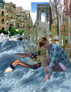
Joseph Gillette attempted to recreate Une Semaine de Bonté with images from the Internet. He has only completed Monday so far (http://unesemaine.josephgillette.net/monday/). It’s interesting to see how his interpretation changes the meaning of the original. Some of the images and their placement simply don’t convey the same situations. For example, we wavered in class on whether it is the woman or man who has more power in the collage on page 47. Correspondingly, on slide 8 on Gillette’s website, it more looks like the woman is falling into the water than kicking the man in the head (as it might look like in the original). The man also instead seems to confront the viewer, or look up as if he has been caught in the middle of doing something wrong.

JG2

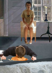
Sometimes, Gillette’s choice of images takes the creepiness or mystery away from the original — maybe because the images are more recognizable to us? For example, the collage on page 60 has a dark quality to it, with the fearful-looking woman staring at an unconscious man. On slide 28, the woman looks a little fearful, but the man kind of just looks like he fell asleep in his spaghetti. That the reinterpretations have much brighter shades and are in color may also take away from the sense of darkness I get when I see the original. I wonder what people in Ernst’s time thought of his collages (e.g., what kind of commentary or critique they made), because maybe for them Victorian novels were more recognizable and familiar and thus allowed them to see a different meaning than I can.

Additionally, I am not sure if Gillette tried to bridge the images together as if they were part of an narrative, like Ernst did. I think Gillette’s process explains why it is harder for me to see the connections between images. He would do a keyword search on Google Images, such as for “woman sleeping” or “waterfall.” Thus, unlike Ernst with Victorian novels, Gillette chose to venture outside of a certain type of material or genre.

I’m not saying that Gillette’s interpretation is bad. I’m not sure if he intended to do Ernst’s work justice in terms of recreating the exact meanings of the original. His recreations instead serve as an interesting contrast to the original — actually, I think it is more helpful for me to more interpret them as a commentary on today’s digital image-informed society rather than something that serves to better illuminate Ernst’s work. Through the wonders of the Internet, Gillette is able to use images from a variety of time periods, allowing us to think of them in an almost unlimited number of contexts. Some images have watermarks on them, which to me is a reference to questions of ownership in the digital age. The lack of depth (at least in comparison to Ernst’s work) makes me think of how there is all this information out there on the Internet, and how it’s hard to weed through them to find quality.

Talk with Yun-Fei Ji

I thought it was really interesting that Yun-Fei made his artwork with the notion that it would eventually be mounted on a wall in a gallery, and so he broke it up into sections. When I first saw the exhibition, I think I was a little overwhelmed by the intense detail and large size of the artworks, and it was difficult for me to get the full story because I couldn’t see everything at once. I was probably too distracted from seeing so many images to notice the sections; in other words, losing sight of the forest for the trees. However, the more time I spent with the artworks, walking past them on various occasions, I was more easily able to see the progression of the story and piece its parts together, especially for The Village and Its Ghosts. I think for that piece, the fact that it wraps around the outside of the moongate structure helps facilitate me processing it, because I am physically unable to see the whole thing at once. As a side note, I found that Yun-Fei’s explanation about how he made artworks with the idea that they would be in an gallery further reflects his struggle between private and public viewership/use of art, which was brought up when he commented that he recognizes a show is a public presentation of his private observations.

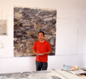
Towards the end of class, I asked Yun-Fei what the figure on the bottom right of this photo was:

YFJ

He said that it was one-half of a sculpture he had made that got shipped back to him from Belgium to be fixed. I wonder if that 3D process has also influenced him like his experience at Dieu Donné has (I forgot to ask him though!).

Also, I thought this animated version of the Song dynasty scroll Along the River During the Qingming Festival at the China Art Museum in Shanghai was really cool. Thinking back on when I went, I feel like because the animated scroll was so large (basically an entire room dedicated to it; at 11:32 the whole thing is shown) and we were small in comparison, it kind of felt like it was being unfolded, or rather, like we were part of the unfolding.


Thoughts on Printmaking Workshop

I’m really glad our group decided to go with woodblock instead of lead, because my preconception of how the printing process would go involved moving pieces around relatively easily. I enjoyed working with the woodblocks because it offered the right amount of artistic freedom with a good degree of restriction and limitation. The process was like putting together a puzzle / problem-solving on two levels: first, we had to use what we were given (the parts) to make something (the whole); second, once we decided on our parts, we had to make sure they fit together given the boundaries and capabilities of the galley and magnets. I appreciated how the process of putting together this puzzle was an iterative: if a piece didn’t work (as in, physically fit into wherever we wanted it to go), we had to put it back and rethink what we wanted to represent. Going back to the drawing board multiple times made getting to the cohesive design in the end all the more rewarding.

Using the printing press was very cool, and gave me a newfound appreciation for the invention. I’m probably going to look up the mechanics behind how the different gears and parts work together; I’d like to demystify (in a good way) this magical machine. I almost expected a “ding!” sound when the cylinder hit the end of the “track” (I’m pretty sure it’s not called that) and made a click. It was instantly gratifying to have such a quick feedback: you ink your pieces, feed paper into the clips, turn the handle, and out comes a print that you would see hanging on a wall or in a book. Going from blueprint to final product within the timespan of a class was a satisfying experience.

There are two things I’d like to recall from the workshop but can’t seem to remember:

  1. The brand name of the printing press (I think it was van something… I would love to find out more about the company’s history!)
  2. The name of the science of making the woodblocks the same level so that they get inked evenly (Prof. Rippeon mentioned this as he slid paper underneath our stag woodblock to elevate it to the right height)

Goya in Bourdeux

I really enjoyed the dialogues Goya had with his younger self in Goya in Bourdeux. Since reading Los Caprichos, I always wondered how the artist reconciled his high status as a painter for the royal court with his criticism of the Spanish government. The two scenes in the film, first with Goya looking at Los Caprichos and at (what I assume were his) portraits, shed some light on this contradictory situation. Although I’m not sure what Goya’s relationship with the court was or how they received Los Caprichos, based on the film it seemed like Goya struggled a lot internally with his thoughts and opinions on Spain’s future. Thus, I appreciated the film in that offered a biographical lens through which I could further understand Goya’s work.

Young/old Goya’s commentary on Los Caprichos brought to life what was going through the artist’s mind when he created these prints, or how he intended them to be interpreted. In the later scene, his ambivalence about who has chosen to paint (“to think once I was proud to be there [in the] […] ‘court of puppets'”) makes me think about the role of art and its consequences — after all, portraits last. His conflict with his conscience and eventual reconciliation with it (“But I had no choice. I did paint people I admired,” “In my defense I must say that I have worked a great deal […],” “I have sacrificed and persevered to overcome the hostility and envy of my colleagues, the criticisms of some, and the dangers of the Inquisition”) helps me piece together the dialectical relationship between the artist and his art.

Overall, I liked the technique of learning about Goya’s earlier life through the perspective of old Goya. The inclusion of his self-reflection in those two scenes (and in others as well) indicates the significance of art in his life, especially in relation to the social and political climates in Spain at the time. I realize that an artist’s career can’t only be summed up with an evaluation of all of his/her works from an aesthetic perspective, but might also include the biographical stories and contexts that have affected these works.

Thumbs Up to Los Caprichos

I really like the aquatint style that Los Caprichos is in. I think it allows Goya’s figures to look pretty realistic, even the horror- and fantasy-based ones. I don’t know how to explain it, but if I were to imagine what a monster looked like, Goya has created it pretty accurately. The use of tones and shading and the way Goya chose to position the figures are really impressive. These techniques add fluidity to the characters and bring them to life, which are qualities that go well with the humor in the captions. I feel like I’m getting glimpses of a comedy skit. While I appreciate the Dover edition’s good quality reproduction of the prints and accompanying explanations, I’ve found the high resolution images on Wikipedia to be super helpful. The clarity of the images is useful for seeing what’s going on, getting a better sense of the variety of tones, and distinguishing the individual etched lines and how they work together in the print as a whole.

I also enjoy the content of Los Caprichos. I like that Goya reveals the sometimes absurd, ridiculous, and/or ironic nature of societal conventions and norms, such as the woman getting married in “They say yes and give their hand to the first comer” (2). In addition to critiquing society on a larger scale, I like that Goya also comments on individuals and the human condition, like how greed gets in the way (“For heaven’s sake: and it was her mother,” 16) or how we are sometimes too preoccupied (“Which of them is the more overcome?,” 27).

Scriptorium Reflection: The Role of the Viewer

One thing I experimented with during the workshop was how true to life I wanted to make my images look. When I was drawing parts of maps for the background of my “J,” I thought, well I could make these look as accurate as possible and have what I want to communicate (i.e. the map locations) strictly laid out. Or, I can try to evoke images of maps in general, of the world, or of traveling — basically, leave it up to the viewer to decide. This dilemma reminded me of the contrast between Western and Eastern manuscript traditions. The Western style represents people and scenery recognizably. Once we studied a few manuscripts, like the Très Riches Heures, I realized, yeah, it’s relatively clear what people are doing, what season it is, and that the Duc de Berry is proud of all his castles. For other illuminations, I feel like the symbols, especially the flowers, have a pretty one-to-one relationship in that each is used specifically to show a certain trait or virtue.

Meanwhile, the Eastern style is more abstract because the concept, meaning, or scene is supposed to be in one’s mind already; one doesn’t need a visual representation of it. It’s almost as if the artist trusts that the viewer will interpret the illumination in an appropriately religious and spiritual way (this is not to say that Western artists don’t trust the viewer). This speculation made me better understand the importance and influence of audience when making art. Do I trust viewers to interpret it in a way that I want them to? Do I even want my viewers to share my specific interpretation in the first place? These questions can also apply to how Pamuk presents the tensions between Eastern and Western styles in My Name is Red. I feel like Pamuk walks a fine line between explaining the pros and cons of each style, thus leaving it up to the reader to form an opinion, while showing acceptance of the Western style, or at the very least the mixing of both, thus nudging the reader towards a certain direction as well.

css.php