The Arrival & Dinotopia

When reading Shaun Tan’s The Arrival, I couldn’t help but draw comparisons to another graphic narrative that happens to be childhood favorite of mine: Dinotopia. For those unfamiliar with the book, it follows a similar plot arc, in which human characters are thrown into a new world with strange and unfamiliar customs and practices. There is a language barrier, so the protagonists struggle to understand their novel environment, and they are aided by those around them and their dinosaur companions. There are a handful of narrative parallels — adjustment into a new home, the frustration that follows culture shock, fantastical companions (creatures and dinosaurs), and ultimate assimilation — but what really stood out to me was the similarity between the art.

For reference, here is a page from Dinotopia

Emperors_Offer.sm copy


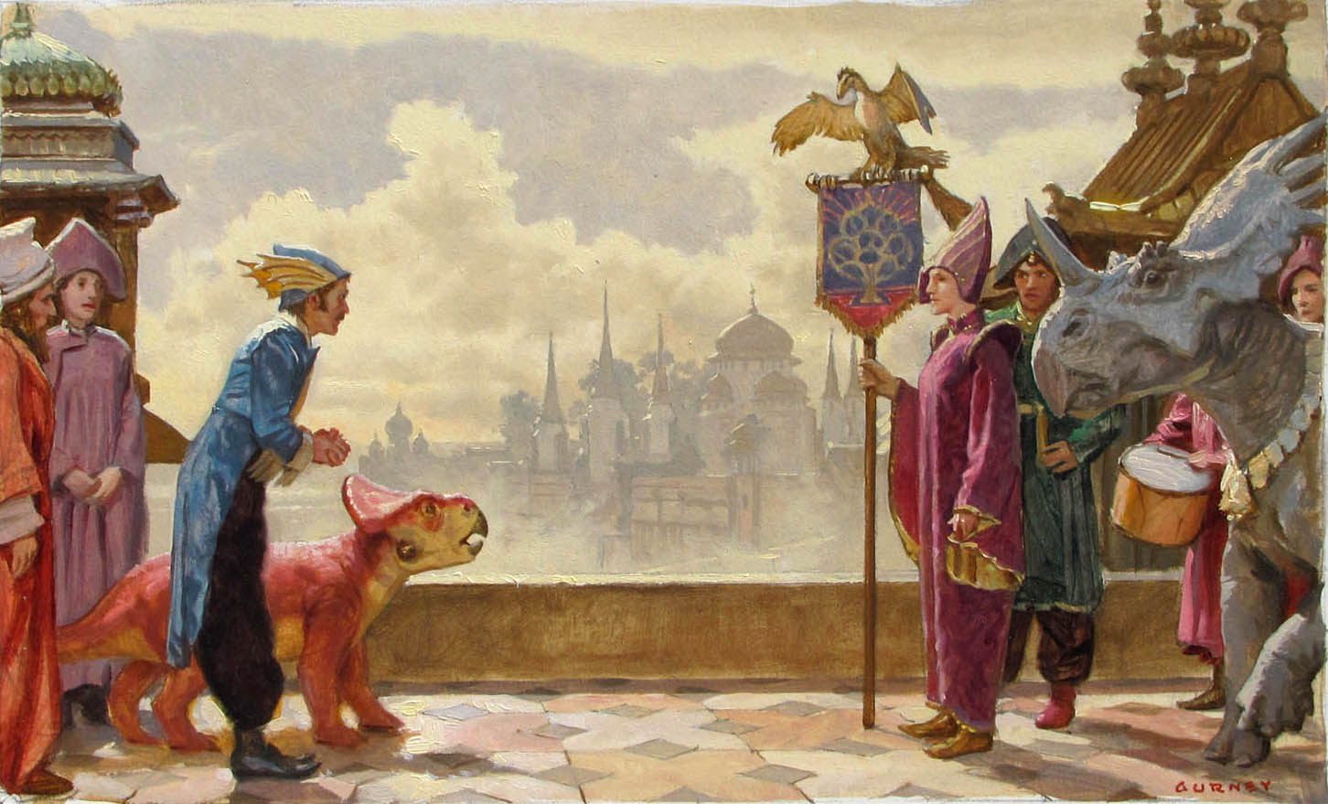
While it lacks the sepia hue, I feel that it is aesthetically similar to Shaun Tan’s illustrations. In the background, one can see a grand and uniquely constructed city; in the foreground, one sees a wordless exchange between two delegates, each with an interesting creature attending them. There are bizarre and unrecognizable insignias throughout the book, much like the signs in The Arrival. In both graphic narratives, the human characters are dressed more or less abnormally.

While Dinotopia has accompanying words, I feel that The Arrival‘s wordlessness offers a different perspective on an identical sentiment. I feel that the protagonists in each are in awe of their surroundings — in a sense, they are “speechless”. The Arrival takes this speechlessness literally and excludes text altogether, while Dinotopia channels this awe through scarce dialogue and annotated diagrams. Both books relate the tale of very human characters in very inhuman (as we know it) environments. In this translocation can be found the tension (and resolution) of the two texts.

The Value of Collage

During Monday’s class, I was struck by the singular absurdity of doing arts and crafts in a 200 level course at an elite liberal arts school. I am certainly not complaining – I rather enjoyed the activity, and felt that it had merit in illustrating the technique of collage, and perhaps also the value of it. I would like to issue a disclaimer that the following text is not a commentary on Ernst’s artistic ability, but rather, my own. Collage is enjoyable because it makes the creative process much more accessible. It is less synthesis than combination. The raw materials already exist and are left to the invention of the collage maker to cut and layer them in interesting ways. It relies on the direction of the maker, but not necessarily his or her ability to draw or paint.

Perhaps some of the power of Ernst’s Une Semaine de Bonte derives from it’s nature as a collage compilation. If we accept that he is making socio-political critiques, then the knowledge that the content of the book came from existing publications of the time period becomes especially significant. He is twisting and manipulating the culture of the time to make a statement about that same culture. In this way, he is making an argument that is more poignant than if his pictures were hand-drawn – none of it is pure invention, just interpretation.

Gorey’s Perversion of Children’s Literature

I was intrigued to learn in class that Gorey was not particularly fond of children, but I cannot say I was surprised. This distaste is abundantly clear in “The Gashlycrumb Tinies”, which depict the imminent deaths of small children to the tune of a whimsical nursery rhyme. The Tinies echo several facets of traditional children’s literature – the rhyme is one such feature, alongside the alphabetical structure and the illustration style.

Another book which channels elements of conventional children’s literature is “The Bug Book”, a short graphic novel that tells the story of a community of fun-loving bugs who violently and abruptly dispose of a mean, disruptive intruder. The “Book” reads like a child’s book – full of color, merriment, and innocence – until the climax, which is decidedly macabre.

What Gorey does in these two collections, and indeed, what I believe he intended to do in creating them, is pervert children’s literature. He purposefully crafts stories that are thematically or cosmetically comparable to children’s stories, only to flip the script and introduce his signature morbidity into an otherwise light-hearted piece. His disdain for youth is manifest here; Gorey lets us know, in no uncertain terms, how he feels about children’s literature.

50 Shades of Blake

Due to the time constraints of the letterpress workshop, groups could not typeset more than a line or two from their text of choice. While the selected excerpt might have been a nice stand-alone sentence or a small analog of the text’s content, it could not provide a full and robust picture of the work. There is something necessarily lost in reduction. In my group, the subsequent illumination picked up the slack and fleshed out the neglected elements of the piece. We settled upon an illustration that would not only augment our printed words, but also expound on the topic presented in the poem we chose. In this sense, we unified the literary and artistic elements of our manuscript – the result being a harmonious multi-media argument.

We have seen a similar coalescence of the verbal and non-verbal in William Blake’s “Songs of Innocence & Experience”. Granted, Blake published entire poems, but he considered the implications of his words and wrought illustrations that would echo the motifs of the poem. For instance, Janelle Schwartz drew our attention to The Sick Rose, which was framed by circular boughs and flowers. Essentially every element of the art could be plausibly interpreted as significant to the meaning of the poem.

Songs_of_innocence_and_of_experience,_page_39,_The_Sick_Rose_(Fitzwilliam_copy)

Consequently, the reader is moved not only the power of the words, but the aggregate of the visual elements of the page. This creates a considerably more immersive experience.

Printing Press Idioms

During our class on Wednesday, Professor Rippeon went over some of the printing press nomenclature with us. He also explained that the expression “out of sorts” arises from being out of a particular kind of type. As it were, the printing press era gave rise to a number of commonly used idioms. I took the liberty of looking some up.

One such expression is “mind your p’s and q’s”. Because they could be so easily mistaken for one another, especially in a backwards or upside down orientation, type setters had to pay extra attention to ensure they were using the correct sort. In the conventional type case, they are also right next to one another.

The designations “uppercase” and “lowercase” also have their roots in printing. The large letters would be kept in a case high on a shelf, while the small letters would be below that. In that time, the “uppercase” and “lowercase” letters rested in their namesake locations.

A final expression is “hot off the press”, for reasons that are fairly obvious. I always find it interesting to learn the origins of common expressions; the printing press revolution had not shortage of these.

Captions in Los Caprichos

Francisco Goya’s Los Caprichos, in their original form, were comprised of simply the plate and a cursive caption underneath each illustration, such as “How they pluck her!” or “Out hunting for teeth”. The audience was left with no other means by which to extract meaning from the grotesque caricatures. In my own perception of the pictures, despite the knowledge that each scene was in some way a cynical social commentary, I would have found it extraordinarily difficult to make sense of what I was seeing without the aid of the descriptions beside each picture. I am unsure as to whether the public at the time would have been privy to Goya’s meaning based on simply intuition and critical thinking skills.

The aforementioned descriptions are characteristic of more modern editions of Los Caprichos and explain Goya’s intended criticism. However, once I considered the plates in the context of their artist’s intention, they became more than amusing grotesqueries – they were disturbingly accurate accounts of social trends or cultural tendencies. The true power of his work lies within these meanings which were not accessible to me without pretext.

Scriptorium Exercise: A (Reasonably) Unbiased Review

I anticipated Wednesday morning to be a relaxing departure from the monotony of academic routine. However, I was met with a challenge of a different sort entirely: I am rarely, if ever, confronted with my own severe artistic inability. I understand that the goal of the exercise was not to actually create a beautiful piece of art, but rather to garner a personal understanding of this type of art. However, this knowledge did not prevent me from growing frustrated with myself – because I so often neglect my artistic side (for good reason), I felt like a 3rd grader during arts and crafts.

As I left Root with a underwhelmingly illustrated “J” in my hand and good-humored self-deprecation in my mind, I realized that I had successfully completed the exercise. I succeeded not because I had drawn a block “J” adorned with some dinky leaves, not because I had managed to paint inside the lines, not because I had proven myself as a competent adult with average motor skills, but because I experienced firsthand how laborious the process of illuminating is. I cannot fathom the collective amount of time and energy artists of the past have spent poring over these historiated letters. It requires the sort of emotional investment that, while I myself do not share, ignites the passions of artists everywhere. It necessitates deep pride – or considerable fees – to fastidiously design and paint these complex pieces of art.

Division of Identity

We understand, at this point in the novel, that Elegant Effendi’s killer is one of the miniaturists commissioned to work on the Sultan’s book. Pamuk writes chapters from the murderer’s perspective that acknowledge the perpetrator’s identity as both a painter and a killer. In these chapters, the narrator refuses to reveal his identity; this is a device by which the author can develop tension and create suspense. However, presumably, the reader has also encountered chapters written from the perspective of the killer under his workshop name, Stork or Butterfly or Olive. Two sides of the same man have been presented, with neither publicly admitting knowledge of the other.

This textual separation of identity, beyond being creatively interesting, indicates a more profound divide. In the chapters narrated by the murderer, the speaker insinuates that the act of killing has made him into a new man – it has stripped him of naivety, heightened his senses, and removed his fear of his own primal nature. Having taken a life, he finds his own to be immutably changed.

When the same man decides to extinguish Enishte’s life, the reader is once again privy to the killer’s division of identity. However, at this moment, it is not the killer ruminating on his own moral turpitude; the miniaturist’s depravity has become so pronounced that Enishte himself is cognizant of it. The narrator writes, as he looks up into his killer’s eyes, that “he was no longer the master miniaturist [he] knew, but an unfamiliar and ill-willed stranger” (173). This passage is almost self-referential insofar as it verbalizes a motif that emerged in earlier pages. Enishte’s epiphany at this moment is a poignant nod to the personal consequences of murder.

Metafiction in My Name is Red

We have spent a considerable amount of time in class discussing  metapictures – images that in some way reflect or comment upon themselves without departing from the genre. Perhaps it is appropriate, then, that we encounter the literary equivalent of this phenomenon in My Name Is Red. Pamuk is unapologetically self-referential from the early pages of the novel, the result being a narrative that is complex, clever, and amusing.

Following a short bit of exposition in the first chapter, the narrator, whom we know to be the late Elegant Effendi’s ethereal counterpart, offers a claim as to what might happen “if the situation into which [he has] fallen were described in a book” (5). Another character contemplates a similar fate in a later chapter. Shekure, daughter of Enishte, muses, “perhaps one day someone from a distant land will listen to this story of mine” (43). In these particular passages, the narrators don’t claim knowledge of their circumstances within the pages of the story; this ignorance is stripped in the next instance of metafiction, in which a painted dog directly addresses the reader. In context, the painting hangs behind a speaker who is voicing the sentiments of the dog to the patrons of a crowded coffeehouse. In a justification of his vocal abilities, the dog says, “I’m a dog, and because you humans are less rational beasts than I, you’re telling yourselves, ‘Dogs don’t talk'”. This passage alone suggests that the dog is speaking to the crowd in front of him. However, he continues, “nevertheless, you seem to believe a story in which corpses speak” (11). This latter quote affirms that the dog is indeed addressing the reader, and consequently, that he knows that he is a character in a book.

Pamuk’s metafiction is evidence of the inter-genre blending that takes place in My Name Is Red. There is a constant dialogue between art and literature that manifests itself in various permutations of commentary – art commenting on itself, literature commenting on art, art commenting on literature, and literature commenting on literature. This meta cocktail produces a book that, like the borders of an illuminated manuscript, interweaves, winds and crosses over itself, and uses space effectively.

Book of Hours: Calendars

Books of Hours typically begin with a series of illustrated calendars that delineate the holy days and celebrations contained within specific months. This information manifests itself as a body of text within a frame that is itself surrounded by elaborate illustration. The accompanying illustrations are all connected by a theme: the pictures show feudal life in its various walks, usually pertaining to the season that the month falls within.

There is a historical consensus that these devotional books belonged solely to those who could afford them: namely, manorial lords and members of the aristocracy. It is no surprise, then, that many of the illustrations besides the calendars depict lords or ladies in luxurious situations. One such illustration contains a lord sitting in a great hall, warming himself in front of a hearth while a meal is laid out behind him by a serving girl of negligible importance. Another shows a well manicured lawn being traversed by a stately-looking couple in noble clothing, while other couples of similar import enjoy music or lounge by the waterfront.

What is peculiar, in light of the knowledge that these books belonged to the wealthy few, is the emphasis that the artwork places on the working men and women of the estate. An inordinate amount of the illustrations depict vassals attending to chores, such as tilling fields, reaping crops, slaughtering animals, sweeping floors, or serving food. I am curious as to whether this seemingly deliberate featuring of serf life is intended as celebratory – a lord taking pride in his vassals’ work – or sadistic. The latter conjures the image of a smug noble reveling in the grueling work of those indentured to him, while the former paints a much nicer picture of the medieval boss-employee relationship.

css.php