The Benefits of Dark Themes in Children’s Books

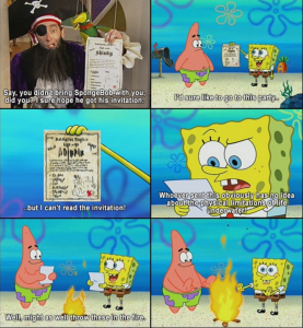
In recent weeks, we have discussed the mature and dark themes that appear in many children’s books. From Amphigorey to The Arrival, we see stories that are stylistically similar to the children’s books that we all know and love, but in fact, have a dark thematic undertone. I have always found adult themes hidden in media designed specifically for children to be interesting. For example, SpongeBob Squarepants is loaded with innuendo and adult jokes. In fact, many cartoons have such components – perhaps to entertain adults who may be watching along with their children. I’m not afraid to admit that I still watch (and enjoy) watching SpongeBob, but I must say that my enjoyment has shifted focus a bit. A lot of jokes that I find myself laughing at now, I do not think I would have understood as a child. This is why I feel that it is sometimes appropriate to integrate some dark humor and subtle adult content into media designed for children (and when I say ‘some’ I certainly mean less than in Amphigorey). Below is an example of humor that a child might not understand, but is funny to an adult. It’s not obscene (although such examples do exist in SpongeBob) but is an example of mature humor nonetheless:

Screen Shot 2016-05-04 at 2.58.22 PM

Certainly, as we have discussed in class, this phenomenon is not isolated to television and extends to many children’s books as well. Looking back on some childhood favorites, it is evident that dark themes are abundant. For example, Where the Wild Things Are could be very frightening to a child. After all, playing with monsters on an island isn’t every child’s idea of a good time. An example that hits closer to home is Harry Potter and The Sorcerer’s Stone. While this novel is not your typical children’s picture book – many elementary school students read this book. I remember being absolutely terrified by this book the first time I read it. I was nervous to talk about the popular story with my friends in school because the thought of three-headed dogs, trolls, and men with two faces kept me up at night. It took me years to get back on the Harry Potter bandwagon. Another interesting example is The Lorax. It is a fun picture book and a classic, but the underlying theme about destruction and the takeover of industries is a bit dark. Nevertheless, it allows parents and children to begin a discourse about such topics early in life. Indeed, the content of The Arrival is similar in this way. The themes themselves are mature, but disguising these themes in a more playful setting introduces children to important historical events from an early age. Thus, I feel as though these themes are actually very important and can be both entertaining and educational.
Dark Themes in this Course: Will They Ever Stop?

I must admit that I was taken off guard by the incredibly dark ending of Asterios Polyp. Then again, should I really have been surprised? It’s not like any of the works we have investigated this semester left me feeling cheerful. We started off with Books of Hours in the beginning of the semester, which was not overtly dark. However, as we progressed in our discussion, darker elements of the illuminations started to reveal themselves. Moreover, we began discussing the underlying themes of many of the Books, including social injustices and other societal letdowns. We moved on to My Name is Red, which was riddled with the murder of people and the betrayal of longstanding notions of what it meant to illuminate – a dark theme indeed. Hoping for a change in pace, we moved to prints. One could only imagine how much more dark things would become. Our studies of Goya led us to Los Caprichos, a set of prints filled with dark humor and grotesque images. As if the prints themselves weren’t enough, the film Goya en Bordeaux was quite disturbing. So, we moved on to the study of collages – a style of art that I had cherished since my childhood. Surely, the collages in Max Ernst’s Une Semaine de Bonte will provide relief from the dark nature of the works we had studied thus far…right? As it turned out, the collages were eerily similar to Goya’s work, packed with grotesque imagery and filled with societal critique. Next up was Amphigorey, a collection of works with cats on the cover! How could a book with cats on the cover have anything dark inside? Cue The Gashlycrumb Tinies. Alas, we moved to Asterios Polyp. The narrative started off a little shaky but generally progressed to what was shaping up to be a happy ending. And then:

IMG_9988When I returned from class today, I cracked open The Arrival to get an idea of how we would be ending the semester. I had high hopes for a work free of any dark themes. Admittedly, I only skimmed a few pages, but I have a feeling I will be left with the same sentiment. Looking back on the semester thus far I think that the most cheerful work that we investigated was The Secret of Kells. Considering how this movie involves the entire town being ransacked and burned, one could only imagine what the remainder of the semester entailed.
Collaging Through the Years

The collage workshop brought me back to my art classes in high school, middle school, and elementary school. The collage I created in class on Monday was not my first but was by far my most deliberate. Studying collage has given me a new outlook on what goes into making a collage, and what should ultimately come out. I think that my experiences with collages throughout the years follow an interesting trend. That is, my collages have become increasingly sophisticated. When I was in elementary school making a collage in art was a dream come true. I didn’t have to get marker all over my hands, or try to draw a good picture. Instead, I cut out scraps of paper, crinkled up pieces of tissue paper, curled up some colorful pipe cleaners and mindlessly glued these objects to a piece of paper. Of course, I never neglected to cover the entire page with glitter when I was finished.

As I graduated to middle school and high school my ideas began to manifest themselves in my collages, but my juxtaposition was nothing to write home about. In 10th grade, I created a collage of newspaper articles and pictures regarding 9/11. Our prompt for the project was to create something, in memoriam of 9/11. My collage integrated many powerful pictures and certainly accomplished the goal of the assignment. However, my placement of images on the page followed no particular pattern and was far from deliberate. Inspired by Max Ernst’s seamless collages in Une Semaine de Bonte, I took to collage once more this past Monday. For the first time in my life I created a collage with deliberate selection of the images and their placement on the page. The components of my collage combined into a single scene, and while my scene was not nearly as seamless as one made by Ernst, I attempted to tell a story with my placement of pictures. My juxtaposition was deliberate rather than haphazard, and my message was likely much more clear. This course has taught me a lot about art history, but I am also learning a great deal about myself as an artist. I once thought I could only become better at art if I practiced and practiced. While that may be the case for my execution, I think the commentary in my art can be improved upon without even picking up a pencil, or a pair of scissors. For example, as my story about my progression of collaging suggests, simply learning about Ernst allowed me to improve. Such phenomena remind me of the value of a liberal arts education. Indeed, what I learned in the classroom made my art better. In fact, much of what I learn in seemingly unrelated classes has proven to have fascinating connections.

Humor in Amphigorey

I have found Amphigorey to be a very interesting read. I think that the humor in Amphigorey shares a lot in common with the works of Goya. The humor is very dark and often provides a message or commentary. Where Amphigorey differs from Goya is in the subtlety of the humor. The humor in Amphigorey hits you across the face, whereas the humor in many of Goya’s works is a lot more subtle. I found many of the prints in Los Caprichos to be funny, but I needed to look at the image for a bit before I found the humorous components. In Amphigorey, on the other hand, I see the humor immediately.

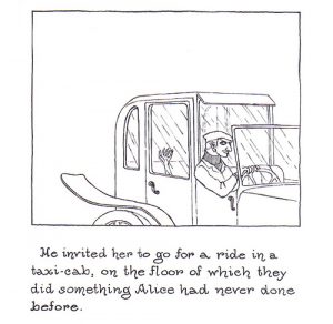
The primary reason for this discrepancy is the presence of text in Amphigorey. In fact, the funniest parts of the narrative are in the text itself, and the images add additional humor after the fact. For example, The Curious Sofa is somewhat humorous (in a dark sense), but the images make it even funnier. I think I would find the narrative funny if I read it without the accompanying images, but the images add an extra element. This is the most apparent, in my opinion, on one of the first pages of The Curious Sofa where the newly acquainted Alice and Herbert make love in a taxi. The idea of “making love” on the floor of a taxi is funny on its own, but when you look closely at the image and notice the suggestive face of the cab driver – the humor is enhanced.

curioussofa2

Another humorous part of Amphigorey that is embedded in the text is (unsurprisingly) the amphigory – the meaningless babble in some of the stories. I found The Object Lesson to be absolutely hilarious because of the utter nonsense. There is no logical connection between the lines of the story, and the use of proper Victorian language in a nonsensical way adds an additional layer of humor. The Gashlycrumb Tinies is probably some of the darkest humor I have ever seen in my life. In fact, I think the only reason I laughed at this particular story was that it was so dark that I actually could not believe that somebody would write such a story. Each of the stories in Amphigorey is an amalgam of funny pictures and funny text, and the result is simultaneously dark and humorous.

Max Ernst Stars in: Collage-ception

A collage-novel is an interesting way to describe the genre of Ernst’s Une Semaine de Bonté. We discussed this notion in class to some extent on Wednesday. I got the impression that this way of classifying the genre of Une Semaine de Bonté was somewhat controversial, and I certainly understand why. On the one hand, the classification is descriptive and gives the reader a realistic idea of what to expect when he or she opens the book. The book is a series of collages which do indeed create a narrative, much like a novel. I see the merit in calling Une Semaine de Bonté a collage-novel, but I also see the opposing argument that we mentioned in class. We mentioned that many believe that calling Une Semaine de Bonté a collage-novel is somewhat redundant. In a way, I feel as though any novel could be a collage. In class, we defined a collage as “a form of visual art that assembles different forms resulting in a new whole.” A novel may not be as “artistic” as the archetypal collage, but it certainly juxtaposes different forms (pages) in a deliberate way in order to create a new whole (the book and narrative).

Under the assumption that any novel is a collage we can certainly call Une Semaine de Bonté a collage-novel, but couldn’t we call any novel a collage? In this way, I see the argument against this classification from those who deem it redundant. If a novel is a collage and Une Semaine de Bonté is a novel composed of collages, then we could consider Une Semaine de Bonté to be a collage of collages – “collage-ception” if you will. However, I’m still not sure what to think. As I write this post I continue to question the arguments for and against this classification. I do not believe that genre is some inherent quality of Une Semaine de Bonté, however, and for this reason, I believe that we should classify Ernst’s work however we would like. If calling it a collage-novel works, then we should stick with it. I see the value in starting a discourse about the possible redundancy of the classification, but does it really matter if it’s what makes sense. The genre collage-novel gets at the two major components of Ernst’s work – a collection of collages, and a carefully constructed novel-esque narrative.

Interpretation of Artwork

When deciding which questions I wanted to ask Yun-Fei Ji on Wednesday I had some interesting thoughts about how he might respond to what I asked. Although I did not get to ask him this question, I wanted to know whether or not he had a favorite piece in the exhibition. This got me thinking about the artist’s perception of his/her own artwork. Surely an artist’s judgment of a piece of art must differ in some ways from that of the casual observer. An artist judges more than the aesthetic quality of the art and the underlying motifs and themes (that an observer may judge) because he/she knows what his/her intentions were. I imagine this struggle between perception and reality as being similar to what it is like to visit somewhere for the first time. For example, when your friend talks about his house repeatedly you develop a perception in your mind’s eye of what your friend’s house looks like. When you finally visit, however, it is almost invariably far from what you imagined. Similarly, I imagine that an artist’s final product often strays from what he/she originally intended. Perhaps the discrepancy is a good thing, and changes were made throughout the process to enhance the quality of the final product. On the other hand, errors in execution may cause the final product to be different from the intended product in a negative way. Even if the intended product and the perceived product are in agreement, the author’s knowledge of a difference in intention and reality (or a lack thereof) adds an extra level of judgment when considering his/her own piece.

I experienced this phenomenon myself while working on my collaborative project. Our initial idea was similar to what we finished with, but we made small changes along the way that changed what I was expecting our project to look like. When others look at our project they may find it to be aesthetically pleasing, have an interesting commentary, and resemble the work of Francisco Goya, but they will never know (for better or for worse) what we expected the work to look like. As a novice artist, I do not have a lot of experience comparing perception and reality, so I would be interested to know what some of the artists in our class think about this. Is this ever a source of frustration, or is this something you hardly even consider? Do you think knowing what your initial intentions for a piece were adds an extra level of judgment for your own work?

Printing Workshop Reflection

I enjoyed learning about typesetting in the print workshop today. It’s always interesting to learn about the origin of phrases like “out of sorts.” After having seen and experienced how time-consuming the process can be, I understand how frustrating being out of sorts could actually be. The scriptorium workshop gave me a greater appreciation for the process of illumination – particularly for the amount of time it required to create such vivid details. Similarly, with the printing workshop I was given extra appreciation for how hard and time consuming typesetting is. When making an entire manuscript like a bible or a novel, it must take an incredible amount of time to create a single page, much less an entire book. It certainly makes sense that inventors target processes such as typesetting, which take inordinate amounts of time, and create devices that automate and speed up the process. It’s hard to believe that I could print an entire book today by pressing a few buttons on my computer and waiting at the printer in less time than it took me to figure out how to typeset a single sentence in our workshop!

In addition to thinking a lot about the process of typesetting, I also thought a lot about my collaborative project and therefore Goya in today’s workshop. We have discussed the style and themes in Goya’s work at length, but the printing workshop provided me with extra insight into his motivation and commitment to his work. It has been hard enough to come up with a clever way to construct a societal critique in our collaborative project, so Goya’s ability to not only integrate a clever narrative into his art, but also develop beautiful images using a very time-consuming technique is admirable. I’m glad that we have had the opportunity to supplement our classroom learning with hands-on exercises and videos that allow us to explore the techniques used by the authors and gain additional insights.

Just When I Thought It Couldn’t Get Any Weirder…

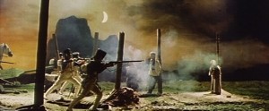
I’ve honestly found the transition from illuminations and My Name is Red to the printmaking and Los Caprichos to be startling. There is certainly a stark contrast between the visual nature of an illumination and a print. However, the biggest differences to me thus far have been in the message. Even the darker illuminations had a lighter feel than Goya’s prints. The prints are funny, granted, (at least in Los Caprichos) but are also extraordinarily crude and dark. I started becoming accustomed to Goya’s style, and the shock factor was wearing off, but just when I thought it couldn’t get any darker and weirder, along came Goya en Bordeos. There were two scenes that I believe captured the “dark and weird” aspect of the film. The middle of the film has a scene where Goya is working at night and he is surrounded by people with demonic masks and the end of the movie has a scene with the soldiers shooting innocent people. These scenes were both dark and very strange. That being said, I think they did a good job capturing some of the things that Goya incorporated into his art. The last scene seemed to represent a motivation for Disasters of War, and the scene in the middle captured the general crude and dark sentiment present in his prints.

1640_06

It may seem like I don’t like Goya, but my “aesthetic discernment” (if you will) has not been clouded by my inability to get over the crude nature of his prints. I think the messages in Goya’s prints are witty, creative and insightful. I enjoy looking at his work and interpreting what he is trying to say. Moreover, the prints are beautiful, and I appreciate the skill that is required to make such detailed drawings. As for the movie, I was not a huge fan. However, I did appreciate the ways in which the film weaved Goya’s inspirations and his biography into the plot. Through his interactions with Rosario, Goya tells the story of his life and simultaneously reveals why he paints and prints the way he does. The style of this film certainly pays homage to Goya in a very fitting way.

Comparing Illuminations and Prints

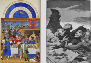
As we transition from looking at illuminations to looking at prints (and in light of our recent comparative paper), I have started comparing and contrasting the notion of illumination with that of printing. It seems as though the goals of illumination and printing are similar: to create an aesthetically pleasing work of art that provides an accompanying narrative. In illuminations such as Books of Hours, the narrative is hidden in metapictures and background details. The narrative is a bit more overt in prints such as Los Caprichos, as the crude prints provide commentary in a much more “in your face” fashion. So, the content of the illuminations and prints share many components (e.g. strong narrative and artistic appeal).

These side-by-side works provide insight into this difference. Each of the works provides some commentary on a social issue. The print (by Goya) paints a caricature of high-society by showing demonic creatures giving one another makeovers. Similarly, the presence of the working class throughout illuminations in the Tres Riches Heures (just like the one shown here) provide commentary on the place of the working class in society. Thus, both works aim to say something about the time period during which they were created. Where printing and illumination differ, however, is in their creation.

Screen Shot 2016-02-26 at 9.41.53 AM

We have had the opportunity to watch several videos and read a few articles that have given us insight into the process of illumination and printmaking. The video we watched in class on Wednesday showed just how difficult it can be to create a print. The aquatint technique used in Los Caprichos requires attention to detail and the investment of a lot of time. Interestingly, the way prints are created allows them to be created in mass – adding to their availability to all types of people while simultaneously subtracting from their uniqueness. We have also learned a lot about the process of illumination through My Name is Red, The Secret of Kells, the scriptorium workshop, and various articles. Creating an illuminated manuscript requires making inks, creating the parchment, and then actually producing a final illumination. Hence, the process of illumination certainly takes a great deal of time as well. However, illuminations are unique and cannot be easily reproduced, limiting their availability to those with better resources. These differences in technique are interesting to consider, though the goal of illumination and printing is very similar.

The Scriptorium Workshop: Illuminating Illumination

This week, the scriptorium workshop allowed me to reconnect with my somewhat artistic side. I have always enjoyed working with and manipulating colors, but unfortunately, my ability to execute is subpar. However, that is beside the point because despite my sad attempt at an illuminated letter, I did learn a lot about the process. While deciding which letter I wanted to make, I was able to consider many of the aspects of what we have discussed thus far including geometry, patterns, and the meaning of what surrounds the letter. Interestingly, I found it difficult to even determine which letter was depicted in many of the examples I looked at due to the intricate design surrounding the letter. That being said, I saw some truly unique examples of illuminated letters while perusing the online resources. Just like the illuminations themselves, it is clear that the letters often have unique features of style. I certainly learned a lot about illumination in the scriptorium, but I also gained a new appreciation for the process.

During our class exercise in illumination, I was able to understand why these illuminations took so long. In class, I was able to finish about half of an illuminated letter in an hour. The intricacy and attention to detail in my letter paled in comparison to the examples we have seen in various manuscripts, not to mention I was making a letter several times the size of the typical manuscript example. I now understand why these manuscripts took so long to make. Not only does it require time to create something so perfectly detailed, but using particular colors wasn’t as easy as reaching for the set of watercolors sitting next to you. Looking back on our discussions in class thus far, I feel as though The Secret of Kells did an excellent job portraying the difficulty of illumination and all that goes with it. The scriptorium workshop was an opportunity to do what we have been speaking about all semester, and it was a truly “illuminating” experience.

css.php